HeroUI v3 trades copied code for a maintained React package
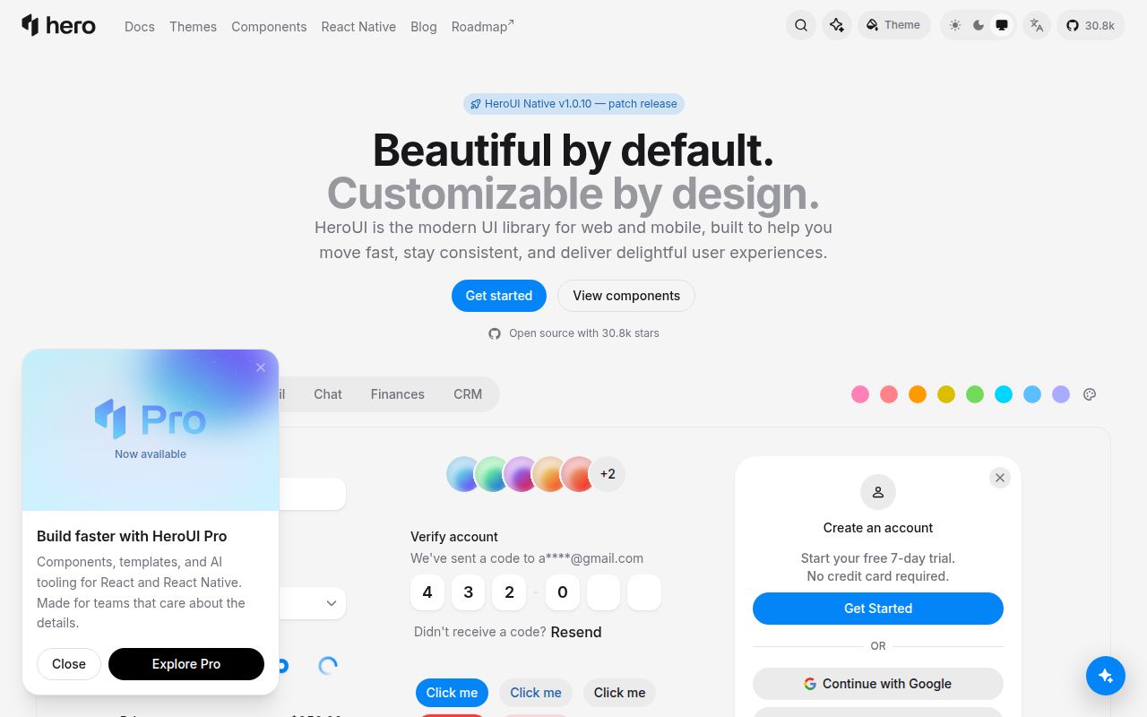
HeroUI v3 supplies React components as npm packages, with @heroui/react as the full bundle and individual packages available for narrower imports. Its compound API puts related pieces under names such as Card.Header and Select.Item. React Aria provides the interaction base, while Tailwind CSS v4 handles styling without a CSS-in-JS runtime. That combination suits a product team that wants one visual system and does not want to assemble every menu, form field, overlay, and table from primitives.
Release v3.2.6 shows what maintained-package ownership buys. Published on September 17, 2026, it reduced unnecessary rerenders across 43 components, changed focus rings on menus and overlay triggers, fixed locale and time-zone labels in Calendar, and updated React Aria. It also added @internationalized/date as a peer dependency. The upside is centralized fixes. The cost is upgrade work arriving on the library's schedule, including peer dependency changes that need testing in your app.
The one-line app install hides a 1,539 MB contributor tree
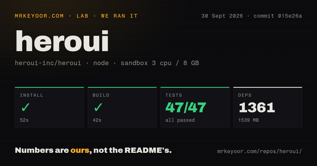
The consumer instruction is only npm install @heroui/react, but our repository install pulled 1,361 packages and occupied 1,539 MB. Those numbers describe contribution and verification, not the size shipped to a browser. They still matter if your team expects to patch upstream, run the docs locally, or keep the monorepo in CI. The checkout itself held 3,286 files and about 175,858 lines of source, spread across pnpm workspaces.
commit 015e26a requires Node 22 or newer and pins pnpm 10.26.2. The contribution guide also requires a one-time Chromium installation before the browser suites can run. HeroUI has 3 CI workflow files, but our scan found no Dockerfile and no top-level tests directory, so there is no repository container recipe that duplicates the contributor environment for you. No secrets were needed for the install and build we ran.
What happened when we ran it
Our sandbox installed commit 015e26a in 52 seconds and built the package targets successfully in another 42 seconds. The unprivileged Debian container had 3 CPUs, 8 GB of RAM, Node 22, and no secrets. Installation added 1,361 packages and left 1,539 MB on disk. This establishes that the documented toolchain can install and compile in a clean Linux environment. It does not measure page speed, component bundle size, or browser rendering.
The full test command failed after 99 seconds with exit code 1. The docs project reported 4 test files passing, containing 47 passed tests and 0 failures. The React project reported 113 passing test files out of 125, with 624 tests passed and 1 error. Turbo identified @heroui/react#test as the failed task, and pnpm ended with ELIFECYCLE. The supplied tail does not include the error message that triggered that result.
A clean build and 624 passing React tests are useful evidence, but they do not turn an exit code of 1 into a pass. We also cannot say whether Chromium, a missing system package, a runner fault, or application code caused the single error because the log excerpt does not show it. Teams using a green-suite release gate should reproduce the command, retain the complete log, and stop there until the error has a name.
Tailwind CSS v4 is the firmest adoption boundary
HeroUI v3 is designed around Tailwind CSS v4 and React 19, and the README says it works with Next.js without a provider wrapper. That is a tidy fit for a new application already on those choices. A Tailwind CSS v3 codebase faces a migration before the component decision is settled. A non-React front end also has little reason to adopt the package, even though the documentation discusses using the styling layer outside React.
React Aria underneath the components is a better starting point than inventing keyboard and focus behavior in each product team. It is not permission to skip application testing. Open issue 6231 describes a sectioned ComboBox on HeroUI v3 beta throwing childNodes is not supported while a user types, after which the input stops responding. The report supplies a reproduction and a flat-list workaround. We did not reproduce that browser case in our sandbox, and the issue remained open on October 1, 2026.
HeroUI v3 gives AI editors context, while package ownership stays upstream
HeroUI v3 includes an MCP server, an llms.txt file, and a CLI command that installs agent guidance for editors including Claude Code. These tools can help an assistant choose existing components and follow the theme instead of inventing a parallel UI vocabulary. Generated code still needs review against the actual component version. The project's contribution guide makes the same demand of AI-assisted pull requests: contributors must understand, review, test, and disclose meaningful generated changes.
Teams that want every component checked into their application should look at shadcn/ui. Material UI makes more sense when Material Design is already the product language, while Chakra UI is a closer packaged-system comparison. HeroUI's case is strongest when React Aria behavior, Tailwind CSS v4, and its compound API all match decisions the team has already made. Picking it only for the MCP layer gives a secondary tool too much weight.
A September 30 push and 22 open items show active maintenance
HeroUI was pushed on September 30, 2026, thirteen days after v3.2.6 shipped. GitHub showed 30,849 stars and 22 combined open issues and pull requests. A separate search split that queue into 18 issues and 4 pull requests. Recent activity included documentation fixes and component patches, so the project is plainly maintained even though our complete suite did not pass. A release tag alone would say less than that combined record.
HeroUI is a sensible default for a React 19 team already committed to Tailwind CSS v4 and willing to consume a maintained package. Our 42-second build passed, yet the 99-second test command did not. That gap should shape the trial: wire up the components your product uses, run their browser paths in your own CI, and make the unexplained React test-run error a release question rather than a footnote.