Chakra UI 3.37.0 provides a complete design-system layer
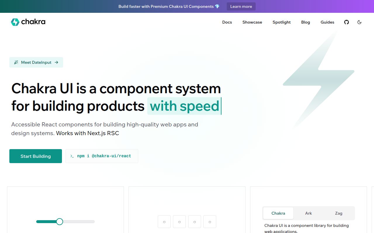
Chakra UI 3.37.0 is for teams that want components and design rules to speak the same language. Buttons, dialogs, tabs, inputs, and layout primitives share style props, tokens, semantic tokens, recipes, and responsive conditions. The package depends on Ark UI for component behavior and Emotion for styling. That combination gives a product team one place to define color, spacing, variants, and interaction patterns instead of settling those choices separately in every feature.
The commitment is bigger than importing a button. Version 3 requires React and React DOM 18 or newer, while the installation guide sets Node.js 20 as the floor. A custom system can enforce strict tokens, generate TypeScript definitions, scope its CSS variables, and turn off or limit the default reset. Those controls matter in a shared design system. They are extra machinery for a small page whose components will never share more than a color palette.
Two packages still need a provider and project-owned snippets
The basic application install names 2 packages: @chakra-ui/react and @emotion/react. Setup also adds a provider at the root. The generated provider combines ChakraProvider with next-themes for color mode, while the CLI can copy prebuilt component snippets into the application. No account, API key, database, or hosted Chakra service sits in that path.
Snippets change the ownership boundary in a useful way. Chakra maintains the primitives, but the generated provider and compositions live in your source tree, where your team can edit them. The theme system goes deeper through recipes, slot recipes, semantic tokens, breakpoints, and type generation. If you adopt those pieces, Chakra can hold a product's UI rules together. If you only want a few isolated widgets, carrying the v3 system and Emotion runtime makes less sense.
What happened when we ran it
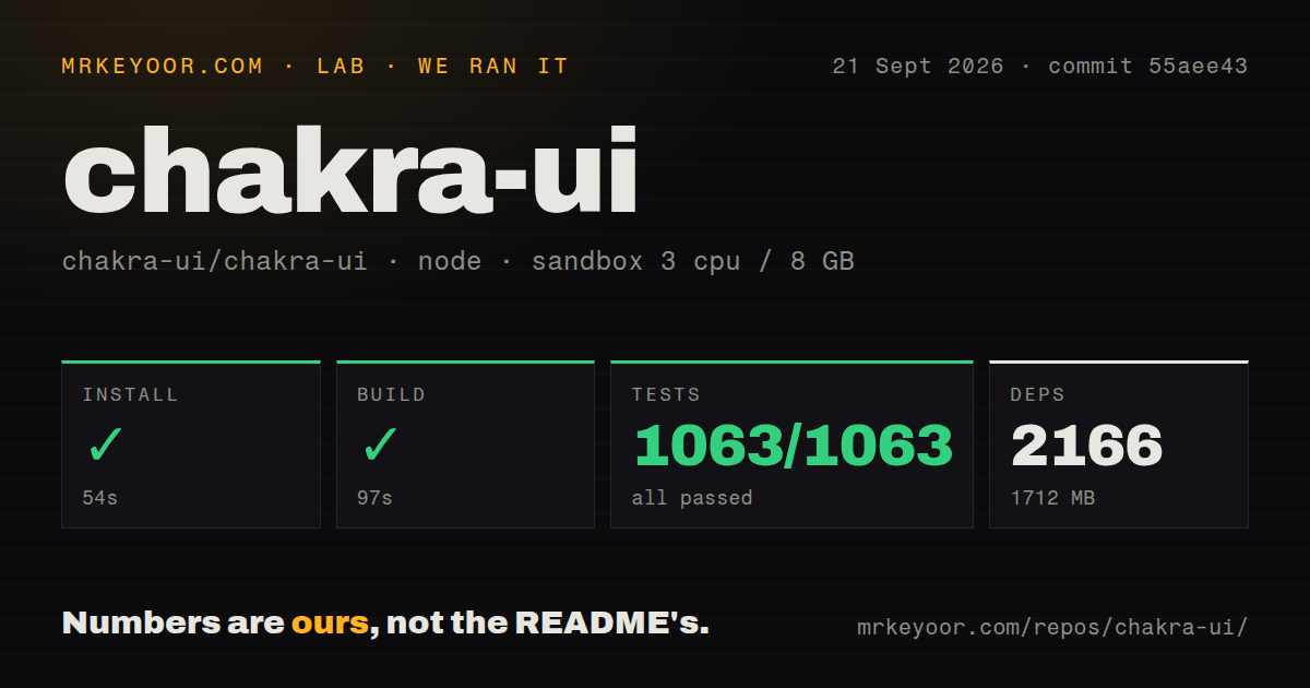
Our sandbox installed the Chakra UI monorepo in 54 seconds, pulling 2,166 pnpm packages and occupying 1,712 MB. The build completed in 97 seconds. Vitest then finished in 82 seconds with 1,063 passed and 0 failed. All three steps succeeded on commit 55aee43 in an unprivileged container with 3 CPUs, 8 GB of RAM, Node 22, and no secrets.
Those figures describe contributor setup, not a consumer installing 2 published packages. The checkout itself contained 3,849 files, about 194,191 lines of source, and used 161.8 MB before installation. We found a workspace monorepo and 3 CI workflow files. There was no Dockerfile or top-level tests directory, although the Vitest command still found and passed 1,063 co-located tests. The clean run is strong evidence that this exact checkout works in the stated environment.
Moving from v2 changes APIs as well as packages
Chakra's v3 guide treats migration as a source rewrite. The codemod handles renamed components, prop changes, imports, and compound component structures, and it has a dry-run mode. Manual work can still be broad: isOpen becomes open, colorScheme becomes colorPalette, Modal becomes a compound Dialog, token values gain value wrappers, and style configs give way to recipes. The old icons package and several hooks and components are removed.
The August 28 release of @chakra-ui/react 3.37.0 shows why the current codemod matters. The same release batch updated the codemod's preview and fixed transforms that could touch the wrong imports or misread TypeScript files. Run the preview first, review its report, then put application tests and visual checks around the result. A green 1,063-test upstream suite cannot prove that a custom v2 theme or wrapper still looks right after those application-level changes.
Emotion remains a runtime dependency in v3
The installation guide says plainly that Chakra uses Emotion at runtime today. It describes a zero-runtime model inspired by Panda CSS as a long-term direction, not an available replacement or a dated promise. Teams with a rule against runtime CSS-in-JS should stop there. Chakra's own package metadata still requires @emotion/react 11 or newer, alongside React 18 or newer.
For teams that accept that tradeoff, v3 has a coherent styling model rather than a loose set of component themes. CSS variables carry tokens, recipes define variants, and strict token mode can reject raw values in TypeScript. That is the strongest reason to choose Chakra over source-owned components. The benefit appears when several engineers must apply the same product rules, not when one developer needs a dialog on a single route.
September activity is current, with 2 open user issues
GitHub recorded a push on September 21, 2026, and listed 40,660 stars plus 14 combined issues and pull requests. The open queue contained 2 user issues and 12 pull requests. Issue 11003, opened September 14 and updated September 21, reports that programmatic tab selection can activate a linked trigger and navigate away. Pull request 11011 targets that behavior and was still open when checked.
The other open issue asks for accessibleWhenDisabled on Button, with a corresponding pull request also open. Meanwhile, version 3.37.0 shipped on August 28 with focus, keyboard, overlay, form, and date-input fixes. That is active maintenance, though accessible defaults still need application tests around the exact components you use. Choose Chakra for a React 18 design system you intend to maintain. For a v2 migration, treat the codemod report and your visual regression suite as release requirements.