What you can do with calender-app-design
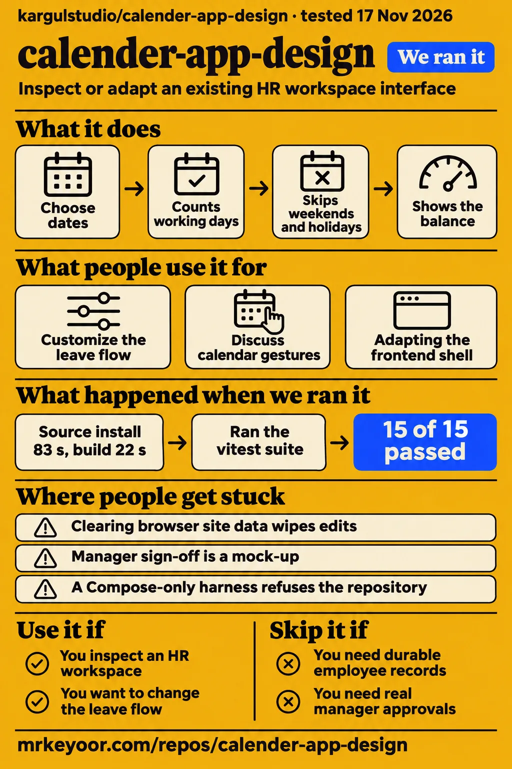
calender-app-design provides calendar and leave-request screens inside Kargul Workspace, a Figma-based HR design prototype. Choose it to inspect or adapt an existing workspace interface. Designers can use the screens to discuss how a person requests leave, reads an allowance and returns to a schedule. Frontend developers can inspect the surrounding navigation and state structure before deciding how much of that interface to retain. The adoption question is how closely this starting point matches the product you intend to build.
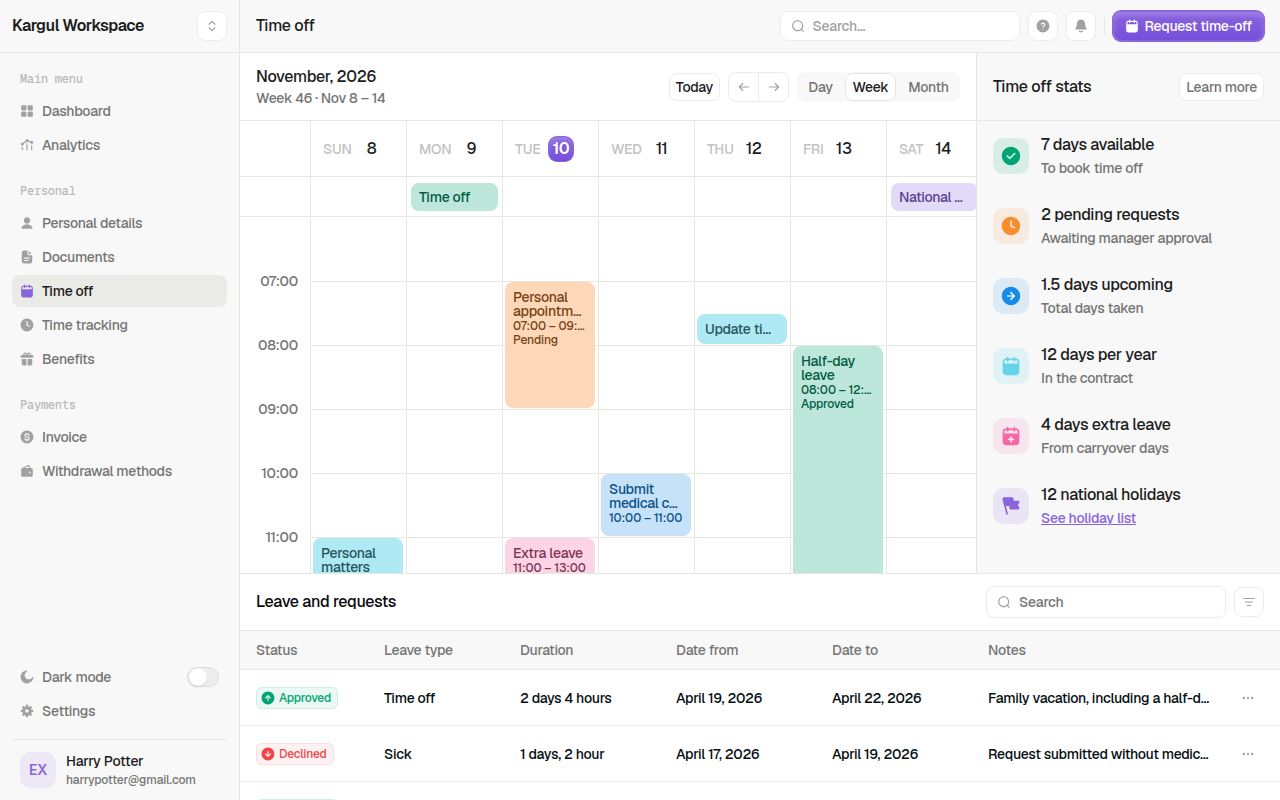
The project README names the project Kargul Calender Design Prototype and identifies Time off as the default route, /time-off. Calendar is another page within the workspace, alongside Dashboard, Analytics, Personal details, Documents, Time tracking, Benefits, Invoice, Withdrawal methods and Settings. That context makes this repository more relevant to someone developing an HR workspace than someone looking for an isolated month grid. Start with the existing leave flow if that surrounding product is what you want to change.
What people use calender-app-design for
X user xiaoanlab recommends this editable prototype to calendar product designers over static images. The Chinese-language post points to draggable calendar views and automatic leave-balance calculations, then asks whether readers would customize the leave flow or day view first. That recommendation gives the project a specific design audience: people who want to change an interaction while discussing it. xiaoanlab's calendar-design recommendation supplies the opinion and the question behind that use case.
The README's workspace description supports two further uses: examining a leave-request interface and adapting the surrounding frontend shell. A design discussion can follow a request from date selection to the displayed allowance and requests table. A frontend adaptation can instead begin with navigation, shared dialogs and persisted state. These are proposed uses of the documented interface, rather than reports of customer adoption or outcomes.
For an initial design review, choose one request and write down the dates and expected balance before changing the interface. Follow that request through date selection, the displayed working-day count and the resulting allowance. This single task gives the discussion a visible outcome and makes disagreements about leave policy easier to separate from disagreements about screen layout. It is the proposed acceptance task used throughout this review.
What happened when we ran it
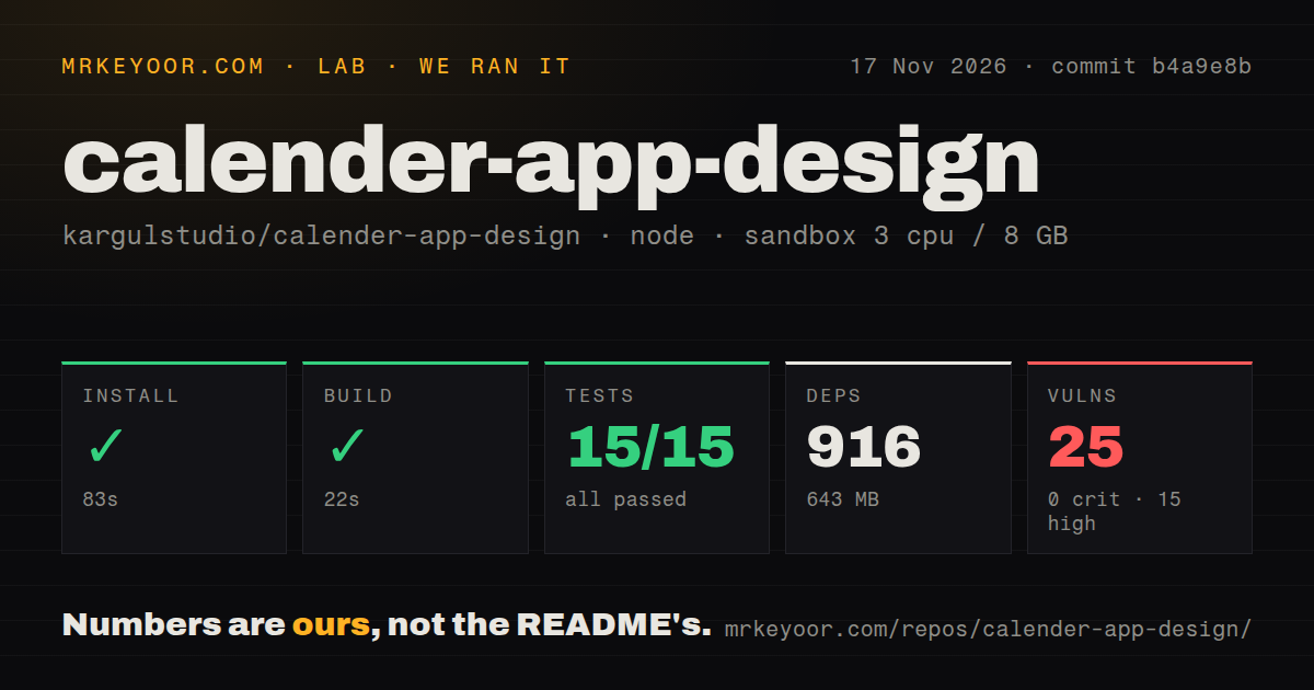
Our run at commit b4a9e8b on November 17, 2026 passed installation, building and all 15 recorded Vitest tests. Installation took 83 seconds, the build took 22 seconds and tests took 2 seconds. The sandbox configuration recorded 3 CPUs, 8 GB RAM and image lab-node:22. The installed dependencies occupied 643 MB, compared with a 1.4 MB checkout. These figures describe the source-check run and give developers a concrete starting point for estimating installation time and disk space.
| Recorded check | Result | What it tells a developer |
|---|---|---|
| npm install | Succeeded in 83 seconds | The recorded dependency-install step completed |
| Build | Succeeded in 22 seconds | The recorded source build completed |
| Tests | Succeeded in 2 seconds; 15 passed, 0 failed of 15 | The recorded Vitest suite passed |
| Dependencies | 916 recorded; 643 MB on disk | Allow space for the development installation |
| npm audit | 25 known vulnerabilities: 15 high, 10 moderate, 0 critical, 0 low | Dependency review belongs before deployment |
| Repository scan | 162 files, about 14,444 source lines, 1.4 MB checked out | The checkout size is much smaller than the installed dependency footprint |
| Delivery signals | 0 CI workflow files, no Dockerfile, no tests directory | These are scan results, separate from the passing test command |
The November 18 hands-on attempt failed its safety step because none of compose.yaml, compose.yml, docker-compose.yaml or docker-compose.yml existed. The harness required a Compose file and labeled the repository unsafe under that rule. The failed safety-step record identifies the missing file requirement explicitly. This is a harness refusal tied to a named requirement, rather than a logged application failure. The earlier npm installation, build and test results remain successful recorded checks.
The November 18 run summary says the repository was deployed with its own Docker Compose and every port bound to 127.0.0.1. That conflicts with the failed safety step, so this account follows the concrete failure rather than counting a completed deployment. The run summary preserves the contradictory description, and teardown reported success. Both records matter when interpreting the attempt; neither supplies a completed browser interaction.
Where people get stuck: saved edits and approval previews
The catalog says clearing browser site data wipes edits and manager sign-off is a mock-up. Those facts determine how to prepare a design session and what backend work an HR adaptation would require. Keep observations outside the demo's editable data, and use the named reset control when returning to the initial design. Treat approval screens as material for discussing status changes and responsibilities. The catalog's HR warning supplies both descriptions.
| Situation | What the evidence says | Sensible next action |
|---|---|---|
| Edits disappear after site data is cleared | The catalog says browser storage holds the data | Use fictitious data and preserve design notes outside the demo |
| A manager needs to approve a real request | The catalog calls sign-off a mock-up | Specify backend approval rules before adapting it for HR |
| You want the original example back | The README documents Settings → Data → Reset demo data | Use the named reset control for a fresh design session |
| A Compose-only harness refuses the repository | Our safety log reports no supported Compose filename | Use an evaluation environment suited to the documented npm route |
Settings → Data → Reset demo data restores the example state described in the README. That makes it useful between design sessions: changes from the previous discussion need not become the starting point for the next one. Preserve requested interface changes separately before resetting. Restoring the example and recovering a person's edits are different tasks; the documented reset gives the next session a common starting point rather than a history of previous changes.
Calendar gestures cover creation, movement, and resizing
The README lists week, day and month views, with dragging to create, move and resize events. It also describes side-by-side overlap layout, an all-day public-holiday lane, a live now-line and an origin-aware details popover. These documented controls give a design review several concrete interactions to discuss. The calendar feature list is the source for these descriptions, including the distinction between dragging empty space and dragging an existing event.
Creation, movement and resizing answer different scheduling needs. In the documented interface, empty-space dragging creates an event, dragging an event moves it across days, and dragging its bottom edge changes its duration. Side-by-side overlap layout concerns how simultaneous events appear, while the all-day lane separates holidays from timed appointments. A reader choosing this prototype can therefore compare its documented interaction model with the intended product before investing in changes to the workspace around it.
Start with the leave flow if the goal is HR design
The documented Time off dialog counts working days, skips weekends and holidays, and shows the balance after a request. That makes the leave flow the stronger starting point when the product question concerns HR. Begin with the day view when the question concerns moving appointments through a schedule. This answers the leave-flow-or-day-view choice in xiaoanlab's post according to the reader's task rather than ranking one screen above the other.
The README's Time off description also lists request statistics and a searchable, filterable, sortable table with details, editing, cancellation, deletion and an approve/decline preview. Those controls place a request within a broader interface: entering dates is only one part of the design. For an adaptation, the relevant question is which of those existing states and actions fit the intended HR workflow, particularly when the organization's allowance rules differ from the example data.
Installation size changes the adaptation budget
The measured 643 MB dependency installation is much larger than the 1.4 MB checkout, so source size is a poor disk-space estimate for this project. The measured-results table keeps the exact dependency count and timing together with their run date. For someone choosing a frontend starting point, this distinction is useful before cloning the repository into a constrained development environment or preparing several copies for a design workshop.
The repository scan and test result describe different aspects of the checkout. A scan can report no directory named tests while Vitest discovers tests elsewhere, so the successful test command and directory finding are compatible. The same distinction applies to delivery files: the scan recorded no Dockerfile and no CI workflow files, while the documented startup route uses npm. Read those results as concrete preparation requirements rather than turning any one signal into a general maturity score.
calender-app-design vs static images, FullCalendar, and React Big Calendar
calender-app-design supplies an existing HR workspace; FullCalendar and React Big Calendar supply calendar components. Choose according to how much surrounding interface your application already has. An existing product may need only a calendar, while an HR design exploration may benefit from the requests table, allowance display and workspace shell together. The static-image comparison comes from xiaoanlab's recommendation to designers and concerns the usefulness of an editable prototype during design work.
| Starting point | What the source offers | Pick it for |
|---|---|---|
| calender-app-design | The README describes calendar and time-off pages inside an HR prototype | Discussing an existing workspace design |
| Static calendar design images | xiaoanlab contrasts them with an editable prototype | Looking at visual references without editing behavior |
| FullCalendar | Its README describes a JavaScript drag-and-drop calendar and lists framework connectors | Adding a calendar to an application you already own |
| React Big Calendar | Its README describes an events calendar component built for React | Building a React interface around your own event data |
FullCalendar's README lists connectors for React, Angular, Vue, Preact, Web Component and Salesforce LWC. FullCalendar's connector list gives that integration context. React Big Calendar's setup instructions require a localizer and a container with height, and describe its stylesheet setup. These are different starting points from adopting a workspace design: the component route places calendar functionality inside the interface and data model you supply.
A proposed evaluation starts with one leave request
The proposed leave-request task starts with chosen dates and an expected allowance, then compares them with the documented interface. Use it to decide whether the existing screens express the workflow you want to build. Record which dates the interface should count and what the balance should show afterward. This is the reviewer's proposed approach, grounded in the README's description of working-day calculations and allowance displays, rather than advice attributed to a video.
The selected dates make policy questions concrete. If a weekend or holiday falls within the request, the expected working-day count should reflect the policy intended for the eventual product. Keep that expected result beside the screen discussion so a disagreement about a number does not become an unfocused request to redesign the entire page. The task ends with a decision about whether the existing leave interface is a useful foundation for the planned adaptation.
FAQ
calender-app-design is a frontend design prototype, and its README says data persists to localStorage. That answers the supplied catalog's live-service-or-demo question directly. The remaining questions below concern the documented installation route, requirements, controls, reset behavior, stack and alternatives. They come from the supplied catalog questions rather than inferred search demand, and each answer points to the relevant README or catalog evidence.
Is calender-app-design a live service or a front-end demo?
The README calls it a design prototype of Kargul Workspace and lists a hosted demo. Time off is the default page, and Calendar sits within the same workspace interface. The project README identifies both the project and its hosted address. For the adoption decision, its description of a browser-based workspace is more useful than treating the hosted address as evidence of an HR service.
How do I run calender-app-design locally?
Run npm install, then npm run dev, and open http://localhost:3000. Those are the README's getting-started instructions, and Time off is its documented default route. Starting there puts the leave-request interface first; Calendar is available within the same workspace for the event controls described above. The installation, build and test results from our dated source-check run appear together in the measured-results section.
Do I need a database or API keys to try calender-app-design?
The catalog says Node.js and npm are enough to install and run the demo, with no database or API key required. Its requirements answer describes a Next.js/React application using localStorage. The README's npm startup route fits that description: the documented first step is a local development installation, rather than provisioning an external service before inspecting the screens.
What should I know before relying on calender-app-design as a real HR app?
The catalog calls it a visual prototype rather than a production HR tool. Its real-app answer is the basis for directing actual employee administration elsewhere. For a designer or frontend developer, the useful output is an adaptation decision about the existing screens. An organization selecting software to hold employee records and operate approvals is making a different decision from choosing this interface as a design starting point.
What interactions does the Calendar page support?
The README documents week, day and month views, event creation by dragging empty space, movement across days and resizing from the bottom edge. Its Calendar feature description also names overlapping-event layout, the public-holiday lane, the live now-line and a details popover. These descriptions let a reader identify which existing controls match the planned scheduling interface without treating the repository as only a visual month-grid reference.
What keyboard shortcuts does calender-app-design support?
The documented keys are ⌘K for search, N for a new event, R for a leave request, T for today, arrows for periods, D/W/M for views and ? for shortcuts. The README's keyboard mapping supplies those actions. The mapping spans both calendar work and the surrounding workspace, which matters when deciding whether to retain the shell or extract a smaller portion of the interface.
How do I reset the demo data?
Use Settings → Data → Reset demo data, as the README instructs. The documented seed uses November 8 through 14, 2026, with Tuesday November 10 selected and allowances of 7 available, 2 pending and 3 upcoming. The README's seed description gives those reference values. They provide a shared example state for a design discussion instead of leaving each participant with different edits from an earlier session.
What UI stack powers calender-app-design?
The README lists Next.js 16, React 19, TypeScript, Tailwind CSS v4 and shadcn/ui with Radix primitives. It also names Zustand for persisted state, next-themes for dark mode, Sonner for toasts and cmdk for the command palette. The documented stack helps a frontend developer assess the fit with an existing application before choosing between adapting this workspace and introducing a calendar component into their own interface.
What projects are similar to calender-app-design?
FullCalendar and React Big Calendar are alternatives for the calendar portion of an application. FullCalendar describes a JavaScript drag-and-drop calendar with framework connectors; React Big Calendar describes a React events calendar component. The comparison table above makes the choice explicit: decide whether the starting point should include the HR workspace, or whether your application will supply the surrounding interface and event data.
What we have not tested yet
The November 18 browser attempt stopped before an application task, so calendar gestures and leave calculations remain untested in our browser evaluation. The pack contains no completed hands-on Q&A tasks, screenshots, interaction timings or application-memory observations. The November 17 source checks cover commit b4a9e8b; they do not establish touch behavior, keyboard accessibility, screen-reader output or leave-balance correctness under different holiday policies. The lab-node:22 image label also does not establish actual runtime or operating-system versions.
The supplied GitHub metadata records 868 stars and lastPush 2026-10-26T20:34:05Z, observed on November 18, 2026. It records 3 open issues and pull requests combined, rather than a sampled support history. Those dated facts supply attention and repository-status context, but not an assessment of response quality or production adoption. Release status stays unknown: lastRelease is null, which does not establish that no release exists. No rate-limit response is supplied.
We did not test the hosted demo, cross-device behavior, a large event dataset, recovery after data loss or a backend adaptation. The supplied records contain no named production deployment or completed user study. The audit summary lacks package-level remediation details and reachability analysis. The supplied video extracts contain introductory material, not support for requirements-method claims. Rendered page layout and site recommendation modules are also outside this text review. Choose this prototype for design and frontend adaptation; keep actual employee records and approvals in an HR system suited to that work.