Copied source gives you control and leaves you holding the diff
The 5,763-file shadcn/ui repository distributes component source that its CLI writes into your application. The introduction explicitly describes it as a way to build your own component library. A button, dialog, or calendar can be inspected and changed like any other local file. That is a cleaner answer than layers of overrides when a product needs different markup or behavior. It also changes the maintenance contract: your team owns the copied layer closest to the design system.
That ownership matters in a repository of 5,763 files and roughly 557,602 source lines. Headless dependencies can still receive fixes through package upgrades, according to the project docs, while edits made to the copied top layer stay local. You need a repeatable way to compare registry changes with your version. Teams that rarely revisit UI source may prefer a packaged library where an upgrade applies changes through one dependency.
The CLI supports six templates and three primitive bases
The shadcn v4 init command lists 6 templates: Next.js, Vite, TanStack Start, React Router, Laravel, and Astro. It also offers Base UI, Radix, or React Aria as the primitive base. The command configures dependencies, CSS variables, and the cn utility. add can preview a change with --dry-run, show a diff, or overwrite files when you choose, which makes the write step easier to review.
Configuration still deserves attention. A components.json file tells the CLI where to place components and how to rewrite imports. Several choices, including the style, base color, and whether theming uses CSS variables, cannot be changed in place after initialization according to the docs. In a monorepo, every workspace needs its own configuration, and shared aliases must agree. That is manageable, but it rewards deciding the directory and theme model before adding dozens of components.
What happened when we ran it
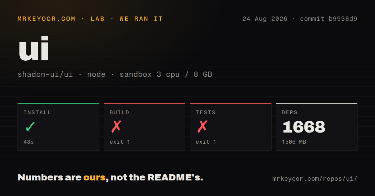
Our measurement setup was an unprivileged Debian sandbox with 3 CPUs, 8 GB of RAM, Node 22, no secrets, and commit b9938d9. We measured a 43-second install of 1,668 pnpm packages using 1,506 MB on disk. The checkout itself was 46.5 MB. Installation succeeded, so dependency resolution was not the step that stopped the run.
The build exited with code 1 after 43 seconds. Three of 4 reported tasks succeeded before the v4 app printed sh: 1: bun: not found. The tail also showed generated TypeScript declaration files, then an ELIFECYCLE failure. The log establishes that the executable was absent from the container path. It does not show a component compiler error as the final failure, and it does not establish why Bun was not installed.
Tests exited with code 1 after 25 seconds at the same boundary. Their registry:build chain built the React package, helpers, and CLI, then attempted bun run ./scripts/build-registry and failed with spawn ENOENT. Our scan found 9 CI workflow files, monorepo workspaces, no Dockerfile, and no tests directory. Those signals do not replace the command result: the supplied test step did not complete in our fresh Node 22 image.
MCP can install registry code from five documented clients
The shadcn v4 MCP guide names 5 clients: Claude Code, Cursor, VS Code, Codex, and OpenCode. Once configured, the server can browse, search, and install items from the standard registry or compatible third-party registries. Claude Code gets a dedicated initialization command and can inspect the server through /mcp. Codex needs a manual entry in its configuration file because the shadcn CLI cannot update that file automatically.
Private registries add a credential boundary. The August 2026 release accepts GitHub CLI credentials or GH_TOKEN and GITHUB_TOKEN, with read-only repository access recommended. The same registry may carry components, feature kits, or agent rules. Since an assistant can cause files and dependencies to be added, registry trust and diff review belong in the normal code-review process. MCP shortens the request, but the resulting source still needs the checks applied to any application change.
Open issues show why copied components need product tests
GitHub listed 2,330 issues and pull requests when we checked; issue 11635 reports that inline slot functions make Calendar rebuild its DOM during a parent render. The reporter reproduced lost clicks in Safari when a custom week picker updated hover state between pointer events. The stock single-date example did not reveal the behavior. This is a useful warning about adopting examples: accessibility and interaction testing must cover the way your product composes a component.
Issue 11303 describes a different edge. Some Base UI wrappers declare ordinary React element props instead of the primitive's props, and the reporter shows Input failing under Preact compatibility types. The issue was open when checked and had 2 comments. Neither report proves every component is unreliable. Both show why source ownership is work as well as freedom, especially after local composition, framework substitutions, or type changes.
August 2026 activity points to an active, fast-changing project
GitHub recorded a push on August 26, 2026, and listed 122,161 stars plus 2,330 combined open issues and pull requests. Release shadcn@4.19.0 was published on August 21. Its changes added private GitHub registry support and a command for migrating a project's base color. Same-day issue activity and a release 5 days earlier are better health signals than the release tag alone.
The project earns a trial when your team wants editable UI source, a shared registry format, and optional MCP access. Start with representative interactive components, settle the 3 primitive-base and theme choices, then test keyboard, focus, mobile, and browser behavior in your own compositions. If your maintenance process expects a single package upgrade to carry upstream UI changes, Chakra UI or Mantine offers a clearer fit.