Material Design is the product decision built into the library
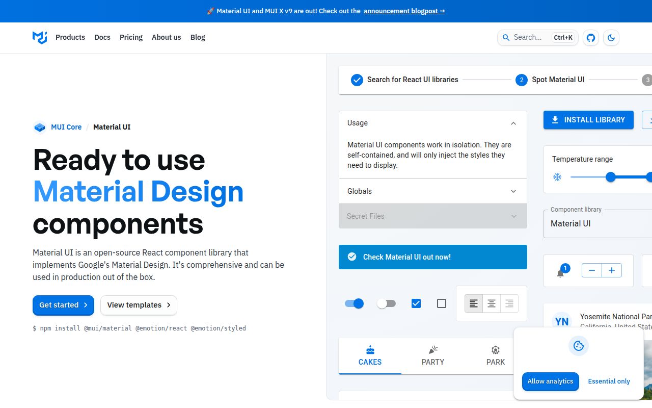
Material UI gives React applications finished controls that follow Google's Material Design. Buttons, dialogs, menus, forms, layout helpers, and theme tokens share conventions, so a team can assemble an interface without inventing every interaction and state. That speed has a visual consequence: even after changing colors and typography, component behavior and default proportions still come from Material Design. Teams wanting that familiarity get a useful head start. Teams with a sharply different design language may spend much of the saved time overriding it.
The core package is MIT licensed and works with React 17, 18, or 19. Emotion is the default styling engine, while React and React DOM remain peer dependencies. More specialized products such as the advanced components in MUI X sit outside the core library described here. That division keeps Material UI focused on general application controls, but adopters should map their whole interface before assuming one package covers data grids, charts, and every complex workflow.
What happened when we ran it
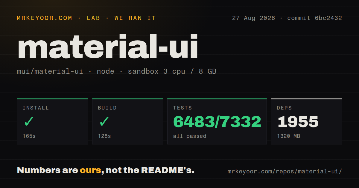
Our sandbox installed commit 6bc2432 in 165 seconds. Pnpm added 1,955 packages and used 1,320 MB on disk. The build completed successfully in 128 seconds. Those figures belong to the contributor monorepo, which contains 41,128 files and about 731,543 lines of source in a 275.6 MB checkout. They do not describe the bundle a browser receives from an application that imports a few components. They show that contributing to Material UI calls for real disk space and patience.
Vitest finished in 219 seconds with 6,483 passed, 0 failed, and 849 skipped out of 7,332 tests. The repository also had a tests directory and 16 CI workflow files. No Dockerfile was present, so the repository does not provide one canonical container for contributors. On the measured commit, install, build, and tests all completed successfully in our unprivileged Node 22 sandbox with 3 CPUs and 8 GB of RAM.
React 18 needs one override, and SSR narrows the styling choice
Installing Material UI in an application is much smaller in concept than preparing its repository: add @mui/material, Emotion, React, and React DOM. There are no API keys or hosted services. The installation guide adds an exception for React 18 and older. Because Material UI uses react-is 19, those applications must install a matching react-is version and set an override or resolution to prevent runtime prop-type errors. That is documented, though it is easy to miss when copying only the first command.
Styling also has a firm server-rendering caveat. MUI documents a styled-components adapter, then says styled-components has been incompatible with server-rendered Material UI projects since late 2021 because its Babel plugin cannot process the styled() calls inside MUI packages. Emotion is the recommended SSR path. If an organization has standardized on styled-components for a Next.js estate, this warning is a valid reason to choose another component system rather than maintain a special styling lane.
Version 9 raises browser floors and removes old APIs
The v9 migration guide is candid about breaking changes. It covers a direct move from v7 to v9 and removes GridLegacy, deprecated component props, old system props, and 23 duplicate icon exports. Several components also change DOM structure, event behavior, keyboard handling, or TypeScript types. Codemods cover many deprecated prop replacements, which lowers mechanical effort. A large app still needs visual and interaction regression tests because a codemod cannot decide whether changed focus, menu, or modal behavior is correct for its users.
Browser support moved as well. Version 9 targets Chrome 117, Edge 121, Firefox 121, and Safari 17 on macOS and iOS. That is a sensible floor for many current web products, but it rules out teams contractually supporting older managed devices. The same guide changes TablePagination number formatting through Intl.NumberFormat and updates several accessibility semantics. These are defensible defaults. They can still produce visible or test-breaking changes in an established product.
The component breadth has a contributor and bundler cost
Our 1,320 MB installation is the clearest local warning, yet browser and development costs depend on imports and tooling. The project advises production users against its CDN build because clients would download the entire library. An open performance issue, number 35840, asks maintainers to flatten internal imports so bundlers traverse fewer modules even when applications use path imports. The issue remains open and was updated in August 2026, so teams with slow development builds should test their own framework configuration rather than rely on tree shaking as a complete answer.
Accessibility work is active rather than finished once a component renders. Open pull request 48916 proposes a WCAG 2.2 report for Button and lists partial support around contrast, focus indicators when ripple is disabled, and the loading state's lack of a live region. Another long-running open issue, 19450, concerns aria-hidden on non-portal modals. Neither report proves that every MUI application has those defects. They show why teams with strict conformance requirements must test their chosen variants, colors, wrappers, and interaction paths.
Current pushes and v9.3.1 point to active maintenance
GitHub recorded a push on August 27, 2026, and the latest release was v9.3.1 from August 6. The repository had 98,944 stars and 1,485 combined open issues and pull requests when fetched. A separate issue-only search returned 1,376 open issues. That is a large queue, but current commits, releases, and same-month issue updates show an operating project rather than an abandoned package with a popular name.
Material UI is the practical choice when a React team accepts Material Design and wants depth, documentation, and migration tooling in one place. The successful 6,483-test run supports confidence in the measured commit, while the 1,955-package contributor install sets expectations about scale. Before adopting it, prototype one real screen, measure local build behavior, exercise keyboard and screen-reader paths, and estimate the cost of future major migrations. If those checks pass, the library can remove a great deal of routine UI work.