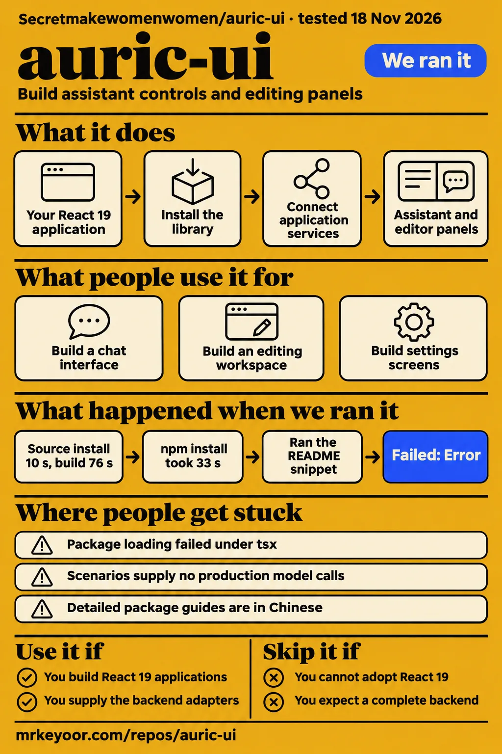
Our AuricUI source build passed in 76 seconds, while a separate auricui@latest import failed under tsx. Use this library if you build React 19 applications and want matching controls for an assistant and an editor. Skip it if you expect the documentation scenarios to supply your application's backend. The useful adoption question is whether its components fit the interface you need and the services your team owns.
What you can do with AuricUI
AuricUI supplies React components for AI assistants, agent workspaces, and media editors. The project is Secretmakewomenwomen/auric-ui, authored by hehuan, and its npm component package is named auricui. That identity matters when finding documentation because the supplied research includes similarly named products. Start with the AuricUI project README, which has an English introduction and links to a Simplified Chinese version.
The package divides its components into working areas. The main import covers ordinary controls such as forms, tables, drawers, and tabs. The Agent entry adds messages, citations, approvals, and tool-execution displays. Chat supplies rich text input, Markdown, and model menus. Studio supplies timelines, layers, assets, projects, and editor components. An assistant beside a content editor is a concrete reason to consider that combination: the ordinary controls and specialist workspace can share a visual system.
Styles include dark and light themes, fonts, and animations. The README says component styling works without additional Tailwind configuration. Its integration instructions still require the stylesheet import and provider setup. The strongest reason to choose AuricUI is the overlap between assistant controls and editing panels. A settings form alone uses a smaller part of the documented package, so the wider workspace components should serve a specific product requirement.
What people use auric-ui for
The README documents five scenarios: chat, editing, project management, application settings, and a template and Skill library. These are examples supplied by the project, rather than customer accounts. The AuricUI scenario documentation in the README explains how the components form larger screens. The following examples give a developer concrete starting points for deciding which parts belong in an existing application and which responsibilities stay with its services.
| Documented scenario | What the project demonstrates | Work your application owns |
|---|---|---|
| Chat workspace | Conversation controls and a composed chat interface | Model requests through application integration |
| Professional editor | Editing components in a workspace | Persistence and media-processing services |
| Project management and settings | Application screens built from shared components | Business data and callback behavior |
A potential integrator also asks for a specific combination. In GitHub issue #1 requesting a pi-agent and honojs frontend, a user requests a simple demonstration using those tools with AuricUI. The supplied record shows the request open with zero comments. That identifies a reader's desired use without turning the request into a delivered feature. The broader documented scenarios remain the practical starting point for understanding the library's composition model.
What happened when we ran it
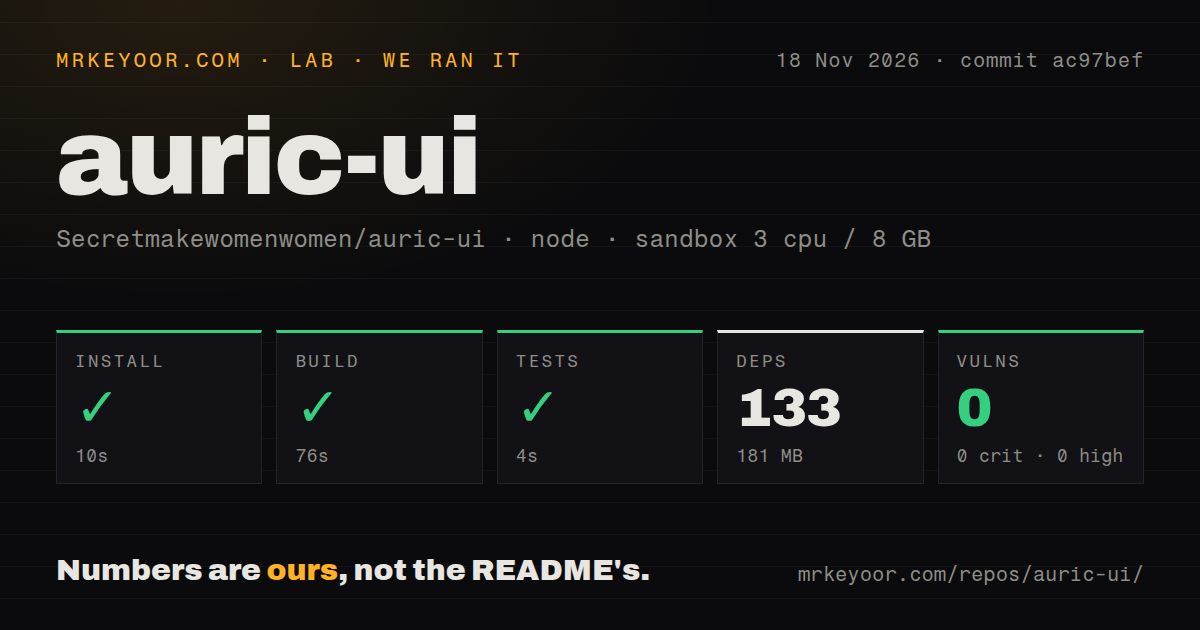
Our source run installed successfully in 10 seconds, built successfully in 76 seconds, and completed the test step successfully in 4 seconds. The separate consumer experiment failed while loading the package under tsx. These were two different execution paths: a measured source checkout and an npm package imported by a snippet runner. Keeping their results separate makes the outcome useful for a developer choosing how to begin integration.
The source run used commit ac97bef on 2026-11-18 with 3 CPUs, 8 GB RAM, and configured image label lab-node:22. Our measurement block records the following results. The timings describe the source sandbox steps, and the repository observations describe that checkout. The test result is a successful step with a recorded duration; the measurement supplies no individual test count to attach to it.
| Source-check step or observation | Recorded result |
|---|---|
| npm install | Succeeded in 10 seconds |
| Build | Succeeded in 76 seconds |
| Tests | Succeeded in 4 seconds |
| Dependencies | 133 recorded; 181 MB on disk |
| npm audit | 0 known vulnerabilities across the reported severity levels |
| Repository scan | 881 files; about 185,707 source lines; 10.6 MB checked out |
| Repository signals | 1 CI workflow file; Dockerfile present; no tests directory detected |
The consumer-run record identifies commit ac97bef701e7 and a fresh unprivileged container with 2 CPUs, 4 GB RAM, no published ports, and no secrets. Its task was the unedited, 27-line README TSX block under "3. Minimal integration", executed through tsx. The clone step completed in 2 seconds. The package-selection record records auricui@latest, resolving to 0.1.0-preview.1; the README specifies auricui@next.
The installed-size observation recorded 73.5 MB in node_modules, and the dependency-count observation recorded 39 packages besides AuricUI. The snippet step failed in 0.4 seconds with exit 1 and Error [ERR_PACKAGE_PATH_NOT_EXPORTED]: No "exports" main defined in /work/qs/node_modules/auricui/package.json. The finding record labels this snippet-failed, and the teardown record reports ok.
The README example imports AuricUIProvider, CardButton, and the stylesheet, then connects a button to theme state. The observed error occurred at package loading. The recorded package channel and runner are therefore part of the result, rather than incidental setup details. For a developer following the README, the next concrete step is its documented preview package in an existing React 19 application, with the resolved version retained in the lockfile.
Where people get stuck: package channels and service boundaries
AuricUI documents React 19 and React DOM 19, separate library and Skill installations, and application-supplied service adapters. These requirements concern different parts of adoption. The React versions belong to the consuming application, the Skill belongs to development tooling, and the adapters connect composed interfaces to application behavior. Assigning each responsibility before building a large screen gives the team a clearer implementation task and a more direct debugging path.
| Situation | Evidence | Useful next action |
|---|---|---|
| Package-export error in our consumer experiment | ERR_PACKAGE_PATH_NOT_EXPORTED under tsx, using @latest |
Follow the README's @next channel in the intended React application and retain the lockfile |
| Demo looks complete, but services belong to the application | README says full scenarios use local mocks | Map model requests, persistence, and media processing to actual services |
| Agent has guides but the application needs the library | README separates the Skill installer from the component package | Install the component package separately and inspect its exports |
| pi-agent and honojs example requested | Issue #1 is open with zero comments | Define the adapter work as part of the implementation task |
Primitive and Agent components connect through props and callbacks. Some composed Chat and Studio components require adapters for model requests, project persistence, and media processing. This is the main service boundary to understand before adopting the workspace components. The README's suggested first task, a small settings page, gives a team a manageable place to connect state, save behavior, and theme setup before composing an editor alongside a chat interface.
The coding-agent Skill guides implementation
The Skill installer installs guides and tools; the component library must be installed separately. The README describes component selection, API lookup, theme guidance, and service integration examples. Its API queries prefer the version installed in the application. That gives the implementation workflow a concrete reference: the agent should inspect the dependencies and public exports that the project actually has before selecting components or writing their props.
By default, npx auricui-skill@latest installs the Skill in .agents/skills/auricui inside the application project. The README also documents a global option and a custom directory for agents that understand SKILL.md. Its dependency and API lookup scripts require Python 3. These instructions belong in the developer setup process, where the person or coding agent implementing the interface can use the guides alongside the application's existing tools.
The workflow begins by inspecting the existing project and preserving its router, package manager, and application logic. The README also asks the agent to avoid duplicate providers and inspect supported props. Those are useful instructions for gradual adoption because they give the change a defined scope. A request to replace a settings interface while keeping its validation and API calls is more concrete than asking an agent to redesign an entire application.
English entry docs lead into Chinese package guides
An English README exists, while the contributing guide and detailed package guides are currently in Chinese. The README states this directly. Its English introduction explains package divisions, installation, the Skill workflow, and minimal integration. Deeper package or contribution work can involve translation, so a worldwide team should account for that documentation cost when deciding who will maintain an integration or investigate an unfamiliar component API.
Source development requires Node.js 22.12+, npm, and tar, with Python 3 required for full validation. The documented source workflow uses npm ci, npm run build, and npm run dev. The first build generates the component library, Skill installer package, and documentation downloads. The README says no npm login or Docker setup is needed for this workflow. Its Dockerfile builds a static documentation-site image.
The minimal integration instructions import auricui/styles.css at the application entry point and mount AuricUIProvider once at the root. They also set the initial HTML theme to match the provider and wrap Chat components in an .auricui-chat container. These are specific setup instructions to follow when assembling the first screen. They also give a reviewer concrete configuration details to compare against generated application code.
Security decisions stay with the application services
Our npm audit reported zero known vulnerabilities in the measured source environment. The README separately assigns model requests, persistence, and media processing to application services. For an implementer, that division identifies where credentials and authorization decisions belong: the endpoints and service code that perform requests or save projects. It is a practical reason to review the interface and the connected service behavior as distinct parts of the application.
An approval display presents an operation to the user; the application service decides whether the signed-in user may perform it. A model menu similarly needs an application policy for provider access and credentials. These are integration recommendations based on the documented callback and adapter model. They help define the work around the components without asserting that AuricUI has a particular security defect or supplies the service policy itself.
AuricUI is MIT licensed. The README also attributes parts of the Chat and Studio UI and browser algorithms to OpenFilm under its original MIT license. Separate third-party notices cover fonts, provider icons, and dependencies. Teams redistributing the library should include those notices in their attribution review, using the README's linked license material rather than treating the top-level license label as the complete inventory.
AuricUI vs assistant-ui and shadcn/ui
AuricUI documents assistant and editor components; assistant-ui documents chat runtimes; shadcn/ui invites developers to build their own component library. Those stated integration models provide a useful comparison for a team choosing its starting point. The decision depends on whether the product needs AuricUI's combined workspace vocabulary, a chat interface connected through a documented runtime, or components the team will customize into its own system.
| Project | What its own README describes | When to choose it |
|---|---|---|
| AuricUI | Shared controls, Agent displays, Chat, Studio, and a coding-agent Skill | A React 19 workspace needs assistant controls and editing panels |
| assistant-ui | Chat primitives and runtime choices including Vercel AI SDK, LangGraph, and custom runtimes | The central task is connecting chat to a documented runtime path |
| shadcn/ui | Customizable components for building your own component library | Owning and extending the component system is the main requirement |
The assistant-ui README says useChatRuntime connects to the Vercel AI SDK and names LangGraph, data-stream, and custom runtime options for other backends. That is a concrete starting point when chat transport drives the choice. Its documented runtime model gives a developer specific integration paths to examine, while AuricUI's README emphasizes its shared controls and composed assistant and editing workspaces.
The shadcn/ui README explicitly invites developers to build their own component library. That approach fits a team shaping components around existing product conventions. AuricUI earns consideration when its documented combination of timelines, layers, projects, messages, and agent displays matches the intended interface. A team choosing between them should start with the screen it needs to build and the ownership model it wants for its component system.
Repository attention is different from support history
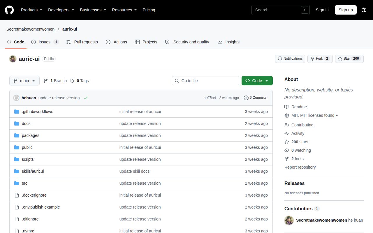
GitHub reported 200 stars and a last push on 2026-11-03 in repository facts observed on 2026-11-18. The sampled issue record contains the pi-agent and honojs request, open with zero comments. These are concrete observations about repository attention, activity, and one support thread. They give an adopter useful context while keeping the decision tied to the documented package and the measured setup results.
The README describes library previews using the next tag and the Skill using latest. It also says the preview channel may lag behind the repository and that the application's lockfile determines the installed version. Those details make package selection part of the adoption workflow. Record the resolved dependency, use its public APIs, and review generated code against that installation when moving between a source checkout and a consuming application.
FAQ
The pi-agent and honojs request is open with zero comments in the supplied issue record. That is the most specific reader question in the research. The README supplies the answers to the first-time setup questions below: React 19 and React DOM 19 are the component-library requirements, and the Skill installer is separate from library installation. Together, these answers identify the intended application environment and the two installation responsibilities.
Can AuricUI be used to demonstrate a simple frontend for pi-agent and honojs?
Issue #1 asks for a simple AuricUI frontend demonstration combining pi-agent and honojs and is recorded as open with zero comments. The integration request identifies the desired combination. The AuricUI README describes props, callbacks, and application service adapters as its integration model. A developer pursuing that screen can use those documented boundaries to define the implementation work.
What React version does AuricUI require?
The README specifies an existing React 19 and React DOM 19 project for component-library installation. Its separate source-development requirements are Node.js 22.12+, npm, and tar, with Python 3 for full validation. The AuricUI setup instructions distinguish consuming the package from developing the repository. Start with the requirements for the workflow your team intends to use, then record the installed package version.
Does the coding-agent Skill include the component library?
The Skill installer installs guides and tools, and the component library requires a separate installation. The AuricUI Skill instructions document both steps. By default, the Skill goes into the application's .agents/skills/auricui directory. The agent can then use its lookup tools to inspect the library version and APIs installed in that application before implementing the requested page.
What we have not tested yet
The recorded consumer experiment ended at package loading, so it supplied no browser interaction result. The documented @next package in a React browser application, keyboard navigation, narrow layouts, theme switching, assistive technology, and the generated Skill workflow remain outside the completed runs. The altered-channel tsx error does not determine the outcome of those paths. The configured image labels also leave actual runtime and operating-system versions dependent on raw toolchain logs.
The measurements contain no chat stream, real provider request, saved project, media export, large timeline, concurrent-user load, or comparison benchmark. Dependency size describes installed files rather than a delivered browser bundle or runtime memory, and the audit result is not a security assessment of application services. The test-step record supplies no test count. The supplied metadata contains no verified latest-release result. No independent production-use report appears in the relevant supplied records.
The relevant third-party pages summarize or reproduce documentation. HotRepo explicitly labels its page as AI-written from the README, while GH Trending Explorer reproduces project documentation. Similarly named products in the research do not establish adoption of this repository. The pack contains no screenshot records. These evidence boundaries leave one useful next result to obtain: the documented preview package in a React 19 application, connected to one actual callback and observed in a browser.