Twelve package families cover components, tokens, and assets
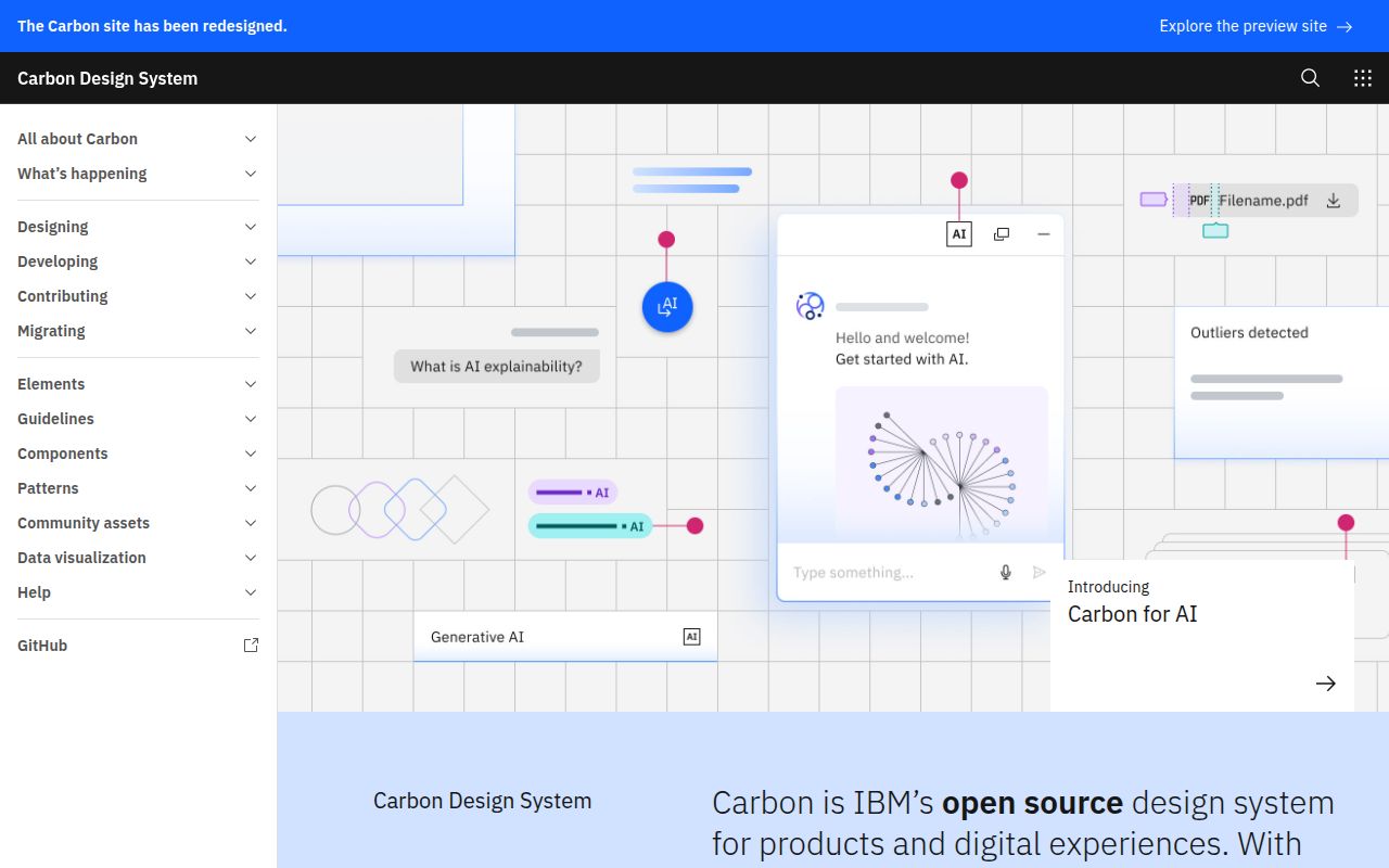
Carbon's root README lists 12 package families, led by @carbon/react and @carbon/web-components. The rest supply colors, IBM Design Language foundations, grids, icons, layout units, motion curves, pictograms, Sass styles, themes, and typography. That breadth gives a product organization one vocabulary from low-level spacing tokens through finished controls. Teams can consume a focused package, while the monorepo lets maintainers change related code, documentation, and assets together.
The visual identity is not neutral. Carbon comes from IBM, pairs type tokens with IBM Plex, and encodes IBM's spacing, color, motion, and component decisions. The measured checkout contained 9,819 files and about 413,421 lines of source in 45.2 MB. Adopting it can save an organization from inventing every interface rule, provided the resulting product should look and behave like a member of the Carbon family.
The contributor install adds 1,331 MB before Storybook
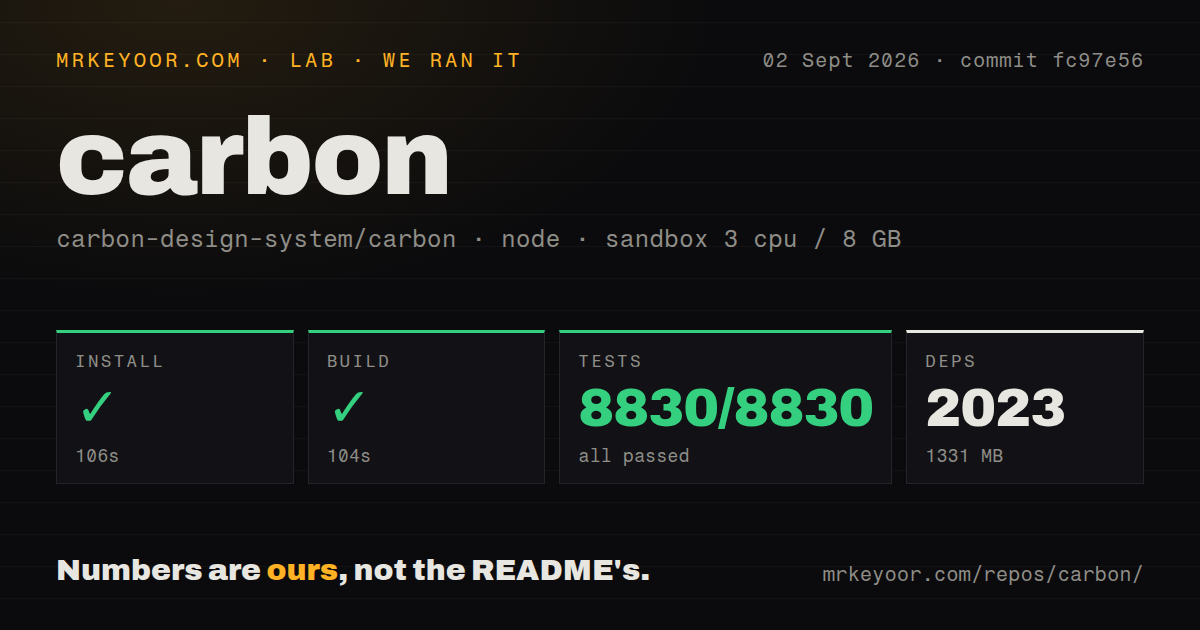
Our sandbox installed 2,023 Yarn packages in 106 seconds and occupied 1,331 MB. The build then took 104 seconds. Those figures describe a root monorepo checkout, not the cost of adding only @carbon/react or one token package to an application. They matter to contributors, fork maintainers, and CI owners because local changes may cross workspaces and require the repository's own build rather than a consumer's smaller dependency graph.
Carbon requires Node 20 or newer, while the measured checkout pins Node 24.20.0 and Yarn 4.10.3. Its workspaces span 3 root groups: actions, config, and packages. React consumers also need Dart Sass for component styles. Contributors on Windows are directed to WSL, and visual changes require design review in addition to developer approvals. The setup is well documented, though it assumes a team comfortable with Node version management, Yarn, Sass, Storybook, and formal review.
What happened when we ran it
Our run used commit fc97e56 in an unprivileged Debian container with 3 CPUs and 8 GB of RAM. Yarn installed 2,023 packages in 106 seconds, leaving 1,331 MB on disk. The build succeeded in 104 seconds. The Jest step completed in 276 seconds with 8,830 passed, 0 failed, and 8,830 total, a clean result across the test command the lab executed.
The repository had 30 CI workflow files and used monorepo workspaces. Our scan found no Dockerfile and no top-level tests directory, even though Jest discovered and passed 8,830 tests in the package tree. That distinction is useful: tests live with the code rather than under one root folder. The full install, build, and test sequence took several minutes, but every measured stage finished successfully on the stated 3-CPU machine.
Two core implementations leave three frameworks to community teams
The Carbon core team maintains 2 primary component implementations: React and web components. The README points Angular, Svelte, and Vue users to community-maintained repositories. Web components can help an organization share controls across framework boundaries, while the React package gets direct components, icons, Sass imports, and Storybook documentation. Framework ownership should be part of selection because parity and release timing may differ outside those 2 core surfaces.
React has a TypeScript caveat that strict teams should test early. Its package README says declaration-file adoption is ongoing, not all components are typed, and consumers can use skipLibCheck: true. The same README requires Dart Sass and describes IBM telemetry that starts with package installation unless users opt out. Our 8,830 passing tests support confidence in the repository, but they do not decide whether a compiler exception or telemetry policy fits your organization.
v11.115.0 remains current while v12 stays behind a flag
Latest GitHub release v11.115.0 arrived on August 27, 2026. The repository develops v12 behavior inside the v11 codebase, where an enable-v12-release flag defaults to false. Separate React and web-component Storybooks expose the preview. This arrangement lets maintainers migrate components and document consumer changes before switching the default, while adopters on v11 can avoid preview behavior until they choose to evaluate it.
The preview has a testing boundary. Carbon's v12 guide says those Storybooks are not currently enabled for Chromatic visual regression testing, and changes affecting v12 must update the migration document. The 104-second build and 276-second Jest pass show the measured code compiles and tests cleanly; they do not replace screenshot comparison for a preview design system. Teams evaluating v12 should treat its Storybook as an explicit preview and keep v11 production assumptions separate.
Web-component form submission still has an open v2.33.0 report
Issue 19872 reports that a cds-button with type="submit" did not submit a surrounding form in @carbon/web-components v2.33.0, while a native button did. The issue was opened in July 2025 and updated on September 2, 2026, without being closed. That does not condemn the whole web-component package. It does give form-heavy applications a precise regression case to reproduce before replacing native submit controls.
GitHub recorded a push on September 2, 2026, and issue and pull-request work was active the same day. The repository had 9,402 stars and 1,006 open issues and pull requests. Release v11.115.0 was less than a week old, so the large queue sits alongside current maintenance rather than a stale project. The 30 workflow files and measured 8,830-test pass match that level of engineering activity, even though a queue this size requires consumers to search for component-specific bugs.
Carbon earns consideration when interface consistency across a large organization outweighs the cost of a heavy contributor environment. Our clean 8,830-test result is strong evidence for the measured commit, and the documentation is frank about Sass, TypeScript, telemetry, framework ownership, and v12. The decision turns on fit: IBM's design language and governance model can remove repeated product debates, or they can become constraints a smaller, differently branded team spends time undoing.