Ant Design documents 3 runtime targets
The README lists 3 runtime targets: modern browsers, server-side rendering, and Electron. Ant Design combines a React component library with a design language for web applications. The catalog covers common product controls, while TypeScript types, localization, theming, and design resources help teams keep screens consistent. This makes it a natural candidate for admin panels, operational dashboards, and business software where forms, tables, navigation, and feedback states recur across many screens.
The tradeoff is visual and technical commitment. Ant Design has its own conventions, and theme customization is based on CSS-in-JS. That can save months of component work when the system suits the product. It can also leave a team fighting defaults when a brand calls for a very different look or when the engineering standard excludes runtime styling. Test a representative dense screen before choosing it, including validation, overlays, tables, keyboard use, and a custom theme.
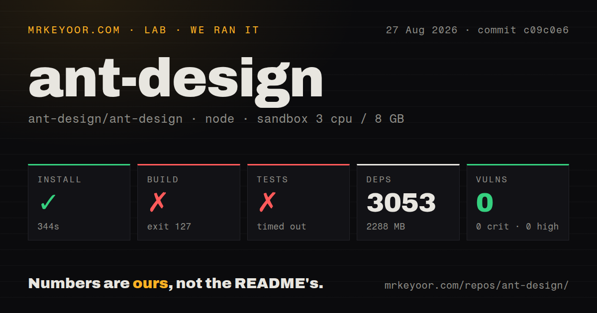
The app install expands to 3,053 packages for contributors
The README's application path is npm install antd, while our contributor checkout pulled 3,053 packages. A direct import of Button or DatePicker follows. There is no account, API key, database, or external service in that basic path. The package also works with yarn, pnpm, and Bun according to the installation section. That is a friendly adoption surface for teams that want to evaluate a few components inside an existing React app.
Repository work is much heavier. Our clean checkout contained 5,037 files, about 289,613 lines of source, and 58.7 MB before installation. npm then increased disk use to 2,288 MB. The README tells contributors to run npm install followed by npm start, which serves the development site on port 8001. It also points to OpenSumi for a browser-hosted development environment. Neither path changes the amount of project machinery maintainers must understand.
What happened when we ran it
Our sandbox installed commit c09c0e6 in 344 seconds on 3 CPUs with 8 GB of RAM using Node 22. Installation succeeded. The build ran for another 115 seconds, generated token metadata, and completed its style step before failing with exit code 127. The failing command was the React 18 test-install step, where the shell reported ut: not found. The log proves that command was unavailable; it does not establish why.
The test command did not finish within our 900-second limit. Its final output showed repeated React server-rendering stack frames ending at tests/shared/demoTest.tsx:82:38. Because the process timed out, we cannot report a passed or failed test count. That distinction matters: a timeout is an incomplete run, not a passing suite and not evidence that the displayed stack trace identifies the root cause.
The npm audit reported 0 known vulnerabilities across critical, high, moderate, and low severity. The repository also contained 33 CI workflow files and a tests directory, with no Dockerfile. These are useful maintenance signals, though they do not overturn the local result: the exact checkout we ran did not complete its build or test steps in the stated fresh Debian container.
Version 6.6.1 contains migration work alongside fixes
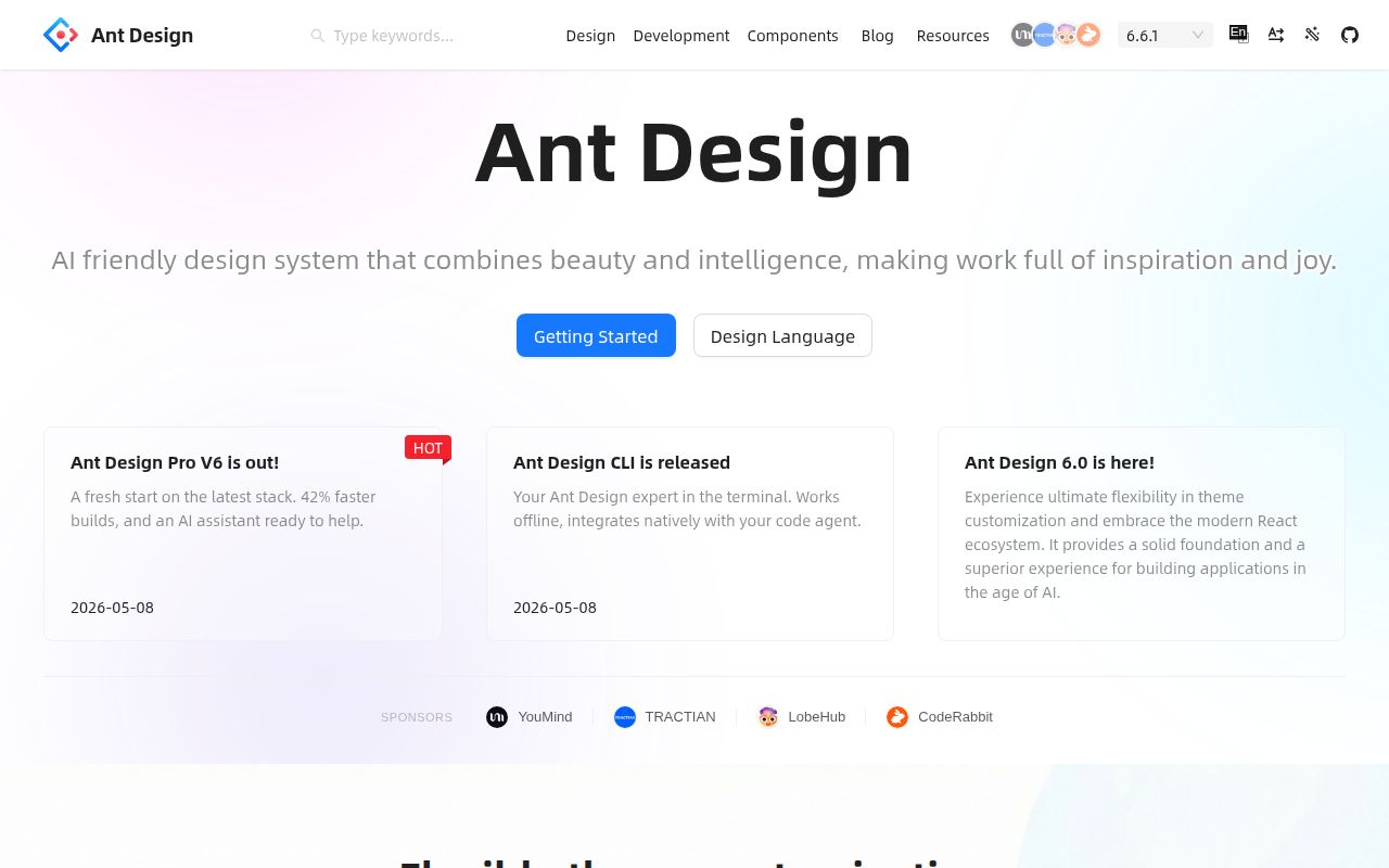
The latest release was 6.6.1, published on August 17, 2026. Its notes include fixes for Upload, Form, Menu, Table, Transfer, Select, and other components. Accessibility work covers localized control names, form labeling guidance, keyboard clearing in Select, and screen-reader treatment in DatePicker and Collapse. For a library used to assemble whole interfaces, this steady attention to component behavior is more useful than a long feature list alone.
The same release documents a List-to-Listy migration because List is deprecated. During our 115-second build attempt, Ant Design also printed deprecation warnings for Input.Group and List, directing users toward Space.Compact and Listy. Existing applications should treat upgrades as code changes that deserve visual and interaction regression tests. A shared component library reduces duplicated UI work, but a deprecated primitive can touch many screens at once.
August activity shows a maintained project with a large queue
GitHub recorded 99,215 stars and 1,097 open issues and pull requests when we fetched the repository. The last push was August 27, 2026, ten days after release 6.6.1. Recent activity included component fixes and accessibility changes, so the large combined queue sits beside current maintenance rather than a dormant codebase. The count is not a bug total because GitHub includes pull requests in that field.
Scale still changes the support experience. A project with 5,037 tracked files, 33 workflows, and more than a thousand open issues and pull requests has far more moving parts than a small component kit. Teams should reproduce defects in the provided playground, pin versions, read release notes, and stage upgrades against their own critical screens. The active community improves the odds of continued fixes; it does not make every product-specific interaction safe by default.
Ant Design fits teams that accept a 2,288 MB contributor checkout
Ant Design 6.6.1 belongs on the shortlist for React teams that need a broad interface catalog and want designers and developers to work from the same system. Localization, TypeScript, server rendering support, and frequent component-level fixes make it credible for long-lived product work. Its MIT license also removes a commercial licensing decision from initial adoption.
The contributor experience we measured is the caution. A 344-second install, 2,288 MB dependency footprint, failed build, and test run beyond 900 seconds make source-level work costly on a modest machine. Adopt it when the catalog and conventions remove more work than upgrades and theming add. If the product needs a sparse custom visual language or the team wants a lean library to modify deeply, compare Material UI, Chakra UI, and Mantine before committing.