Kumo packages Cloudflare's interface choices for React
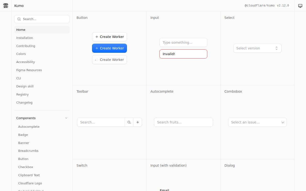
Kumo provides styled React components on top of Base UI. The library handles keyboard navigation, focus management, and ARIA attributes, while Cloudflare's tokens determine color and presentation. Consumers import components such as Button, Input, and Dialog, then load one stylesheet. Granular paths such as @cloudflare/kumo/components/button are available when an application wants narrower imports. Kumo also re-exports Base UI primitives for cases where its packaged components do not cover the required interaction.
That arrangement is most attractive to a team that wants Cloudflare's design decisions, not merely accessible behavior. The repository had 3,760 stars and an MIT license when fetched, and the package has a normal versioned release line. A product with a distinct brand will still have to audit every token and state it overrides. If the goal is a neutral behavior layer, importing Base UI or Radix directly may leave less Kumo-specific styling to undo.
The package install is short, while the workspace is heavy
Application setup in the README is four packages: Kumo plus React, React DOM, and Phosphor Icons. A component import and @cloudflare/kumo/styles provide the first rendered control. The command-line package can list components or print their documentation, which is handy for an engineer or coding agent working without the live documentation site open. No Cloudflare account is listed as a runtime requirement.
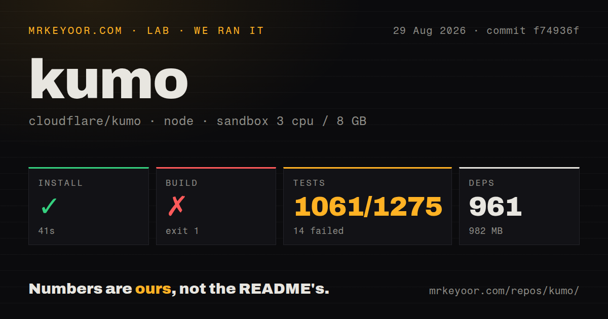
Our clean install finished in 41 seconds, but pnpm added 961 packages and occupied 982 MB. That is contributor-workspace cost rather than proof that a production bundle ships anything close to 982 MB. The repository itself contained 703 files, about 139,188 source lines, and 5.7 MB checked out. Teams evaluating the published package should measure their own client bundle, because the supplied lab run contains no browser bundle-size result.
What happened when we ran it
Our sandbox installed commit f74936f successfully in 41 seconds. The build then failed with exit code 1 after 9 seconds. Astro could not load its config because packages/kumo-docs-astro/src/lib/vite-plugin-kumo-colors.ts imported @cloudflare/kumo/scripts/theme-generator/config, which the build could not find. pnpm stopped at the first failing workspace, the Kumo Astro documentation package.
Tests also exited 1 after 33 seconds. Vitest reported 1,061 passed, 14 failed, and 200 skipped out of 1,275. The failures were concentrated in 3 files: 2 catalog tests, 3 add-command tests, and 9 blocks-command tests. The log tail does not state why those assertions failed, so it would be speculation to connect them to the missing docs import. Both commands independently failed in the fresh Debian container.
The scan found 12 CI workflow files and pnpm workspaces, with no Dockerfile and no root tests directory. We ran the checkout with 3 CPUs, 8 GB of RAM, Node 22, no secrets, and no privileged container access. That environment establishes a reproducible repository result. It does not show whether a fresh consumer application can install the released package and render an individual Button successfully.
The default light brand text has a documented contrast problem
Kumo's accessibility pitch deserves testing at the token level. Open issue 733 checks the published 2.10.0 stylesheet and reports that the orange --text-color-kumo-brand token has a 2.58:1 contrast ratio on the white light surface. The issue compares that result with the 4.5:1 WCAG AA threshold for normal text. It also reports 7.42:1 in dark mode, isolating the complaint to the light branch.
This does not make every Kumo component inaccessible. It does mean the phrase handles accessibility should be read as behavior support, not an exemption from checking colors, labels, focus order, zoom, or application composition. Release 2.12.0 fixed disabled and loading semantics for Toolbar.Button, another reminder that component accessibility changes over time. Pin the package, test both color modes, and rerun checks during upgrades.
Base UI supplies behavior, while Kumo owns the opinionated layer
The escape valve is useful. Base UI primitives are re-exported, so an application can use a Popover primitive when Kumo's complete component is too prescriptive. That reduces the need to bring in another primitive dependency for one exception. It can also blur ownership if half a screen uses finished Kumo components and the rest uses locally styled primitives. Teams need rules for when to stay inside the component catalog and when custom composition is acceptable.
Version 2.12.0 illustrates that the public surface is still changing. It added a Text heading variant, deprecated numbered heading variants, and marked MenuBar for future removal in favor of segmented Tabs. The same release added scrollToItem to the sidebar API and made reduced-motion behavior explicit for smooth scrolling. These are sensible changes, but consumers should expect migrations rather than assuming the current names will remain untouched.
The Figma path is optional and requires its own credential
The monorepo includes a Figma plugin and an optional token-sync step. Contributors copy an example environment file and provide FIGMA_TOKEN, with FIGMA_FILE_KEY listed as optional, before building that workspace. Product teams without Figma can ignore this route. Teams that use it should keep the token out of the repository and decide which side, code or design file, is authoritative when values disagree.
GitHub recorded a last push on August 28, 2026, eight days after release 2.12.0. The repository showed 49 combined issues and pull requests, not 49 confirmed defects. Recent reports cover animation behavior and color contrast, while the release notes contain fixes across component semantics and visual states. Kumo is active enough to evaluate, but our failed 9-second build and 14 failed tests make a clean contributor checkout a requirement to verify, not an assumption.