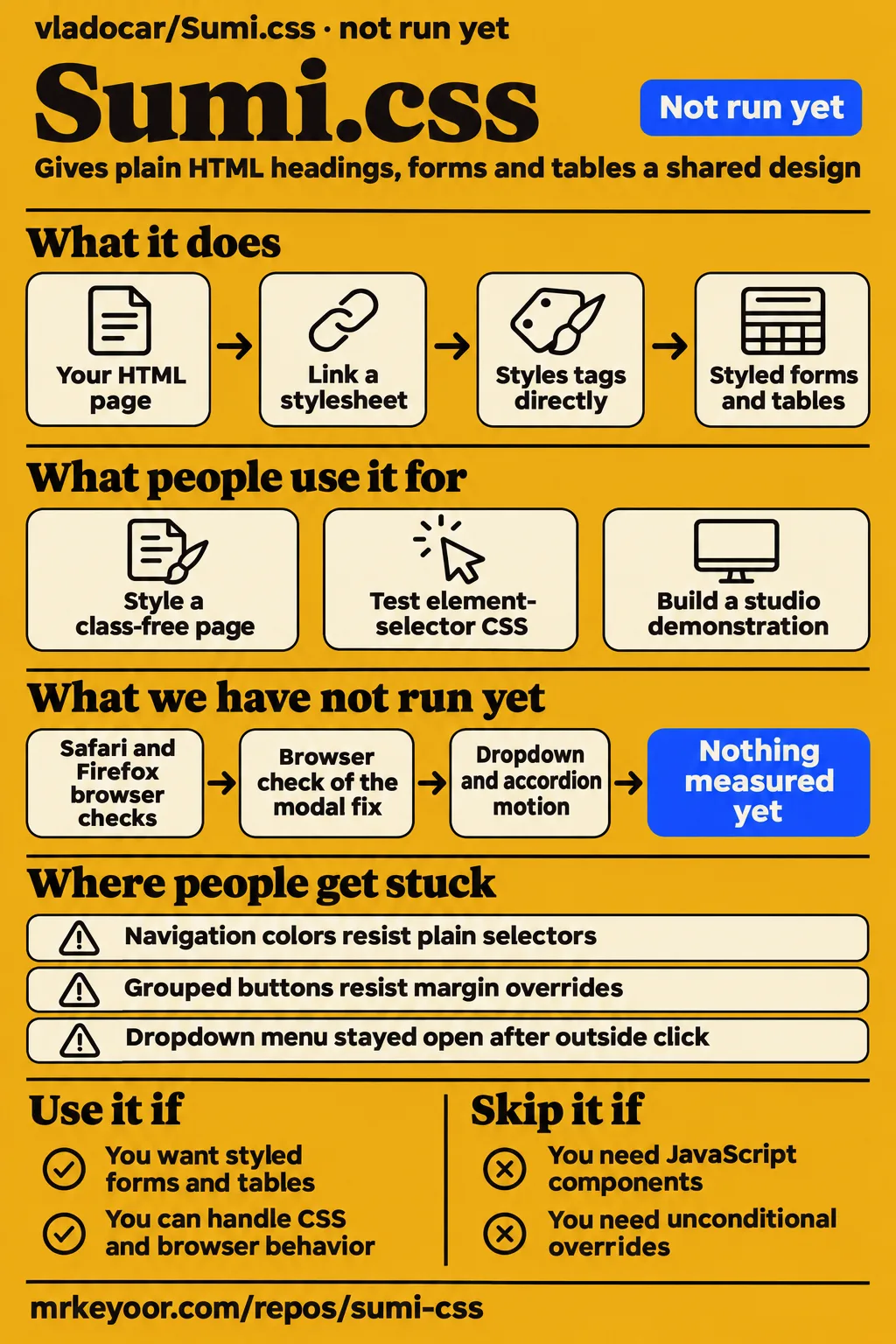
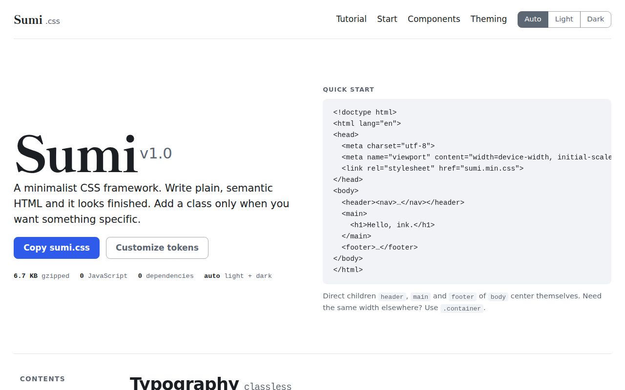
Sumi.css styled a class-free page in select1.dev's Chromium test, but its promise that plain selectors always win has documented exceptions. Use it for a small HTML site or internal page whose owner can handle CSS and browser behavior. Skip it if you need a ready-made JavaScript component system or a guarantee that every framework rule yields to your own. Our sandbox attempt stopped before execution, so the browser findings below belong to the independent reviewer, not MrKeyoor.
What people use Sumi.css for
The concrete examples are a reviewer's HTML test page and the project's worked calligraphy-studio tutorial. They show how Sumi styles ordinary markup and where optional layout classes enter. Neither example should be mistaken for evidence that a business has operated a Sumi application over time.
| Who used it | What they did | What happened |
|---|---|---|
| The select1.dev reviewer | Linked only sumi.min.css to a class-free page with navigation, forms, a button group, a table and a disclosure section | The elements received styling. Independent page test |
| The select1.dev reviewer | Loaded custom element-selector CSS before and after Sumi | 129 of 132 tested values applied in either order. Navigation and grouped-button exceptions remained. Override experiment |
| The select1.dev reviewer | Emulated system themes, forced themes, keyboard navigation and reduced motion in Playwright | Forced themes took precedence, links showed focus rings, and reduced motion suppressed visible button transitions. Browser checks |
| The project's official tutorial | Built a demonstration for a calligraphy studio with course cards, a booking form and an FAQ | It supplies a worked example page, rather than evidence of a functioning booking service. Official tutorial |
A classless CSS framework applies styles to element names, so headings and form controls can receive a house style without framework classes. Sumi adds optional classes for things a tag cannot express: a grid, an enlarged introduction or a button variant. That makes it appealing when you want to keep a hand-written HTML page easy to read. It also means your choice of HTML element affects appearance: the README treats an article as a card and offers .prose for long-form reading. Repository documentation
For a first evaluation, use one of your own pages containing navigation, a form and a table. Those elements exercise more of Sumi's assumptions than a hero headline does. Decide whether the default structure suits your content before spending time changing tokens. This is a proposed evaluation, not a task our lab completed.
What happened when we ran it
Our November 16, 2026 sandbox attempt at commit 0a9d1b0 was not run: the harness had no supported ecosystem for the HTML repository and found no Dockerfile. The recorded sandbox configuration was 3 CPUs and 8 GB RAM, with image listed as n/a. Those are the resources allocated to the attempt, not minimum requirements for serving a stylesheet.
| Recorded check | Result | Meaning for this review |
|---|---|---|
| Repository execution | NOT RUN: no supported ecosystem, language HTML; no Dockerfile | No installation, build or test result is available |
| Hands-on safety step | FAILED because none of compose.yaml, compose.yml, docker-compose.yaml or docker-compose.yml existed | The deployment route stopped at its Compose prerequisite |
| Teardown | ok | Cleanup was recorded, without a successful application task |
The safety log calls the repository unsafe because a Compose file is required by that runner. This describes the runner's rule, not a demonstrated security defect in Sumi. The separate run label says it was deployed with its own Docker Compose, but the failed prerequisite contradicts that label. We give the explicit failed step precedence and claim no working deployment. The teardown record says cleanup completed.
The README's consumer route is to download and link a stylesheet, which explains why a container-oriented runner is a poor match for this project. A failed safety prerequisite tells you nothing about whether a browser can render the CSS. It also cannot support an installation-time estimate. The useful rendering evidence here comes from select1.dev's separately attributed experiment. Documented download route
Where people get stuck: navigation and button groups resist overrides
Issue #2 reports four property values that resisted plain element selectors on commit 3e29bbd. Its author tested navigation-link colors and grouped-button spacing and corners in Chromium through Playwright, with custom CSS loaded on either side of Sumi. The issue remains open in the supplied record. Issue #2
The broader select1.dev experiment tried six properties across 22 elements and counted 129 successful values out of 132 in each stylesheet order. The issue's four-value reproduction includes a plain navigation link as well as the current-page link. These are different experiments, so their failure counts should stay separate. Reviewer experiment and narrow reproduction
| Symptom in the issue | Reported rule behind it | Practical response |
|---|---|---|
| Plain navigation link keeps its color | A negation attribute selector sits outside :where() | Inspect specificity rather than repeatedly moving your stylesheet |
| Current-page link keeps its color | Current-state attribute selectors sit outside :where() | Target the state deliberately or adapt the source rule |
| Grouped button keeps its margin | Group rules use important margin declarations | The report says overriding this needs another important declaration |
| Grouped button keeps its corner radius | The group attribute selector outranks a plain button selector | Account for the group selector when customizing corners |
The author proposed moving selectors inside :where() or documenting intentional exceptions. That proposal is useful diagnosis, not a shipped fix. In the reproduction, a button outside the group accepted the same custom values. That detail matters: a developer can waste time rewriting a valid button rule when the group wrapper is the reason it loses. Reported rule analysis
A separate complaint came from gecegokyuzu on r/css: dropdown buttons lacked feedback and the menu stayed open after an outside click. The same tester reported an uncentered modal and differing accordion and modal motion. These are one person's quick inspection, not a failure rate across users. The supplied thread contains no dropdown fix or retest. Keep that report separate from the resolved modal issue. Reddit inspection
CSS supplies appearance; your page supplies the actions
The README's modal example requires a call to dialog.showModal(), and its persistent theme switch uses JavaScript and localStorage. Styling a control does not implement the action behind it. This distinction is easy to miss when a component gallery presents a dialog, form and dropdown together as finished-looking examples. README examples
| Feature | What the stylesheet provides | What you still own |
|---|---|---|
| Native dialog | Modal and backdrop styling | Opening it from the intended control |
| Theme selection | System preference and forced theme styles | Saving and restoring a visitor's explicit choice |
| Form feedback | Colors tied to aria-invalid | Deciding when a field is invalid and updating state |
| Loading indication | Styling tied to aria-busy | Starting and finishing the operation |
The official tutorial makes the form boundary visible: its script checks required fields and sets aria-invalid. A styled booking form is therefore a useful layout example, not evidence that reservations are stored or confirmations are sent. If you're building an internal tool, put the same care into the submit path and error messages that you put into choosing the form's colors. Tutorial form example
For navigational links, the current README uses data-style="button". Issue #3 explains why using role="button" instead changes the semantics announced to assistive technology and introduces a Space-key expectation that CSS does not provide. The issue is closed, and the later documentation supplies the data attribute route. Preserve the anchor's destination and native semantics when all you want is a button-like appearance. Issue #3 and current example
Dark-mode branding needs both palette definitions
The README says the dark palette appears in two places: the system-preference rule and the forced-dark rule. It tells authors who change dark colors to change both blocks. A brand adjustment tested only on the light page can therefore leave a different palette when the operating system or a saved preference selects dark mode. Dark palette instructions
The documented custom properties cover colors, fonts, spacing and corner radii. Start with those controls if the default component shapes already suit your page. Then inspect ordinary, hover, focus and invalid states in both themes. This is especially relevant to the primary color because the README assigns it to links, buttons, focus rings and checked controls. One token change reaches several kinds of feedback.
select1.dev's forced-theme check is encouraging: the chosen mode took precedence over the emulated system preference. That result supports theme selection in that Chromium check. It doesn't settle whether your replacement text and background colors remain readable. Treat theme mechanics and the quality of your own palette as separate decisions. Independent theme check
Attention is easier to find than sustained deployments
The sampled Hacker News discussion contains interest in Sumi, while its coworker-and-S3 success story names only an unspecified classless framework. That story supports a reason to like simple markup, not a claim that Sumi powered that workflow. The concrete independent Sumi usage remains the reviewer's test page. HN discussion
The jQueryScript X post announces the classless-first approach without describing an application it built. Likewise, lekoalabe's r/css objection that classless frameworks fail outside basic use cases is an opinion about the category. It is worth considering if your interface needs many distinct component states, but it is not a demonstrated Sumi production failure. X announcement and Reddit discussion
The repository documentation is in English and includes both component examples and a tutorial. select1.dev's November 5 follow-up records a November 3 commit and the added data-style attributes. Together with the closed semantics and modal issues, that shows activity beyond the launch snapshot. The open override issue is a reason to read the actual issue history instead of equating a recent commit with every reported defect being resolved. Follow-up
Sumi.css vs Bootstrap, Pico.css, MVP.css and Pure
Bootstrap addresses a broader component workflow, while Sumi starts by styling the elements already in your HTML. The supplied comparisons also place MVP.css and Pure on different sides of the classless choice. Pick on markup and behavior needs before comparing compressed file sizes. Independent comparison and tutorial comparison
| Alternative | Reason to choose it | Where Sumi fits instead |
|---|---|---|
| Bootstrap | The independent review identifies utility classes and JavaScript components | You want plain HTML defaults and can supply your own behavior |
| Pico.css | Existing Pico pages give you a concrete migration baseline | HN commenters welcomed Sumi after Pico's reported deprecation, without demonstrating drop-in compatibility |
| MVP.css | The tutorial positions it as entirely classless | You want optional grids and component variants alongside element styling |
| Pure | Its README describes small responsive CSS modules; the tutorial describes class-based styling | You prefer styled native elements as the starting point |
The Bootstrap size comparison is specifically against version 5.3.3 in select1.dev's test. It is not a measurement of every Bootstrap configuration or today's development branch. Pure's modular approach also changes what an author chooses to include. A whole-file comparison cannot decide whether a particular application's downloaded CSS is smaller. Recorded comparison and Pure README
Why use a small framework instead of AI-generated styling? HN replies favored a clean starting point they could customize, and the option to work without AI. That is a preference for a known set of styles, not proof of faster development. If you already like writing CSS, Sumi's value is having defaults to edit rather than having to invent them for every page. AI discussion
What the other reviews get wrong
The blanket claim that custom CSS always wins leaves out the navigation and button-group exceptions documented in issue #2. The README, daily.dev and Reveneau repeat versions of the easy-override promise. The independent reproduction is the reason to qualify it, even though the larger experiment succeeded for most tested values. Override issue
select1.dev's verdict says Sumi offers no utility classes. The repository explicitly lists .muted, .small, .center, .sr-only and .overflow-auto as utilities. The accurate distinction is a small helper set, rather than none. Reveneau also says browser guidance goes no further than modern browsers, whereas the supplied README names feature-dependent minimum versions. Reviewer verdict, Reveneau and repository list
Reveneau's launch account places the last commit the day after the October 20 creation. The later select1.dev follow-up records November 3, so the launch account cannot serve as current maintenance status. Its claim about removing a day of styling work also lacks a timed comparison in these records. We would not use that claim to budget a project. Launch account and later check
The Design Inspiration tutorial describes role="button" as ideal for a link jumping to a section. Issue #3 explains the semantic cost, and the later README uses data-style="button". Copy the later markup when you want a link that looks like a button. Tutorial advice and semantics discussion
Questions people ask
Sumi.css styles semantic HTML from one linked stylesheet, with optional classes for layouts and variants. The distinction matters because classless-first does not mean every layout is expressed without a class. Repository overview
What is a classless CSS framework, and how does Sumi.css work?
A classless CSS framework styles tags directly, and Sumi uses that approach for headings, forms, tables and navigation. Optional classes such as .grid and .lead cover layout or appearance that the element name alone cannot describe. Independent explanation
How large is Sumi.css, and which browsers does it support?
select1.dev measured sumi.min.css at 6,874 bytes with gzip -9 and 28,245 bytes uncompressed. Those are its file measurements, not ours. The README names Chrome and Edge 111, Firefox 121 and Safari 16.2 as feature-dependent minimums for its use of :where(), :has() and color-mix(). Those are documented support claims. File measurement and browser guidance
Can I override Sumi.css with plain element selectors without !important?
Often, but not universally: issue #2 reports navigation-link colors and grouped-button margins and corners resisting plain selectors. Its grouped-margin rules include important declarations. The larger independent experiment's 129 successful values out of 132 should not be read as a guarantee for every selector. Issue #2 reproduction
Why does the Sumi.css demo modal open at the bottom instead of the center?
Issue #1 identifies the bottom-aligned modal as a docs-page CSS bug, and the maintainer replied that it was fixed. The thread is closed. That resolution applies to the reported modal example, not the dropdown behavior mentioned elsewhere. Issue #1
How can I style a link as a button without overriding its native link semantics?
Use the README's data-style="button" on the anchor while retaining its href. Issue #3 explains why adding role="button" changes announced semantics and implies keyboard behavior that CSS does not supply. Current markup and issue #3
Why choose another classless framework when so many already exist?
Sumi combines element styling with optional grids, variants and automatic themes. Choose it if that particular default design suits your page. The tutorial's comparisons give reasons to consider Basic.css, MVP.css or Pure instead, while the Reddit objection supplies no side-by-side Sumi application result. Framework comparison
Why use Sumi.css or another small CSS framework instead of AI-generated styling?
A framework supplies a known starting style that you can customize without generating a new UI. That was the preference expressed by HN respondents to the AI question. The discussion supplies reasons people choose this workflow, not a measured productivity advantage over AI. HN responses
Can Sumi.css be a useful alternative after Pico.css's deprecation?
Yes, as a candidate for the same plain-HTML styling job: HN commenters explicitly welcomed it after Pico's reported deprecation. The thread shows interest rather than a completed migration. Compare the markup and components your existing page actually uses before treating Sumi as a replacement. Pico discussion
What we have not tested yet
MrKeyoor has no completed browser run of Sumi at 0a9d1b0, no measured installation or build duration, and no test-suite or security-audit result. The allocated sandbox resources do not establish operating requirements. Actual runtime and operating-system versions require the raw toolchain logs, and image n/a supplies neither. The contradictory deployment label also leaves no basis for a successful hands-on claim.
The independent browser work used Chromium through Playwright, including iPhone emulation. It does not supply Safari, Firefox, physical iPhone or screen-reader results. Visible focus rings, reduced motion and ARIA styling are useful individual checks, not an accessibility certification. We have not reproduced the modal fix, retested the open override report against 0a9d1b0, or tested the unresolved dropdown and accordion-motion complaints.
The evidence contains no sustained named Sumi deployment, comparative development-time measurement or large-application maintenance study. The supplied video records contain no attributable Sumi walkthrough, so there is no video-derived usage result to add. Unrelated Sumi::CSS Perl pages, gosumi terminal documentation and Hattori AI's Sumi theme are different projects. Search demand and volume are unknown, and the empty autocomplete record cannot supply them.
For a production decision, the missing result is a browser check of your own navigation, grouped controls and form behavior in the version you intend to ship. That is the next useful test before standardizing on this stylesheet.