Five effect packages share one npm workspace
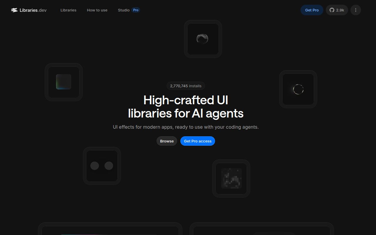
The checked monorepo contains 5 React libraries: border-beam, liquid-gooey, thinking-orbs, metal-fx, and img-fx. They solve narrow visual problems. Border Beam wraps an element with traveling or pulsing light, Liquid Gooey merges moving surfaces, Thinking Orbs depicts agent states, Metal FX draws a shader-based ring, and Image FX reveals images through animated mosaics. This is a shelf of effects, not a button, form, and dialog system.
That focus is useful when the design already exists and one treatment is missing. Each package owns its README, license, build, and demo. The root uses npm workspaces, so a single install connects the source libraries to their demo sites for hot reload. Consumers still install the packages separately. Taking only thinking-orbs does not require shipping the WebGL code used by the 2 shader packages.
Three packages get top billing while the tree contains five
The root README's opening table lists 3 packages: border-beam, liquid-gooey, and thinking-orbs. The checked package tree also contains metal-fx and img-fx, and the root package description names all 5. That mismatch makes discovery less tidy than the individual documentation. Read the package README before choosing because the rendering method, peer dependencies, browser behavior, and control surface differ considerably.
Thinking Orbs is the cleanest small component here. It has 9 named agent states at 2 tuned sizes, uses a 2D canvas, pauses outside the viewport, caps device pixel ratio at 2, and supplies labels. Border Beam provides 5 motion presets and 4 color palettes. Liquid Gooey is far more involved, measuring DOM geometry and combining live content with SVG effects. The libraries share an aesthetic, though their operating costs are not interchangeable.
What happened when we ran it
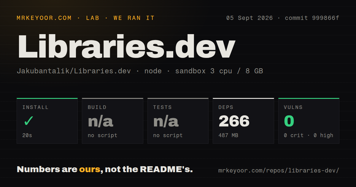
Our sandbox installed 266 npm packages in 20 seconds and left 487 MB on disk. The checkout at commit 999866f contained 1,003 files, about 47,567 lines of source, and occupied 138.1 MB before installation. Our measurement setup used a fresh unprivileged Node 22 container with 3 CPUs, 8 GB of RAM, and no secrets. Npm audit found 0 known vulnerabilities across all severity levels.
The root package did not expose a standard build script or target recognized by the lab, so we skipped the build. This does not mean the packages cannot compile. The root defines named commands such as build:beam, build:gooey, build:orbs, and several site builds. It means there is no single default build result for the 5-package workspace. A release gate should call the exact library and demo commands it intends to publish.
There was also no test script or target, so we skipped tests. Our scan found 3 CI workflow files but no tests directory or Dockerfile. Type checking has a root command, and package source includes careful implementation details, yet neither substitutes for a test result. Visual effects need screenshot checks, keyboard and screen-reader checks around wrapped controls, reduced-motion verification, and failure cases for missing WebGL or blocked image access. The checked repository did not give our harness one command covering those outcomes.
Reduced-motion behavior differs between the packages
Thinking Orbs documents a static frame under prefers-reduced-motion and keeps its accessible label. Border Beam's pulse variants include a reduced-motion block, while the rotate variants rely on the consuming application. That split is easy to miss because both variants come from one package. If a product has a strict motion policy, add an application-level media query and verify every variant rather than assuming the wrapper handles all 5 presets.
The decorative layers in Border Beam ignore pointer events, which preserves access to the wrapped control. Liquid Gooey says the real DOM stays above its visual silhouette, retaining focus rings, hit targets, ARIA, and handlers. These are sound design choices. They still need testing inside your layout because the effects measure child size, border radius, motion, or neighboring elements. A transformed parent, clipped overflow, or theme system can change the result without producing a TypeScript error.
Two packages make WebGL a runtime requirement
Metal FX and Image FX use WebGL, while Thinking Orbs uses 2D canvas and Liquid Gooey relies on DOM and SVG techniques. Metal FX shares one WebGL context across mounted instances and pauses copies outside the viewport. Image FX also shares a renderer, caps its default animation at 10 frames per second, and pauses offscreen cards. Those decisions reduce obvious waste, but they are implementation claims rather than measurements from our sandbox. We did not benchmark rendering speed.
Image FX also needs same-origin or CORS-enabled images to sample a revealed image's palette. When access is blocked, it falls back to the preset colors. This is a graceful visual fallback, but a product team should test CDN headers and browser privacy settings before building a branded transition around sampling. Server rendering receives special handling in Metal FX, which mounts the WebGL path after hydration. Again, test the actual framework because the repository covers React components rather than every React server stack.
Native ports exist in source but are not published
The root README says Thinking Orbs carries React Native and SwiftUI ports under its package directory, kept in step through shared vectors, but neither is published. The checked tree also contains native port material under Border Beam. Open issue 9 describes the practical Swift problem: GitHub cannot add the repository directly as a Swift package because Package.swift is in a subdirectory. Mobile adopters are taking source and packaging responsibility today.
Release v1.3.0 arrived on July 2, 2026 with tuning hooks for Border Beam's pulse-outside variant. GitHub recorded another push on September 4 and listed 7 combined issues and pull requests when fetched. The queue includes Vue 3 support, custom colors, Swift packaging, and a Liquid Gooey fix. That is current activity around a young, small project. It supports trying a specific effect, while the missing root test target argues against adopting all 5 packages by default.