seaborn review
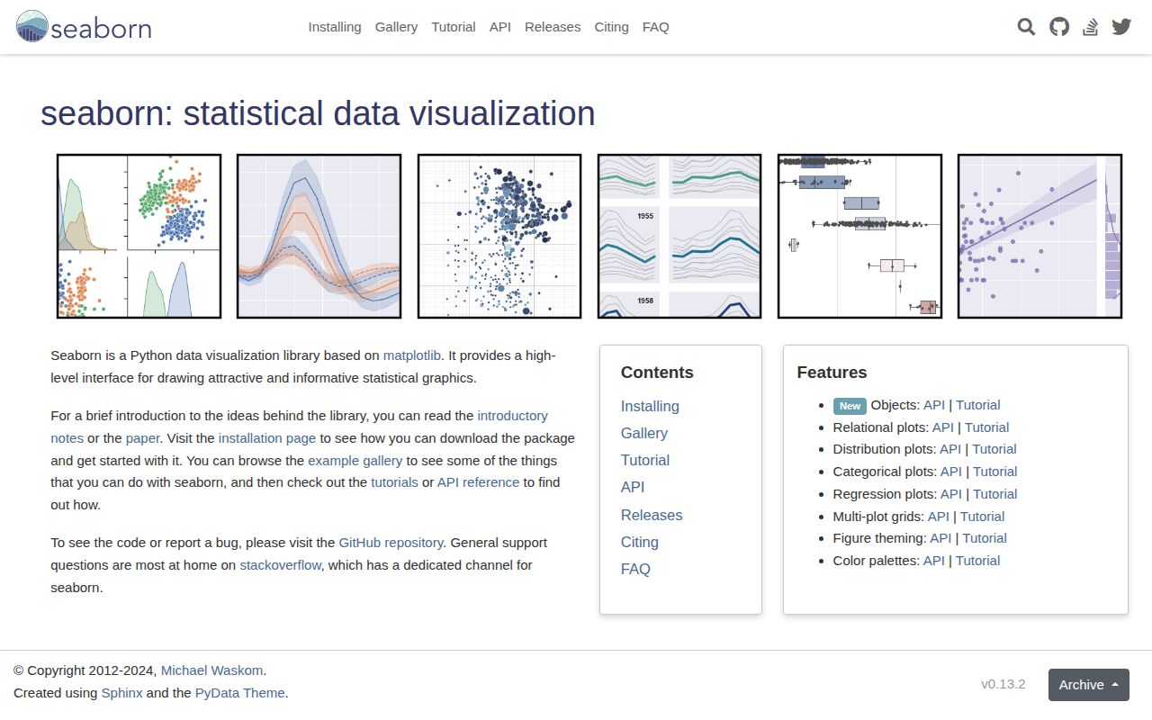
seaborn 0.13.2 is a statistical plotting layer for Python dataframes, NumPy arrays, and matplotlib figures. Column names map to position, hue, style, size, and facets; plotting functions can also estimate distributions, regressions, and uncertainty intervals. Our Python 3.12 import succeeded, though the installed environment was much larger than the pure Python seaborn package alone. Release 0.13.2 changes internals for upcoming pandas deprecations. The 0.13 series also rewrote categorical plots, adding native_scale, log_scale, formatter, gap, fill, and explicit legend controls.
seaborn 0.13.2 installed in 1 second but consumed 175 MB across 13 packages and took 3.07 seconds to import in our sandbox, so it earns its place when pandas-aware statistical plotting saves real analysis code. Skip it for small runtime images or browser interaction, and visually review categorical charts after a 0.13 upgrade.
We installed it
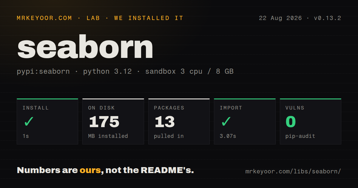
| Install | ✓ · 1s | 13 packages on disk · 175 MB |
| Import | ✓ | import seaborn in 3.07s · pure Python · requires Python >=3.8 |
| Known vulns | 0 | (pip-audit) |
Answers from our run
Does seaborn install cleanly?
Yes. In a fresh container with an empty cache, pip install seaborn finished in 1 seconds, leaving 13 packages and 175 MB on disk. pip-audit reported no known vulnerabilities.
What does seaborn need to run?
Python >=3.8, and nothing compiled: it is pure Python. In our run import seaborn succeeded in 3.07s.
seaborn or matplotlib: which should you use?
matplotlib: Use it directly for unusual artists, precise layout control, or a plotting layer with no dataframe semantics. seaborn 0.13.2 installed in 1 second but consumed 175 MB across 13 packages and took 3.07 seconds to import in our sandbox, so it earns its place when pandas-aware statistical plotting saves real analysis code.
When should you not use seaborn?
The deliverable needs browser hover, linked selections, client-side zoom, or dashboard callbacks. seaborn renders through matplotlib rather than a browser interaction runtime.
Use it if
- Analysis already lives in pandas and matplotlib, and charts should map dataframe columns directly to visual roles.
- You need quick faceting and consistent legends across distributions, relationships, or categorical comparisons.
- A static statistical chart should remain editable through the underlying matplotlib Axes and Figure objects.
- The team can inspect estimator, interval, normalization, grouping, and missing-data choices instead of accepting defaults blindly.
- The deliverable needs browser hover, linked selections, client-side zoom, or dashboard callbacks. seaborn renders through matplotlib rather than a browser interaction runtime.
- The environment must stay small or start quickly. Our clean install occupied 175 MB across 13 packages and importing seaborn took 3.07 seconds.
- Strict typing depends on declarations shipped by each dependency. Version 0.13.2 had no py.typed marker in our package check.
- Your pipeline uses Polars or another dataframe implementation to avoid pandas conversion. The 0.13 notes say alternate frames use the exchange protocol but are converted to pandas internally.
- You cannot review visual output during upgrades. Version 0.13 rewrote categorical functions, changed their default colors, altered dodge behavior, and deprecated several palette and sizing forms.
Setup reality
We installed seaborn 0.13.2 in a fresh Python 3.12 Bookworm container. Installation finished in 1 second and left 13 packages using 175 MB. Our package record counted 22 direct dependencies, required Python 3.8 or newer, and found pure Python code with no py.typed marker. pip-audit reported 0 known vulnerabilities, and the measured license was BSD License.
Importing seaborn worked in our sandbox and took 3.07 seconds. NumPy, pandas, and matplotlib account for much of the working stack. Long-form data gives x, y, hue, style, row, and col clear column names; wide inputs often need melt(). Missing observations are generally dropped, so inspect group counts before interpreting an estimate or interval.
Axes-level calls such as scatterplot(), lineplot(), boxplot(), and heatmap() accept ax= and draw inside a layout you own. Figure-level relplot(), displot(), catplot(), lmplot(), jointplot(), and pairplot() create their own grid or figure. Save through the returned Axes or grid, and close figures in batch jobs. set_theme() changes matplotlib rc parameters for the entire Python process.
Version 0.13.2 adds no chart family; it adjusts internals for pandas deprecations. The 0.13 categorical rewrite is the upgrade risk: native_scale changes coordinate treatment, palette without hue is deprecated, dodge defaults to auto, and statistics on nonlinear axes run in transformed space. SciPy and statsmodels remain optional for some calculations. Compare rendered artifacts when moving older notebooks to this release.
Patterns
Configure plotting defaults once set-process-theme
import seaborn as sns

sns.set_theme(
    style='whitegrid',
    context='notebook',
    palette='deep',
)
set_theme() changes matplotlib rc parameters for the whole process. Call it during notebook or application setup, not inside every chart helper.
Draw into a matplotlib layout compose-axes
import matplotlib.pyplot as plt
import seaborn as sns

fig, axes = plt.subplots(1, 2, figsize=(10, 4))
sns.scatterplot(data=df, x='bill_length_mm', y='body_mass_g', hue='species', ax=axes[0])
sns.boxplot(data=df, x='species', y='body_mass_g', ax=axes[1])
fig.tight_layout()
scatterplot() and boxplot() are axes-level functions, so ax= places both inside the Figure created by plt.subplots().
Split a scatter plot into columns facet-relationship
grid = sns.relplot(
    data=df,
    x='bill_length_mm',
    y='body_mass_g',
    hue='species',
    col='island',
    height=3.5,
)
grid.set_axis_labels('Bill length (mm)', 'Body mass (g)')
relplot() owns its figure and returns a FacetGrid. It does not accept an existing matplotlib Axes.
Normalize each hue group separately compare-distributions
sns.histplot(
    data=df,
    x='body_mass_g',
    hue='species',
    stat='density',
    common_norm=False,
    element='step',
)
common_norm=False gives every species its own density normalization. Areas cannot then be read as each group's share of all observations.
Estimate a weighted group mean plot-weighted-mean
sns.barplot(
    data=df,
    x='region',
    y='price',
    weights='sample_weight',
    estimator='mean',
    errorbar=('ci', 95),
)
Weights support for mean estimates arrived in 0.13.1. The 95 percent bootstrap interval reflects the weighted estimator, not raw observation spread.
Keep numeric category coordinates preserve-native-scale
sns.boxplot(
    data=df,
    x='dose_mg',
    y='response',
    native_scale=True,
    width=0.8,
)
native_scale=True keeps numeric dose positions instead of mapping categories to consecutive integers. Element width follows the minimum spacing between values.
Draw a linear fit with observations fit-regression
sns.regplot(
    data=df,
    x='bill_length_mm',
    y='body_mass_g',
    ci=95,
    scatter_kws={'alpha': 0.35},
)
regplot() fits association between the two columns. Its 95 percent band does not adjust for omitted confounders or establish causation.
Show one half of a correlation table mask-correlation-matrix
import numpy as np

corr = df.corr(numeric_only=True)
mask = np.triu(np.ones_like(corr, dtype=bool))
sns.heatmap(
    corr, mask=mask, annot=True, fmt='.2f',
    cmap='vlag', center=0, vmin=-1, vmax=1,
)
numeric_only=True excludes nonnumeric columns. Pairwise missing values can still give different cells different sample counts.
Convert series columns into a hue reshape-wide-data
long = wide.melt(
    id_vars='date',
    value_vars=['north', 'south'],
    var_name='region',
    value_name='sales',
)
sns.lineplot(data=long, x='date', y='sales', hue='region')
melt() turns 2 regional value columns into one measured column plus a region label, which makes hue and later faceting explicit.
Inspect numeric pairs by group show-pairwise-grid
grid = sns.pairplot(
    data=df,
    vars=['bill_length_mm', 'bill_depth_mm', 'body_mass_g'],
    hue='species',
    corner=True,
    diag_kind='hist',
)
Three vars produce 6 visible panels with corner=True. Pair grids grow quickly as more variables are added, so choose columns deliberately.
Layer marks with seaborn.objects build-objects-plot
import seaborn.objects as so

plot = (
    so.Plot(df, x='bill_length_mm', y='body_mass_g', color='species')
    .add(so.Dot(alpha=0.5))
    .add(so.Line(), so.PolyFit(order=1))
    .facet(col='island')
)
seaborn.objects uses a declarative API separate from classic sns functions. Version 0.13.1 added layout extent and other fixes, but feature coverage still differs.
Release a figure after export save-and-close
import matplotlib.pyplot as plt

ax = sns.scatterplot(data=df, x='bill_length_mm', y='body_mass_g')
ax.figure.savefig('scatter.png', dpi=200, bbox_inches='tight')
plt.close(ax.figure)
plt.close() releases matplotlib's reference to the Figure. Batch jobs that leave many figures open accumulate memory.
Alternatives
| Package | Registry | Pick it when |
|---|---|---|
| matplotlib | PyPI | Use it directly for unusual artists, precise layout control, or a plotting layer with no dataframe semantics. |
| plotly | PyPI | Use it when charts need browser hover, zoom, selection, or embedding in an interactive application. |
| altair | PyPI | Use it for declarative Vega-Lite specifications and browser interactions based on a grammar of graphics. |
| plotnine | PyPI | Use it when a ggplot2-style grammar and explicit layered composition fit the team's existing mental model. |
More data guides
numpy · fsspec · pandas · sqlalchemy · pyarrow · lxml · the whole shelf →
How this guide is made: grounded in the library's documentation, release notes, changelog, and issue history, on a fixed rubric — not a hands-on install of every release. The 50 most-downloaded entries are additionally install-verified in clean containers. Corrections: contact the desk.