plotly review
Plotly 7.0.0 creates browser-rendered charts from Python. Plotly Express maps dataframe columns to visual properties with short calls; `graph_objects` exposes traces, axes, annotations, shapes, maps, and layout details. A figure can display in notebooks, travel as interactive HTML, export through Kaleido, or become part of a Dash app. Version 7 moves to plotly.js 4, adds quiver traces, changes automatic map fitting, and removes the old Mapbox trace family, several deprecated figure factories, Orca export, pre-1.0 Kaleido, and the image `engine` argument. Our measured install was 6.9.0, the immediately preceding release.
Plotly 6.9.0 installed in 1.2 seconds and consumed 46 MB across 3 packages with 0 audit findings in our sandbox; current 7.0.0 then removed several legacy map and export APIs. Install v7 for interactive, portable figures after checking those removals, or choose Matplotlib when the final artifact is static.
We installed it
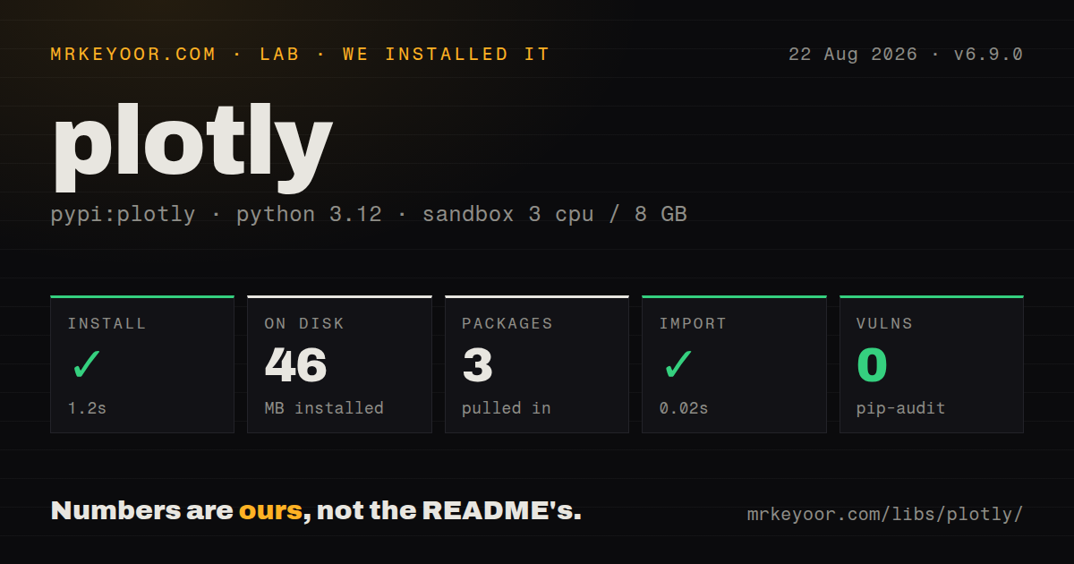
| Install | ✓ · 1.2s | 3 packages on disk · 46 MB |
| Import | ✓ | import _plotly_utils in 0.02s · pure Python · requires Python >=3.8 |
| Known vulns | 0 | (pip-audit) |
Answers from our run
Does plotly install cleanly?
Yes. In a fresh container with an empty cache, pip install plotly finished in 1 seconds, leaving 3 packages and 46 MB on disk. pip-audit reported no known vulnerabilities.
What does plotly need to run?
Python >=3.8, and nothing compiled: it is pure Python. In our run import _plotly_utils succeeded in 0.02s.
plotly or matplotlib: which should you use?
matplotlib: Choose it for static figures, detailed print control, and established scientific publication workflows. Plotly 6.9.0 installed in 1.2 seconds and consumed 46 MB across 3 packages with 0 audit findings in our sandbox; current 7.0.0 then removed several legacy map and export APIs.
When should you not use plotly?
The output is print-first or journal artwork; Matplotlib has a deeper static publishing workflow and Plotly image export adds Kaleido plus Chrome
Use it if
- Readers need hover details, zoom, pan, legend toggles, selections, or animation in a notebook or HTML report
- A dataframe should drive color, size, facets, hover fields, and frames without handwritten browser code
- The work needs scientific, financial, geographic, 3D, Sankey, sunburst, or vector-field traces in one figure model
- Figures will be reused between notebooks, standalone HTML, static exports, and Dash
- The output is print-first or journal artwork; Matplotlib has a deeper static publishing workflow and Plotly image export adds Kaleido plus Chrome
- Offline HTML must stay small; embedding plotly.js increases the file, while CDN mode makes viewing depend on a network connection
- The chart must keep millions of raw points fluid; SVG slows first and WebGL still has memory, context, and feature limits
- Static typing is mandatory for the Python package; our 6.9.0 install had no `py.typed` marker and used 46 MB
- Existing code still calls `scatter_mapbox`, old figure factories, Orca, Kaleido below 1.0, or `engine=` on image export; Plotly 7 removes those paths
Setup reality
We installed Plotly 6.9.0, the release immediately before current 7.0.0, in a fresh Python 3.12 Bookworm container in 1.2 seconds. It left 3 packages using 46 MB, and pip-audit reported 0 known vulnerabilities. The measured distribution was pure Python, required Python 3.8 or newer, carried the MIT license, and had 71 direct requirement entries. It did not ship py.typed. import _plotly_utils completed in 0.02 seconds.
The base install can construct figures and open HTML. Jupyter widget mode also needs Jupyter and anywidget. Static PNG, SVG, PDF, and WebP output needs Kaleido 1.0 or newer plus Chrome or Chromium; version 7 removes Orca and the old engine selector. Slim CI containers must install that browser and its system libraries. County choropleth factory data has historically required the separate plotly-geo package, but several deprecated factories are gone in 7.
Plotly Express works most predictably with long-form data. It returns a graph_objects.Figure, so customization moves into update_traces(), update_layout(), and trace constructors. Hover templates use plotly.js placeholders and d3 number formats. Subplot grids accept traces rather than complete figures. Version 7 removes scattermapbox, choroplethmapbox, and densitymapbox; migrate to their *map replacements and review the new automatic fitting defaults.
write_html() embeds plotly.js by default for offline viewing. include_plotlyjs='cdn' produces a smaller document that needs network access. WebGL traces handle denser scatters than SVG but still consume browser memory and WebGL contexts. Fix axis ranges across animation frames or the visual scale jumps. Plotly 7 also drops decimal-fraction RGB strings, HSV color strings, and MathJax 2 support through its plotly.js 4 upgrade, so snapshot-test custom colors and equation rendering during migration.
Patterns
Make an interactive bar chart from arrays create-bar-chart
import plotly.express as px

fig = px.bar(
    x=['alpha', 'beta', 'gamma'],
    y=[4, 7, 3],
    labels={'x': 'Team', 'y': 'Open items'},
)
fig.show()
Plotly Express is the short route for a single-table chart. The result is still a `graph_objects.Figure`, so later trace and layout edits use the lower-level API.
Bind dataframe columns to size and color plot-dataframe
import plotly.express as px

fig = px.scatter(
    frame, x='revenue', y='margin',
    color='region', size='orders',
    hover_name='account', log_x=True,
)
fig.show()
Column references are resolved at runtime. Validate or rename required columns before chart construction if upstream schemas can change independently.
Overlay actual and forecast series compose-traces
import plotly.graph_objects as go

fig = go.Figure()
fig.add_trace(go.Scatter(x=dates, y=actual, name='Actual', mode='lines'))
fig.add_trace(go.Scatter(
    x=dates, y=forecast, name='Forecast',
    mode='lines', line={'dash': 'dot'},
))
fig.show()
Graph objects expose trace properties directly and are more verbose than Express. Use this route when the figure mixes trace types or needs exact per-trace control.
Set figure-level presentation once customize-layout
fig.update_layout(
    title='Monthly revenue',
    template='plotly_white',
    height=440,
    margin={'l': 50, 'r': 20, 't': 60, 'b': 50},
    legend={'orientation': 'h', 'y': -0.2},
)
fig.update_xaxes(showgrid=False)
Layout owns figure-wide structure. Markers, line styles, trace opacity, and hover templates belong on traces or in `update_traces()`.
Format a custom hover label format-hover
fig = px.scatter(frame, x='revenue', y='margin', custom_data=['account'])
fig.update_traces(
    hovertemplate=(
        '%{customdata[0]}<br>'
        'Revenue: %{x:$,.0f}<br>'
        'Margin: %{y:.1%}<extra></extra>'
    )
)
The placeholders and number formats come from plotly.js and d3, not Python formatting. An empty `<extra>` element suppresses the separate trace-name box.
Add traces to a two-cell grid create-subplots
from plotly.subplots import make_subplots
import plotly.graph_objects as go

fig = make_subplots(rows=1, cols=2, subplot_titles=['Volume', 'Price'])
fig.add_trace(go.Bar(x=days, y=volume), row=1, col=1)
fig.add_trace(go.Scatter(x=days, y=price), row=1, col=2)
`make_subplots()` accepts traces. When starting from an Express figure, add entries from `express_figure.data` instead of inserting the complete figure into one cell.
Wrap regional small multiples facet-data
fig = px.scatter(
    frame, x='revenue', y='margin',
    facet_col='region', facet_col_wrap=3,
)
fig.for_each_annotation(
    lambda item: item.update(text=item.text.split('=')[-1])
)
Express prefixes facet labels with the source field. Wrapped grids often need an explicit height and spacing so lower rows and annotations remain readable.
Keep axes fixed across animated years animate-frames
fig = px.scatter(
    frame, x='income', y='life_expectancy', size='population',
    color='continent', animation_frame='year',
    range_x=[100, 150000], range_y=[20, 90], log_x=True,
)
Fixed ranges make positions comparable from frame to frame. The animation remains interactive HTML and cannot be represented by one static PNG.
Switch a dense scatter to WebGL render-webgl
fig = px.scatter(
    frame, x='x', y='y', color='group',
    render_mode='webgl',
)
fig.update_traces(marker={'size': 4, 'opacity': 0.5})
WebGL raises the practical point count but has different styling support and consumes a browser graphics context. Aggregate or sample if interaction still stalls.
Save a smaller network-dependent report write-html
fig.write_html(
    'report.html',
    include_plotlyjs='cdn',
    full_html=True,
    config={'displaylogo': False},
)
CDN mode avoids embedding the plotly.js runtime and therefore needs network access when opened. Use the default embedded mode for a genuinely offline file.
Render a high-resolution PNG with Kaleido export-image
# pip install 'plotly[kaleido]'
fig.write_image('chart.png', width=1200, height=700, scale=2)
Plotly 7 requires Kaleido 1.0 or newer and a discoverable Chrome or Chromium installation. The old `engine=` argument and Orca route have been removed.
Use the v7 quiver trace for vector data draw-vector-field
import plotly.graph_objects as go

fig = go.Figure(go.Quiver(
    x=x, y=y, u=u, v=v,
    scale=0.2, arrow_scale=0.3,
))
fig.show()
Quiver is new with the plotly.js 4 schema used by Plotly 7. Pin 7.0 or newer anywhere that reads or renders the saved figure specification.
Alternatives
| Package | Registry | Pick it when |
|---|---|---|
| matplotlib | PyPI | Choose it for static figures, detailed print control, and established scientific publication workflows. |
| altair | PyPI | Choose it when a concise Vega-Lite grammar fits the analysis better than direct trace mutation. |
| bokeh | PyPI | Choose it for interactive plots connected to Python callbacks and streaming through a Bokeh server. |
| plotnine | PyPI | Choose it when a ggplot2-style grammar matters more than browser interaction. |
More data guides
numpy · fsspec · pandas · pyarrow · sqlalchemy · s3fs · the whole shelf →
How this guide is made: grounded in the library's documentation, release notes, changelog, and issue history, on a fixed rubric — not a hands-on install of every release. The 50 most-downloaded entries are additionally install-verified in clean containers. Corrections: contact the desk.