matplotlib review
Matplotlib 3.11.1 is Python's low-level plotting toolkit for constructing figures from axes, artists, transforms, scales, text, images, and layout rules. It can display through notebook or desktop GUI backends and export raster or vector files such as PNG, SVG, PDF, and PostScript. The explicit Figure and Axes interface gives detailed control over ticks, annotations, shared axes, legends, colormaps, and page dimensions. Version 3.11 rebuilt much of the font and text pipeline around libraqm, HarfBuzz, SheenBidi, and newer FreeType support. The 3.11.1 patch fixes shared-y tight layout, several 3D axis and clipping bugs, mouse-position reporting, `uint8` image cursor formatting, and PDF or PostScript font embedding.
Matplotlib 3.11.1 installed in 1 second but left 132 MB across 11 packages, and its first import took 0.93 seconds in our sandbox. Install it when static output needs precise, scriptable control; choose a statistical wrapper or browser-native charting system when that control is not the main job.
We installed it
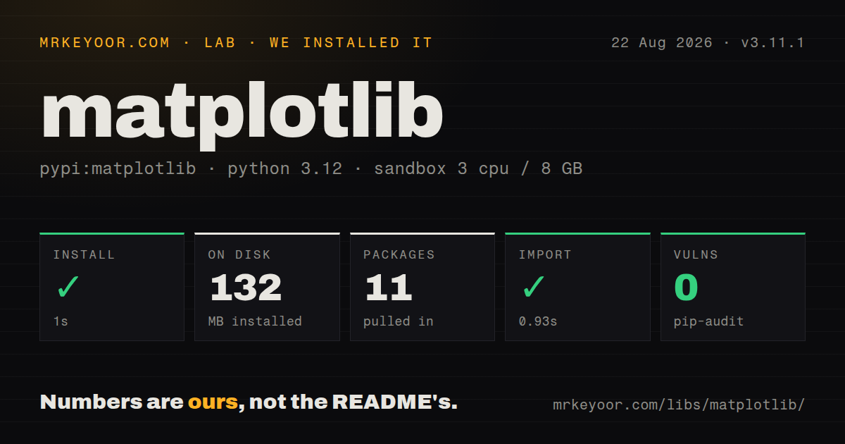
| Install | ✓ · 1s | 11 packages on disk · 132 MB |
| Import | ✓ | import matplotlib in 0.93s · compiled extensions · py.typed · requires Python >=3.11 |
| Known vulns | 0 | (pip-audit) |
Answers from our run
Does matplotlib install cleanly?
Yes. In a fresh container with an empty cache, pip install matplotlib finished in 1 seconds, leaving 11 packages and 132 MB on disk. pip-audit reported no known vulnerabilities.
What does matplotlib need to run?
Python >=3.11, and a platform wheel with compiled extensions. In our run import matplotlib succeeded in 0.93s, and the package ships py.typed for type checkers.
matplotlib or seaborn: which should you use?
seaborn: Use it for compact statistical graphics and DataFrame-aware defaults, then drop to Matplotlib only for final edits. Matplotlib 3.11.1 installed in 1 second but left 132 MB across 11 packages, and its first import took 0.93 seconds in our sandbox.
When should you not use matplotlib?
The deliverable is an interactive browser chart with hover labels, linked selection, and client-side zoom. Plotly or Bokeh supplies those interactions directly.
Discussed on
- hnArs Technica makes up quotes from Matplotlib maintainer; pulls story555 points
- hnEffectively Using Matplotlib375 points
- hnXkcd-Style Plots in Matplotlib (2012)325 points
- hnJohn Hunter [matplotlib.sourceforge.net] has died.324 points
- hnAn open access book on scientific visualization using Python and Matplotlib309 points
Use it if
- Reports or papers require exact axes, ticks, annotations, fonts, dimensions, and static export formats.
- A Python library needs a plotting foundation that higher-level packages can customize through Figure, Axes, and Artist objects.
- The same plotting code must run in notebooks, scripts, headless jobs, or supported desktop GUI toolkits by changing backends.
- NumPy or pandas data needs chart types and layout control beyond the defaults of a statistical wrapper.
- The deliverable is an interactive browser chart with hover labels, linked selection, and client-side zoom. Plotly or Bokeh supplies those interactions directly.
- The task is exploratory statistical plotting from tidy DataFrames. Seaborn expresses distributions and categorical comparisons with less manual styling.
- The runtime is Python 3.10 or older. Matplotlib 3.11.1 requires Python 3.11 or newer.
- A short-lived function cannot absorb 132 MB across 11 installed packages. Our wheel also contained compiled extensions, which adds platform constraints beyond pure Python.
- Several threads will modify shared artists or open GUI windows. Matplotlib does not promise thread safety, and GUI event loops generally belong on the main thread.
Setup reality
We installed Matplotlib 3.11.1 in a fresh Python 3.12 Bookworm container in 1 second. The environment ended with 11 packages using 132 MB. Matplotlib declares 9 direct dependencies, requires Python 3.11 or newer, ships compiled .so extensions, and includes py.typed. pip-audit found 0 known vulnerabilities. A plain import matplotlib completed in 0.93 seconds in our sandbox.
No account or credential is involved. Backend selection is the first deployment choice. Notebook integrations usually select one automatically; a server job should set MPLBACKEND=Agg or call matplotlib.use('Agg') before importing pyplot. Importing pyplot can choose and initialize a backend too early. The first render also creates a font cache, so read-only containers need MPLCONFIGDIR pointed at a writable, persistent directory.
Use fig, ax = plt.subplots() and keep those references in application code. Pyplot's current-figure state is convenient at a prompt but becomes confusing inside services and libraries. Close finished figures with plt.close(fig) in loops, workers, and request handlers, or image buffers and pyplot managers accumulate. Text output may shift after the 3.11 font-stack overhaul, so image-snapshot tests should compare with a justified tolerance instead of requiring identical pixels.
Matplotlib is not thread-safe. Lock any shared Figure or Artist, keep GUI calls on the main thread, and prefer separate processes for concurrent batch rendering. The project uses its own permissive license agreement rather than a short SPDX label. Redistribution must retain its license and copyright notice; modified redistributed versions also need a short change summary, while bundled fonts and native libraries keep their separate notices.
Patterns
Draw and label two series plot-labelled-lines
import matplotlib.pyplot as plt
import numpy as np

x = np.linspace(0, 2 * np.pi, 200)
fig, ax = plt.subplots()
ax.plot(x, np.sin(x), label='sin(x)')
ax.plot(x, np.cos(x), label='cos(x)')
ax.set(xlabel='radians', ylabel='value')
ax.legend()
plt.show()
Keep the Axes object. Later tick, annotation, and scale changes should target `ax` instead of implicit pyplot state.
Export PNG and SVG files save-raster-and-vector
import matplotlib.pyplot as plt

fig, ax = plt.subplots(figsize=(7, 4))
ax.plot([1, 2, 3], [4, 2, 5])
fig.savefig('chart.png', dpi=200, bbox_inches='tight')
fig.savefig('chart.svg', bbox_inches='tight')
plt.close(fig)
DPI affects raster output such as PNG. SVG stays vector, while `bbox_inches='tight'` recalculates the saved bounding box.
Select a headless backend render-without-display
import matplotlib
matplotlib.use('Agg')
import matplotlib.pyplot as plt

fig, ax = plt.subplots()
ax.plot(range(10))
fig.savefig('/tmp/output.png')
plt.close(fig)
Select `Agg` before importing pyplot. `MPLBACKEND=Agg` is often simpler in containers and scheduled jobs.
Create a shared 2 by 2 grid arrange-shared-subplots
import matplotlib.pyplot as plt

fig, axes = plt.subplots(2, 2, figsize=(9, 7), sharex=True, squeeze=False)
axes[0, 0].plot(x, first)
axes[0, 1].scatter(x, second, s=12)
axes[1, 0].hist(first, bins='auto')
axes[1, 1].bar(labels, counts)
fig.suptitle('Run summary')
fig.tight_layout()
With `squeeze=False`, the result remains a 2-dimensional Axes array even when a configurable grid shrinks to one row or column.
Format monthly date ticks plot-datetime-series
import matplotlib.dates as mdates
import matplotlib.pyplot as plt

fig, ax = plt.subplots()
ax.plot(dates, totals)
ax.xaxis.set_major_locator(mdates.MonthLocator())
ax.xaxis.set_major_formatter(mdates.DateFormatter('%b %Y'))
fig.autofmt_xdate()
Use datetime objects or NumPy datetime64 values. Plain strings create categorical positions and bypass date locators.
Map values to point colors add-scatter-colorbar
import matplotlib.pyplot as plt

fig, ax = plt.subplots()
points = ax.scatter(x, y, c=temperature, cmap='viridis', s=24)
fig.colorbar(points, ax=ax, label='temperature (C)')
Pass the scatter return value to `colorbar()`. It carries the normalization and colormap used for those points.
Point text at one data value annotate-observation
import matplotlib.pyplot as plt

fig, ax = plt.subplots()
ax.plot(x, y)
ax.annotate(
    'deployment',
    xy=(x[8], y[8]),
    xytext=(12, 24),
    textcoords='offset points',
    arrowprops={'arrowstyle': '->'},
)
Here `xy` uses data coordinates and `xytext` uses display-point offsets. Naming `textcoords` keeps the label placement predictable.
Plot values on a log axis use-logarithmic-scale
import matplotlib.pyplot as plt

fig, ax = plt.subplots()
ax.plot(epochs, losses)
ax.set_yscale('log')
ax.set_xlabel('epoch')
ax.set_ylabel('loss')
ax.grid(which='both', alpha=0.25)
A log scale cannot represent zero or negative values. Filter or choose a different scale when the data crosses zero.
Format large y-axis numbers customize-ticks
import matplotlib.pyplot as plt
from matplotlib.ticker import FuncFormatter

fig, ax = plt.subplots()
ax.bar(labels, values)
ax.yaxis.set_major_formatter(FuncFormatter(lambda value, _: f'{value / 1_000_000:.1f}M'))
A formatter changes labels only. The plotted values and axis limits remain in their original units.
Scope a style to one figure apply-temporary-style
import matplotlib.pyplot as plt

with plt.style.context('dark_background'):
    fig, ax = plt.subplots()
    ax.plot(x, y, color='cyan')
    fig.savefig('dark.png')
    plt.close(fig)
`plt.style.use()` changes process-wide rcParams. A style context restores the previous settings when its block exits.
Display an image with a fixed range render-image-array
import matplotlib.pyplot as plt

fig, ax = plt.subplots()
image = ax.imshow(matrix, cmap='magma', vmin=0, vmax=100, interpolation='nearest')
fig.colorbar(image, ax=ax, label='score')
ax.set_axis_off()
Fixed `vmin` and `vmax` keep colors comparable across several images. Automatic normalization can assign the same color to different values.
Release figures inside a render loop close-batch-figures
import matplotlib.pyplot as plt

for report in reports:
    fig, ax = plt.subplots()
    ax.plot(report.x, report.y)
    fig.savefig(report.output_path, dpi=150)
    plt.close(fig)
Pyplot retains managed figures until they are closed. Batch workers should close each Figure after saving it.
Alternatives
| Package | Registry | Pick it when |
|---|---|---|
| seaborn | PyPI | Use it for compact statistical graphics and DataFrame-aware defaults, then drop to Matplotlib only for final edits. |
| plotly | PyPI | Use it when browser hover, zoom, selection, animation, or Dash integration is part of the requirement. |
| altair | PyPI | Use it when a declarative Vega-Lite chart specification is easier to review than a sequence of drawing calls. |
| bokeh | PyPI | Use it for linked browser plots and Python-backed interactive dashboards without writing the frontend interaction layer. |
More data guides
numpy · fsspec · pandas · pyarrow · sqlalchemy · s3fs · the whole shelf →
How this guide is made: grounded in the library's documentation, release notes, changelog, and issue history, on a fixed rubric — not a hands-on install of every release. The 50 most-downloaded entries are additionally install-verified in clean containers. Corrections: contact the desk.