altair review
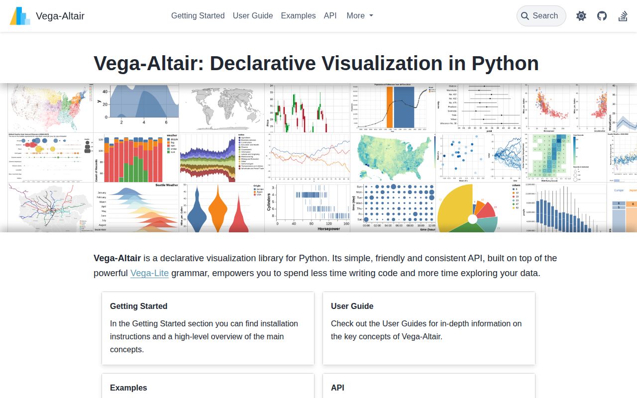
Altair 6.2.2 is a Python interface for writing Vega-Lite 6 chart specifications. A chart maps table columns to visual channels such as position, color, size, and tooltip, then a Vega-Lite renderer draws it. That division is useful in notebooks and in systems that store or send chart JSON. Release 6.2.2 fixes duplicate view names in layered concatenations and restores selection parameters inside those nested views. Our Python 3.12 check also found a typed, pure-Python package whose basic import worked.
Altair 6.2.2 installed in 0.3 seconds and occupied 12 MB in our sandbox, with a working 1.02-second import and 0 audit findings. Install it when a portable Vega-Lite 6 specification is the deliverable; choose a canvas-first or server-callback tool when the browser grammar becomes the constraint.
We installed it
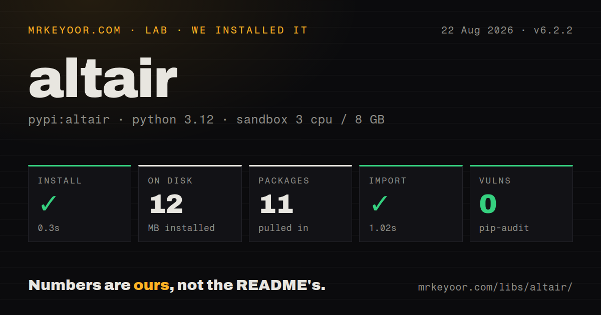
| Install | ✓ · 0.3s | 11 packages on disk · 12 MB |
| Import | ✓ | import altair in 1.02s · pure Python · py.typed · requires Python >=3.10 |
| Known vulns | 0 | (pip-audit) |
Answers from our run
Does altair install cleanly?
Yes. In a fresh container with an empty cache, pip install altair finished in 0.3s, leaving 11 packages and 12 MB on disk. pip-audit reported no known vulnerabilities.
What does altair need to run?
Python >=3.10, and nothing compiled: it is pure Python. In our run import altair succeeded in 1.02s, and the package ships py.typed for type checkers.
altair or plotly: which should you use?
plotly: Use it when 3D traces or a Dash server callback is part of the product. Altair 6.2.2 installed in 0.3 seconds and occupied 12 MB in our sandbox, with a working 1.02-second import and 0 audit findings.
When should you not use altair?
Your main output is PNG, SVG, or PDF. Those formats need the optional vl-convert-python dependency, while HTML works from the base install.
Use it if
- You want charts saved as Vega-Lite JSON or standalone HTML instead of pixels drawn directly by Python.
- Your notebook needs linked brushing, legend selection, faceting, or input-bound parameters that can run in the browser.
- Your analysis starts with pandas, Polars, PyArrow, or another supported tabular object and column encodings fit the job.
- A frontend already renders Vega-Lite 6 and needs chart specifications produced by a Python service.
- Your main output is PNG, SVG, or PDF. Those formats need the optional vl-convert-python dependency, while HTML works from the base install.
- You need to embed an unaggregated table above Altair's 5,000-row default. The data transformer raises MaxRowsError unless you reduce, externalize, or transform the data.
- The design calls for 3D plots, freehand canvas drawing, Sankey diagrams, or another geometry Vega-Lite does not define. Altair has no artist-level drawing fallback.
- Clicking a mark must immediately execute application code in Python outside Jupyter. Browser selections do not call a server, and JupyterChart callbacks require a live kernel plus anywidget.
- You need physical print dimensions and exact placement of every label or line. Altair uses the browser and Vega-Lite layout rules rather than a figure canvas with individual artists.
Setup reality
Our install of Altair 6.2.2 finished in 0.3 seconds in a fresh Python 3.12 container. It left 11 packages and 12 MB on disk. pip-audit reported 0 known vulnerabilities, and import altair completed in 1.02 seconds. The package is pure Python, requires Python 3.10 or newer, ships py.typed, and its metadata listed 47 direct dependencies.
A base install can build a specification and write HTML. Static PNG, SVG, and PDF output goes through vl-convert-python, normally added with the save extra. JupyterChart uses anywidget when a selection or variable must be observed from Python. In a normal script, call save() or show() because leaving a chart as the final expression only displays it in a supported interactive environment.
The default data transformer serializes rows into the chart specification and stops above 5,000 rows with MaxRowsError. That limit applies before the browser performs a Vega-Lite aggregation. Pre-aggregate in Python, point the specification at a URL, or install VegaFusion for supported pre-transforms. Simply disabling the limit can copy a large table into every saved HTML file or notebook output.
Altair 6 emits Vega-Lite 6 specifications, so a separately pinned web renderer must understand that schema version. Parameters and ordinary selections run as Vega expressions in JavaScript. Release 6.2.2 matters for dashboards that combine layering with horizontal or vertical concatenation: it fixes colliding generated view names and makes nested layered views participate in selection parameters.
Patterns
Encode columns in a scatter plot make-scatter-plot
import altair as alt

chart = (
    alt.Chart(cars)
    .mark_point()
    .encode(
        x=alt.X('Horsepower:Q'),
        y=alt.Y('Miles_per_Gallon:Q'),
        color=alt.Color('Origin:N'),
        tooltip=['Name:N', 'Year:T'],
    )
    .properties(width=520, height=300)
)
chart.save('cars.html')
The `Q`, `N`, `O`, and `T` suffixes select quantitative, nominal, ordinal, and temporal field types. A mistaken suffix changes grouping and scale behavior as well as labels.
Aggregate rows in Vega-Lite aggregate-bars
bars = alt.Chart(cars).mark_bar().encode(
    x=alt.X('mean(Miles_per_Gallon):Q', title='Average MPG'),
    y=alt.Y('Origin:N', sort='-x'),
)
`mean(...)` runs after the rows reach Vega-Lite. The source rows still enter the specification and count against the 5,000-row default limit.
Shrink data before chart construction preaggregate-data
summary = (
    sales.groupby('category', as_index=False)
    .agg(amount=('amount', 'sum'))
)

chart = alt.Chart(summary).mark_bar().encode(
    x='category:N',
    y='amount:Q',
)
Pre-aggregation reduces the rows serialized into JSON. Keep the transform in Vega-Lite only when the browser needs access to the original records.
Combine a line with highlighted points layer-charts
base = alt.Chart(stocks).encode(x='date:T', y='price:Q')
line = base.mark_line(color='steelblue')
points = base.mark_circle(size=36, color='navy')

combined = (line + points).resolve_scale(y='shared')
Layered views share scales unless you resolve them differently. Apply top-level configuration after composition because child views cannot own every Vega-Lite config property.
Filter one view with a brush link-brush-filter
brush = alt.selection_interval()

scatter = (
    alt.Chart(cars)
    .mark_point()
    .encode(
        x='Horsepower:Q',
        y='Miles_per_Gallon:Q',
        color=alt.when(brush).then('Origin:N').otherwise(alt.value('lightgray')),
    )
    .add_params(brush)
)

counts = (
    alt.Chart(cars)
    .mark_bar()
    .encode(x='count():Q', y='Origin:N')
    .transform_filter(brush)
)

scatter & counts
`add_params(brush)` must be attached to the view that receives the pointer gesture. The dependent filter has no selection state without it.
Turn a legend into a selector bind-legend
picked = alt.selection_point(fields=['Origin'], bind='legend')

chart = (
    alt.Chart(cars)
    .mark_point()
    .encode(
        x='Horsepower:Q',
        y='Miles_per_Gallon:Q',
        color='Origin:N',
        opacity=alt.when(picked).then(alt.value(1)).otherwise(alt.value(0.1)),
    )
    .add_params(picked)
)
Legend-bound selection executes in the renderer. It still works in standalone HTML because it does not need a Python callback.
Chart a Polars result pass-polars-frame
import altair as alt
import polars as pl

events = pl.read_parquet('events.parquet')
daily = events.group_by('day').len()

chart = alt.Chart(daily).mark_bar().encode(
    x='day:T',
    y='len:Q',
)
Altair accepts the Polars dataframe interchange path, but explicit field types remain useful for categorical values, time zones, and durations.
Write interactive and static output save-chart
chart.save('chart.html')
chart.save('offline.html', inline=True)

# pip install 'altair[save]'
chart.save('chart.png', scale_factor=2)
chart.save('chart.svg')
HTML saving works in the base package. PNG and SVG call the optional static conversion backend, while `inline=True` puts renderer assets into the HTML file.
Register a project theme register-theme
@alt.theme.register('house', enable=True)
def house() -> alt.theme.ThemeConfig:
    return {
        'config': {
            'view': {'continuousWidth': 480, 'continuousHeight': 300},
            'axis': {'grid': False, 'labelFontSize': 12},
        }
    }
Theme dictionaries use Vega-Lite camelCase property names. A misspelled key fails schema validation rather than becoming a Python attribute.
Inspect generated Vega-Lite JSON inspect-spec
spec = chart.to_dict()
json_text = chart.to_json(indent=2)
restored = alt.Chart.from_dict(spec)

# Diagnostic escape hatch only
unvalidated = chart.to_dict(validate=False)
Inline data is present in the returned dictionary. Treat exported specifications as data files when checking privacy, storage, and review diffs.
Observe a brush in Jupyter observe-selection-python
brush = alt.selection_interval(name='brush')
chart = alt.Chart(cars).mark_point().encode(
    x='Horsepower:Q',
    y='Miles_per_Gallon:Q',
).add_params(brush)

jchart = alt.JupyterChart(chart)

def on_brush(change):
    print(change.new)

jchart.selections.observe(on_brush, ['brush'])
jchart
`JupyterChart` requires anywidget and a running kernel for Python observers. A saved HTML copy keeps the brush but cannot call `on_brush`.
Join data into a TopoJSON map make-choropleth
counties = alt.topo_feature(alt.Data(url=topology_url), 'counties')

chart = (
    alt.Chart(counties)
    .mark_geoshape()
    .encode(color=alt.Color('rate:Q', scale=alt.Scale(scheme='blues')))
    .transform_lookup(
        lookup='id',
        from_=alt.LookupData(rates, 'id', ['rate']),
    )
    .project(type='albersUsa')
)
The second argument to `topo_feature` must match an object stored in the topology. A wrong object name can leave the map empty before a useful Python error appears.
Alternatives
| Package | Registry | Pick it when |
|---|---|---|
| plotly | PyPI | Use it when 3D traces or a Dash server callback is part of the product. |
| matplotlib | PyPI | Use it for print figures, custom geometry, or control over individual artists. |
| seaborn | PyPI | Use it for statistical defaults that should produce a matplotlib figure. |
| bokeh | PyPI | Use it when widgets need a persistent Python server session. |
More data guides
numpy · fsspec · pandas · sqlalchemy · pyarrow · lxml · the whole shelf →
How this guide is made: grounded in the library's documentation, release notes, changelog, and issue history, on a fixed rubric — not a hands-on install of every release. The 50 most-downloaded entries are additionally install-verified in clean containers. Corrections: contact the desk.