
Short answer: use it for an interface you will connect yourself
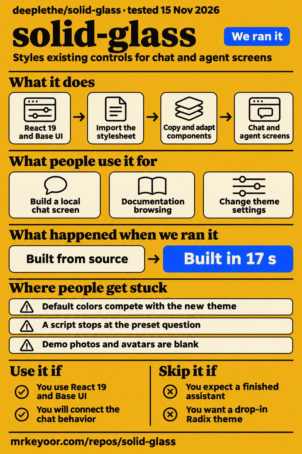
DeepLethe's Solid Glass is a stylesheet and component set for React 19, Tailwind CSS 4 and shadcn/ui's Base UI components. Our sandbox installed the repository in 46 seconds and built it in 17 seconds. Use it if that is your application stack and you want to own the resulting interface code. Skip it if you want a finished assistant, a drop-in Radix theme or a broad marketing-page kit.
The adoption decision is whether you need the surface and controls of an agent interface. The README names a composer, status line, tool steps, diff view and decision card, alongside other components. Those pieces give an existing application a consistent presentation. Choosing how messages reach a model and how tool actions run is a separate application decision. DeepLethe's component descriptions
What people use solid-glass for
TeezStack used Solid Glass for a local chat screen, documentation browsing and theme customization; DeepLethe supplies a copyable agent-workspace block.
| Who used it | What they did | Recorded outcome |
|---|---|---|
| TeezStack's lab | Combined Composer, StatusGlyph and Button in a new Vite application using Base UI and Nova. | Pressing Enter submitted a local message. Chat experiment |
| TeezStack's lab | Opened the home page, Blocks, documentation and Create page, then typed into the workspace. | Those pages worked, and the workspace accepted typing as a static demonstration. Documentation experiment |
| TeezStack's lab | Switched the Create page to light mode. | The preview changed immediately, and Get Code supplied the changed CSS variables. Theme experiment |
| The project authors | Supplied an agent-workspace example. | The README presents whole screens that developers can inspect and copy. Upstream blocks |
The chat experiment gives a developer a concrete starting point: named components assembled in a fresh application, with Enter submitting text. TeezStack identifies its checkout as commit 387c3c2, package version 0.1.0. Our repository build used commit 6e8903e. Keeping those identities beside their respective results makes it possible to distinguish a reported component interaction from our later source-build result. TeezStack's checkout and experiment
The Create experiment answers a different practical question: how to change the appearance before editing individual screens. TeezStack changed the theme and copied variables from the same page. The README also describes controls for thickness, tint, chart color, type, radius, rim and blur. That workflow suits a developer choosing a shared material treatment before adjusting individual component layouts. Create workflow
What happened when we ran it
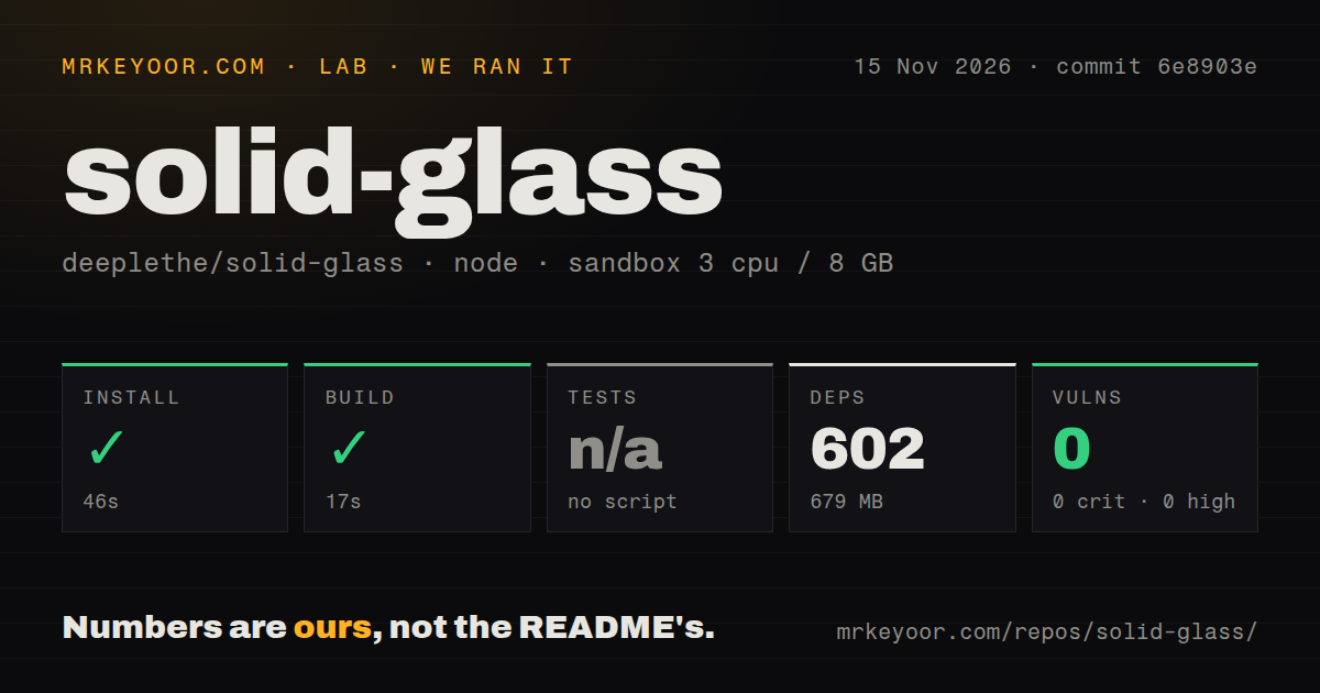
Our npm sandbox run at commit 6e8903e on November 15, 2026 installed successfully in 46 seconds and built successfully in 17 seconds.
| Recorded check | Our result | What it tells you |
|---|---|---|
| Installation | Succeeded in 46 seconds | The recorded repository setup completed. |
| Dependencies | 602 recorded, 679 MB on disk | This is the installed development checkout's footprint. |
| Build | Succeeded in 17 seconds | The recorded build step completed. |
| Tests | No tests script or target, skipped | No automated test suite ran. |
| npm audit | 0 known vulnerabilities, including 0 critical, 0 high, 0 moderate and 0 low | The audit returned no known advisories for this installation. |
| Repository scan | 771 files, approximately 46,836 source lines, 2.9 MB checked out | The checkout includes the site, documentation and supporting files. |
| Delivery signals | 2 CI workflow files, no Dockerfile, no tests directory | These are recorded repository contents. |
Our measurement setup recorded 3 CPUs, 8 GB RAM and image label lab-node:22. The installed checkout occupied 679 MB, while the source checkout occupied 2.9 MB. These figures describe different stages of the development checkout. The README's directory inventory explains why the repository contains more than a stylesheet: it also includes the documentation, site, examples, blocks and registry-building scripts.
A separate hands-on deployment attempt stopped at its safety check because no Compose file existed. The failed step names all four absent candidates: compose.yaml, compose.yml, docker-compose.yaml and docker-compose.yml. That runner required a Compose file before continuing. The result is a failed prerequisite in the deployment procedure; the npm build above followed a different path.
The attempt also contains a summary saying deployment used its own Docker Compose on our lab server with every port bound to 127.0.0.1. Its detailed step instead records failure before deployment, and its teardown says teardown: ok. Both records belong in the account: the summary conflicts with the failed step, while cleanup has its own recorded outcome.
Where people get stuck: CSS ownership and the starting stack
The README requires Solid Glass's stylesheet after Tailwind and shadcn's styles, with the generated root and dark color variables removed because the names overlap.
| Symptom or decision | Evidence | Useful response |
|---|---|---|
| Default colors compete with the new theme | The README says both define the same color variable names. | Follow its import order and remove the generated color variables it identifies. |
| An existing app uses Radix-based shadcn components | The documented target is React 19, Tailwind CSS 4 and Base UI. | Compare the existing stack with that target before changing its styles. |
| A script stops at the preset question | TeezStack reports that shadcn init stopped without a terminal. | Its recorded workaround was to pass -p nova. |
| Demo photos or avatars are blank | TeezStack says its sandbox blocked the external image hosts. | Check access to the Unsplash and GitHub assets. |
| StatusGlyph looks smaller than expected | TeezStack describes its default drawing as small. | Its suggested adjustment is a size through className. |
The preset prompt is a specific snag with a reported workaround. TeezStack reached an interactive question in an environment without a terminal, then supplied the Nova preset explicitly. Its report also describes empty demo images and a small default StatusGlyph. Keeping those observations separate helps a developer distinguish command-line setup, network access to sample assets and an intentional component size. TeezStack's setup observations
CSS ownership is the more consequential integration step. The README says the theme finds component parts through their existing data-slot attributes and classes, and defines shadcn/ui's color-variable names. Import order and variable replacement therefore belong in the adoption work. OpenSourceDrop also explicitly identifies older Radix-based applications as a different starting point from the documented Base UI setup. README installation, target-stack explanation
The glass treatment keeps its finish near the edges
The authors describe Solid Glass through edge highlights, fine borders and soft shadows, with limited background visibility on text-heavy screens.
The README positions the material between flat design and liquid glass. Its explanation connects restrained transparency with reading changing information, including streamed responses, agent activity and requests for human input. Treat that as the authors' reason for the design. For a developer, the useful implementation detail is that a shared stylesheet applies the treatment to existing component parts. Design and implementation rationale
The supplied video extract introduces a move from software waiting for clicks to autonomous AI agents requiring supervision. It contrasts that with SaaS interfaces designed to display static database records and predictable, user-initiated state transitions. That introduction supplies context for the agent-interface problem discussed here. The README provides the concrete evidence about Solid Glass's material, installation and components. Video introduction
For an application evaluation, put the theme around the screen you expect to ship: a conversation containing tool results or a decision request. The README's component list gives you those building blocks, and its workspace gives you a larger composition to inspect. Compare the resulting screen with your product's existing presentation before committing to a shared stylesheet across every view.
A clean dependency audit is one recorded setup result
Our npm audit returned zero known vulnerabilities across critical, high, moderate and low severities in the November 15 installation.
The repository also contains two CI workflow files, and the README identifies checks and publication workflows. Those are useful facts when examining how the project is maintained. The audit result, repository scan and successful build answer different questions, so the review keeps them separate rather than folding them into a general assurance about application quality or readiness.
TeezStack reports seven high-severity advisories in the documentation site's dependencies at its different checkout. It also reports an ineffective dynamic import warning during its project build. These are attributed findings from that review, alongside its successful typecheck and build observations. Keeping the warning and advisory report visible preserves the installation record rather than presenting only its successful steps. TeezStack's project checks
Solid Glass vs Tailwind Plus, assistant-ui and AI Elements
TeezStack describes Solid Glass as a partial paid-kit replacement for chat and agent interfaces, with a narrower scope than a broad section library.
| Alternative | TeezStack's description | Selection question |
|---|---|---|
| Tailwind Plus / Tailwind UI | A broader collection of marketing and application sections than Solid Glass's own offering. | Do you need agent controls or a wider range of page sections? |
| assistant-ui | React chat components with model API wiring. | Is connecting chat behavior the main requirement? |
| Vercel AI Elements | shadcn-based AI components intended to work with the AI SDK. | Is your application organized around the AI SDK? |
| Stock shadcn/ui themes and presets | A flatter appearance using the same components. | Do ordinary shadcn surfaces fit your product? |
These descriptions come from TeezStack's alternatives discussion. They give you a shortlist organized by the work your application needs. Solid Glass's own README supplies its specific selection case: a material stylesheet over shadcn/ui component parts, plus controls for agent-oriented screens. Start with the required behavior and page types, then choose the visual treatment around them.
The practical distinction is between adding a visual system to existing application behavior and choosing components because they supply behavior you need. A team with message handling already in place can evaluate Solid Glass around that flow. A team still selecting its chat integration should settle that dependency alongside the interface choice, using the relevant project's documentation before implementation.
Avoid the naming collision and resource-footprint confusion
DeepLethe's repository documents a shadcn registry installation; the supplied iplanwebsites repository documents a different package installed with npm install solid-glass.
Use the full owner and repository name when following installation instructions. The iplanwebsites README describes effects using CSS, SVG filters and physics-based refraction. DeepLethe's README describes a stylesheet targeting shadcn/ui component parts. The shared name does not make their commands interchangeable, and the package installation in the other README is not DeepLethe's documented registry route. Other repository's README, DeepLethe installation
Resource figures also need their original labels. TeezStack explains that its headline footprint includes Docker and development tooling. Our 679 MB figure describes the installed development checkout. Read those as setup footprints, alongside the repository contents and tools included in each measurement. A developer estimating delivery size should begin with the assets produced by their application rather than reuse a checkout or container footprint.
Questions people ask
TeezStack calls Solid Glass a partial replacement for paid UI kits when the intended screen is a shadcn chat or agent interface.
Can Solid Glass replace Tailwind Plus or Tailwind UI?
TeezStack says partly: it distinguishes chat and agent components from a paid kit's broader collection of marketing and application sections. That is a useful way to frame the buying decision. List the screens you need and compare that list with the supplied components and workspace, rather than treating a consistent material finish as a substitute for every page layout. Paid-kit comparison
Should a Solid Glass PowerPoint generator live in this repository or a separate companion project?
Maintainer WaylandYang recommends a separate companion project in issue #60. The request is an exploratory proposal for reusable, editable presentation templates. The response explains that a generator would have no CSS, React or registry item in common with this repository, and would need a presentation-file library, its own checks and its own release cadence. Proposal and maintainer response
Which Solid Glass material characteristics should an editable presentation template preserve?
WaylandYang's response prioritizes the edge treatment: a top line of light, an outside hairline and a narrow downward shadow. It also calls for neutral glass, meaningful accent color and depth expressed through thickness. For presentation output, the maintainer recommends starting with the opaque version and preserving editable effects. These are recommendations in the proposal discussion. Maintainer's material guidance
How we scored the documented evaluation path
Setup receives 3/5 for the successful installation and build with explicit CSS configuration work; documentation receives 4/5 for its concrete adoption instructions.
These are editorial judgments using a visible scale: 1 means a documented blocking obstacle, 2 means substantial setup work left unresolved, 3 means a usable path with material work for the adopter, 4 means detailed support for the evaluated path, and 5 requires broader corroboration across that path. The setup score concerns the source-build and documented integration path described on this page.
Documentation earns its score from the README's target stack, registry commands, import order, color-variable replacement, component inventory and Create workflow. Community and maturity are N/A: the supplied scope discussion and workflow inventory are descriptive evidence, while the evidence needed to judge support capacity and production reliability belongs to a broader assessment. The numerical scores therefore cover setup and documentation only.
What we have not tested yet
Our run covers a source installation and build at commit 6e8903e, with tests skipped because no tests script or target existed.
We have not tested a live model connection, production deployment, controlled readability task or comparative browser-rendering workload. TeezStack explicitly describes its workspace as a static demo with no model connection. Its alternative descriptions are secondary-source leads, not our comparative tests or primary-source confirmation of those projects' capabilities. Its Windows and macOS instructions are also labeled untested in the supplied review.
The evidence does not establish keyboard coverage, screen-reader behavior, reduced-motion behavior, mobile layout quality or rendering cost for long conversations and simultaneous tool updates. The lab-node:22 image label does not establish actual runtime or operating-system versions; those require raw toolchain logs. An older Radix application's migration path also needs its own assessment against the documented React 19, Tailwind CSS 4 and Base UI target.
The contradictory Compose summary needs reconciliation before that attempt counts as a completed deployment. Its pack contains no completed known-answer tasks or screenshot records from the attempt. The supplied video extract supports only the introductory discussion retained above. The X material concerns other software rather than a Solid Glass browser measurement, and the supplied use cases contain no independent production-adoption evidence.
TeezStack's documentation dependency advisories have no recorded remediation, and matching dependency logs are needed to explain the difference from our zero-advisory result. An audit is a dated dependency result rather than an application-security assessment. Issue #60 remains a proposal, and no PowerPoint generator was exercised. Before adoption, connect a representative composer to your message handler and assess a long response, a failed request and a decision awaiting approval.