Short answer: try the tray in an app before choosing it
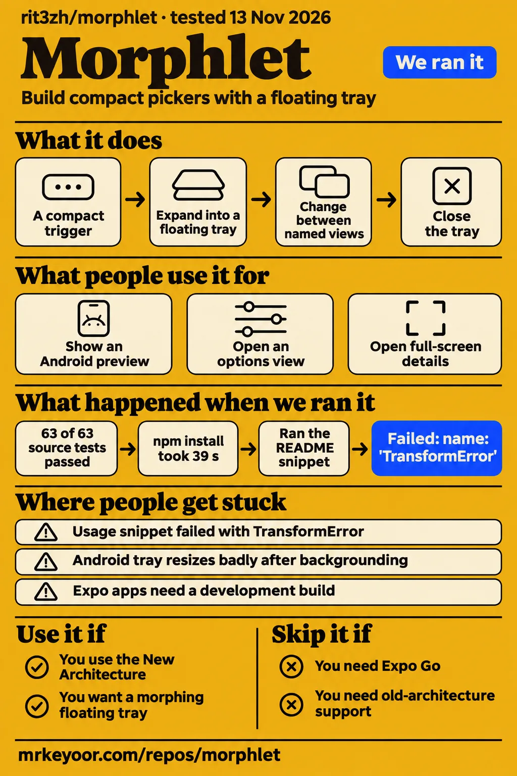
Our sandbox passed all 63 Jest tests, while the separate README Usage snippet attempt ended with TransformError. Use Morphlet if you already maintain a React Native app on the New Architecture and want a control that expands into a floating tray. Skip it if you need the old architecture, an Expo Go workflow, or evidence of a completed device evaluation before adding a native dependency.
The attraction is specific: the trigger can become the tray, and the tray can change between named views. That could suit a compact picker or an options panel better than a generic overlay. The README makes those controls explicit. My recommendation is to try that interaction on a real screen in your app before replacing an existing sheet. A passing JavaScript suite is useful evidence for working on the repository; the screen itself is the adoption decision.
What people use morphlet for
Project author rit3zh demonstrated a React Native floating tray and announced an Android preview alongside v0.1.2. The author's X announcement links directly to rit3zh/morphlet. The r/reactnative launch thread, posted by BumblebeeWorth3758, describes the same native, morphing tray and includes Android and TrayStack replies. The documented outcome is a demonstration, rather than a customer integration report.
| Who | What they shared | What the evidence supports |
|---|---|---|
| rit3zh | v0.1.2 announcement with an Android preview | A public preview of the tray, linked to the reviewed repository. Announcement |
| BumblebeeWorth3758 on r/reactnative | Launch video and replies labelled Android and Android (TrayStack) | A community introduction to the interaction. Launch thread |
A commenter named Grimmjowx9 wrote, "My app has 3k+ MAU I will check this out!" That is interest from an app developer. It is not a report that Morphlet serves those users. Another commenter, elrd5150, said it "feels native". Read that as a reaction to the post, not an independently instrumented performance result. Both comments are in the same Reddit record.
For your own app, the README's named-view example is a clearer starting point than the applause: an options view can open a details view, and the details view can be full screen. That is a concrete interaction to evaluate. The distinction between a preview and an integration matters because the latter has to coexist with navigation, changing content and the rest of your screen.
What happened when we ran it
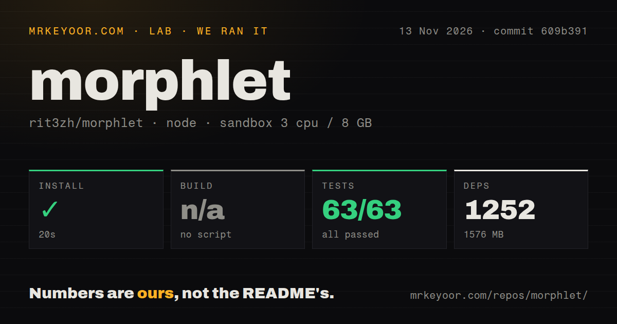
Our November 13, 2026 repository run installed successfully in 20 seconds and passed 63 of 63 Jest tests in 13 seconds at commit 609b391. The separate hands-on task took the README's Usage TSX block, unedited, and attempted to run it with tsx. That attempt failed with TransformError. The hands-on run record identifies commit 609b39181ce0, the task and its isolated container configuration.
| Repository harness step | Recorded result | What to take from it |
|---|---|---|
| Install | Succeeded in 20 seconds; 1,252 dependencies recorded; 1,576 MB on disk | This is the repository workspace footprint. |
| Build | Skipped: no build script or target | There is no successful build result to report. |
| Tests | Succeeded in 13 seconds; Jest reported 63 passed, 0 failed of 63 | The recorded suite passed. |
| Sandbox configuration | 3 CPUs, 8 GB RAM, image label lab-node:22 |
The label alone does not identify actual runtime or operating-system versions. |
The workspace scan found monorepo workspaces, one CI workflow file, no Dockerfile and no tests directory. The absence of a directory named tests plainly does not mean an absence of tests: Jest ran successfully. Likewise, a CI configuration file says a workflow exists, rather than proving its current status. The checkout contained 457 files, approximately 15,539 source lines and 8.9 MB of checked-out content. Those are repository observations, not the size of an app shipping Morphlet.
The README attempt stopped before a usable tray
The Usage snippet failed with TransformError, and the captured tail includes Node stream frames. Imagine following the short example because you want to see the Open button become a tray: our recorded attempt ended at transformation, before delivering that interaction. The failed step and finding describe that outcome. The tail supplies no actionable root cause or demonstrated fix.
That second task consumed the published npm package, whereas the harness worked on the repository. Its package-install step, installed-size record and dependency record describe that separate scope. Keep the workspace figures above attached to the workspace. The recorded hands-on environment had 2 CPUs and 4 GB RAM, no published ports and no secrets; its teardown completed successfully.
Where people get stuck: native setup and Android transitions
The README requires the New Architecture, Android API 24 or later, and an Expo development build. Those requirements should decide whether you proceed before you spend time adjusting springs. Its installation instructions include the package command and an iOS CocoaPods step. For an app deliberately staying on the old architecture, Morphlet asks for a platform change before it can solve a presentation problem.
| Situation | Source says | Useful next action |
|---|---|---|
| An existing app uses the old architecture | New Architecture is required | Decide whether an architecture migration is justified separately from choosing a tray. |
| An Expo project expects to use Expo Go | Use a development build | Evaluate through the documented development-build route. |
The lab Usage attempt stops at TransformError |
The snippet failed under tsx |
Retain the failure and collect the complete transform diagnostic before changing code. |
| An Android app backgrounds during permission changes | A contributor reports broken tray resizing in PR #2 | Reproduce that app transition with your own content and follow the proposed patch. |
The Android report is more useful than a vague claim of rough edges. In PR #2, its author describes a permissions tray, including location and battery-optimization flows that send the app to the background. They report that the tray then resizes badly and disrupts its contents. The contributor says their example fails before their patch and works after it. This is their reproduction and proposed fix, not a result from our sandbox.
PR #2 was open when inspected on November 14, 2026. Its author also says they had not noticed the issue on iOS. That observation belongs to their app and report. For an Android application that opens system settings from a tray, this is a reason to exercise the return-to-app path early, rather than spending the first evaluation session on the ideal opening animation.
The API covers changing views as well as opening a card
The README documents named views, full-screen content, stacking and explicit open-state controls. Tray.Root owns open state and the active view; Tray.Trigger opens the content, and Tray.Close closes it. Header and footer components sit around the body. A morph trigger is the option that grows the tray from its trigger, so the compact JSX example also describes the interaction's main selling point.
The view example uses defaultView="options", a named details view and setView('details'). The hook also lists goBack and canGoBack. For a picker with a second information screen, that gives you an API vocabulary to inspect before designing your own navigation inside an overlay. I would start with that small flow, using real labels and changing values, instead of building an elaborate nested tray immediately.
The same README lists morph, slide, fade and scale transitions, animation presets and custom springs. These are documented controls, not a speed ranking. Choose them for the behavior your screen needs. A content change while a tray is opening, or a selected value changing its trigger's width, is a more informative evaluation case than repeatedly opening an unchanged card.
The release addresses trigger behavior, not every Android report
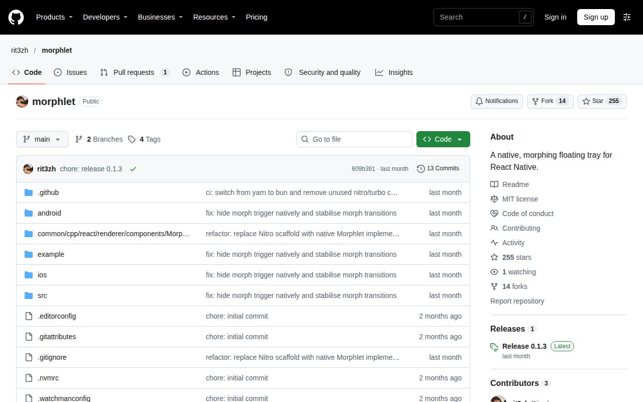
The v0.1.3 release notes describe native trigger hiding, fresh trigger snapshots on dismissal and resizing during an opening morph. The release page says native hiding prevents re-renders from flashing the trigger back into view. It also says the trigger snapshot and colour are captured again when dismissing, and that content changing size during opening settles to its new size.
Those details matter for a picker: selecting a different value changes what the button should show when the tray folds back. The release notes also introduce a Picker example. That makes it a sensible example to inspect for this use case, while keeping the maintainer's description separate from our own device results. None of the repository timings measures that animation.
The later PR #2 discusses backgrounding and Android resizing. Do not treat the earlier release's resizing description as a resolution of that later report. They describe different reproduction conditions. The useful question for an integration is whether its own content and app transitions work on the selected version, rather than whether a release heading sounds close to a reported problem.
Morphlet vs React Native Bottom Sheet and react-native-modal
React Native Bottom Sheet documents scrollable sheets and web support; react-native-modal documents an animated extension of React Native's Modal. Those are different starting points from Morphlet's trigger-to-tray interaction. The following comparison uses their primary READMEs to choose an evaluation candidate, with no comparative performance ranking.
| Project | Documented emphasis | Pick it for this requirement |
|---|---|---|
| Morphlet | Morphing trigger, named tray views, full-screen and stacked content | A compact control that opens into a changing floating tray. README |
| React Native Bottom Sheet | Dynamic sizing, FlashList, scrolling interactions and React Native Web | A sheet whose requirements center on scrollable content or web support. README |
| react-native-modal | Animated Modal extension, custom backdrops and visibility controlled through isVisible |
An animated overlay built around the familiar Modal model. README |
I would choose the presentation model before comparing animation settings. If your screen needs a scrollable bottom sheet, start with the project that explicitly documents that work. If the requirement is an overlay that appears and disappears, inspect react-native-modal's visibility and backdrop controls. Morphlet earns its place on the shortlist when the origin control and changing tray are part of the intended interaction.
These are not interchangeable API replacements. Morphlet's examples use compound tray components and named views; react-native-modal's example controls visibility through a boolean. A migration decision should include rewriting the actual screen, not merely exchanging imports. Keep your existing component until the replacement handles the screen's complete task.
Documentation earns a middle rating for a usable API map
The README documents platform requirements, compound components and named-view examples, earning documentation 3/5 on our editorial scale. For this dimension, 1 means insufficient instructions to identify an evaluation path, 3 means a concrete path and API map with execution questions still open, and 5 requires detailed instructions corroborated by our completed integration. Intermediate ratings describe evidence between those points, rather than measured product performance.
Setup, community and maturity stay unrated because the completed work does not support those judgments. That avoids turning a failed standalone snippet into a low native-setup score, or turning a passing JavaScript suite into a high reliability score. The documentation rating concerns the help a developer gets from the README; the final section collects the work needed for an adoption decision.
The other Morphlet is a desktop file converter
The desktop utility at the-mayankjha/morphlet is a separate project from rit3zh/morphlet. Its repository record describes local file conversion, PDF editing and document exports on desktop platforms. The reviewed project's README describes a React Native floating tray. The shared name is enough to send an unfamiliar reader toward instructions for the wrong software.
Check the repository owner before following a setup guide or interpreting a problem report. Desktop conversion-wheel behavior, desktop permissions and desktop application signing belong to that utility's evaluation. They say nothing about whether this React Native tray integrates into your app. Conversely, Morphlet's New Architecture requirement belongs to rit3zh's library and should not be attached to the desktop converter.
Questions people ask
Morphlet requires React Native's New Architecture, Android API 24 or later, and an Expo development build. Those are the README's explicit platform boundaries. With the name collision resolved, they are the quickest way to decide whether this is even a candidate for your project. The answers below use the library's primary README, rather than desktop-converter instructions.
Can I use Morphlet in Expo Go?
The README says to use an Expo development build. Choose that documented route for an evaluation. If your team intends to stay entirely in Expo Go, skip this library for that workflow. The instructions also require the New Architecture, so the Expo decision and architecture decision both come before trying the component example. Source: Morphlet README.
What Android version does Morphlet require?
The README specifies Android API 24 or later. That is a stated minimum, rather than a device compatibility result. Compare it with your app's supported platform range before adding the dependency. The Android preview shows what the author presented, while the API requirement tells you which platform boundary the documentation sets. Source: Morphlet README.
Is Morphlet open source, and what licence does it use?
Morphlet's README identifies the licence as MIT. That answers the library's stated licensing question; it does not change the native setup requirements. Read the repository's licence before distributing your application, and keep the exact owner name in your dependency notes so a later audit does not confuse it with the desktop utility. Source: Morphlet README.
What we have not tested yet
Our evidence stops at the repository checks and the failed standalone Usage attempt; we have not completed a native iOS or Android app evaluation. There is no measured frame rate, animation latency, battery impact or app-bundle contribution here. The 1,576 MB workspace figure is not a mobile download size, a memory requirement or an estimate of the package's contribution to your app.
We did not reproduce PR #2, evaluate its patch, or test backgrounding through system permission screens. We also did not assess screen-reader focus, large text, keyboard interaction, reduced motion, repeated presentation under load or changing orientation. The README labels title and description components as accessible text, but that documentation is not an accessibility audit of a complete tray flow.
The quickstart record's transform tail does not establish a package defect or an environment cause. Complete diagnostics and a supported native reproduction are needed to distinguish them. The container image label supplies no actual toolchain-version proof. No security audit or network inspection accompanies these runs; the README's installation and usage sections name no hosted service credentials, which is narrower than a privacy guarantee.
The supplied community records show demonstrations and interest, not a named production adoption result. We have no support-response assessment, and the video records contain no usable transcript for attributing an independent walkthrough. For an adoption decision, the next useful result is your own picker opening, changing value and closing correctly, followed by the Android return-from-settings path if your app uses it.