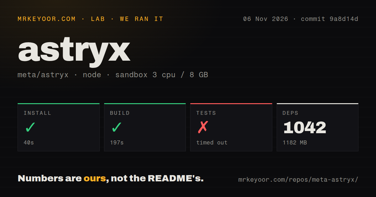
Astryx built in our sandbox, but its tests reached the 900-second limit without finishing. For a team choosing components, that supports an application trial with an unfinished verification record. The first adoption question is simpler: are you already on React 19, and can your release policy accommodate a beta design system?
React 19 is a requirement, while StyleX stays behind the CSS
The Astryx README requires React 19 or later, with react and react-dom as Core peer dependencies. A product staying on React 18 has a concrete reason to choose another library. Component breadth won't resolve an unsupported starting point.
For supported applications, the documented consumer path imports prebuilt CSS and uses typed React components. It calls for Core, a theme and StyleX among the packages, but says the simplest integration needs no build plugin or PostCSS or Babel configuration. Although Astryx authors its styles with StyleX, consumers can override through className using plain CSS, CSS modules or Tailwind. That's a useful distinction for a team with existing styling conventions.
Themes use CSS custom property overrides. Changing the theme therefore needn't mean copying each component's implementation. The README also exposes a more involved escape: swizzle copies a component's full source into your project. Choose that when you want ownership of the implementation, then budget for maintaining the copy. It doesn't establish automatic synchronization with later upstream fixes.
What happened when we ran it
Our Astryx workspace installed in 40 seconds and built in 197 seconds at commit 9a8d14d on November 6, 2026. The pnpm run recorded 1,042 dependencies and 1,182 MB on disk. Tests timed out after 900 seconds. We have no completed suite result or exhaustive passing count to report.
The final output showed successful individual checks around CLI query handling, theme-family output and agent-document path safety. Paths included packages/cli/api/theme/build/build.family.test.mjs and packages/cli/foundation/agent-docs/agent-docs.path-safety.test.mjs. That establishes progress through those checks, not a complete pass. The tail doesn't identify which remaining work prevented completion, so attributing the timeout to a particular package or resource shortage would be guesswork.
The recorded configuration specified 3 CPUs, 8 GB RAM and image lab-node:22. That label does not verify the actual Node or operating-system version. The checkout contained 9,736 files, approximately 1,892,559 source lines and occupied 356.4 MB. The scan found monorepo workspaces and 22 CI workflow files, without a Dockerfile or tests directory detected. The visible test paths show why that directory scan cannot establish an absence of tests.
These measurements concern the contributor workspace. They don't tell you the installed size or downloaded JavaScript of an app using a few published components. We also didn't measure browser responsiveness, keyboard behavior or accessibility. A successful repository build leaves those application questions open.
Lab and chart packages have different publication boundaries
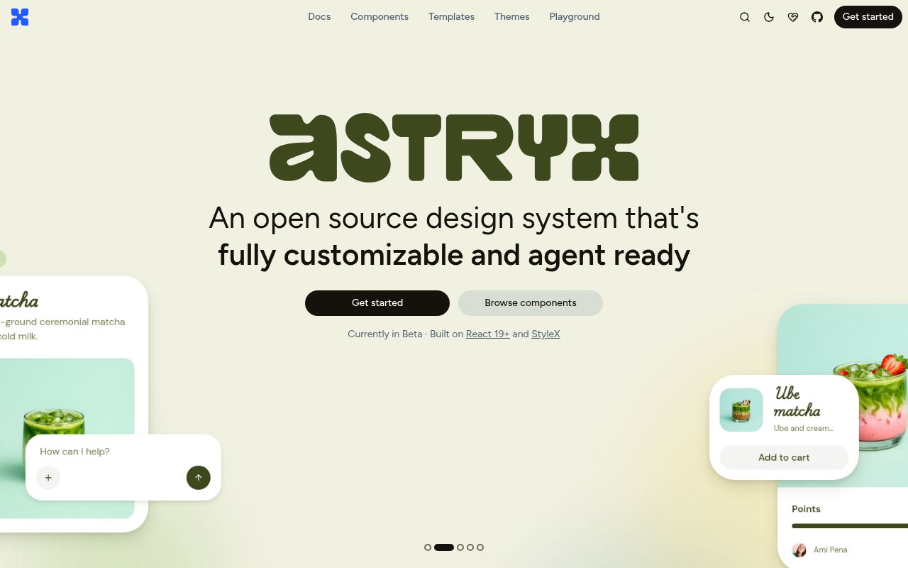
The README labels the public system beta. It separately says the experimental Lab package is used internally for Storybook and the sandbox and is not published to npm. Charts and the Vega wrapper are available only under the canary tag, with no stable release yet. Those distinctions matter if a demo is what persuaded you to try Astryx.
Before planning a screen around a demonstrated control, identify its package and publication channel. A product requiring a stable chart dependency should resolve the canary constraint before committing to the surrounding design system. For a first application trial, choose a representative form or settings screen built from published Core components and your actual theme. That tests the integration you need without assuming every displayed component has the same availability.
The CLI shares documentation with coding assistants
The root README describes a CLI for component docs, templates, scaffolding, themes and codemods. It recommends a package.json script that invokes the project's local CLI entry point, avoiding path errors when developers or assistants call it. The shared reference is a practical reason to evaluate the tooling if your team already uses coding assistants.
Our log tail includes agent-document path-safety checks, but it doesn't establish the quality of an assistant-generated screen. Keep that distinction in the trial: ask for the components your app needs, inspect the resulting imports and interactions, then check the screen yourself. We have no measured agent-accuracy or development-time result.
Recent changes still need checking in your application
GitHub recorded a last push on November 7, 2026, and recent PR activity included clipboard failure announcements and ChatLayout changes. Release v0.7.10 was published November 6. Its notes describe dialog autofocus and submenu Tab behavior fixes, among other interaction changes. Together those sources show active development, without establishing support response times or compatibility with your screen.
Material UI implements Google's Material Design system in React. Choose it when that visual language is already the requirement. Radix Primitives supplies low-level components that can be adopted incrementally, which suits a team building its own design system. These are scope comparisons, without comparative setup or performance measurements. Astryx's ratings remain unassessed because consumer setup, exercised documentation, support quality and application reliability weren't established. The next useful result is your representative screen working with its chosen package versions, including keyboard navigation and the touch behavior your users need.