Two screens explain one unusually specific interaction
Liquid Glass Screens is not a general component kit. It contains two versions of the same welcome-screen structure: Sky uses a cloud video, while Astro uses a star layer and separate horizon glow. In both, an upward drag moves a large glass dome away from the bottom edge. The dome shrinks into a button, stickers rise through it, and onboarding text appears. Dragging down reverses the scene with a theme-specific exit.
Both cookbooks share one TypeScript component and differ through their themes and assets. The scene, stickers, lens, glass, and copy form 5 rendering layers. Forty sticker slots move on the UI thread, and Astro adds a 260-particle stardust buffer. This makes the repository more instructive than a looping design clip because the visible result maps to named files, shader code, motion constants, and exported component props.
The project is a study, not a screen license
The README calls the work an educational reference inspired by a publicly visible Wabi screen. It tells users not to ship either implementation unchanged. Before public or commercial use, you are expected to replace the wordmarks, stickers, text, and backdrops, then create distinct colors, typography, spacing, composition, and motion. A renamed app and a new accent color do not satisfy that instruction.
That warning should shape the adoption decision. GPL-3.0 covers original code and material that Appllama can license, but it cannot grant rights to someone else's trademarks, trade dress, or copyrighted work. The repository includes asset provenance and generation prompts, which help you produce new ingredients. They do not turn the assembled reference design into a neutral product template. Use it to understand the engineering, then give a designer room to change the result.
What happened when we ran it
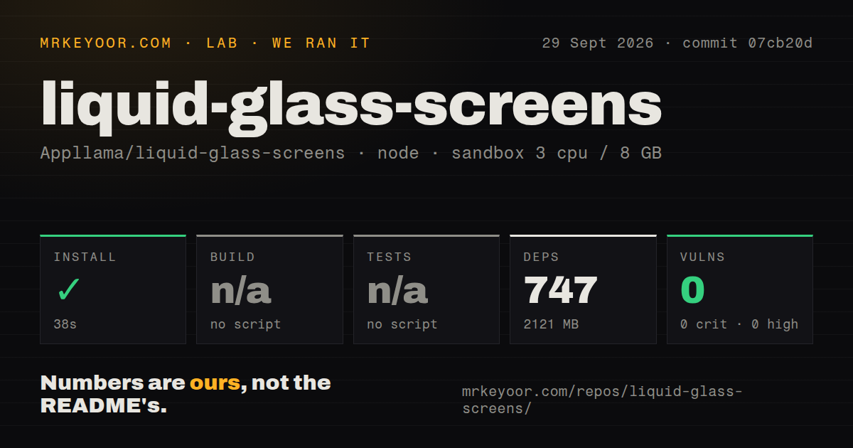
Our fresh Debian sandbox installed commit 07cb20d in 38 seconds. npm added 747 packages and the installed tree occupied 2,121 MB, compared with a 5.9 MB checkout containing 100 files and about 2,060 source lines. npm audit returned 0 known vulnerabilities. Those are clean dependency results, though the installed footprint is large for a repository that ultimately demonstrates two screens.
Our runner found no standard build script or target, so it skipped the build. It also found no standard tests script or target and skipped tests. The repository does contain a tests directory, and its README documents a separate npm run verify command for TypeScript, lint, dependency checks, and particle regressions. We did not run that command in this lab block, so the honest result is narrower: install passed, while build and test behavior were not measured.
Expo Go and web builds are outside the supported path
The gallery targets Node.js 22.13 or newer, Expo SDK 57, React Native 0.86, and Skia 2.6. You also need Xcode or Android Studio because Skia runtime shaders and native video decoding require a development or native build. Expo Go cannot run these screens, and the project has no web export. That removes the quickest preview paths many Expo developers expect.
Existing apps can import from the source-distributed Git dependency, but the README recommends copying one cookbook when SDK versions differ. That route means bringing over the main screen, 4 helper modules, one theme, and its assets, then installing only compatible missing packages with npx expo install. The host app must also preload those assets, mount the screen inside a gesture-handler root, remove the surrounding navigation header, and connect the semantic action to its own onboarding route.
The motion work is more reusable than the artwork
The strongest material lives below the screenshots. Layout is authored against a 402 by 874 reference frame. Sphere size is derived from position, so a partial drag behaves consistently in either direction. Release velocity enters the spring, while force controls the caustic. Reduced-motion mode removes the landing bounce and replaces the moving blur wipe with a fade. Accessibility keeps the call-to-action out of the tree until it is visible.
Those details answer questions that most visual demos leave open. The component also exposes initialState, an action callback, and a deterministic open state for screenshots. None of this proves the effect will suit an older phone or a different app layout. There are no performance measurements in our lab result, and the separate width and height scaling was authored around iPhone geometry. Validate an Android viewport, reduced motion, partial drags, and the actual device floor your app supports.
September 5 activity gives little maintenance history
The repository was created and last pushed on September 5, 2026. GitHub showed 303 stars, 29 forks, and 0 combined open issues and pull requests when checked. There was no latest release entry. A single active day can produce a polished source drop, but it cannot show how maintainers respond to SDK upgrades, device-specific rendering failures, or dependency changes over several months.
The included CI workflow and detailed README are good starting evidence. Long-term support remains unproven because there is no release trail and almost no elapsed project history. For an internal prototype, that is acceptable. For a production onboarding flow, own the copied code, pin the native package versions, record the behavior on your supported devices, and treat future Expo upgrades as your responsibility.