This is a private Expo 57 template, not an npm library
Expo Dynamic Notifications looks like a reusable component in the README, but the distribution tells a different story. Its package is marked private, the entry point is an Expo Router app, and installation begins with cloning the whole repository. The notification code lives under src/components, src/hooks, and neighboring project folders. Adopting it means taking ownership of source rather than adding a maintained package version to your lockfile.
That can be reasonable for a signature interaction. The component turns a small black pill into a hanging notification card with a neck and droplet shape. Skia draws the goo effect, Reanimated drives its values, Gesture Handler covers taps and upward swipes, and safe-area measurements place it around the top inset. The result is more specific than a toast. It also carries far more native rendering machinery.
One active alert gets one pending replacement
The public API is small enough to understand in one sitting. Wrap the application in DynamicNotifications, call trigger() from the hook, and pass a title plus optional message, avatar, symbol, color, duration, press handler, or custom renderer. A root duration applies by default, while null keeps an alert visible until code or a gesture dismisses it. The README documents the card's dimensions and color controls in detail.
The source reveals the queue limit. One ref holds the active notification and another holds a single queued notification. If you call trigger() during an active alert, the current item exits and the new one waits. A further call before that transition settles overwrites the waiting value. This fits occasional social or upload alerts. It is a poor match for chat bursts, monitoring events, or any flow where every pending item must be shown.
What happened when we ran it
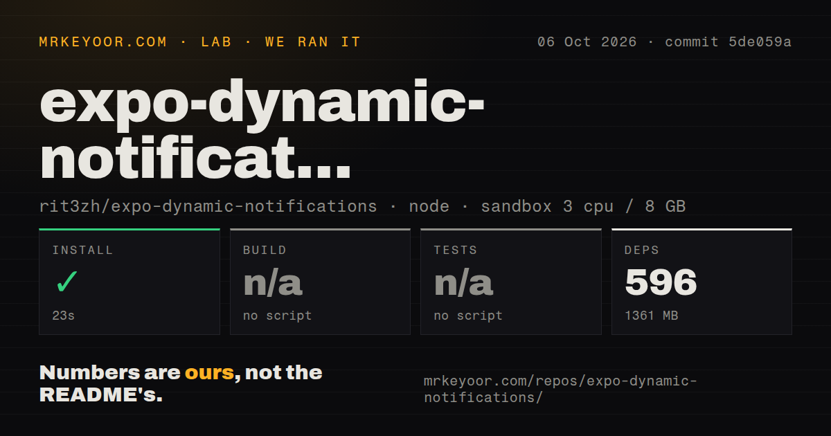
Our sandbox installed commit 5de059a in 23 seconds with Bun. That step pulled 596 packages and used 1,361 MB on disk, a striking expansion from a 1.8 MB checkout. The repository contained 103 files and about 4,315 lines of source. The container had 3 CPUs, 8 GB of RAM, Node 22, no secrets, and no elevated privileges. Installation itself completed successfully.
There was no build script or target, so we skipped that step. The package scripts offer Expo start, Android, iOS, web, lint, and a reset helper, but no build command. There was also no test script or target, so no tests ran. Our scan found no CI workflow files, Dockerfile, or tests directory. We therefore have no lab result for native compilation, animation behavior, or gestures on a device.
Those omissions change how to read the 23-second install. It proves the JavaScript dependency graph resolved in our fresh container. It does not prove bun ios, Expo prebuild, Skia rendering, or the Reanimated worklets work in your existing native project. The 1,361 MB footprint also lands before Xcode artifacts, Android tooling, or caches enter the picture.
Eight peer technologies make the visual effect costly to transplant
The README lists Skia, Reanimated 4, Worklets, Gesture Handler 2, Safe Area Context, Expo Blur, Expo Image, and Expo Symbols as peer technologies already configured in the template. Package metadata pins Expo 57.0.23, React Native 0.86.3, React 19.2.3, Skia 2.6.2, and Reanimated 4.5.1. An app near those versions may absorb the code cleanly. An older Expo app has a migration project hiding behind the animation.
Source imports use the @/ alias across configuration, constants, context, geometry, hooks, interfaces, and UI code. Copying the visible component folder alone will not be enough. You need its neighboring modules and your bundler alias must resolve the same paths, or you must rewrite them. This is why the repository makes more sense as an interaction reference or starter than as a drop-in dependency.
Gesture behavior is documented, accessibility behavior is not
A tap invokes the notification's onPress callback and then begins dismissal. An upward swipe dismisses after either the configured distance or velocity threshold, while an incomplete swipe springs the card back. The root receives onDismiss only after the exit animation settles. These are useful, inspectable rules, and custom content still receives the same surrounding motion and gesture behavior.
The README does not explain screen-reader announcements, focus movement, reduced-motion handling, keyboard or switch access, or what happens when a notification covers interactive content. The source we inspected does not turn that absence into a confirmed accessibility failure. It does put validation on the adopter. Test VoiceOver and TalkBack, add a reduced-motion path, and decide whether an in-app alert should be announced before shipping it.
Five commits on September 18 leave little maintenance history
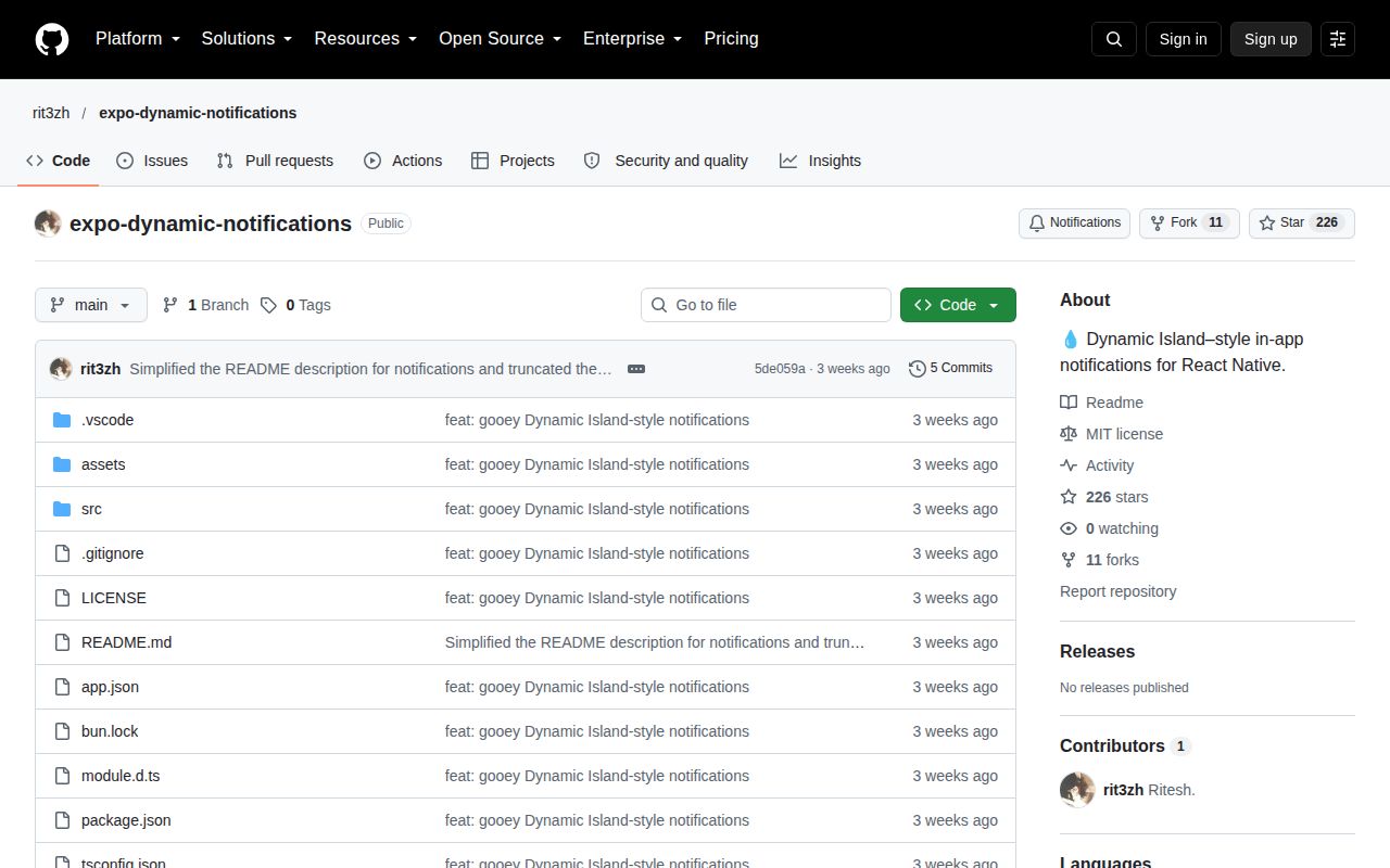
GitHub showed 226 stars, zero open issues and pull requests, and no releases on October 7, 2026. All five visible commits landed on September 18, with the feature implementation followed by a preview link and README wording edits. The repository was pushed that same day. It is recent, but one day of history cannot show how the component handles Expo upgrades or bug reports.
The code is appealing when the animation itself is the product decision. You get explicit geometry, custom bodies, timed dismissal, and a source-level design you can change. You also inherit 596 packages, a 1,361 MB install, native graphics dependencies, and no automated checks from the repository. For a standard success banner or queued messages, choose a package built around notification behavior. Choose this template when the morph is worth maintaining.