@visx/shape review
@visx/shape 4.0.0 turns data, accessors, scales, and curve choices into React SVG marks and paths. Its exports cover bars, lines, areas, pies, stacks, polygons, and several link geometries. It is deliberately below the chart level: axes, legends, responsive measurement, tooltips, animation, keyboard behavior, and a screen-reader summary come from other packages or your code. Version 4 requires React 18 or 19, upgrades its D3 shape/path layer, publishes strict-ESM-compatible output, removes lodash from the package, and restricts supported imports to the package root. Deep `lib/shapes/*` imports used by older apps must change.
@visx/shape 4.0.0 installed in 4.8 seconds, used 8 MB, bundled to 14.5 KB gzipped, and had 0 audit findings in our sandbox. Choose it for bespoke React SVG charts when the team will own the whole chart; ordinary dashboards should start with Recharts or Nivo.
We installed it
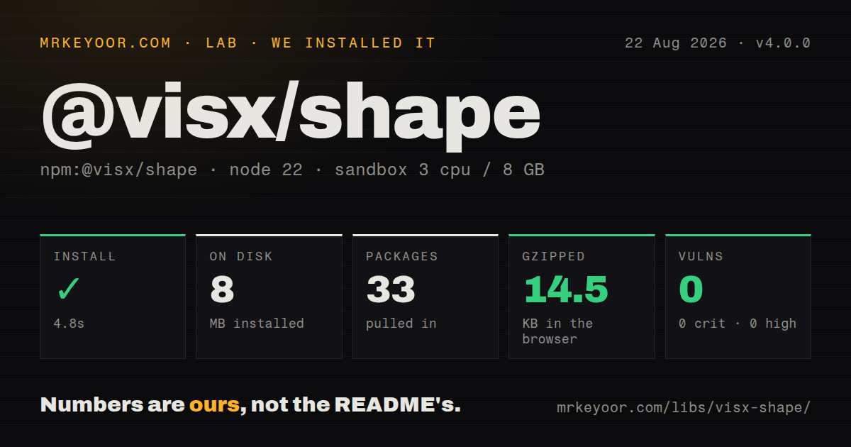
| Install | ✓ · 4.8s | 33 packages on disk · 8 MB |
| Import | ✓ | ESM import works · require() works · CommonJS package with exports map |
| Browser | 14.5 KB | gzipped (45.4 KB minified), bundled with esbuild |
| Types | ✓ | TypeScript types bundled |
| Known vulns | 0 | 0 critical · 0 high · 0 moderate · 0 low (npm audit) |
Answers from our run
Does @visx/shape install cleanly?
Yes. In a fresh container with an empty cache, npm install @visx/shape finished in 5 seconds, leaving 33 packages and 8 MB on disk. npm audit reported no known vulnerabilities.
How much does @visx/shape add to a browser bundle?
14.5 KB gzipped (45.4 KB minified) when the whole package is bundled for the browser with esbuild. Importing only part of it is usually smaller.
Does @visx/shape work with both ESM and CommonJS?
Yes. Both import '@visx/shape' and require('@visx/shape') worked in Node 22 in our run. The package is published as CommonJS with an exports map.
Does @visx/shape include TypeScript types?
Yes, type declarations ship inside the package, so no @types install is needed.
@visx/shape or recharts: which should you use?
recharts: Use it when product teams need ready-composed React charts with axes, legends, tooltips, and responsive containers. @visx/shape 4.0.0 installed in 4.8 seconds, used 8 MB, bundled to 14.5 KB gzipped, and had 0 audit findings in our sandbox.
When should you not use @visx/shape?
The requirement is a responsive chart with axes, legend, tooltip, theme, and accessibility out of the box. @visx/shape supplies none of those chart-level pieces.
Use it if
- A React design system needs custom SVG charts whose markup, layout, interaction, and visual rules must remain under product control.
- The team understands scale domains, SVG coordinates, accessors, baselines, and missing-data policy and wants D3 math without D3 DOM selections.
- Only selected visx packages should be installed instead of adopting a finished charting framework.
- The application needs bars, paths, stacks, pies, or tree links as composable React primitives rather than one fixed chart API.
- The requirement is a responsive chart with axes, legend, tooltip, theme, and accessibility out of the box. @visx/shape supplies none of those chart-level pieces.
- The project uses React 16 or 17. Version 4 declares React 18 or 19 and matching React types as peer dependencies; older applications must stay on visx 3.
- Thousands of live marks need Canvas or WebGL throughput. Shape components render SVG, so browser DOM count and React reconciliation become the limiting factors.
- Built-in transitions are required. The visx FAQ says animation is intentionally excluded and expects the application to choose a React animation library.
- The team does not want to own scale ranges, margins, invalid values, resize behavior, pointer targets, keyboard focus, labels, contrast, and a nonvisual data representation.
Setup reality
We installed @visx/shape 4.0.0 in a fresh Node 22 Bookworm sandbox. npm finished in 4.8 seconds, left 33 packages, and occupied 8 MB on disk. The package is 896 KB unpacked with 5 direct dependencies and 2 peers. npm audit found 0 known vulnerabilities. It includes TypeScript declarations.
Version 4 publishes CommonJS and ESM entries behind an exports map; both require() and import worked in our checks. React 18 or 19 and matching @types/react satisfy the peer contract. Import from @visx/shape, since deep paths are blocked as private internals. Upgrade every @visx/* dependency to the same major. No stylesheet, credential, or native build is required.
A useful chart usually adds scale, axis, responsive, tooltip, text, or group packages. Our full namespace browser bundle measured 45.4 KB minified and 14.5 KB gzipped. Root exports and sideEffects: false allow a production bundler to remove unused shapes, but inspect the final application bundle. SVG y coordinates grow downward, band scales may return undefined, and bar heights need a chosen baseline.
Shape components pass SVG props through and leave semantics to the caller. Add a title and description, a table or textual equivalent, keyboard reachability for interactive marks, visible focus, and pointer targets large enough to use. Missing points need a defined policy; filtering them can falsely connect separate observations. Preact needs React aliases plus peer-range configuration. Legacy browsers such as IE11 are outside version 4's target, according to the migration guide.
Patterns
Place bars with band and linear scales draw-bar-chart
import { Bar } from '@visx/shape';
import { scaleBand, scaleLinear } from '@visx/scale';

const x = scaleBand({ domain: rows.map(d => d.label), range: [0, innerWidth], padding: 0.2 });
const y = scaleLinear({ domain: [0, Math.max(...rows.map(d => d.value))], range: [innerHeight, 0] });

const marks = rows.map(d => {
  const top = y(d.value);
  return <Bar key={d.label} x={x(d.label) ?? 0} y={top} width={x.bandwidth()} height={innerHeight - top} fill="#2563eb" />;
});
SVG y coordinates increase downward. Reverse the y range and subtract the scaled position from the inner height.
Round the top of a positive bar round-bar-corners
import { BarRounded } from '@visx/shape';

<BarRounded
  x={left}
  y={top}
  width={barWidth}
  height={barHeight}
  radius={6}
  top
  fill="#0f766e"
/>
`BarRounded` emits a path rather than a rect. The radius cannot exceed half of the shorter side.
Render a monotone line through observations draw-line
import { LinePath } from '@visx/shape';
import { curveMonotoneX } from '@visx/curve';

<LinePath
  data={points}
  x={d => xScale(d.date)}
  y={d => yScale(d.value)}
  curve={curveMonotoneX}
  fill="none"
  stroke="#7c3aed"
  strokeWidth={2}
/>
Monotone interpolation avoids reversing along x, yet it still invents a curve between samples. Use a linear curve when that implication is misleading.
Leave gaps where observations are missing break-on-missing-data
<LinePath
  data={points}
  defined={d => d.value != null}
  x={d => xScale(d.date)}
  y={d => yScale(d.value ?? 0)}
  fill="none"
  stroke="currentColor"
/>
The `defined` accessor breaks the path. Filtering missing rows would connect the points on either side and hide the gap.
Fill an area down to the scale baseline draw-area
import { AreaClosed } from '@visx/shape';

<AreaClosed
  data={points}
  x={d => xScale(d.date)}
  y={d => yScale(d.value)}
  yScale={yScale}
  fill="rgba(37,99,235,0.25)"
  stroke="#2563eb"
/>
`AreaClosed` uses the y scale to find its baseline. Include zero in the domain unless a truncated baseline is an explicit design choice.
Render keyed donut segments draw-donut
import { Pie } from '@visx/shape';

<Pie data={segments} pieValue={d => d.value} innerRadius={60} outerRadius={100}>
  {({ arcs, path }) => arcs.map(arc => (
    <path key={arc.data.id} d={path(arc) ?? undefined} fill={color(arc.data.id)} />
  ))}
</Pie>
Use stable data identifiers as React keys. A donut is poor at close comparisons, so choose bars when exact ranking matters.
Hide labels on narrow arcs label-pie
<Pie
  data={segments}
  pieValue={d => d.value}
  outerRadius={radius}
  centroid={([x, y], arc) =>
    arc.endAngle - arc.startAngle > 0.25
      ? <text x={x} y={y} textAnchor="middle">{arc.data.label}</text>
      : null
  }
/>
Centroid labels overlap on small segments. Put every label and value in adjacent text or a data table even when the SVG hides it.
Generate side-by-side bar groups group-bars
import { BarGroup } from '@visx/shape';

<BarGroup
  data={rows}
  keys={seriesKeys}
  height={innerHeight}
  x0={d => d.category}
  x0Scale={categoryScale}
  x1Scale={seriesScale}
  yScale={valueScale}
  color={key => colors[key]}
/>
This requires one band scale for categories, another for series inside each category, and a value scale. Axes and legends are separate.
Generate stacked bar segments stack-bars
import { BarStack } from '@visx/shape';

<BarStack
  data={rows}
  keys={seriesKeys}
  x={d => d.category}
  xScale={xScale}
  yScale={yScale}
  color={key => colorScale(key)}
  value={(d, key) => Number(d[key] ?? 0)}
/>
Calculate the y domain from each row's total across stack keys. Using the largest single segment can push the stack beyond the chart.
Take over the generated SVG path customize-path
<LinePath data={points} x={d => x(d.x)} y={d => y(d.y)}>
  {({ path }) => (
    <path d={path(points) ?? undefined} fill="none" stroke="url(#trend)" strokeWidth={3} />
  )}
</LinePath>
A render child replaces the default element. Handle a null path result and add your own SVG semantics and event props.
Mirror pointer behavior on keyboard focus add-accessible-interaction
<Bar
  x={left}
  y={top}
  width={barWidth}
  height={barHeight}
  tabIndex={0}
  role="img"
  aria-label={`${datum.label}: ${datum.value}`}
  onPointerMove={event => showTooltip(event, datum)}
  onFocus={event => showTooltip(event, datum)}
  onBlur={hideTooltip}
/>
SVG props pass through, but visx does not create chart semantics. Add a chart description and nonvisual data representation beyond per-mark labels.
Keep scales inside translated chart margins apply-margins
import { Group } from '@visx/group';

const innerWidth = width - margin.left - margin.right;
const innerHeight = height - margin.top - margin.bottom;

<svg width={width} height={height}>
  <Group left={margin.left} top={margin.top}>
    {renderMarks({ width: innerWidth, height: innerHeight })}
  </Group>
</svg>
Every scale range should use inner dimensions. Mixing outer width with a translated group clips marks and shifts axes.
Alternatives
| Package | Registry | Pick it when |
|---|---|---|
| recharts | npm | Use it when product teams need ready-composed React charts with axes, legends, tooltips, and responsive containers. |
| @nivo/core | npm | Use Nivo when themed chart families, animation, and Canvas variants matter more than direct control over SVG geometry. |
| victory | npm | Use it for a higher-level declarative chart API with an established React Native path. |
| d3-shape | npm | Use it when path generators are enough and React components or the wider visx package family add no value. |
More web frontend guides
postcss · react · react-dom · tailwindcss · htmlparser2 · tailwind-merge · the whole shelf →
How this guide is made: grounded in the library's documentation, release notes, changelog, and issue history, on a fixed rubric — not a hands-on install of every release. The 50 most-downloaded entries are additionally install-verified in clean containers. Corrections: contact the desk.