recharts review
Our full Recharts 3.10.1 import produced 588 KB minified JavaScript and 161.2 KB gzipped, a material cost for a charting dependency. Recharts expresses SVG charts as React components: a chart contains axes, series, grids, legends, tooltips and reference elements, and many parts accept custom React renderers. Version 3 uses internal Redux Toolkit state and adds chart-state hooks and typed chart factories, while preserving the component-composition style users recognize from earlier majors.
Recharts is a productive React choice for ordinary dashboard charts with custom UI pieces. Its measured 161.2 KB gzip cost and SVG-per-mark rendering are the reasons to walk away when the page budget or data density is tight.
We installed it
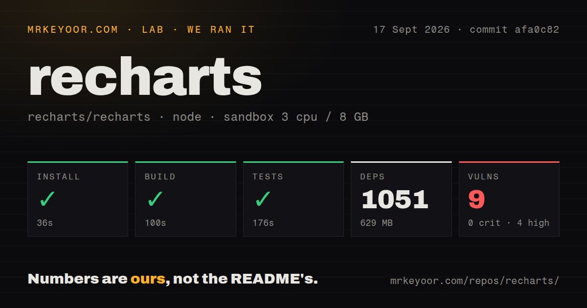
| Install | ✓ · 5.6s | 42 packages on disk · 49 MB |
| Import | ✓ | ESM import works · require() works · CommonJS package |
| Browser | 161.2 KB | gzipped (588 KB minified), bundled with esbuild |
| Types | ✓ | TypeScript types bundled |
| Known vulns | 0 | 0 critical · 0 high · 0 moderate · 0 low (npm audit) |
Answers from our run
Does recharts install cleanly?
Yes. In a fresh container with an empty cache, npm install recharts finished in 6 seconds, leaving 42 packages and 49 MB on disk. npm audit reported no known vulnerabilities.
How much does recharts add to a browser bundle?
161.2 KB gzipped (588 KB minified) when the whole package is bundled for the browser with esbuild. Importing only part of it is usually smaller.
Does recharts work with both ESM and CommonJS?
Yes. Both import 'recharts' and require('recharts') worked in Node 22 in our run. The package is published as CommonJS.
Does recharts include TypeScript types?
Yes, type declarations ship inside the package, so no @types install is needed.
recharts or chart.js: which should you use?
chart.js: Use it for canvas rendering and denser datasets when React-tree composition is unnecessary. Recharts is a productive React choice for ordinary dashboard charts with custom UI pieces.
When should you not use recharts?
Shipping 161.2 KB gzipped for the complete import is too costly for the page budget or only one small chart is needed
Discussed on
Use it if
- A React dashboard needs common SVG charts built from familiar component composition
- Tooltips, legends, ticks or shapes need application-owned React markup
- Several charts should synchronize tooltip position or brush ranges with a shared syncId
- The dataset is modest enough that one SVG element per rendered mark remains responsive
- Shipping 161.2 KB gzipped for the complete import is too costly for the page budget or only one small chart is needed
- Dense time series or scatterplots contain thousands of visible marks; SVG DOM work becomes the bottleneck and canvas or WebGL fits better
- Built-in zoom, pan, editable annotations or cross-filtering is required; Recharts supplies primitives but leaves those interactions to you
- Server HTML must contain a visible responsive chart; ResponsiveContainer depends on measured browser dimensions and can initially render an empty area
- A version 2 application relies on internal props or function-component defaultProps, because the version 3 state rewrite requires migration work
Setup reality
Our clean Node 22 install of Recharts 3.10.1 finished in 5.6 seconds. It left 42 packages using 49 MB, and npm audit found zero known vulnerabilities. Recharts declares 11 direct dependencies and three peer dependencies; its own unpacked package is 9,784 KB under MIT and requires Node 18 or newer. TypeScript declarations are bundled. It is CommonJS without an exports map, although require() and ESM import both worked. A full esbuild import measured 588 KB minified and 161.2 KB gzipped.
Install a react-is version matching the application's React version, as the README requests. No credentials or project config file are needed. ResponsiveContainer must sit inside an element with measurable width and height; a parent with automatic height can collapse the chart to zero. For server-rendered pages, reserve dimensions or provide an initial size to reduce layout shift, while accepting that browser measurement still controls the responsive result.
Recharts renders marks as SVG nodes. Memoize derived data when parent renders are frequent, disable entrance animation for live-updating charts, and aggregate or window dense datasets before passing them in. Brush changes the visible range but does not virtualize the underlying dataset. Custom HTML tooltips render outside the SVG and must handle the inactive state and an absent payload.
Version 3 moved internal chart state and exposes supported hooks for active tooltip data and plot geometry. Replace code that reached into old context or depended on injected internals. Dual-axis series need an explicit matching yAxisId, and synchronized charts with different row counts should use value-based synchronization rather than the default index matching.
Patterns
Render a responsive line chart responsive-line-chart
import { LineChart, Line, XAxis, YAxis, CartesianGrid, Tooltip, ResponsiveContainer } from 'recharts';

<div style={{ width: '100%', height: 320 }}>
  <ResponsiveContainer>
    <LineChart data={data} margin={{ top: 8, right: 16, bottom: 8, left: 0 }}>
      <CartesianGrid strokeDasharray="3 3" />
      <XAxis dataKey="date" />
      <YAxis />
      <Tooltip />
      <Line type="monotone" dataKey="revenue" stroke="#2563eb" dot={false} />
    </LineChart>
  </ResponsiveContainer>
</div>
Give the parent a concrete height. A percentage height cannot resolve when every ancestor remains automatic.
Supply an HTML tooltip component custom-tooltip
import { Tooltip } from 'recharts';

function CustomTooltip({ active, payload, label }) {
  if (!active || !payload?.length) return null;
  return (
    <div className="rounded border bg-white p-2 text-sm shadow">
      <div className="font-medium">{label}</div>
      {payload.map(entry => (
        <div key={entry.dataKey} style={{ color: entry.color }}>
          {entry.name}: {entry.value}
        </div>
      ))}
    </div>
  );
}

<Tooltip content={<CustomTooltip />} />
The tooltip mounts before interaction, so return null when active is false or payload is missing.
Format axes and tooltip values format-axis-and-tooltip-values
const currency = new Intl.NumberFormat('en-US', { style: 'currency', currency: 'USD', maximumFractionDigits: 0 });

<XAxis
  dataKey="date"
  tickFormatter={value => new Date(value).toLocaleDateString('en-US', { month: 'short' })}
  minTickGap={24}
/>
<YAxis tickFormatter={currency.format} width={72} />
<Tooltip formatter={value => currency.format(value)} />
Reserve enough axis width for formatted labels and use tick spacing to prevent date collisions.
Stack related area series stacked-area-chart
import { AreaChart, Area, XAxis, YAxis, Tooltip, Legend, ResponsiveContainer } from 'recharts';

<ResponsiveContainer width="100%" height={300}>
  <AreaChart data={data}>
    <XAxis dataKey="month" />
    <YAxis />
    <Tooltip />
    <Legend />
    <Area type="monotone" dataKey="free" stackId="plan" stroke="#94a3b8" fill="#cbd5e1" />
    <Area type="monotone" dataKey="pro" stackId="plan" stroke="#2563eb" fill="#93c5fd" />
  </AreaChart>
</ResponsiveContainer>
Shared stackId values create one stack. stackOffset can convert the same data into proportional output.
Assign series to two Y axes composed-chart-dual-axis
import { ComposedChart, Bar, Line, XAxis, YAxis, Tooltip, Legend } from 'recharts';

<ComposedChart width={640} height={320} data={data}>
  <XAxis dataKey="week" />
  <YAxis yAxisId="left" />
  <YAxis yAxisId="right" orientation="right" />
  <Tooltip />
  <Legend />
  <Bar yAxisId="left" dataKey="signups" fill="#93c5fd" />
  <Line yAxisId="right" type="monotone" dataKey="conversionRate" stroke="#dc2626" />
</ComposedChart>
Every series needs the intended yAxisId or it binds to the default scale without an error.
Color pie slices from stable data pie-chart-with-per-slice-colors
import { PieChart, Pie, Cell, Tooltip, Legend } from 'recharts';

const COLORS = ['#2563eb', '#16a34a', '#f59e0b', '#dc2626'];

<PieChart width={320} height={320}>
  <Pie data={data} dataKey="value" nameKey="label" innerRadius={60} outerRadius={110} paddingAngle={2}>
    {data.map((entry, i) => (
      <Cell key={entry.label} fill={COLORS[i % COLORS.length]} />
    ))}
  </Pie>
  <Tooltip />
  <Legend />
</PieChart>
Index-based colors move when rows are sorted or filtered. Derive color from a stable category when order changes.
Mark a target range reference-line
import { ReferenceLine, ReferenceArea } from 'recharts';

<ReferenceLine y={target} stroke="#dc2626" strokeDasharray="4 4" label={{ value: 'target', position: 'right' }} />
<ReferenceArea x1="2026-03-01" x2="2026-03-14" fill="#f1f5f9" ifOverflow="extendDomain" />
References outside the domain stay hidden unless ifOverflow changes domain or visibility behavior.
Add a brush range selector brush-range-selector
import { LineChart, Line, XAxis, YAxis, Brush } from 'recharts';

<LineChart width={720} height={360} data={data}>
  <XAxis dataKey="date" />
  <YAxis />
  <Line type="monotone" dataKey="value" dot={false} />
  <Brush
    dataKey="date"
    height={28}
    startIndex={Math.max(0, data.length - 90)}
    onChange={({ startIndex, endIndex }) => setRange([startIndex, endIndex])}
  />
</LineChart>
Brush reports array indices and does not reduce the number of data objects held or processed.
Synchronize separate charts sync-multiple-charts
<LineChart data={cpu} syncId="host-metrics" width={640} height={160}>{/* ... */}</LineChart>
<LineChart data={memory} syncId="host-metrics" width={640} height={160}>{/* ... */}</LineChart>
Use value synchronization when datasets differ in length; index matching can align unrelated timestamps.
Stop animation from replaying stop-animation-restarts
const chartData = useMemo(() => rows.map(toPoint), [rows]);

<Line
  type="monotone"
  dataKey="value"
  isAnimationActive={false}
  dot={false}
/>
Keep the data array identity stable and disable animation for charts refreshed on a timer.
Read chart state through version 3 hooks read-chart-state-with-hooks
import { Customized, useActiveTooltipDataPoints, usePlotArea } from 'recharts';

function ActiveReadout() {
  const points = useActiveTooltipDataPoints();
  const plot = usePlotArea();
  if (!points?.length || !plot) return null;
  return (
    <text x={plot.x + 8} y={plot.y + 16} fontSize={12}>
      {points[0].value}
    </text>
  );
}

<LineChart data={data} width={640} height={320}>
  <Line dataKey="value" />
  <Customized component={<ActiveReadout />} />
</LineChart>
The supported hooks only work inside a chart subtree and replace reliance on older internal context details.
Narrow dataKey with a typed factory type-safe-chart-components
import { createHorizontalChart } from 'recharts';

type Point = { date: string; revenue: number };

const { LineChart, Line, XAxis, YAxis, Tooltip } = createHorizontalChart<Point, string, number>();

<LineChart data={points} width={640} height={320}>
  <XAxis dataKey="date" />
  <YAxis />
  <Tooltip />
  <Line dataKey="revenue" />
</LineChart>
Typed chart factories catch misspelled series keys that the default broad dataKey type can let reach runtime.
Alternatives
| Package | Registry | Pick it when |
|---|---|---|
| chart.js | npm | Use it for canvas rendering and denser datasets when React-tree composition is unnecessary |
| @nivo/core | npm | Use Nivo when its broader chart families and packaged themes match the product |
| @visx/xychart | npm | Use it when lower-level React and D3 primitives justify more chart assembly work |
More web frontend guides
postcss · react · react-dom · tailwindcss · htmlparser2 · tailwind-merge · the whole shelf →
How this guide is made: grounded in the library's documentation, release notes, changelog, and issue history, on a fixed rubric — not a hands-on install of every release. The 50 most-downloaded entries are additionally install-verified in clean containers. Corrections: contact the desk.