sonner review
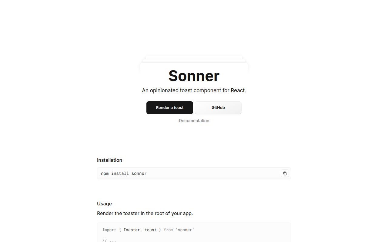
Our clean Node 22 install of Sonner 2.0.8 finished in 1.2 seconds and left 4 packages using 8 MB on disk. The package is a React toast renderer built around one Toaster and an imperative toast function, so a request handler, store, or click callback can update the same on-screen queue. It covers status icons, promise progress, action buttons, timed dismissal, swipe gestures, stacked placement, themes, custom JSX, and an aria-live region. The package has no direct dependencies, but React, React DOM, and React types are peers. Version 2.0.8 adds custom aria labels and fixes empty hotkeys, React Aria modal layering, custom-toast dismissal, Safari styling, and event-listener cleanup.
Sonner 2.0.8 is a sensible React toast default when you accept its stack and runtime CSS; our install was fast, audited cleanly, and carried no direct dependencies. Skip it for non-React clients, persistent notification inboxes, or CSP rules that cannot allow its injected style element.
We installed it
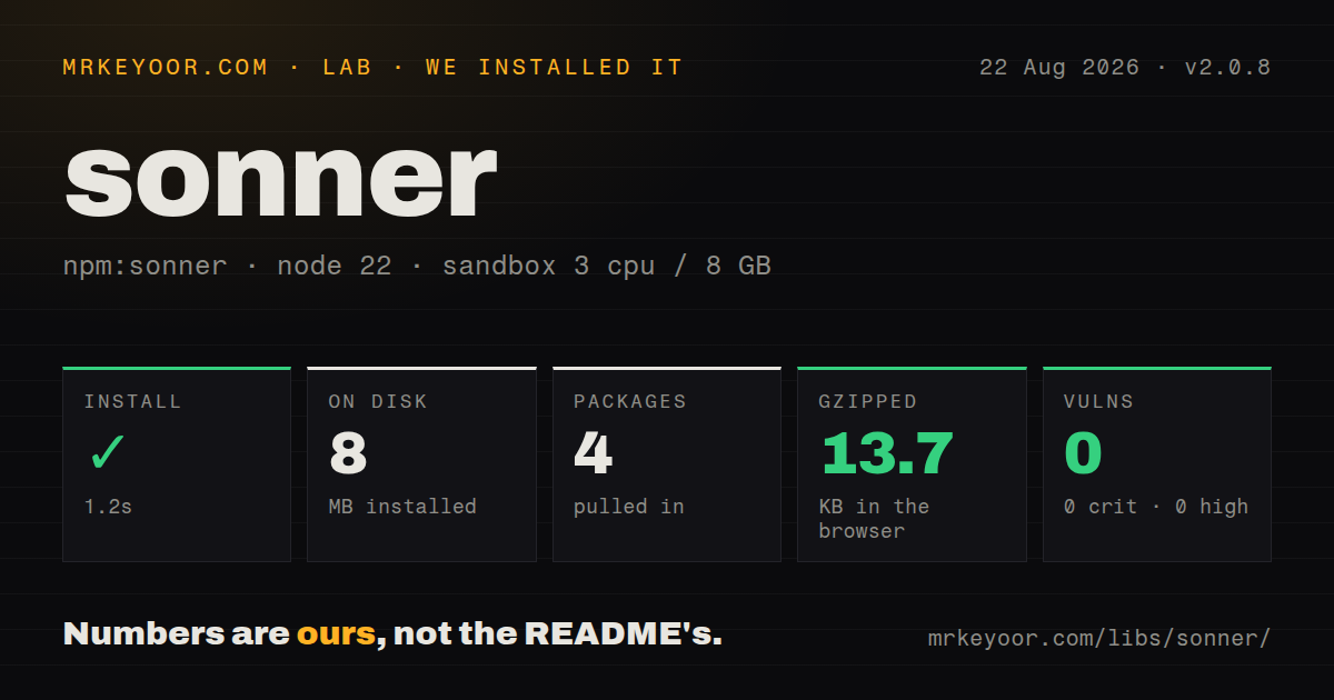
| Install | ✓ · 1.2s | 4 packages on disk · 8 MB |
| Import | ✓ | ESM import works · require() works · CommonJS package with exports map |
| Browser | 13.7 KB | gzipped (46.7 KB minified), bundled with esbuild |
| Types | ✓ | TypeScript types bundled |
| Known vulns | 0 | 0 critical · 0 high · 0 moderate · 0 low (npm audit) |
Answers from our run
Does sonner install cleanly?
Yes. In a fresh container with an empty cache, npm install sonner finished in 1 seconds, leaving 4 packages and 8 MB on disk. npm audit reported no known vulnerabilities.
How much does sonner add to a browser bundle?
13.7 KB gzipped (46.7 KB minified) when the whole package is bundled for the browser with esbuild. Importing only part of it is usually smaller.
Does sonner work with both ESM and CommonJS?
Yes. Both import 'sonner' and require('sonner') worked in Node 22 in our run. The package is published as CommonJS with an exports map.
Does sonner include TypeScript types?
Yes, type declarations ship inside the package, so no @types install is needed.
sonner or react-hot-toast: which should you use?
react-hot-toast: Choose it for a compact React toast API with headless rendering hooks and fewer stack controls to configure. Sonner 2.0.8 is a sensible React toast default when you accept its stack and runtime CSS; our install was fast, audited cleanly, and carried no direct dependencies.
When should you not use sonner?
Your application is built with Vue, Svelte, Solid, or plain DOM code. Sonner's package peers are React, React DOM, and React types, and its public components render React nodes
Use it if
- You need transient feedback in a React 18 or 19 application and want one call site for success, error, loading, and action toasts
- An async mutation should keep one notification in place while it moves from loading to success or failure
- Your UI needs swipe dismissal, stacked notifications, keyboard focus, and reduced-motion CSS without implementing those details again
- You want to replace the built-in look through class names, CSS variables, icons, or a fully custom React node while keeping Sonner's queue
- Your application is built with Vue, Svelte, Solid, or plain DOM code. Sonner's package peers are React, React DOM, and React types, and its public components render React nodes
- Your Content Security Policy rejects runtime style elements. The published JavaScript creates a style tag and inserts the bundled CSS without a nonce option, so a strict style-src policy can block the default styling
- You need durable notifications with read state, server persistence, pagination, or cross-device history. toast.getHistory only exposes the in-memory events held by the current JavaScript process
- Your design calls for a queue model or animation that differs sharply from Sonner's fixed-position stack. toast.custom replaces the card contents, while placement and stack behavior still come from Toaster
- A notification must originate and render entirely during server execution. Toaster is a client component internally, and a server action must send a result back to browser code before toast can update the mounted queue
Setup reality
In our fresh Node 22 Bookworm sandbox, Sonner 2.0.8 installed successfully in 1.2 seconds. The install left 4 packages and occupied 8 MB. Sonner has 0 direct dependencies and 3 peer dependencies, while its own published package is 200 KB unpacked. npm audit found 0 known vulnerabilities at every severity. Bundled TypeScript declarations were present.
The published package is CommonJS with an exports map that routes import to an ESM build and require to a CommonJS build; both worked in our test. An esbuild browser entry using import * measured 46.7 KB minified and 13.7 KB gzipped. React, React DOM, and React types must already satisfy the declared React 18 or 19 peer ranges.
Mount one Toaster near the application root. The module marks itself as a client component, so Next.js can render Toaster from a server layout, but code that calls toast from an event still belongs in browser code. A server action should return a result that a client component turns into a toast. Two default Toasters subscribe to the same store and duplicate output; use distinct ids plus toasterId only when separate regions are intentional.
Sonner inserts its CSS into document.head when the main bundle loads and also exports sonner/dist/styles.css. That runtime style element has no nonce setting, which matters under a strict CSP. The default theme is light; theme="system" follows prefers-color-scheme. Timers pause while the document is hidden or the user interacts with a toast. Loading toasts and duration: Infinity do not expire, so provide an explicit completion, close button, action, or dismiss call.
Patterns
Mount a Toaster and send feedback mount-and-show-toast
import { Toaster, toast } from 'sonner';

export function App() {
  return (
    <>
      <Toaster position="bottom-right" closeButton />
      <button onClick={() => toast('Preferences saved')}>Save</button>
    </>
  );
}
Mount one default Toaster. A second default instance listens to the same module store and renders the same toast again.
Use status-specific toasts show-status-variants
import { toast } from 'sonner';

toast.success('Invoice sent');
toast.error('Payment failed');
toast.warning('Card expires soon');
toast.info('Exports are ready');
toast.message('Sync complete', {
  description: '42 records changed',
});
Set richColors on Toaster if each status should use a tinted background. Without it, status calls keep the neutral card and change the icon.
Track and await one promise track-promise-result
import { toast } from 'sonner';

const pending = toast.promise(saveProfile(formData), {
  loading: 'Saving profile...',
  success: (profile) => `${profile.name} saved`,
  error: (error) => `Save failed: ${error.message}`,
  finally: () => setSubmitting(false),
});

const profile = await pending.unwrap();
Call unwrap when the surrounding code also needs the resolved value or rejection. The toast can then present state while your own try and catch controls the workflow.
Add an undo button offer-undo-action
import { toast } from 'sonner';

toast('Conversation archived', {
  duration: 10000,
  action: {
    label: 'Undo',
    onClick: () => restoreConversation(conversationId),
  },
});
Action clicks dismiss the toast after running onClick. Use a longer duration when the user needs time to understand and reverse the change.
Replace a loading toast in place update-toast-by-id
import { toast } from 'sonner';

const id = toast.loading('Uploading 0%');

uploader.onProgress((percent) => {
  toast.loading(`Uploading ${percent}%`, { id });
});

await uploader.done;
toast.success('Upload complete', { id });
Reusing id updates the existing item and avoids another stack entry. This manual flow fits progress events that toast.promise cannot describe.
Dismiss one item or the whole queue dismiss-toast
import { toast } from 'sonner';

const id = toast.loading('Waiting for worker...');

toast.dismiss(id);
toast.dismiss();
The id form targets one toast. Calling dismiss without an id marks every current toast for removal.
Render a custom toast card render-custom-content
import { toast } from 'sonner';

toast.custom((id) => (
  <div className="rounded-xl border bg-white p-4 shadow-lg">
    <strong>Deployment complete</strong>
    <button onClick={() => toast.dismiss(id)}>Close</button>
  </div>
), { duration: 8000 });
Custom content keeps Sonner's positioning and queue. You own the card's visual states, close control, and accessible text.
Replace the built-in card styling apply-custom-classes
import { Toaster } from 'sonner';

<Toaster
  toastOptions={{
    unstyled: true,
    classNames: {
      toast: 'flex gap-3 rounded-lg border bg-white p-4 shadow',
      title: 'text-sm font-semibold',
      description: 'text-sm text-slate-600',
      error: 'border-red-300 bg-red-50',
      actionButton: 'rounded bg-slate-900 px-2 py-1 text-white',
    },
  }}
/>;
unstyled removes the default card appearance, so define every state your application uses. Sonner still supplies layout, stacking, and motion rules.
Follow the operating system theme follow-system-theme
import { Toaster } from 'sonner';

export function Notifications() {
  return <Toaster theme="system" richColors />;
}
The default theme is light. theme=system listens to prefers-color-scheme and updates when the system preference changes.
Send a toast to a named region route-to-separate-toaster
import { Toaster, toast } from 'sonner';

export function Regions() {
  return (
    <>
      <Toaster id="editor" position="bottom-left" />
      <Toaster id="account" position="top-right" />
    </>
  );
}

toast('Draft saved', { toasterId: 'editor' });
A Toaster with id only renders toasts carrying the matching toasterId. Untagged toasts go to a Toaster without an id.
Name the notification region and close button set-accessible-labels
import { Toaster } from 'sonner';

<Toaster
  containerAriaLabel="Account notifications"
  customAriaLabel="Account notifications, press Alt+T to focus"
  toastOptions={{ closeButtonAriaLabel: 'Dismiss notification' }}
  closeButton
/>;
customAriaLabel support arrived in 2.0.8. If you override the hotkey, keep the spoken instruction in sync with the actual keys.
Tune stack limits and swipe direction configure-stack-and-swipe
import { Toaster } from 'sonner';

<Toaster
  position="top-right"
  visibleToasts={5}
  gap={10}
  duration={6000}
  expand
  swipeDirections={['right']}
  offset={{ top: 20, right: 20 }}
  mobileOffset={12}
/>;
visibleToasts controls how many items are visible, while later items remain in the store. A large burst can therefore take time to work through.
Alternatives
| Package | Registry | Pick it when |
|---|---|---|
| react-hot-toast | npm | Choose it for a compact React toast API with headless rendering hooks and fewer stack controls to configure. |
| react-toastify | npm | Choose it when per-container configuration, progress bars, transitions, and a wider set of long-standing options are requirements. |
| @radix-ui/react-toast | npm | Choose it when you want accessible primitives and plan to own the markup, styling, viewport, and provider wiring yourself. |
| notistack | npm | Choose it for Material UI projects that need snackbars, provider-level limits, and MUI-shaped customization. |
More web frontend guides
postcss · react · react-dom · tailwindcss · htmlparser2 · tailwind-merge · the whole shelf →
How this guide is made: grounded in the library's documentation, release notes, changelog, and issue history, on a fixed rubric — not a hands-on install of every release. The 50 most-downloaded entries are additionally install-verified in clean containers. Corrections: contact the desk.