react-hot-toast review
react-hot-toast 2.6.0 keeps transient React notifications in a module-level store and renders them through `<Toaster>`, `<ToastBar>`, or headless hooks. It handles plain, success, error, loading, custom JSX, and promise states with configurable timing, position, style, icon, and ARIA properties. Version 2.6 adds multiple independent toaster IDs and minifies its inlined CSS during the build. Our package-wide browser build reached 20.3 KB minified and 7.8 KB gzipped, including more than the small core cost often quoted for selected entry points.
react-hot-toast 2.6.0 installed in 1.4 seconds and produced a 7.8 KB gzipped package-wide bundle in our sandbox with 0 audit findings. It is a good fit for disposable React feedback, not for a notification inbox or errors users must revisit.
We installed it
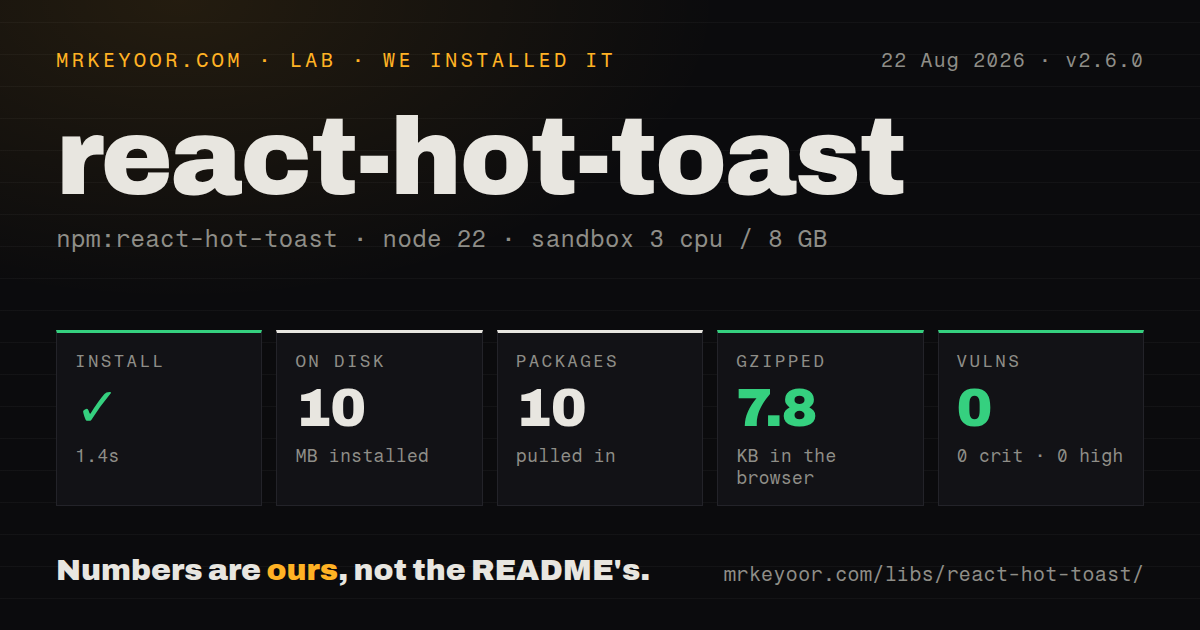
| Install | ✓ · 1.4s | 10 packages on disk · 10 MB |
| Import | ✓ | ESM import works · require() works · CommonJS package with exports map |
| Browser | 7.8 KB | gzipped (20.3 KB minified), bundled with esbuild |
| Types | ✓ | TypeScript types bundled |
| Known vulns | 0 | 0 critical · 0 high · 0 moderate · 0 low (npm audit) |
Answers from our run
Does react-hot-toast install cleanly?
Yes. In a fresh container with an empty cache, npm install react-hot-toast finished in 1 seconds, leaving 10 packages and 10 MB on disk. npm audit reported no known vulnerabilities.
How much does react-hot-toast add to a browser bundle?
7.8 KB gzipped (20.3 KB minified) when the whole package is bundled for the browser with esbuild. Importing only part of it is usually smaller.
Does react-hot-toast work with both ESM and CommonJS?
Yes. Both import 'react-hot-toast' and require('react-hot-toast') worked in Node 22 in our run. The package is published as CommonJS with an exports map.
Does react-hot-toast include TypeScript types?
Yes, type declarations ship inside the package, so no @types install is needed.
react-hot-toast or sonner: which should you use?
sonner: Use it for modern stacked-toast presentation and an API common in current React design systems. react-hot-toast 2.6.0 installed in 1.4 seconds and produced a 7.8 KB gzipped package-wide bundle in our sandbox with 0 audit findings.
When should you not use react-hot-toast?
The application is not React; the standard renderer declares React and React DOM peers
Use it if
- A React application needs attractive transient feedback with one root renderer
- Promise state should update one toast from loading to success or failure
- Event handlers outside component render functions need an imperative toast call
- A custom renderer or React Native target can use the headless store and lifecycle hooks
- The application is not React; the standard renderer declares React and React DOM peers
- Runtime CSS-in-JS is prohibited; the normal entry uses goober, so use the headless path or another system
- Notifications must persist, synchronize across tabs, or be acknowledged; this store is memory-only and ephemeral
- Critical errors need durable inline recovery rather than a disappearing live-region announcement
- A year-old repository push and 143 open issues and pull requests are too much maintenance uncertainty for your UI layer
Setup reality
We installed react-hot-toast 2.6.0 in 1.4 seconds. The fresh sandbox left 10 packages using 10 MB on disk; the package itself was 280 KB unpacked with 2 direct dependencies and 2 peers. npm audit found 0 known vulnerabilities. The package is CommonJS with an exports map, while both require() and ESM import worked. TypeScript declarations ship in the package.
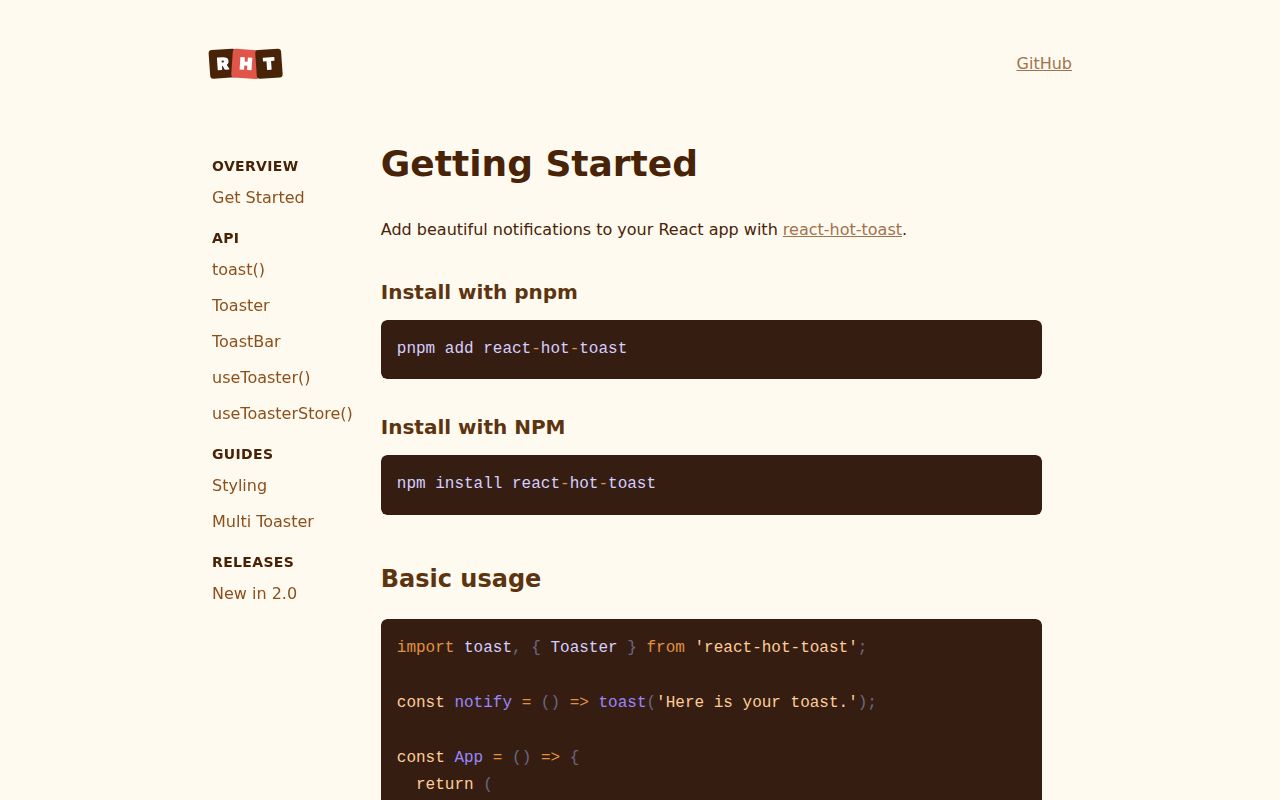
React and React DOM are peer dependencies. Mount one <Toaster /> for the default store, usually near the root. Next.js App Router needs that renderer inside a client component because it uses hooks and browser layout. There is no provider, stylesheet import, account, or config file. The standard entry uses goober; react-hot-toast/headless leaves rendering to you.
Our browser build measured 20.3 KB minified and 7.8 KB gzipped. Dismissed items remain mounted for an exit animation and are removed after 1,000ms by default; toast.remove() skips that delay. A manual loading toast has infinite duration, so every branch must update, dismiss, or remove its ID. toast.promise() returns the original promise and does not replace application-level error handling.
Version 2.6 can route calls to separate renderers through matching toasterId values. That helps embedded surfaces, but a missing ID silently targets the default toaster. All toast types default to role=status with polite announcements, including errors. Use assertive ARIA sparingly, and keep validation or destructive-action failures inline where users can find and act on them after the toast disappears.
Patterns
Render the default toast outlet once mount-toaster
import { Toaster } from 'react-hot-toast'

export function App() {
  return <>
    <Routes />
    <Toaster position="top-right" />
  </>
}
One matching Toaster must be mounted before calls become visible; mounting one per route creates duplicate outlets.
Emit success and error messages show-feedback
import toast from 'react-hot-toast'

toast.success('Profile saved')
toast.error('Could not save profile')
Both types announce politely by default. Important failures still need visible inline text and a recovery action.
Map one promise across 3 states track-promise
await toast.promise(saveProfile(values), {
  loading: 'Saving profile...',
  success: (profile) => `Saved ${profile.name}`,
  error: 'Save failed',
})
The returned promise is the original operation, so a rejection still needs normal application error handling.
Finish a manually started loader update-loading-toast
const id = toast.loading('Publishing...')
try {
  await publish()
  toast.success('Published', { id })
} catch (error) {
  toast.error('Publish failed', { id })
}
Loading duration is infinite; reuse the same ID in every completion branch or the spinner stays on screen.
Upsert one logical notification prevent-duplicates
toast.success('Copied to clipboard', {
  id: 'clipboard-copy',
})
A stable ID replaces the existing toast. Choose IDs per event so unrelated feedback never overwrites it.
Dismiss with the exit animation dismiss-toast
const id = toast('Connection restored')
setTimeout(() => toast.dismiss(id), 1000)
`dismiss()` waits the default 1,000ms removal delay; `remove(id)` deletes the DOM node immediately.
Set durations and urgent ARIA behavior set-global-options
<Toaster toastOptions={{
  duration: 5000,
  success: { duration: 2500 },
  error: { ariaProps: { role: 'alert', 'aria-live': 'assertive' } },
}} />
Per-call options override these defaults. Reserve assertive announcements for messages that require immediate attention.
Target a named sidebar outlet route-toaster
<Toaster toasterId="sidebar" containerStyle={{ position: 'absolute' }} />

toast('Sidebar updated', { toasterId: 'sidebar' })
Both sides need the same ID in version 2.6. Omitting it sends the notification to the default outlet.
Alternatives
| Package | Registry | Pick it when |
|---|---|---|
| sonner | npm | Use it for modern stacked-toast presentation and an API common in current React design systems. |
| react-toastify | npm | Use it when built-in transitions, progress controls, and a larger configuration surface are useful. |
| notistack | npm | Use it in Material UI applications that want provider-based snackbar queues. |
| @radix-ui/react-toast | npm | Use primitives when markup and visual styling must remain under your design system's control. |
More web frontend guides
postcss · react · react-dom · tailwindcss · htmlparser2 · tailwind-merge · the whole shelf →
How this guide is made: grounded in the library's documentation, release notes, changelog, and issue history, on a fixed rubric — not a hands-on install of every release. The 50 most-downloaded entries are additionally install-verified in clean containers. Corrections: contact the desk.