react-toastify review
React-Toastify 11.1.0 combines a mounted `ToastContainer` with an imperative `toast()` API for React 18 and 19. It handles timed messages, promise state, manual updates, controlled progress, stacked queues, swipe dismissal, custom React content, and multiple containers. Version 11.1 adds a CSP nonce for its injected style tag, fixes dismissal event order and touch dragging, clamps deep stacked layouts, restores mobile width, and supplies ARIA values for progress bars. An unstyled export is available when the application owns all notification CSS.
React-Toastify 11.1.0 installed in 1.3 seconds, occupied 9 MB, and added 12.6 KB gzipped in our sandbox, with bundled types and 0 audit findings. It earns that weight when a React 18 or 19 app needs promise updates, queues, stacking, or custom content; use a local live region or smaller toaster for a few simple messages.
We installed it
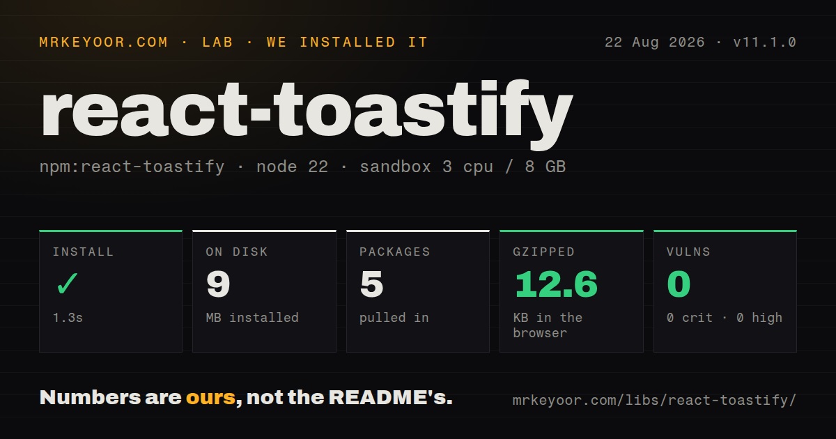
| Install | ✓ · 1.3s | 5 packages on disk · 9 MB |
| Import | ✓ | ESM import works · require() works · CommonJS package with exports map |
| Browser | 12.6 KB | gzipped (42.2 KB minified), bundled with esbuild |
| Types | ✓ | TypeScript types bundled |
| Known vulns | 0 | 0 critical · 0 high · 0 moderate · 0 low (npm audit) |
Answers from our run
Does react-toastify install cleanly?
Yes. In a fresh container with an empty cache, npm install react-toastify finished in 1 seconds, leaving 5 packages and 9 MB on disk. npm audit reported no known vulnerabilities.
How much does react-toastify add to a browser bundle?
12.6 KB gzipped (42.2 KB minified) when the whole package is bundled for the browser with esbuild. Importing only part of it is usually smaller.
Does react-toastify work with both ESM and CommonJS?
Yes. Both import 'react-toastify' and require('react-toastify') worked in Node 22 in our run. The package is published as CommonJS with an exports map.
Does react-toastify include TypeScript types?
Yes, type declarations ship inside the package, so no @types install is needed.
react-toastify or sonner: which should you use?
sonner: Use it for a more opinionated toaster with fewer configuration decisions. React-Toastify 11.1.0 installed in 1.3 seconds, occupied 9 MB, and added 12.6 KB gzipped in our sandbox, with bundled types and 0 audit findings.
When should you not use react-toastify?
Your project uses React 17 or older; version 11.1.0 declares only React and React DOM 18 or 19 as peers
Use it if
- A React 18 or 19 app needs promise, loading, update, dismiss, and progress flows from one API
- Notifications must be callable from ordinary modules as well as component event handlers
- Stacking, queue limits, swipe gestures, RTL, or several independently positioned containers are required
- Custom toast components need typed data and an application-specific close reason
- Your project uses React 17 or older; version 11.1.0 declares only React and React DOM 18 or 19 as peers
- The app needs only one local live-region message and does not justify our measured 12.6 KB gzipped full import
- A global imperative notification store conflicts with isolated feature ownership or server-first rendering
- Your CSP cannot accept an injected style tag and you cannot pass a nonce or use the unstyled export
- Every informational event must have a carefully chosen screen-reader policy; individual toasts default to `alert` and timers can remove content before it is reviewed
Setup reality
Our React-Toastify 11.1.0 install completed in 1.3 seconds in a fresh Node 22 container. It left 5 packages occupying 9 MB, and npm audit reported 0 known vulnerabilities. The package was 612 KB unpacked with 1 direct dependency and 2 peer dependencies. It bundles TypeScript declarations and an exports map. CommonJS require() and ESM import both worked.
Install React and React DOM 18 or 19, then mount a client-side ToastContainer. The styled entry injects CSS when the container mounts in version 11.1, so a strict CSP must pass its nonce through the new nonce prop. react-toastify/unstyled avoids that style tag but leaves placement, transitions, progress, responsive layout, and every visual state to your CSS. Next.js App Router needs a use client wrapper.
Calls made before a container mounts wait in the shared store, which can conceal a missing container in tests. Defaults include a 5,000 ms timeout, top-right placement, light theme, pause on hover and window blur, touch dragging, and role alert. Alt+T focuses the first notification and Escape collapses a stack. Review those keyboard and announcement choices instead of assuming they match the rest of the app.
A container limit queues excess messages. toast.dismiss() removes visible items but does not empty that waiting queue; call toast.clearWaitingQueue() when both must go. Multiple containers need matching stable IDs on the container and each toast call. Unsubscribe toast.onChange listeners and unmount containers after tests because the store is global. Our esbuild import measured 42.2 KB minified and 12.6 KB gzipped, excluding the React peers.
Patterns
Mount one client-side notification outlet mount-container
'use client';
import { ToastContainer, toast } from 'react-toastify';

export function Notifications() {
  return <ToastContainer aria-label="Application notifications" />;
}
export const notifySaved = () => toast.success('Saved');
The 11.1 styled entry injects CSS at mount. Next.js App Router requires the client boundary shown here.
Set duration per message type status-variants
toast.info('Sync started');
toast.success('Profile saved', { autoClose: 2500 });
toast.warning('Storage is almost full');
toast.error('Upload failed', { autoClose: false });
The default timeout is 5,000 ms. `false` keeps the error visible until a person or code dismisses it.
Reflect one promise in a toast promise-status
await toast.promise<User, Error>(saveUser(), {
  pending: 'Saving user...',
  success: { render: ({ data }) => `Saved ${data.name}` },
  error: { render: ({ data }) => `Save failed: ${data.message}` },
});
`toast.promise` returns the original promise and passes its resolved or rejected value into the corresponding renderer.
Finish a manually controlled loading message loading-update
const id = toast.loading('Uploading...');
try {
  await uploadFile(file);
  toast.update(id, { render: 'Upload complete', type: 'success', isLoading: false, autoClose: 3000 });
} catch {
  toast.update(id, { render: 'Upload failed', type: 'error', isLoading: false, autoClose: false });
}
Reset `isLoading` and choose the next timer. Otherwise the updated content can retain loading behavior.
Give a persistent warning one ID deduplicate
const OFFLINE = 'offline';
if (!toast.isActive(OFFLINE)) {
  toast.error('You are offline', { toastId: OFFLINE, autoClose: false });
}
A stable `toastId` prevents duplicate store entries; `isActive` is useful when creation depends on current visibility.
Remove displayed and waiting messages clear-queue
toast.dismiss();
toast.clearWaitingQueue();

// Target one item:
toast.dismiss('offline');
A container limit creates a waiting queue. Dismissing visible toasts alone allows queued items to replace them.
Close custom content with a typed reason custom-content
import type { ToastContentProps } from 'react-toastify';
type Invite = { email: string };
function InviteToast({ data, closeToast }: ToastContentProps<Invite>) {
  return <div>Invite sent to {data.email}<button onClick={() => closeToast('undo')}>Undo</button></div>;
}
toast<Invite>(InviteToast, { data: { email: 'ada@example.com' } });
The string passed to `closeToast` reaches `onClose` as a reason, allowing code to distinguish Undo from ordinary dismissal.
Limit a dark stacked container to 3 items stacked-policy
<ToastContainer
  position="bottom-right"
  theme="dark"
  stacked
  newestOnTop
  limit={3}
  nonce={cspNonce}
  aria-label="Status messages"
/>
The nonce applies to the injected style tag. The fourth notification waits until a visible slot opens.
Route editor and global messages separately multiple-containers
<ToastContainer containerId="global" position="top-right" />
<ToastContainer containerId="editor" position="bottom-center" />

toast('Draft autosaved', { containerId: 'editor' });
toast.error('Session expired', { containerId: 'global' });
The toast's `containerId` must match a mounted outlet. A typo sends the message nowhere useful.
Drive progress from upload bytes manual-progress
const id = toast('Uploading...', { autoClose: false, progress: 0 });
upload.onProgress((loaded, total) => {
  toast.update(id, { progress: loaded / total });
});
upload.onComplete(() => toast.done(id));
Controlled progress ranges from 0 through 1. Version 11.1 exposes its current, minimum, and maximum values to assistive technology.
Observe and release the global subscription change-events
const unsubscribe = toast.onChange((item) => {
  console.log(item.id, item.status, item.reason);
});

// cleanup
unsubscribe();
Version 11.1 reports `removed` synchronously when `toast.dismiss()` runs. Always unsubscribe during teardown.
Bring every visual rule yourself unstyled-entry
import { ToastContainer, toast } from 'react-toastify/unstyled';
import './notifications.css';

<ToastContainer toastClassName="app-toast" />;
toast('Custom design system toast');
The unstyled export injects no default sheet. Your CSS must cover position, dimensions, transitions, progress, and mobile behavior.
Alternatives
| Package | Registry | Pick it when |
|---|---|---|
| sonner | npm | Use it for a more opinionated toaster with fewer configuration decisions. |
| react-hot-toast | npm | Use it for a compact React API with headless rendering access. |
| notistack | npm | Use it for provider-based snackbar queues in applications already following Material UI patterns. |
| @radix-ui/react-toast | npm | Use it when unstyled primitives are preferable and your team will build the store and policy. |
More web frontend guides
postcss · react · react-dom · tailwindcss · htmlparser2 · tailwind-merge · the whole shelf →
How this guide is made: grounded in the library's documentation, release notes, changelog, and issue history, on a fixed rubric — not a hands-on install of every release. The 50 most-downloaded entries are additionally install-verified in clean containers. Corrections: contact the desk.