Nine states give an agent more vocabulary than a spinner
Thinking Orbs treats waiting as information. Its 9 states cover working, searching, solving, listening, connecting, weaving, composing, breathing, and shaping. Each state has a distinct motion, so a voice assistant can listen differently from a search agent scanning for results. That is the package's reason to exist. If every state in your product still means only loading, most of the library's design work will go unused.
The API stays small despite that visual range. A React component takes state, size, theme, speed, paused, and an optional ARIA label, then passes ordinary canvas props through. Version 0.3.1 also exports the drawing engine separately for developers who want its geometry without the component wrapper.
Two tuned sizes are the feature and the constraint
The package ships 20px and 64px presets. They are separately tuned designs with their own dot counts, sizes, and animation speeds, rather than one drawing enlarged or reduced with CSS. At 20px, the orb can sit beside text; at 64px, it can replace an assistant avatar. That attention is visible in the API because size accepts those two values instead of pretending every dimension has been designed.
Fixed choices also limit where the component fits. Open issues 14 and 16 ask for larger and intermediate sizes such as 24px, 32px, and 48px. A hero panel, wearable display, or unusual density may need a different canvas size, and stretching a tuned preset is not the documented contract.
What happened when we ran it
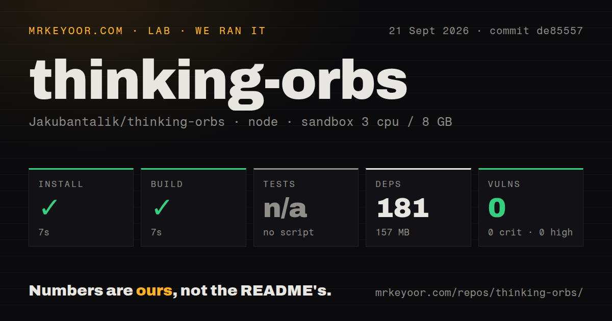
Our sandbox installed thinking-orbs at commit de85557 in 7 seconds. Npm added 181 packages and used 157 MB on disk. The build then succeeded in 7 seconds in a fresh Debian container with 3 CPUs and 8 GB of RAM. Npm audit reported 0 known vulnerabilities across the installed dependency tree. Nothing in the install or build log blocked packaging the library.
There was no test script or target, so our harness skipped tests. The repository includes generated spec data and package scripts for typechecking, production building, demo building, and extracting specs, but none is exposed as test. A successful 7-second build proves that the measured source compiles. It does not prove that all 9 animations paint correctly in Chrome, Safari, and Firefox or that observer cleanup works across repeated mounts.
The checkout was small before installation: 69 files, about 3,038 lines of source, and 1.3 MB. Our scan found 2 CI workflow files, no Dockerfile, and a tests directory. A container would add little value for a browser component, while automated behavior checks would.
A 2x pixel cap comes with sensible motion behavior
Thinking Orbs uses a plain 2D canvas with the device-pixel ratio capped at 2. The README says instances share one clock, pause when scrolled offscreen or when the tab is hidden, and resume in phase. Those choices address the common failure where a decorative loader burns resources even when nobody can see it. The lack of WebGL and canvas filters also keeps the renderer easier to place in an existing page.
Accessibility has received real API work. Each canvas gets role="img" and a state-specific label, which callers can replace. A reduced-motion preference renders a static representative frame instead of continuing the animation. Theme detection checks an ancestor class or data-theme attribute, then the operating-system preference, and watches for changes.
React 18 and monochrome styling define the current boundary
Version 0.3.1 declares React 18 or newer as its only peer dependency. The published contract does not include Vue, Svelte, Solid, React Native, or a terminal renderer. Open pull requests propose several of those targets, but an open proposal is not a shipped capability. Teams on another framework should judge the current package they can install, not code that may change during review.
Color is similarly strict. The automatic theme selects light dots for dark backgrounds or dark dots for light backgrounds, and callers can pin either mode. There is no documented accent-color prop. An open pull request proposes one, while the current README calls the component monochrome.
Twenty open items show interest without a tagged release trail
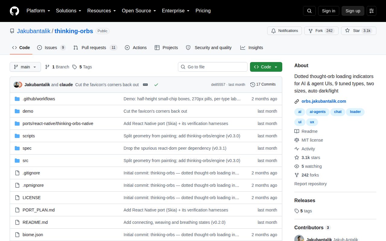
GitHub recorded the last push on August 16, 2026. The repository had 3,069 stars and 20 combined open issues and pull requests when fetched, split into 9 issues and 11 pull requests. Issue activity reached September 1 and pull-request activity September 4, so the later push date does not describe an abandoned project. Contributors are actively testing where the original narrow design can stretch.
GitHub exposes no tagged release for the repository, while package.json identifies the measured code as version 0.3.1. That leaves the package contract, commit history, and publish workflow to carry more of the change story. The clean build and focused README make adoption low-risk for a visual detail. The missing test target should still keep the orb inside your own component tests, especially for reduced motion, theme changes, and unmounting.
The 7-second build makes a visual trial cheap
Thinking Orbs is an easy recommendation for a React agent interface that can name its waiting states honestly. Put the 9 animations beside real status text, switch them only when the underlying operation changes, and preserve the built-in reduced-motion behavior. The component then communicates progress instead of acting as decoration. A short prototype will reveal whether users can tell searching from solving without instruction.
Use React Spinners when size and color controls matter more than an AI-specific visual language. SVG Spinners removes the React dependency, and SpinKit is enough for ordinary CSS loading feedback. Thinking Orbs earns its place only when the verbs carry meaning. Our 181-package install and missing test target are manageable costs for a trial, but they are poor reasons to add nine states to a product that only has one.