Isolated stories make awkward UI states easier to inspect
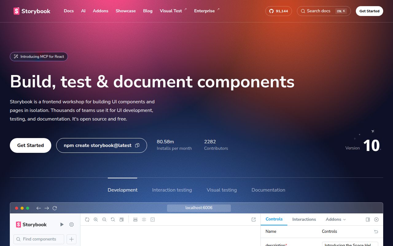
Storybook lets you open a component without navigating through the application that normally contains it. A story records an example state: an empty list, a disabled button, or a dialog with an unusually long label. For a shared component library, that gives reviewers something concrete to discuss. You can return to the same example after changing the component instead of recreating the right account, route, and data by hand.
The README lists React, Angular, Vue 3, Svelte, and other renderers, alongside addons for documentation and accessibility checks. That breadth has a cost for contributors: our checkout contained 8,768 files and roughly 687,273 source lines. Those are measurements of Storybook's own repository. They don't describe the size of adding Storybook to your application, and treating them as an ordinary user's dependency bill would give the wrong advice.
What happened when we ran it
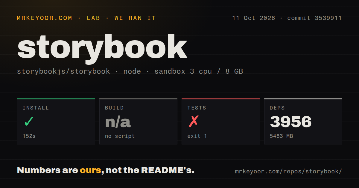
Our sandbox installed Storybook commit 3539911 in 152 seconds, adding 3,956 packages and using 5,483 MB on disk. We ran the checkout on October 11, 2026, in a fresh Debian container with 3 CPUs and 8 GB of RAM, using image lab-node:22 without secrets or elevated privileges. Installation succeeded. The checkout itself occupied 124.6 MB before dependencies, so disk capacity deserves attention if you intend to work on upstream code.
The test command exited with code 1 after 6 seconds. Its log ended with ERR_MODULE_NOT_FOUND for @storybook/svelte/dist/svelte-csf/compiler/transform.js. The stack included Node's module loader, Tailwind's Node package, and Vite customization hooks. That establishes an unresolved module during the command. It doesn't establish whether the cause was an upstream defect, an omitted preparation step, or our environment. We couldn't validate the complete suite with this run.
The harness found no build script or target, so it skipped that step. Its scan recorded 20 CI workflow files and workspace configuration, but no Dockerfile or tests directory. A missing directory with that name doesn't mean the repository lacks tests: the test command did run. Likewise, the skipped build says what the harness discovered, rather than proving Storybook cannot produce a distributable application. These boundaries matter when deciding what the result actually supports.
App adoption and upstream development need different preparation
The Storybook installation guide starts inside an existing project and detects its framework. The repository README sends new users to those docs, while its development section describes yarn start and yarn task for framework sandboxes. If you want a component workshop for your app, use the application guide. Cloning the upstream workspace gives you the maintainers' development environment and a much broader set of concerns.
Our 3,956-package installation belongs to that upstream route. A basic local workshop doesn't require a hosted Storybook account or API credential, but components still need their surrounding configuration. The provider mocking guide shows a decorator supplying a theme and parameters selecting different values. In practice, somebody must own those fixtures. Otherwise a component that works in the application can fail in the workshop because its expected context isn't present.
Addon migration is a real maintenance commitment
The README explicitly directs users of info/notes toward docs, contexts toward toolbars, and addon-storyshots toward the separate test-runner project. That is a concrete reason to decline Storybook if your team wants to preserve an old addon setup indefinitely. The extension system gives you room to tailor a workshop, but each extension also adds another compatibility decision when you upgrade. I'd keep the initial addon list short and expand it only for a review task people actually perform.
The 5,483 MB environment also makes upstream contribution a deliberate choice on a constrained laptop or disposable runner. For everyday adoption, my bigger concern is duplicated application scaffolding: a story with a mocked provider can drift from the live screen. Start with a component whose awkward states repeatedly cause review trouble. Keep those examples next to the code, and make updating them part of changing the component. An unattended catalog soon becomes misleading documentation.
An October push and active pull requests show ongoing repair
GitHub recorded the last push on October 16, 2026, with 91,319 stars and 1,877 open issues and PRs. The latter figure includes pull requests, so it isn't a bug count. The recent activity list included proposed fixes for documentation source transforms and sidebar identifiers. Together, the push date and concrete repair work show a maintained project with an active queue. Popularity doesn't tell you how quickly your particular framework problem will get attention.
Release v10.6.2 shipped on October 12, after our measured checkout. Its notes cover Angular-Vite requirements, Yarn command output, and Preact support. Those changes illustrate why framework compatibility deserves a check before adoption. They don't demonstrate that the missing Svelte module in our run has been fixed. Read the release notes for the renderer you use, and keep the measured commit separate from claims about a newer release.
Ladle and Histoire narrow the workshop decision
Ladle focuses on React component stories. Histoire provides Vite-based component playgrounds. Consider either when its supported framework and authoring style fit your component library and you don't need Storybook's broader renderer choices. We haven't measured those alternatives here, so there is no basis for promising a faster command or a smaller dependency footprint.
Storybook earns its upkeep when shared UI states need a durable place for review and documentation. Our 152-second install succeeded, while the upstream test command failed, which makes me comfortable recommending a focused application trial and cautious about promising an easy contributor checkout. Choose a troublesome component, give its stories the context it needs, and let the people reviewing the next change decide whether that extra surface saved them work.