
Three packages cover three specific visual jobs
Libraries contains 3 published React effects in one monorepo. Border Beam wraps an element with a traveling or breathing glow. Liquid Gooey lets interface pieces merge, trail, or dissolve while keeping live DOM content above the filtered silhouette. Thinking Orbs renders activity states such as searching, listening, solving, or composing on a 2D canvas. Each package has its own README, license, output bundle, and demo site, which makes adoption more selective than the repository name suggests.
That narrowness is the strongest reason to consider it. A team can install one effect without inheriting a design system or copying a large component catalog. Border Beam 1.4.0 targets cards, buttons, inputs, and search bars. Liquid Gooey 0.1.0 targets menus, avatar groups, sliders, tabs, and draggable elements. Thinking Orbs 0.3.1 provides 9 named states at 20-pixel and 64-pixel sizes. The tradeoff is that your application still owns layout, semantics, and the visual judgment around the effect.
Border Beam needs room outside the wrapped element
Border Beam 1.4.0 has traveling, line, and pulse variants, with theme, intensity, duration, brightness, saturation, and hue controls. It reads the first child's border radius unless one is supplied. Decorative layers ignore pointer events, so the wrapper does not steal clicks. Pulse animation shares a capped requestAnimationFrame loop and pauses when inactive, offscreen, or under reduced motion. Rotate effects use CSS keyframes and have a fallback when @property interpolation is unavailable.
The outside pulse has strict composition requirements. Its colored core sits behind the content at a negative stacking level, so the child must be opaque. The wrapper uses visible overflow and expects surrounding layout to leave room for the bloom. It also relies on the child's own 1-pixel border for the resting edge. In a card grid with clipped corners or an ancestor using overflow: hidden, the demo can look right while the product integration loses most of the halo.
Liquid Gooey keeps real controls above its SVG silhouette
Liquid Gooey 0.1.0 separates the filtered shape from the actual interface. An SVG silhouette below the content handles merging and shadows, while buttons, text, images, focus rings, ARIA, and event handlers remain in ordinary DOM above it. Morph mode joins nearby pieces and can animate shape changes. Move mode lets a liquid shape trail motion controlled by CSS, pointer code, or another animation library. An optional dissolve treatment warps imagery where surfaces meet.
The package exposes a small set of normalized controls plus lower-level options. Component-driven springs compile to CSS linear() easing, while observed items share one animation loop that sleeps after roughly 0.5 seconds without movement. These are sensible choices, yet the documented conflicts are real. Dissolve writes mask-image to images during contact, morph can write a blur filter, rotation is not mirrored in version 1, and the group must be sized for the full path its children travel.
What happened when we ran it
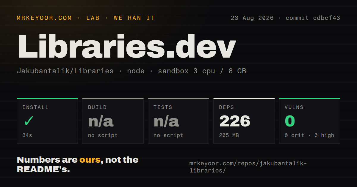
Our clean Debian sandbox installed commit cdbcf43 in 34 seconds. Npm added 226 packages and the resulting dependency tree occupied 205 MB. Npm audit found 0 known vulnerabilities. The repository checkout contained 719 files, about 23,301 lines of source, and used 101.2 MB. It was organized as an npm-workspaces monorepo with 2 CI workflow files, no Dockerfile, and no tests directory.
The measured root had no build script or target, so our harness skipped the build. It also had no test script or target, so tests were skipped. That finding does not mean the packages cannot build: their own manifests contain package-level build commands, and the current README lists workspace-specific site builds and a typecheck command. It means a fresh automated consumer could not run one conventional root build and test sequence at commit cdbcf43. CI and release configuration deserve inspection before upgrading.
Thinking Orbs handles motion preferences inside the package
Thinking Orbs 0.3.1 draws dotted status animations with the 2D canvas API. It avoids WebGL and filter effects, caps device pixel ratio at 2, shares one clock across instances, and pauses work when an orb scrolls offscreen or its browser tab becomes hidden. Under prefers-reduced-motion, it renders a static representative frame. Each canvas has an image role and a state-specific accessible label, which consumers can replace when the visible status text needs different wording.
Theme detection checks an ancestor class or data-theme, then falls back to the operating-system preference. The canvas paints only on the client, so server rendering does not guess a theme. Two sizes are separately tuned rather than scaled copies. That specificity is useful for chat and inline status, though 9 verbs are still a fixed vocabulary. If your agent has states with different meaning, map them carefully or supply visible text instead of stretching an attractive animation into a misleading status.
Native ports are source code, not published packages
Thinking Orbs 0.3.1 includes 2 native ports, one for React Native and one for SwiftUI, kept in step through generated specifications and golden vectors. The root README says neither native package is published. The SwiftUI manifest sits below the repository root. Issue 9 reports that Swift Package Manager cannot add the repository URL because it expects Package.swift at the root. The installation example the reporter followed therefore fails under normal SwiftPM resolution.
GitHub recorded a push on September 10, 2026, with 3,365 stars and 11 combined open issues and pull requests. A reduced-motion pull request and a macOS demo-runner fix were opened on September 8, while a border-color syntax fix followed on September 14. Release v1.3.0 arrived on July 2 and added tuning hooks for an outside-pulse variant. Pin the packages separately, test the chosen effect on Safari and reduced-motion settings, and keep the native ports out of procurement promises until their installation path is published and verified.