@visx/responsive review
@visx/responsive 4.0.0 measures a React container or browser window and passes the dimensions into a chart, or scales a fixed SVG viewBox to fit its wrapper. It supplies useParentSize, ParentSize, useScreenSize, older higher-order components, and ScaleSVG. Version 4 fixes containers stuck at 0 by changing useParentSize to a callback ref, prevents flex and grid height-growth loops with a 2-div ParentSize structure, accepts an external ref, removes lodash, and requires React 18 or 19. It supplies measurements rather than axes, marks, scales, or a finished chart.
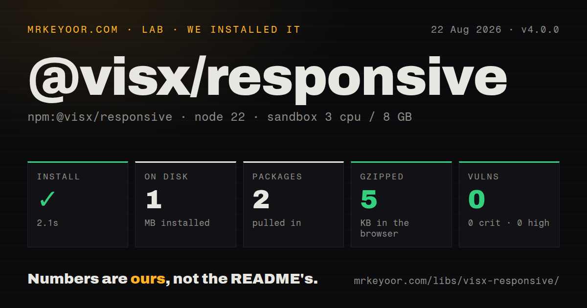
@visx/responsive 4.0.0 installed 2 packages and 1 MB in 2.1 seconds, while our namespace bundle measured 5 KB gzipped, so it is cheap measurement glue for React 18 or 19 teams already building charts from visx. A generic bounds hook is the better install when no other visx primitive is present.
We installed it
| Install | ✓ · 2.1s | 2 packages on disk · 1 MB |
| Import | ✓ | ESM import works · require() works · CommonJS package with exports map |
| Browser | 5 KB | gzipped (13.9 KB minified), bundled with esbuild |
| Types | ✓ | TypeScript types bundled |
| Known vulns | 0 | 0 critical · 0 high · 0 moderate · 0 low (npm audit) |
Answers from our run
Does @visx/responsive install cleanly?
Yes. In a fresh container with an empty cache, npm install @visx/responsive finished in 2 seconds, leaving 2 packages and 1 MB on disk. npm audit reported no known vulnerabilities.
How much does @visx/responsive add to a browser bundle?
5 KB gzipped (13.9 KB minified) when the whole package is bundled for the browser with esbuild. Importing only part of it is usually smaller.
Does @visx/responsive work with both ESM and CommonJS?
Yes. Both import '@visx/responsive' and require('@visx/responsive') worked in Node 22 in our run. The package is published as CommonJS with an exports map.
Does @visx/responsive include TypeScript types?
Yes, type declarations ship inside the package, so no @types install is needed.
@visx/responsive or react-use-measure: which should you use?
react-use-measure: Use it for general-purpose React bounds measurement with ResizeObserver outside a chart toolkit. @visx/responsive 4.0.0 installed 2 packages and 1 MB in 2.1 seconds, while our namespace bundle measured 5 KB gzipped, so it is cheap measurement glue for React 18 or 19 teams already building charts from visx.
When should you not use @visx/responsive?
The application uses React 16 or 17. visx 4 declares only React 18 and 19; the migration guide directs older apps to visx 3.
Use it if
- A chart built from visx primitives needs width and height from its actual dashboard container.
- ResizeObserver measurement needs initial dimensions, debounce control, ignored fields, a polyfill hook, or a caller-owned ref.
- Legacy React components still need withParentSize or withScreenSize while newer code uses hooks.
- A fixed-coordinate SVG can scale as one unit without recomputing tick count or label layout.
- The application uses React 16 or 17. visx 4 declares only React 18 and 19; the migration guide directs older apps to visx 3.
- You expect a ready-made responsive chart. This package returns measurements or a scaled SVG wrapper and draws no axes, marks, tooltips, or accessible labels.
- The target runtime has no ResizeObserver and you cannot inject one. Parent measurement starts after mount through that browser API.
- Server HTML must contain exact final dimensions with no estimate. The default initial size is 0 by 0 because element and window measurements run in effects.
- Layout must respond entirely through CSS container queries without React renders. ResizeObserver updates state, with a 300 ms debounce by default.
- Your only need is generic element bounds outside visx. react-use-measure or use-resize-observer has a narrower purpose and no chart-toolkit context.
Setup reality
We installed @visx/responsive 4.0.0 in a fresh Node 22 Bookworm sandbox. npm completed in 2.1 seconds and left 2 packages using 1 MB. The package is 216 KB unpacked, declares 0 direct dependencies and 2 peer dependencies, and produced 0 npm audit findings. It is CommonJS with an exports map and bundled TypeScript declarations; both require() and ESM import worked. Our namespace browser build measured 13.9 KB minified and 5 KB gzipped.
Install React 18 or 19, plus matching @types/react for TypeScript. No provider, stylesheet, credentials, or config file is required. Layout is the setup: ParentSize defaults to 100% width and height, so its ancestor needs a resolved height. Version 4 renders an outer wrapper and an absolute measurement div to stop flex and grid feedback loops. CSS selectors and snapshots built around the v3 single-wrapper DOM need updating.
useParentSize returns a callback parentRef in v4, not an object with .current. Read node for the measured element or pass externalRef when another feature needs the same DOM node. Dimensions begin at 0 by 0 unless initialSize is supplied, then update after mount through ResizeObserver and requestAnimationFrame. Server-rendered charts should use a stable estimate or render a placeholder with the same outer structure to avoid a sharp layout jump.
Resize updates are debounced by 300 ms by default and can fire on the leading edge. Lowering debounceTime makes drag-resizing feel quicker but adds React renders. Test environments and old browsers need resizeObserverPolyfill. ScaleSVG takes a design width and height and scales strokes, labels, and marks together; it never chooses new ticks for the rendered pixel width. The v4 exports map blocks undocumented deep imports, so use only names exported from @visx/responsive.
Patterns
Give a chart its container dimensions measure-parent-component
<div style={{ width: '100%', height: 360 }}>
  <ParentSize>
    {({ width, height }) =>
      width > 0 && height > 0 ? <Chart width={width} height={height} /> : null
    }
  </ParentSize>
</div>
The ancestor has an explicit 360 px height. ParentSize cannot derive 100% height from an auto-sized containing block.
Attach measurement to your own container measure-parent-hook
function ResponsiveChart() {
  const { parentRef, width, height } = useParentSize();
  return (
    <div ref={parentRef} style={{ width: '100%', height: 320 }}>
      {width > 0 && height > 0 && <Chart width={width} height={height} />}
    </div>
  );
}
In v4 parentRef is a callback. Use the returned node value instead of parentRef.current.
Start from a useful server-render size set-ssr-initial-size
const { parentRef, width, height } = useParentSize({
  initialSize: { width: 640, height: 360 },
});
The 640 by 360 estimate is replaced after mount. Pick a stable placeholder size to limit layout movement.
Update sooner during container drags reduce-resize-delay
const size = useParentSize({
  debounceTime: 50,
  enableDebounceLeadingCall: true,
});
The default is 300 ms. A 50 ms delay feels more immediate but can schedule more React renders during continuous resize.
Provide ResizeObserver for an older runtime inject-resize-observer
import { ResizeObserver } from '@juggle/resize-observer';

const size = useParentSize({
  resizeObserverPolyfill: ResizeObserver,
});
The polyfill is not one of the package's 0 direct dependencies. Install and pass it yourself.
Forward the container to another feature share-measured-element-ref
const containerRef = useRef<HTMLDivElement>(null);
const { parentRef, node, width } = useParentSize<HTMLDivElement>({
  externalRef: containerRef,
});

return <div ref={parentRef}>{width > 0 && <Chart width={width} />}</div>;
externalRef and node point at the same element measured by the callback ref in v4.
Render only for size changes ignore-position-only-changes
const size = useParentSize({
  ignoreDimensions: ['top', 'left'],
});
A top or left change alone does not replace state. Width and height changes still carry the full new measurement.
Size a full-window visualization measure-browser-window
const { width, height } = useScreenSize({
  initialSize: { width: 1280, height: 720 },
  debounceTime: 100,
});
return <Chart width={width} height={height} />;
useScreenSize reads window dimensions after mount. Nested dashboard charts should measure their parent instead.
Fit one fixed SVG coordinate system scale-fixed-viewbox
<ScaleSVG width={800} height={400}>
  <ChartMarks width={800} height={400} />
</ScaleSVG>
ScaleSVG scales all marks, text, and strokes from an 800 by 400 viewBox. It does not recompute label density.
Fill the wrapper and crop excess crop-scaled-svg
<ScaleSVG
  width={800}
  height={400}
  preserveAspectRatio="xMidYMid slice"
>
  <ChartMarks width={800} height={400} />
</ScaleSVG>
slice fills the viewport and may crop chart edges. The default meet behavior keeps the whole viewBox visible.
Measure a legacy component through an HOC wrap-class-chart
function Chart({ parentWidth, parentHeight }) {
  if (parentWidth == null || parentHeight == null) return null;
  return <svg width={parentWidth} height={parentHeight} />;
}

export default withParentSize(Chart);
withParentSize supports older component patterns. New function components can use useParentSize directly.
Set a manual ParentSize value override-parent-size
<ParentSize initialSize={{ width: 400, height: 240 }}>
  {({ width, height, resize }) => (
    <>
      <Chart width={width} height={height} />
      <button onClick={() => resize({ width: 800, height, top: 0, left: 0 })}>Wide</button>
    </>
  )}
</ParentSize>
resize() passes through debounce and sets all 4 fields. The next ResizeObserver event can replace the manual width.
Alternatives
| Package | Registry | Pick it when |
|---|---|---|
| react-use-measure | npm | Use it for general-purpose React bounds measurement with ResizeObserver outside a chart toolkit. |
| use-resize-observer | npm | Use it for a focused hook with rounding, callbacks, and observed-box controls. |
| @react-hook/resize-observer | npm | Use it when an existing ref should receive lightweight ResizeObserver updates. |
| react-resize-detector | npm | Use it when a general React hook or component wrapper is preferable to visx-specific naming. |
More web frontend guides
postcss · react · react-dom · tailwindcss · htmlparser2 · tailwind-merge · the whole shelf →
How this guide is made: grounded in the library's documentation, release notes, changelog, and issue history, on a fixed rubric — not a hands-on install of every release. The 50 most-downloaded entries are additionally install-verified in clean containers. Corrections: contact the desk.