@visx/grid review
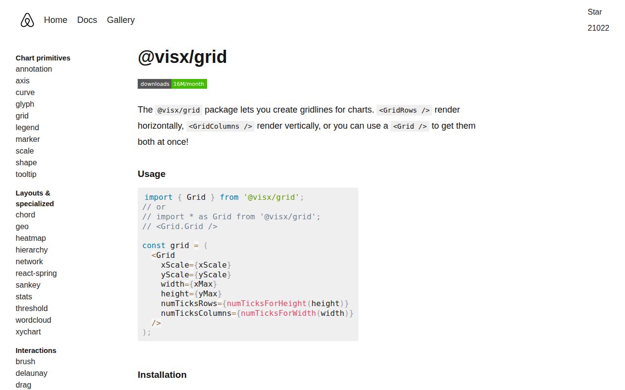
@visx/grid 4.0.0 contains React components that turn scale ticks into SVG chart lines. `GridRows` draws horizontal rules, `GridColumns` draws vertical ones, and `Grid` combines them; angle, radial, and polar components cover circular layouts. You supply the scales, plot dimensions, tick choices, and paint. Version 4 adds React 19 support and modern package exports while dropping React 16/17 and runtime PropTypes. The package does not draw data marks, axes, labels, tooltips, legends, or a responsive container.
@visx/grid 4.0.0 installed in 4.3 seconds with no audit findings, but our import brought 35 packages and measured 15.8 KB gzipped for grid primitives alone. Install it when shared visx scales and custom SVG composition justify that cost; choose a higher-level chart library or hand-written lines when they do not.
We installed it
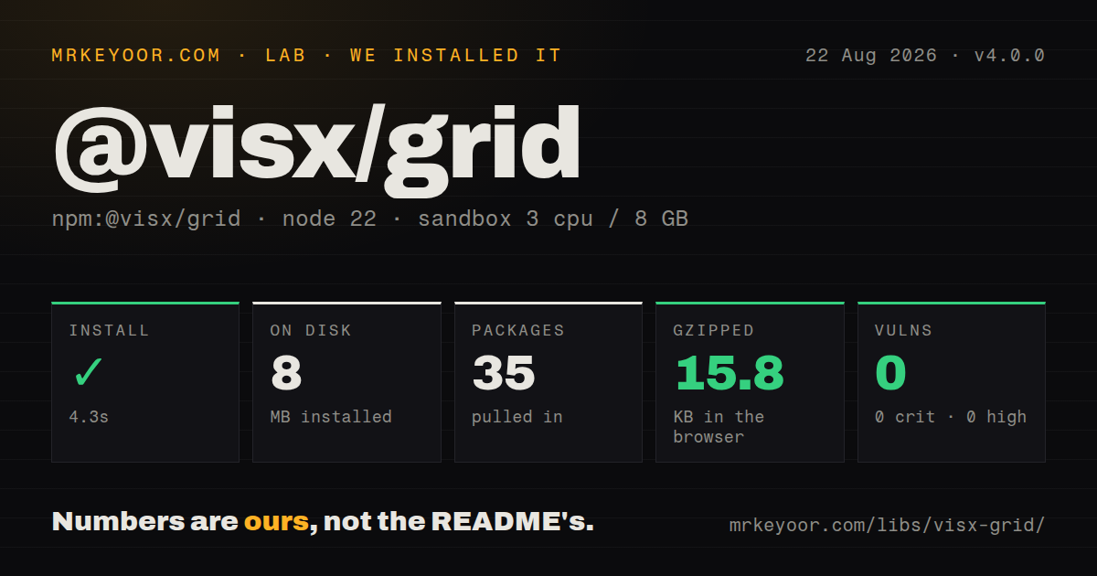
| Install | ✓ · 4.3s | 35 packages on disk · 8 MB |
| Import | ✓ | ESM import works · require() works · CommonJS package with exports map |
| Browser | 15.8 KB | gzipped (44 KB minified), bundled with esbuild |
| Types | ✓ | TypeScript types bundled |
| Known vulns | 0 | 0 critical · 0 high · 0 moderate · 0 low (npm audit) |
Answers from our run
Does @visx/grid install cleanly?
Yes. In a fresh container with an empty cache, npm install @visx/grid finished in 4 seconds, leaving 35 packages and 8 MB on disk. npm audit reported no known vulnerabilities.
How much does @visx/grid add to a browser bundle?
15.8 KB gzipped (44 KB minified) when the whole package is bundled for the browser with esbuild. Importing only part of it is usually smaller.
Does @visx/grid work with both ESM and CommonJS?
Yes. Both import '@visx/grid' and require('@visx/grid') worked in Node 22 in our run. The package is published as CommonJS with an exports map.
Does @visx/grid include TypeScript types?
Yes, type declarations ship inside the package, so no @types install is needed.
@visx/grid or recharts: which should you use?
recharts: Choose it when a React chart should include CartesianGrid, axes, common series, legends, and responsive layout. @visx/grid 4.0.0 installed in 4.3 seconds with no audit findings, but our import brought 35 packages and measured 15.8 KB gzipped for grid primitives alone.
When should you not use @visx/grid?
You want a chart component from a data array: this package supplies grid primitives and leaves axes, series, legends, tooltips, and layout to other code
Use it if
- A custom React SVG chart needs gridlines calculated from the same scales used by its marks and axes
- Rows and columns need exact tick arrays, separate styling, or a custom line render function
- A radar or radial chart needs reusable spoke and ring geometry
- The application already uses visx 4 and accepts responsibility for chart sizing, layering, and semantics
- You want a chart component from a data array: this package supplies grid primitives and leaves axes, series, legends, tooltips, and layout to other code
- The app uses React 16 or 17 or still targets IE11: visx 4 requires React 18 or 19 and tells legacy-browser users to stay on version 3
- A few fixed background rules would do: our package import measured 15.8 KB gzipped and installed 35 packages
- The plot needs Canvas or WebGL for dense rendering: `@visx/grid` emits SVG lines and paths
- Animation and runtime prop validation are requirements: visx leaves animation to another library, and version 4 removed generated PropTypes
Setup reality
In our sandbox, @visx/grid 4.0.0 installed in 4.3 seconds and left 35 packages using 8 MB. The package has 6 direct dependencies, 2 peer dependencies, bundled TypeScript declarations, and a 208 KB unpacked size. npm audit reported 0 known vulnerabilities. It is CommonJS with an exports map; both require() and ESM import worked. Our browser import measured 44 KB minified and 15.8 KB gzipped.
React 18 or 19 is required, and @types/react is the optional second peer for TypeScript projects. Upgrade all @visx/* dependencies to version 4 together because their entry points and internal package ranges moved as a set. Deep imports such as @visx/grid/lib/... are blocked by the exports map; use symbols from @visx/grid. JavaScript apps get no generated PropTypes in v4, so invalid scales or dimensions have no runtime validation layer from visx.
A grid needs ready-made scales plus plot width and height. Those dimensions should describe the inner plot after margins, and the scale ranges must use that same box. numTicks is a request to the scale, not a fixed count; pass tick values when the exact lines matter. Band-scale gridlines are centered within each band. SVG paint order is literal, so render a decorative grid before data marks and set pointerEvents='none' plus aria-hidden='true'.
Responsiveness comes from @visx/responsive or your own observer, not this package. Avoid drawing until the measured width and height are positive, especially around server rendering and the first browser layout. Polar components expect angle output in radians and a separate radial scale; explicit ticks prevent odd rings from domain-derived values. There is no theme context, clipping rule, axis synchronization, or transition system in @visx/grid 4.0.0.
Patterns
Draw rows and columns draw-cartesian-grid
import { Grid } from '@visx/grid'
import { scaleLinear } from '@visx/scale'

const width = 640
const height = 320
const xScale = scaleLinear({ domain: [0, 100], range: [0, width] })
const yScale = scaleLinear({ domain: [0, 1], range: [height, 0] })

<svg width={width} height={height}>
  <Grid xScale={xScale} yScale={yScale} width={width} height={height}
    numTicksRows={5} numTicksColumns={10} />
</svg>
The scale ranges and grid dimensions must describe the same plot box; requested tick counts remain approximate.
Render horizontal rules only draw-horizontal-grid
import { GridRows } from '@visx/grid'

<GridRows
  scale={yScale}
  width={plotWidth}
  numTicks={6}
  stroke='#d7dde5'
  strokeWidth={1}
/>
`GridRows` takes a y-position scale and draws each result from x=0 to the supplied width.
Center rules inside category bands draw-band-columns
import { GridColumns } from '@visx/grid'
import { scaleBand } from '@visx/scale'

const xScale = scaleBand({
  domain: ['Mon', 'Tue', 'Wed'],
  range: [0, plotWidth],
  padding: 0.2,
})

<GridColumns scale={xScale} height={plotHeight} />
For a band scale, `GridColumns` adds half of `bandwidth()` so each rule crosses the band center.
Use exact grid values set-grid-ticks
<Grid
  xScale={xScale}
  yScale={yScale}
  width={plotWidth}
  height={plotHeight}
  columnTickValues={[0, 25, 50, 75, 100]}
  rowTickValues={[0, 0.5, 1]}
/>
Explicit arrays replace the scale's approximate tick selection and must contain values each scale accepts.
Style rows and columns separately style-grid-directions
<Grid
  xScale={xScale}
  yScale={yScale}
  width={plotWidth}
  height={plotHeight}
  stroke='#94a3b8'
  strokeDasharray='3 4'
  rowLineStyle={{ opacity: 0.55 }}
  columnLineStyle={{ opacity: 0.25 }}
/>
Shared SVG stroke props reach both directions; `rowLineStyle` and `columnLineStyle` override each set.
Translate the inner plot once align-chart-margins
import { Group } from '@visx/group'

const margin = { top: 20, right: 24, bottom: 40, left: 48 }
const plotWidth = width - margin.left - margin.right
const plotHeight = height - margin.top - margin.bottom

<svg width={width} height={height}>
  <Group left={margin.left} top={margin.top}>
    <Grid xScale={xScale} yScale={yScale} width={plotWidth} height={plotHeight} />
    {marks}
  </Group>
</svg>
Set both scale ranges from `plotWidth` and `plotHeight`. Reapplying the margin inside the grid shifts lines away from marks.
Put gridlines behind chart data hide-decorative-grid
<svg width={width} height={height}>
  <Grid
    xScale={xScale}
    yScale={yScale}
    width={width}
    height={height}
    aria-hidden='true'
    pointerEvents='none'
  />
  <DataSeries data={data} />
</svg>
SVG paints in document order. Rendering the grid first keeps it behind marks, while the two props remove decorative lines from hit testing and the accessibility tree.
Replace default row elements render-custom-rows
<GridRows scale={yScale} width={plotWidth} tickValues={[0, 25, 50, 75, 100]}>
  {({ lines }) => (
    <g>
      {lines.map(({ from, to, index }) => (
        <line key={index} x1={from.x} y1={from.y} x2={to.x} y2={to.y}
          stroke={index === 0 ? '#334155' : '#cbd5e1'}
          strokeWidth={index === 0 ? 2 : 1} />
      ))}
    </g>
  )}
</GridRows>
A child render function replaces the default line elements. Keep tick ordering stable when using the generated index as the React key.
Measure the chart container measure-responsive-grid
import { ParentSize } from '@visx/responsive'

<ParentSize debounceTime={100}>
  {({ width, height }) => {
    if (width < 1 || height < 1) return null
    const xScale = makeXScale(width)
    const yScale = makeYScale(height)
    return <svg width={width} height={height}>
      <Grid xScale={xScale} yScale={yScale} width={width} height={height} />
    </svg>
  }}
</ParentSize>
Container measurement belongs to `@visx/responsive`; server output and the first browser pass may not have a positive size.
Draw radial chart spokes draw-angle-spokes
import { GridAngle } from '@visx/grid'
import { scaleLinear } from '@visx/scale'

const angleScale = scaleLinear({ domain: [0, 8], range: [0, Math.PI * 2] })

<GridAngle scale={angleScale} tickValues={[0, 1, 2, 3, 4, 5, 6, 7]}
  innerRadius={24} outerRadius={140} left={160} top={160} />
The angle scale outputs radians. `GridAngle` rotates the coordinate conversion so angle zero appears at the top.
Draw concentric value rings draw-radial-rings
import { GridRadial } from '@visx/grid'
import { scaleLinear } from '@visx/scale'

const radiusScale = scaleLinear({ domain: [0, 100], range: [0, 140] })

<GridRadial scale={radiusScale} tickValues={[20, 40, 60, 80, 100]}
  left={160} top={160} stroke='#cbd5e1' fill='transparent' />
Explicit radial ticks prevent an unwanted center ring and keep the circles tied to meaningful data values.
Combine spokes and rings draw-polar-grid
import { GridPolar } from '@visx/grid'

<GridPolar
  scaleAngle={angleScale}
  scaleRadial={radiusScale}
  outerRadius={140}
  left={160}
  top={160}
  tickValuesAngle={[0, 1, 2, 3, 4, 5, 6, 7]}
  tickValuesRadial={[20, 40, 60, 80, 100]}
  strokeAngle='#e2e8f0'
  strokeRadial='#cbd5e1'
/>
`GridPolar` composes angle and radial grids; it does not infer compatible domains, radii, or center coordinates from data.
Alternatives
| Package | Registry | Pick it when |
|---|---|---|
| recharts | npm | Choose it when a React chart should include CartesianGrid, axes, common series, legends, and responsive layout. |
| victory | npm | Choose it for declarative chart composition with axes, grids, themes, and animation in one system. |
| @nivo/line | npm | Choose it when an opinionated line chart with interaction, legends, and SVG or Canvas rendering is preferable. |
More web frontend guides
postcss · react · react-dom · tailwindcss · htmlparser2 · tailwind-merge · the whole shelf →
How this guide is made: grounded in the library's documentation, release notes, changelog, and issue history, on a fixed rubric — not a hands-on install of every release. The 50 most-downloaded entries are additionally install-verified in clean containers. Corrections: contact the desk.