swiper review
Swiper 14.1.0 is an ESM carousel engine for touch sliders, galleries, product rails, and presentation-style screens. It handles dragging, momentum, snap points, RTL, responsive slide counts, loop mode, virtual slides, controllers, keyboard and mouse-wheel input, effects, and accessibility attributes. Entry points cover direct DOM use, React, Vue, and registered Web Components. The current patch restores viewport-relative element offsets, preserves module options across realms and breakpoints, and fixes their types. Our all-exports build measured 19.9 KB gzipped before CSS, so simple overflow rows should stay native.
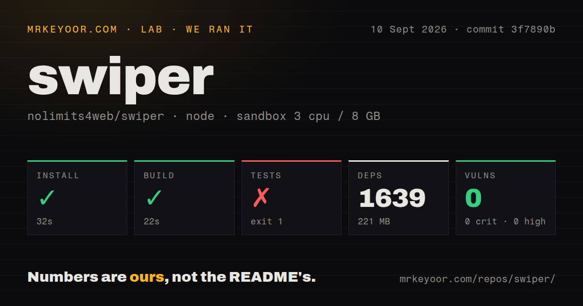
Swiper 14.1.0 installed as one 5 MB package in 0.8 seconds, and our all-exports bundle measured 19.9 KB gzipped with 0 audit findings. Pay that cost for gesture-heavy galleries or virtualized sliders; use CSS scroll snap or a headless engine for an ordinary horizontal row.
We installed it
| Install | ✓ · 0.8s | 1 package on disk · 5 MB |
| Import | ✓ | ESM import works · require() works · ESM package with exports map |
| Browser | 19.9 KB | gzipped (64 KB minified), bundled with esbuild |
| Types | ✓ | TypeScript types bundled |
| Known vulns | 0 | 0 critical · 0 high · 0 moderate · 0 low (npm audit) |
Answers from our run
Does swiper install cleanly?
Yes. In a fresh container with an empty cache, npm install swiper finished in 0.8s, leaving 1 package and 5 MB on disk. npm audit reported no known vulnerabilities.
How much does swiper add to a browser bundle?
19.9 KB gzipped (64 KB minified) when the whole package is bundled for the browser with esbuild. Importing only part of it is usually smaller.
Does swiper work with both ESM and CommonJS?
Yes. Both import 'swiper' and require('swiper') worked in Node 22 in our run. The package is published as ESM with an exports map.
Does swiper include TypeScript types?
Yes, type declarations ship inside the package, so no @types install is needed.
swiper or embla-carousel: which should you use?
embla-carousel: Use it for a smaller headless engine when your design system should own markup, buttons, and styling. Swiper 14.1.0 installed as one 5 MB package in 0.8 seconds, and our all-exports bundle measured 19.9 KB gzipped with 0 audit findings.
When should you not use swiper?
CSS scroll snap plus previous and next buttons covers the feature. Our import measured 19.9 KB gzipped before any Swiper CSS.
Use it if
- Touch momentum, nested sliders, RTL, and tuned gesture behavior are central product requirements.
- One carousel implementation must serve direct DOM, React, Vue, and Web Component code.
- The interaction needs linked thumbnails, virtual slides, zoom, autoplay, controller syncing, or visual effects.
- The team can ship module CSS and test focus, announcements, autoplay controls, reduced motion, and real touch input.
- CSS scroll snap plus previous and next buttons covers the feature. Our import measured 19.9 KB gzipped before any Swiper CSS.
- Old browsers are in scope. The project README explicitly limits support to modern applications and says it is not compatible with every platform.
- Configuration must change loop or effect at breakpoints, combine rewind with loop, or freely mix centered and grid options. The API documents those combinations as unsupported.
- Major-version migrations cannot be budgeted. Swiper is at 14, and prior majors changed imports, module setup, markup, and framework integrations.
- Installing A11y is expected to finish accessibility work. It supplies roles and messages, while content order, focus, a visible autoplay control, reduced motion, and keyboard behavior still need testing.
Setup reality
We installed Swiper 14.1.0 in 0.8 seconds in a fresh Node 22 Bookworm container. It left 1 package using 5 MB, and npm audit reported 0 known vulnerabilities. The package has no direct or peer dependencies, is 4924 KB unpacked, and uses the MIT license. It declares ESM with an exports map and bundles types; require() and ESM import both worked in our checks. Our all-exports browser build was 64 KB minified and 19.9 KB gzipped.
A visible slider requires JavaScript and CSS. Vanilla markup needs .swiper, .swiper-wrapper, and .swiper-slide, plus at least swiper/css. Missing styles produce a stacked or vertical list that often looks like failed initialization. Optional modules come from swiper/modules, must be passed in modules, and usually need their matching CSS. swiper/css/bundle is convenient but includes styles for every module. React and Vue use separate entry points; Web Components require register() in browser code.
SSR frameworks should initialize Swiper only in a client component or browser hook. The container needs measurable width and height. A slider first rendered inside a hidden tab or modal may need update() after it becomes visible; late fonts and images can create the same recalculation issue. Breakpoints use viewport width unless breakpointBase is changed to container. Version 14.1.0 fixes module-option typing across breakpoints and restores viewport-relative elementOffset behavior.
Loop mode rearranges slide elements and requires enough slides, with group and grid counts satisfying documented multiples unless blank slides are allowed. loop and effect cannot be switched at breakpoints, and rewind is incompatible with loop. Autoplay does not create a visible pause button. Treat A11y as baseline attributes and announcements, then test keyboard order, screen-reader output, reduced motion, and focus after every slide transition.
Patterns
Initialize the required DOM structure create-basic-slider
import Swiper from 'swiper';
import 'swiper/css';

const swiper = new Swiper('.swiper', {
  slidesPerView: 1,
  spaceBetween: 16,
});
Swiper expects one wrapper around the slide elements. `swiper/css` supplies required layout rules rather than optional decoration.
Load navigation and pagination add-navigation-pagination
import Swiper from 'swiper';
import { Navigation, Pagination } from 'swiper/modules';
import 'swiper/css';
import 'swiper/css/navigation';
import 'swiper/css/pagination';

new Swiper('.swiper', {
  modules: [Navigation, Pagination],
  navigation: {
    nextEl: '.swiper-button-next',
    prevEl: '.swiper-button-prev',
  },
  pagination: { el: '.swiper-pagination', clickable: true },
});
JavaScript module imports do not bring CSS with them. Import both style modules or accept all module styles through `swiper/css/bundle`.
Set responsive slide counts configure-breakpoints
new Swiper('.swiper', {
  slidesPerView: 1,
  spaceBetween: 12,
  breakpoints: {
    640: { slidesPerView: 2, spaceBetween: 16 },
    1024: { slidesPerView: 4, spaceBetween: 24 },
  },
});
Keys refer to viewport width unless breakpointsBase is `container`. The API continues to label container-based breakpoints beta.
Satisfy loop-mode slide counts enable-safe-looping
new Swiper('.swiper', {
  slidesPerView: 3,
  slidesPerGroup: 1,
  loop: true,
  loopAddBlankSlides: true,
});
Loop reorders elements and needs at least slidesPerView plus slidesPerGroup. Counts must also divide by group and grid rows unless blank insertion is enabled.
Keep autoplay running after interaction configure-autoplay
import { Autoplay } from 'swiper/modules';
import 'swiper/css/autoplay';

const swiper = new Swiper('.swiper', {
  modules: [Autoplay],
  autoplay: {
    delay: 5000,
    disableOnInteraction: false,
    pauseOnMouseEnter: true,
  },
});

document.querySelector('#pause').addEventListener('click', () => {
  swiper.autoplay.paused ? swiper.autoplay.resume() : swiper.autoplay.pause();
});
This option does not create a pause button or honor reduced motion by itself. Add both behaviors in the surrounding interface.
Read the logical slide index listen-to-slide-changes
const swiper = new Swiper('.swiper', {
  on: {
    slideChange(instance) {
      console.log('logical index', instance.realIndex);
    },
  },
});
Loop mode rearranges slides, so activeIndex tracks internal order. realIndex identifies the corresponding original slide.
Refresh after DOM changes update-dynamic-slides
const wrapper = document.querySelector('.swiper-wrapper');
wrapper.insertAdjacentHTML('beforeend', '<div class="swiper-slide">New</div>');
swiper.update();
Call update() after manual mutations. Observer options can automate recalculation but add continuous mutation monitoring.
Control and destroy an instance control-slider-programmatically
swiper.slideTo(3, 400);
swiper.disable();
swiper.enable();

// Before permanently removing the carousel:
swiper.destroy(true, true);
Vanilla applications should destroy the instance before its element disappears, releasing listeners and optionally removing generated inline styles.
Render a React carousel build-react-carousel
import { Swiper, SwiperSlide } from 'swiper/react';
import { Navigation, Pagination } from 'swiper/modules';
import 'swiper/css';
import 'swiper/css/navigation';
import 'swiper/css/pagination';

export function Gallery({ images }) {
  return (
    <Swiper modules={[Navigation, Pagination]} navigation pagination={{ clickable: true }}>
      {images.map((src) => (
        <SwiperSlide key={src}><img src={src} alt="" /></SwiperSlide>
      ))}
    </Swiper>
  );
}
Swiper needs browser DOM APIs. In an SSR or React Server Components app, put this component behind the client boundary.
Virtualize React slides render-virtual-react-slides
import { Virtual } from 'swiper/modules';
import { Swiper, SwiperSlide } from 'swiper/react';
import 'swiper/css';
import 'swiper/css/virtual';

<Swiper modules={[Virtual]} virtual>
  {items.map((item, index) => (
    <SwiperSlide key={item.id} virtualIndex={index}>
      {item.label}
    </SwiperSlide>
  ))}
</Swiper>
React owns rendering in this mode. Each slide still needs its logical virtualIndex or navigation and recycled positions drift apart.
Add keyboard and A11y modules enable-keyboard-a11y
import { A11y, Keyboard } from 'swiper/modules';

new Swiper('.swiper', {
  modules: [A11y, Keyboard],
  keyboard: { enabled: true, onlyInViewport: true },
  a11y: {
    containerRoleDescriptionMessage: 'Featured products carousel',
    nextSlideMessage: 'Show next product',
    prevSlideMessage: 'Show previous product',
  },
});
A11y supplies attributes and live messages. Test focus order, image alternatives, control labels, and announcements with actual assistive technology.
Switch to cssMode use-css-scroll-mode
new Swiper('.swiper', {
  cssMode: true,
  slidesPerView: 'auto',
  spaceBetween: 16,
});
cssMode delegates movement to scroll snap. Cube effects, some transition events, simulateTouch mouse dragging, resistance, and parts of grouping are unavailable.
Alternatives
| Package | Registry | Pick it when |
|---|---|---|
| embla-carousel | npm | Use it for a smaller headless engine when your design system should own markup, buttons, and styling. |
| keen-slider | npm | Use it for a compact touch slider with official React, Vue, and Solid bindings. |
| @splidejs/splide | npm | Use it when declarative markup and stronger accessible defaults matter more than a long effects list. |
More web frontend guides
postcss · react · react-dom · tailwindcss · htmlparser2 · tailwind-merge · the whole shelf →
How this guide is made: grounded in the library's documentation, release notes, changelog, and issue history, on a fixed rubric — not a hands-on install of every release. The 50 most-downloaded entries are additionally install-verified in clean containers. Corrections: contact the desk.