embla-carousel review
embla-carousel 8.6.0 supplies the motion and geometry for a touch-draggable, snapping carousel without rendering its interface. It measures a viewport, its first container child, and the slides inside that container. The returned API exposes snap positions, current selection, previous and next movement, progress, visible-slide queries, events, reinitialization, and plugin access. Your application still owns slide markup, CSS sizing, navigation buttons, status text, focus treatment, and responsive layout. Version 8.6.0 corrects `scrollProgress()` so it follows the container translation more closely; it does not introduce a new public API.
embla-carousel 8.6.0 installed in 0.4 seconds with 0 runtime dependencies, and our full browser import measured 18 KB minified and 7.5 KB gzipped. It is a good base for a deliberately designed carousel, but teams seeking a finished accessible widget should install something that renders the controls too.
We installed it
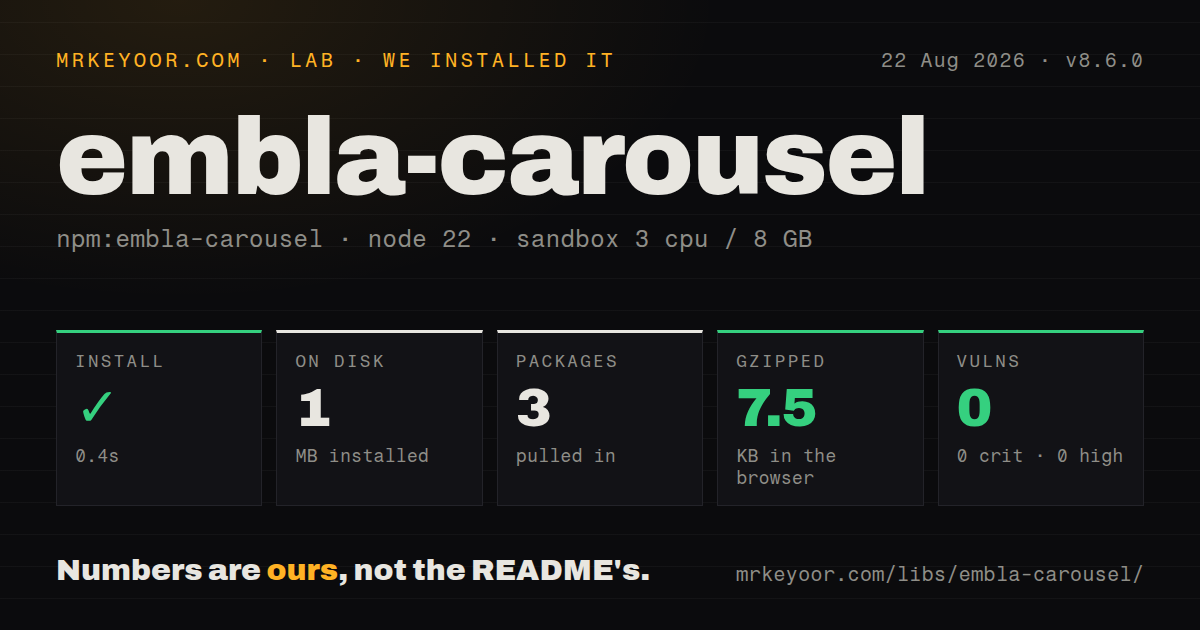
| Install | ✓ · 0.4s | 3 packages on disk · 1 MB |
| Import | ✓ | ESM import works · require() works · CommonJS package with exports map |
| Browser | 7.5 KB | gzipped (18 KB minified), bundled with esbuild |
| Types | ✓ | TypeScript types bundled |
| Known vulns | 0 | 0 critical · 0 high · 0 moderate · 0 low (npm audit) |
Answers from our run
Does embla-carousel install cleanly?
Yes. In a fresh container with an empty cache, npm install embla-carousel finished in 0.4s, leaving 3 packages and 1 MB on disk. npm audit reported no known vulnerabilities.
How much does embla-carousel add to a browser bundle?
7.5 KB gzipped (18 KB minified) when the whole package is bundled for the browser with esbuild. Importing only part of it is usually smaller.
Does embla-carousel work with both ESM and CommonJS?
Yes. Both import 'embla-carousel' and require('embla-carousel') worked in Node 22 in our run. The package is published as CommonJS with an exports map.
Does embla-carousel include TypeScript types?
Yes, type declarations ship inside the package, so no @types install is needed.
embla-carousel or swiper: which should you use?
swiper: Use it when built-in navigation, pagination, effects, and a much larger module catalog are worth a heavier API. embla-carousel 8.6.0 installed in 0.4 seconds with 0 runtime dependencies, and our full browser import measured 18 KB minified and 7.5 KB gzipped.
When should you not use embla-carousel?
You need an install-and-render widget with arrows, dots, captions, and accessible labels already present. Embla deliberately renders none of those pieces.
Use it if
- The product design calls for custom cards, controls, and spacing, but drag physics and snap calculations should come from a tested engine.
- CSS must decide whether a slide is full width, fractional, variable width, or separated by responsive gaps.
- Application state needs selected-snap events, progress, visible-slide indexes, or programmatic movement.
- One carousel model has to work in plain JavaScript or through the project's React, Vue, Svelte, and Solid packages.
- You need an install-and-render widget with arrows, dots, captions, and accessible labels already present. Embla deliberately renders none of those pieces.
- CSS scroll snap plus native horizontal overflow already gives the required behavior. That path works before JavaScript hydration and avoids another interaction engine.
- The team expects a `slidesPerView` option. Embla calculates slide sizes from CSS, so that mental model leads to confusing configuration and layout bugs.
- A feed contains thousands of mounted slides. The engine observes and measures DOM slides; it does not virtualize the collection for you.
- Effects and automatic behavior must come from one core dependency. Autoplay, auto-scroll, fade, class-name hooks, and wheel gestures live in additional packages or plugins.
Setup reality
We installed embla-carousel 8.6.0 in a fresh Node 22 Bookworm container in 0.4 seconds. It left 3 packages and 1 MB on disk. The core package is 904 KB unpacked, declares 0 direct dependencies and 0 peers, and includes TypeScript declarations. npm audit reported 0 known vulnerabilities. Its package metadata is CommonJS with an exports map; both require() and ESM import worked in our sandbox.
The required setup is mostly HTML and CSS. Pass the overflow-clipped viewport to EmblaCarousel(). Its first child becomes the moving container, and that child's children become slides unless selectors or elements override them. A flex slide commonly needs flex: 0 0 100% and min-width: 0. Width, gaps, and multi-card layouts come from CSS, not a slidesPerView setting. Passing the moving container instead of its viewport gives the engine the wrong root geometry.
There are no credentials or config files. Runtime bookkeeping is the part teams underestimate. ResizeObserver and MutationObserver can trigger reInit; rebuild pagination when snap count changes, and listen to both select and reInit when enabling arrows. Plain JavaScript callers must keep callback references for off() and invoke destroy() during teardown. Official framework hooks handle the instance lifecycle, but their API value is unavailable until the viewport ref mounts.
Our namespace browser build measured 18 KB minified and 7.5 KB gzipped. Controls still need button elements, accessible names, disabled states, and a way to announce the current item. The core moves focus into view when its focus watcher is active, but it does not decide the product's labels or reduced-motion policy. Autoplay is separate, and any timer should be stopped or softened when the user requests reduced motion.
Patterns
Start a plain JavaScript carousel initialize-core
import EmblaCarousel from 'embla-carousel'

const root = document.querySelector('.carousel__viewport')
const embla = EmblaCarousel(root, { align: 'start', loop: false })
Version 8 expects the clipped viewport as its root. The first child is treated as the slide container by default.
Create the viewport and slide geometry build-required-css
<div class="carousel__viewport">
  <div class="carousel__track">
    <section class="carousel__slide">A</section>
    <section class="carousel__slide">B</section>
  </div>
</div>

<style>
.carousel__viewport { overflow: hidden; }
.carousel__track { display: flex; }
.carousel__slide { flex: 0 0 100%; min-width: 0; }
</style>
Slide width is read from rendered CSS. `min-width: 0` stops flex content from enlarging a slide beyond its basis.
Show a partial next card show-card-peek
.carousel__track {
  display: flex;
  gap: 16px;
}
.carousel__slide {
  flex: 0 0 82%;
  min-width: 0;
}
Embla includes measured CSS gaps in its snap calculations. There is no `slidesPerView` option in 8.6.0.
Wire previous and next buttons connect-navigation
previous.addEventListener('click', () => embla.scrollPrev())
next.addEventListener('click', () => embla.scrollNext())

function updateButtons() {
  previous.disabled = !embla.canScrollPrev()
  next.disabled = !embla.canScrollNext()
}

embla.on('select', updateButtons)
embla.on('reInit', updateButtons)
updateButtons()
Selection and reinitialization can both change whether another snap exists. Update button state on both events.
Build pagination from snap points create-snap-dots
function renderDots() {
  dots.replaceChildren(...embla.scrollSnapList().map((_, index) => {
    const button = document.createElement('button')
    button.type = 'button'
    button.ariaLabel = `Go to carousel position ${index + 1}`
    button.addEventListener('click', () => embla.scrollTo(index))
    return button
  }))
}

embla.on('reInit', renderDots)
renderDots()
A snap can represent a group of slides. Count `scrollSnapList()` entries instead of assuming one dot per slide.
Reflect the selected snap in UI state mark-current-snap
function updateSelection() {
  const selected = embla.selectedScrollSnap()
  [...dots.children].forEach((dot, index) => {
    dot.setAttribute('aria-current', index === selected ? 'true' : 'false')
  })
}

embla.on('select', updateSelection)
embla.on('reInit', updateSelection)
updateSelection()
`selectedScrollSnap()` is a zero-based snap index, which may differ from an individual slide index.
Scale a progress bar track-progress
function updateProgress() {
  const progress = Math.min(1, Math.max(0, embla.scrollProgress()))
  bar.style.transform = `scaleX(${progress})`
}

embla.on('scroll', updateProgress)
embla.on('reInit', updateProgress)
updateProgress()
Release 8.6.0 fixes progress getting out of step with the translated container. Clamp the value before sending it to CSS.
Lazy-load slides currently in view query-visible-slides
function loadVisible() {
  for (const index of embla.slidesInView()) {
    const image = embla.slideNodes()[index].querySelector('img[data-src]')
    if (image) {
      image.src = image.dataset.src
      image.removeAttribute('data-src')
    }
  }
}

embla.on('slidesInView', loadVisible)
loadVisible()
`slidesInView()` returns slide indexes, not snap indexes. Map them through `slideNodes()` when updating DOM content.
Change snapping at a media query set-breakpoints
const embla = EmblaCarousel(root, {
  align: 'center',
  slidesToScroll: 1,
  breakpoints: {
    '(min-width: 768px)': { align: 'start', slidesToScroll: 2 },
  },
})
Breakpoint keys are media-query strings. Matching CSS still controls the actual slide widths at 768px and above.
Install autoplay as a plugin add-autoplay
import EmblaCarousel from 'embla-carousel'
import Autoplay from 'embla-carousel-autoplay'

const autoplay = Autoplay({ delay: 5000, stopOnMouseEnter: true })
const embla = EmblaCarousel(root, { loop: true }, [autoplay])
Autoplay is a separate npm package. Its stop and interaction options decide what happens after pointer or keyboard use.
Mount the React wrapper use-react-hook
import useEmblaCarousel from 'embla-carousel-react'

function Gallery({ items }) {
  const [viewportRef, api] = useEmblaCarousel({ loop: false })
  return (
    <div className="carousel__viewport" ref={viewportRef}>
      <div className="carousel__track">
        {items.map((item) => <div className="carousel__slide" key={item.id}>{item.name}</div>)}
      </div>
    </div>
  )
}
The hook's API value is undefined until React attaches the viewport ref. Guard calls made from effects or external controls.
Clean up a plain JavaScript instance remove-and-destroy
function announce() {
  status.textContent = `Position ${embla.selectedScrollSnap() + 1}`
}

embla.on('select', announce)

function teardown() {
  embla.off('select', announce)
  embla.destroy()
}
`off()` needs the original function reference. `destroy()` releases observers, plugins, and event handlers for a plain JavaScript instance.
Alternatives
| Package | Registry | Pick it when |
|---|---|---|
| swiper | npm | Use it when built-in navigation, pagination, effects, and a much larger module catalog are worth a heavier API. |
| keen-slider | npm | Use it for another low-level slider with framework hooks and a different event and plugin model. |
| @splidejs/splide | npm | Use it when supplied structure and explicit accessibility behavior matter more than total markup control. |
| tiny-slider | npm | Use it for an older configuration-led slider that creates more of the familiar carousel behavior for you. |
More web frontend guides
postcss · react · react-dom · tailwindcss · htmlparser2 · tailwind-merge · the whole shelf →
How this guide is made: grounded in the library's documentation, release notes, changelog, and issue history, on a fixed rubric — not a hands-on install of every release. The 50 most-downloaded entries are additionally install-verified in clean containers. Corrections: contact the desk.