react-select review
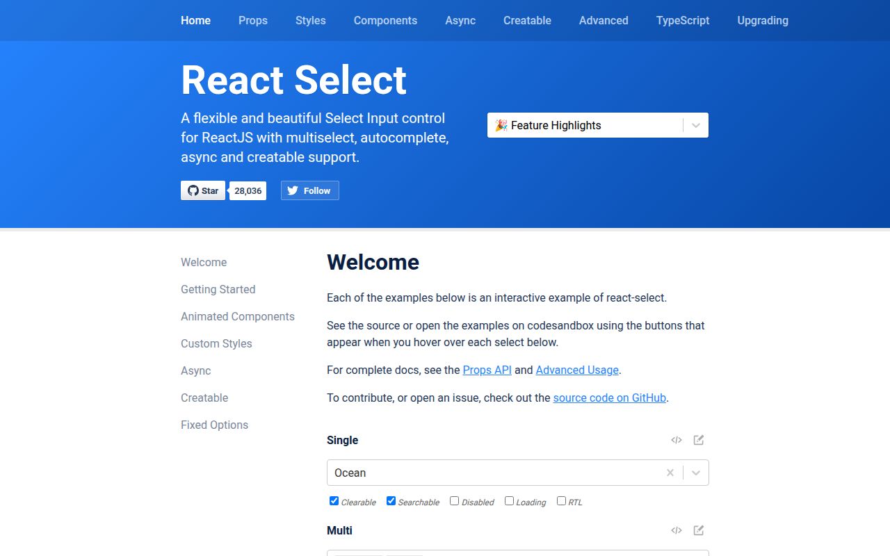
react-select is a React combobox and multi-select component with keyboard navigation, searchable options, controlled or internal state, groups, async loading, user-created values, portals, replaceable subcomponents, and a styling API built on Emotion. Values are option objects rather than primitive strings, which gives custom data shapes room but affects forms and state design. Version 5 is written in TypeScript and ships its own declarations. The current 5.10.2 patch fixes a hydration problem in Apple-device detection while leaving the public select API unchanged. Server-rendered applications should take the patch rather than staying on 5.10.1.
react-select is worth its weight for a searchable, object-valued React select with async, creatable, and component injection needs. Keep the native element or choose a headless primitive when mobile-native behavior, tiny bundles, or total DOM control matter more.
We installed it
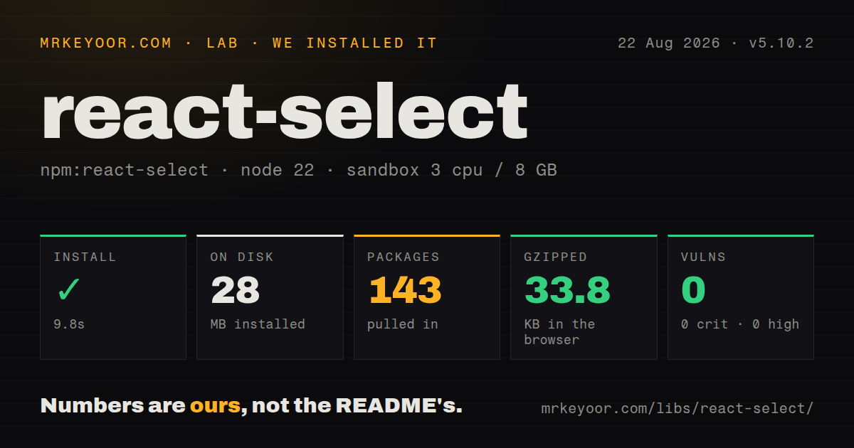
| Install | ✓ · 9.8s | 143 packages on disk · 28 MB |
| Import | ✓ | ESM import works · require() works · CommonJS package with exports map |
| Browser | 33.8 KB | gzipped (101.6 KB minified), bundled with esbuild |
| Types | ✓ | TypeScript types bundled |
| Known vulns | 0 | 0 critical · 0 high · 0 moderate · 0 low (npm audit) |
Answers from our run
Does react-select install cleanly?
Yes. In a fresh container with an empty cache, npm install react-select finished in 10 seconds, leaving 143 packages and 28 MB on disk. npm audit reported no known vulnerabilities.
How much does react-select add to a browser bundle?
33.8 KB gzipped (101.6 KB minified) when the whole package is bundled for the browser with esbuild. Importing only part of it is usually smaller.
Does react-select work with both ESM and CommonJS?
Yes. Both import 'react-select' and require('react-select') worked in Node 22 in our run. The package is published as CommonJS with an exports map.
Does react-select include TypeScript types?
Yes, type declarations ship inside the package, so no @types install is needed.
react-select or downshift: which should you use?
downshift: Use it when headless combobox state and accessibility hooks are preferable to a prescribed menu and styling system. react-select is worth its weight for a searchable, object-valued React select with async, creatable, and component injection needs.
When should you not use react-select?
A native select meets the requirement. react-select adds 33.8 KB gzipped in our broad import and replaces browser-native mobile pickers with a custom menu.
Use it if
- A React form needs searchable single or multi selection with keyboard behavior and option groups
- The selected value carries a domain object and getOptionValue or getOptionLabel can define its identity and display
- Menus must support async results, creatable options, portals, or replaceable rows without building a combobox state machine
- The team is willing to test accessibility and form serialization around a composite control rather than a native select
- A native select meets the requirement. react-select adds 33.8 KB gzipped in our broad import and replaces browser-native mobile pickers with a custom menu.
- The form expects a normal string value and direct register() behavior. react-select stores option objects and usually needs a controller adapter for form libraries.
- Thousands of options must render at once. The core menu does not virtualize the list; add a compatible virtualization layer or use a component designed for large collections.
- You need headless behavior with your own DOM and CSS. react-select brings its component structure and Emotion runtime even when unstyled removes default visual rules.
- Server rendering must be deterministic but the project will not take current patches. Version 5.10.2 exists specifically to fix hydration caused by Apple-device detection.
- Async search requires cancellation, debouncing, and bounded caching out of the box. AsyncSelect calls your loader, while request scheduling, stale-result handling, and cache policy remain application work.
Setup reality
We installed react-select 5.10.2 in a clean Node 22 Bookworm container. npm completed in 9.8 seconds, left 143 packages using 28 MB, and reported zero known vulnerabilities. The package has 9 direct dependencies, 2 peer dependencies, and 1216 KB unpacked. It is CommonJS with an exports map; require() and ESM import both worked under Node 22.23.2. TypeScript declarations are bundled. Our broad browser import produced 101.6 KB minified and 33.8 KB gzipped.
React and React DOM are peers, so the application supplies compatible versions. The default import renders a composite control, not a native select. In controlled mode, value must be the selected option object or array of objects. If state stores only an id, find the matching option before passing value. The name prop creates a hidden form input, but complex values and multi-select submission still need deliberate serialization.
AsyncSelect has no built-in debounce. loadOptions may run for each input change, and cacheOptions keeps entries by input until its prop identity changes. Add cancellation or stale-response protection when network order matters. CreatableSelect calls onCreateOption but, once that callback is supplied, your code owns adding the new object to both options and selected value.
Menus inside modals or overflow containers often need menuPortalTarget=document.body plus an explicit z-index. Guard document access during server rendering. Custom Option components should wrap components.Option so keyboard selection and ARIA state survive. Version 5.10.2 fixes one hydration bug, but custom portals, generated ids, and browser-only props still deserve an SSR hydration test.
Patterns
Keep the selected option in state control-single-value
import Select from 'react-select';

const [flavor, setFlavor] = useState(null);

<Select
  options={options}
  value={flavor}
  onChange={setFlavor}
  isClearable
/>
value is the complete option object or null. Passing only option.value leaves the control visually empty.
Handle the readonly multi-value array select-multiple-values
import Select, { type MultiValue } from 'react-select';

const [tags, setTags] = useState<readonly Tag[]>([]);
<Select<Tag, true>
  isMulti
  options={allTags}
  value={tags}
  onChange={(next: MultiValue<Tag>) => setTags(next)}
  closeMenuOnSelect={false}
/>
MultiValue is readonly. Replace state with the returned array or a spread copy instead of mutating it.
Use domain objects without remapping map-domain-options
<Select<User>
  options={users}
  getOptionValue={(user) => String(user.id)}
  getOptionLabel={(user) => `${user.firstName} ${user.lastName}`}
  isOptionDisabled={(user) => user.suspended}
/>
getOptionValue must return a stable string. It supplies identity when objects do not have the default value and label fields.
Search a remote endpoint load-remote-options
import AsyncSelect from 'react-select/async';

async function loadOptions(input: string) {
  if (input.length < 2) return [];
  const response = await fetch(`/api/users?q=${encodeURIComponent(input)}`);
  if (!response.ok) throw new Error('search failed');
  return response.json();
}

<AsyncSelect cacheOptions defaultOptions loadOptions={loadOptions} />
AsyncSelect does not debounce calls or cancel stale requests. Add that behavior when request order can change the shown results.
Insert a user-created option yourself create-new-option
<CreatableSelect
  isMulti
  options={tags}
  value={selected}
  onCreateOption={(input) => {
    const created = { value: slugify(input), label: input };
    setTags((current) => [...current, created]);
    setSelected((current) => [...current, created]);
  }}
/>
Supplying onCreateOption transfers insertion to your code. Update both available options and controlled selection.
Move a clipped menu to the document body portal-menu-from-modal
<Select
  options={options}
  menuPortalTarget={typeof document === 'undefined' ? null : document.body}
  menuPosition='fixed'
  styles={{
    menuPortal: (base) => ({ ...base, zIndex: 9999 }),
  }}
/>
The guard avoids reading document during server rendering. The portal needs its own stacking level outside the modal tree.
Preserve behavior in a custom option replace-option-row
import { components, type OptionProps } from 'react-select';

function UserOption(props: OptionProps<User>) {
  return (
    <components.Option {...props}>
      <img src={props.data.avatarUrl} alt='' width={20} height={20} />
      {props.data.firstName}
    </components.Option>
  );
}

<Select<User> options={users} components={{ Option: UserOption }} />
Wrapping components.Option retains mouse handlers, focus behavior, and ARIA selection state. A bare div loses that wiring.
Adapt the controlled component to a form connect-react-hook-form
<Controller
  name='country'
  control={control}
  rules={{ required: 'Pick a country' }}
  render={({ field }) => (
    <Select {...field} options={countries} isClearable />
  )}
/>
The submitted field is an option object. Convert it to the backend's primitive id in form transformation or submit handling.
Alternatives
| Package | Registry | Pick it when |
|---|---|---|
| downshift | npm | Use it when headless combobox state and accessibility hooks are preferable to a prescribed menu and styling system. |
| @radix-ui/react-select | npm | Use it for a composable select primitive in a Radix-based interface that does not need react-select's searchable async model. |
| @headlessui/react | npm | Use its Combobox when Tailwind-oriented headless components and full markup control fit the design system. |
More web frontend guides
postcss · react · react-dom · tailwindcss · htmlparser2 · tailwind-merge · the whole shelf →
How this guide is made: grounded in the library's documentation, release notes, changelog, and issue history, on a fixed rubric — not a hands-on install of every release. The 50 most-downloaded entries are additionally install-verified in clean containers. Corrections: contact the desk.