downshift review
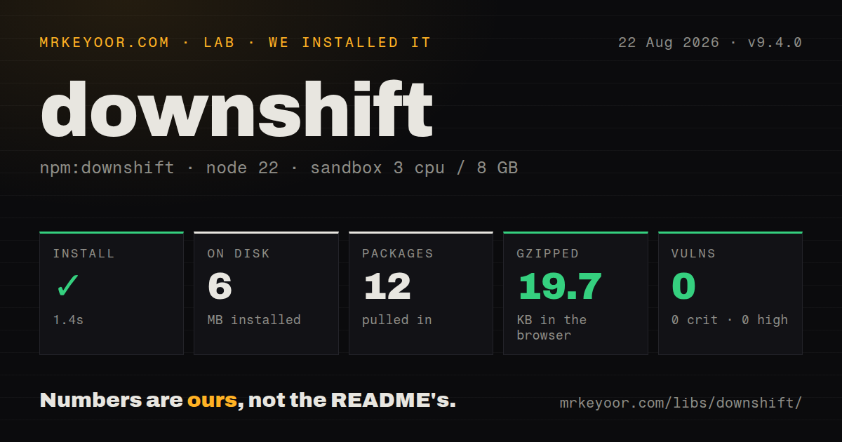
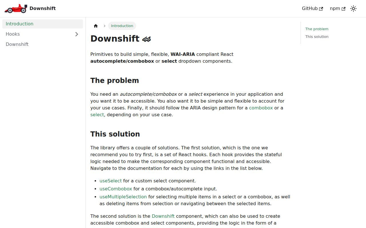
Our downshift 9.4.0 browser build measured 65.6 KB minified and 19.7 KB gzipped. It is a headless React state engine for editable comboboxes, button-driven selects, and removable tag groups. useCombobox, useSelect, and useTagGroup return state, actions, and prop getters; your component owns the DOM, styles, filtering, positioning, and data requests. Version 9.4.0 adds React Compiler compatibility. The older Downshift render-prop component remains exported, but the project recommends hooks because they follow the newer ARIA combobox pattern.
downshift 9.4.0 installed in 1.4 seconds and produced a 19.7 KB gzipped browser bundle in our sandbox, so its cost is reasonable for a design system that will own the DOM and accessibility tests. Use a native control or a more complete component when your team also expects filtering, positioning, visuals, and async request handling from the dependency.
We installed it
| Install | ✓ · 1.4s | 12 packages on disk · 6 MB |
| Import | ✓ | ESM import works · require() works · CommonJS package with exports map |
| Browser | 19.7 KB | gzipped (65.6 KB minified), bundled with esbuild |
| Types | ✓ | TypeScript types bundled |
| Known vulns | 0 | 0 critical · 0 high · 0 moderate · 0 low (npm audit) |
Answers from our run
Does downshift install cleanly?
Yes. In a fresh container with an empty cache, npm install downshift finished in 1 seconds, leaving 12 packages and 6 MB on disk. npm audit reported no known vulnerabilities.
How much does downshift add to a browser bundle?
19.7 KB gzipped (65.6 KB minified) when the whole package is bundled for the browser with esbuild. Importing only part of it is usually smaller.
Does downshift work with both ESM and CommonJS?
Yes. Both import 'downshift' and require('downshift') worked in Node 22 in our run. The package is published as CommonJS with an exports map.
Does downshift include TypeScript types?
Yes, type declarations ship inside the package, so no @types install is needed.
downshift or react-aria-components: which should you use?
react-aria-components: Use it for accessible React primitives with a more structured component model across many widget types. downshift 9.4.0 installed in 1.4 seconds and produced a 19.7 KB gzipped browser bundle in our sandbox, so its cost is reasonable for a design system that will own the DOM and accessibility tests.
When should you not use downshift?
A native select or datalist covers the requirement: it avoids Downshift's 19.7 KB gzipped measured browser cost and much of the assembly work
Use it if
- A React design system needs its own markup and visual language while reusing keyboard, focus, and ARIA state logic
- You need an editable autocomplete, a custom select opened by a button, or a tag group with removable items
- Selection rules require controlled props, named state-change actions, or a pure stateReducer
- Your item objects need explicit text and identity through null-safe itemToString and itemToKey callbacks
- A native select or datalist covers the requirement: it avoids Downshift's 19.7 KB gzipped measured browser cost and much of the assembly work
- You want a styled component with menu positioning: Downshift supplies neither CSS nor collision handling, portals, loading UI, or remote search
- The team cannot test keyboard and screen-reader behavior: a missing or overwritten prop getter can break the intended interaction contract
- Your app is outside React or Preact: npm declares React 16.12 or newer as the peer dependency and the primary API consists of React hooks
- You need quiet major upgrades: versions 7, 8, and 9 each have hook migration guides, and version 9 removed several accessibility message options
Setup reality
We installed downshift 9.4.0 in 1.4 seconds on Node 22. The sandbox ended with 12 packages and 6 MB on disk. downshift itself has five direct dependencies, one peer dependency, bundled TypeScript declarations, and a 3,676 KB unpacked size. npm audit found 0 known vulnerabilities. require() and ESM import both worked through its exports map. Our full-package browser build was 65.6 KB minified and 19.7 KB gzipped.
React 16.12 or newer must already be present. No credentials or config file are needed. The work starts in JSX: keep the menu node mounted, connect the label, input or toggle, menu, and each item with their matching getter, and pass the real index for every rendered option. itemToString receives null, and itemToKey is needed when object references change.
Downshift does not filter data or fetch results. Remote comboboxes need cancellation or request ordering so an old response cannot replace a newer query. Passing a controlled selectedItem, inputValue, highlightedIndex, or isOpen also makes your callback responsible for updating it. Event handlers belong inside the getter argument; a later onKeyDown or onBlur prop can overwrite Downshift's handler.
Version 9 removed selectedItemChanged in favor of itemToKey and stopped providing default status text for the hooks. Supply getA11yStatusMessage when users need result or highlight announcements. Iframes and shadow roots need the correct environment object. The package handles mouse, touch, and keyboard state, but you still need tests for Escape, arrows, Home, End, focus return, disabled items, async updates, and the screen readers your users run.
Patterns
Connect an editable combobox build-editable-combobox
import {useCombobox} from 'downshift';

function FruitBox({items}) {
  const d = useCombobox({items});
  return <>
    <label {...d.getLabelProps()}>Fruit</label>
    <input {...d.getInputProps()} />
    <ul {...d.getMenuProps()}>
      {d.isOpen && items.map((item, index) => (
        <li key={item} {...d.getItemProps({item, index})}>{item}</li>
      ))}
    </ul>
  </>;
}
The menu element must stay mounted and each getter must reach its intended DOM node; Downshift provides no menu CSS or positioning.
Filter items from the input value filter-local-results
const [shown, setShown] = useState(allItems);
const box = useCombobox({
  items: shown,
  onInputValueChange({inputValue = ''}) {
    setShown(allItems.filter(x => x.toLowerCase().includes(inputValue.toLowerCase())));
  },
});
Filtering belongs to the application; remote queries also need cancellation or request IDs to prevent stale results.
Give object items text and stable identity identify-object-items
const box = useCombobox({
  items: users,
  itemToString: user => user?.name ?? '',
  itemToKey: user => user?.id,
  onSelectedItemChange: ({selectedItem}) => saveUser(selectedItem?.id ?? null),
});
Version 9 uses itemToKey for identity, and both mapping callbacks must accept null.
Keep selection in application state control-selection
const [selectedItem, setSelectedItem] = useState(null);
const box = useCombobox({
  items,
  selectedItem,
  onSelectedItemChange({selectedItem: next}) { setSelectedItem(next); },
});
A controlled selectedItem changes only when its callback updates the value; leaving it unchanged makes selection look frozen.
Prevent selection of unavailable items disable-items
const box = useCombobox({
  items: plans,
  itemToString: plan => plan?.name ?? '',
  isItemDisabled: plan => plan.soldOut,
});
isItemDisabled keeps an option out of keyboard selection, while your markup still needs a visible disabled state.
Keep the menu open after choosing keep-menu-open
const box = useCombobox({
  items,
  stateReducer(state, action) {
    const chosen = action.type === useCombobox.stateChangeTypes.ItemClick ||
      action.type === useCombobox.stateChangeTypes.InputKeyDownEnter;
    return chosen ? {...action.changes, isOpen: true} : action.changes;
  },
});
Version 9 reducers receive an action with a nested changes object; examples for old majors may use another signature.
Create a non-editable custom select build-button-select
const d = useSelect({items});
return <>
  <label {...d.getLabelProps()}>Plan</label>
  <button type='button' {...d.getToggleButtonProps()}>{d.selectedItem ?? 'Choose'}</button>
  <ul {...d.getMenuProps()}>
    {d.isOpen && items.map((item, index) => <li key={item} {...d.getItemProps({item, index})}>{item}</li>)}
  </ul>
</>;
useSelect targets button-driven selection; a native select is simpler when custom markup is unnecessary.
Wire a removable tag group build-removable-tags
const d = useTagGroup({initialItems: ['React', 'TypeScript']});
return <div {...d.getTagGroupProps({'aria-label': 'Skills'})}>
  {d.items.map((item, index) => <span key={item} {...d.getTagProps({index, 'aria-label': item})}>
    {item}<button type='button' {...d.getTagRemoveProps({index, 'aria-label': `Remove ${item}`})}>x</button>
  </span>)}
</div>;
useTagGroup supplies roving focus and removal props; the application must make keyboard focus visible.
Pass custom events through a getter merge-event-handler
<input {...getInputProps({
  onBlur() { analytics.track('combobox-blur'); },
})} />
Handlers passed to getInputProps are merged; an onBlur written after the spread replaces Downshift's returned handler.
Write the hook's live status message announce-result-status
const box = useCombobox({
  items,
  getA11yStatusMessage({isOpen, highlightedIndex}) {
    if (!isOpen) return '';
    return highlightedIndex >= 0
      ? `${items[highlightedIndex].name} highlighted`
      : `${items.length} results available`;
  },
});
Version 9 hooks no longer install a default status-message function, so localized announcements must be supplied when needed.
Clear both the item and input clear-selection
const {selectItem, setInputValue} = useCombobox({items});

<button type='button' onClick={() => {
  selectItem(null);
  setInputValue('');
}}>Clear</button>
Clearing selection and text are separate actions; icon-only buttons also need an accessible name.
Bind events to an iframe window use-iframe-environment
const frameWindow = iframeRef.current?.contentWindow;
const box = useCombobox({
  items,
  environment: frameWindow ?? window,
});
The environment must expose the document and event-listener methods from the context where the widget renders.
Alternatives
| Package | Registry | Pick it when |
|---|---|---|
| react-aria-components | npm | Use it for accessible React primitives with a more structured component model across many widget types. |
| @headlessui/react | npm | Use it when its prescribed headless components and transition model fit your React or Tailwind stack. |
| @radix-ui/react-select | npm | Use it for a custom select that already includes portal and positioned-content pieces. |
| react-select | npm | Use it when you want a finished, styled select API and accept less control over the rendered structure. |
More web frontend guides
postcss · react · react-dom · tailwindcss · htmlparser2 · tailwind-merge · the whole shelf →
How this guide is made: grounded in the library's documentation, release notes, changelog, and issue history, on a fixed rubric — not a hands-on install of every release. The 50 most-downloaded entries are additionally install-verified in clean containers. Corrections: contact the desk.