react-base16-styling review
react-base16-styling 0.10.0 turns a Base16 palette and named style definitions into `{ className, style }` props that can be spread onto React elements. Definitions may be class strings, inline-style objects, or functions receiving component state. Themes can extend defaults or use the `:inverted` modifier. The package comes from the Redux DevTools monorepo but does not depend on React itself. Version 0.10 moved the package to ESM; our Node 22 checks still loaded it through import and require, and declarations were bundled. A whole-package browser import measured 17.9 KB gzipped.
Our react-base16-styling 0.10.0 install used 9 MB and bundled to 17.9 KB gzipped, a sizable cost for Base16-to-props merging. Keep it in Redux DevTools-adjacent interfaces with an existing Base16 contract; new design systems should start with semantic tokens and real CSS output.
We installed it
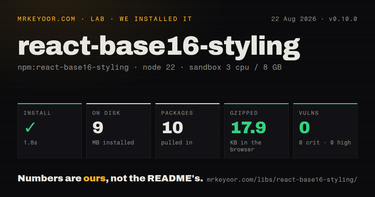
| Install | ✓ · 1.8s | 10 packages on disk · 9 MB |
| Import | ✓ | ESM import works · require() works · ESM package |
| Browser | 17.9 KB | gzipped (49.9 KB minified), bundled with esbuild |
| Types | ✓ | TypeScript types bundled |
| Known vulns | 0 | 0 critical · 0 high · 0 moderate · 0 low (npm audit) |
Answers from our run
Does react-base16-styling install cleanly?
Yes. In a fresh container with an empty cache, npm install react-base16-styling finished in 2 seconds, leaving 10 packages and 9 MB on disk. npm audit reported no known vulnerabilities.
How much does react-base16-styling add to a browser bundle?
17.9 KB gzipped (49.9 KB minified) when the whole package is bundled for the browser with esbuild. Importing only part of it is usually smaller.
Does react-base16-styling work with both ESM and CommonJS?
Yes. Both import 'react-base16-styling' and require('react-base16-styling') worked in Node 22 in our run. The package is published as ESM.
Does react-base16-styling include TypeScript types?
Yes, type declarations ship inside the package, so no @types install is needed.
react-base16-styling or styled-components: which should you use?
styled-components: Use it for React context theming and generated CSS with selectors, media queries, and component-scoped rules. Our react-base16-styling 0.10.0 install used 9 MB and bundled to 17.9 KB gzipped, a sizable cost for Base16-to-props merging.
When should you not use react-base16-styling?
You are starting an application design system; 16 generic color slots do not cover semantic colors, spacing, typography, breakpoints, or component tokens
Use it if
- A Redux DevTools-style interface already names colors as Base16 slots from base00 through base0F
- Components need one override contract that merges class names, inline objects, and state-dependent style functions
- Consumers should extend named component styles without replacing the underlying palette
- A small existing theme layer needs bundled declarations and both import paths measured under Node 22
- You are starting an application design system; 16 generic color slots do not cover semantic colors, spacing, typography, breakpoints, or component tokens
- The requirement includes a React provider, hooks, context, CSS generation, server-side style extraction, or persistence; this package provides none of those
- Styles need pseudo-selectors, media queries, keyframes, container queries, or vendor processing; inline objects cannot express them and class CSS remains your responsibility
- A post-1.0 compatibility promise is required; the package remains at 0.10.0 and earlier releases included a breaking helper rename plus the later ESM conversion
- 17.9 KB gzipped is too much for prop merging around a fixed palette; ordinary CSS variables can express a small Base16 theme with no runtime library
Setup reality
Our install of react-base16-styling 0.10.0 finished in 1.8 seconds, leaving 10 packages and 9 MB on disk. The package was 564 KB unpacked with 4 direct dependencies and no peer dependencies. npm audit reported 0 known vulnerabilities. It declares ESM and has no exports map; both ESM import and CommonJS require() worked in our Node 22 sandbox. TypeScript declarations were bundled. The browser result measured 49.9 KB minified and 17.9 KB gzipped.
There is no React peer because the output is an ordinary props object. Setup starts with a function that maps scheme, author, and base00 through base0F into your own named styles. Those names become a public component override contract. createStyling is curried: configure the mapper first, select a theme or overrides second, then request style names. Missing that middle call produces confusing usage.
Multiple named styles merge left to right. Later object properties overwrite earlier inline properties, while class strings append. Dynamic definitions receive the accumulated { className, style } and extra arguments supplied at lookup time. The included declarations type those extra arguments broadly, so a component wrapper may need tighter local types. The package never emits CSS for a returned class name.
A string theme name resolves from bundled or supplied Base16 maps, and the :inverted suffix applies generated color inversion. Inversion is mathematical, not a reviewed light or dark scheme, so test actual contrast and focus states. A complete custom palette needs every base00 through base0F value or fallback behavior can mix palettes. Version 0.10 is maintained inside a much larger Redux DevTools repository; monorepo activity does not guarantee frequent releases for this helper.
Patterns
Map Base16 slots to named props define-styles
import { createStyling } from 'react-base16-styling';

const getStyles = (theme) => ({
  panel: {
    color: theme.base05,
    backgroundColor: theme.base00,
    border: `1px solid ${theme.base02}`,
  },
  heading: { color: theme.base0D },
});
const selectTheme = createStyling(getStyles);
The keys `panel` and `heading` become the component's styling contract; document what each of the 16 palette slots means.
Apply a default themed style apply-default
const styling = selectTheme();

export function Panel({ children }) {
  return <section {...styling('panel')}>{children}</section>;
}
`createStyling` returns a theme-selection function first. Call it before looking up `panel`.
Supply a complete Base16 palette custom-palette
const ocean = {
  scheme: 'Ocean', author: 'Your team',
  base00: '#1b2b34', base01: '#343d46', base02: '#4f5b66', base03: '#65737e',
  base04: '#a7adba', base05: '#c0c5ce', base06: '#cdd3de', base07: '#d8dee9',
  base08: '#ec5f67', base09: '#f99157', base0A: '#fac863', base0B: '#99c794',
  base0C: '#5fb3b3', base0D: '#6699cc', base0E: '#c594c5', base0F: '#ab7967',
};
const styling = selectTheme(ocean);
Provide base00 through base0F. An incomplete object can fall back in ways that mix the custom values with defaults.
Merge conditional style names merge-style-keys
const props = styling([
  'panel',
  isSelected && 'selected',
  isDisabled && 'disabled',
]);
return <button {...props}>Save</button>;
False entries are ignored. Later names win when inline style properties conflict.
Pass state into a style function dynamic-style
const getStyles = (theme) => ({
  meter: ({ style }, value) => ({
    style: {
      ...style,
      width: `${Math.max(0, Math.min(100, value))}%`,
      backgroundColor: theme.base0B,
    },
  }),
});
const styling = createStyling(getStyles)();
Extra lookup arguments reach the function after accumulated props. Local wrapper types can describe `value` more precisely than the package declarations.
Return a class and inline color combine-class-style
const getStyles = (theme) => ({
  button: ({ className, style }) => ({
    className: [className, 'toolbar-button'].filter(Boolean).join(' '),
    style: { ...style, color: theme.base05 },
  }),
});
The package does not generate the `.toolbar-button` rule. Ship that class from your own stylesheet.
Merge consumer overrides override-styles
const createPanelStyling = createStyling(getStyles);
const styling = createPanelStyling({
  panel: { borderRadius: 8 },
  heading: 'product-heading',
});
Object properties merge over defaults, while class strings append. Overrides do not automatically replace the full named style.
Request an inverted named theme invert-selection
import { createStyling, invertTheme } from 'react-base16-styling';

const selected = invertTheme('apathy');
const styling = createStyling(getStyles)(selected);
Generated inversion does not guarantee WCAG contrast. Test the resulting 0.10.0 colors on real text, controls, and focus indicators.
Alternatives
| Package | Registry | Pick it when |
|---|---|---|
| styled-components | npm | Use it for React context theming and generated CSS with selectors, media queries, and component-scoped rules. |
| @emotion/react | npm | Use it for a theme provider and CSS-in-JS objects or templates in a current React application. |
| theme-ui | npm | Use it for semantic tokens, variants, and a theme-aware `sx` prop. |
| base16 | npm | Use it when only Base16 scheme data is needed and style-prop merging can stay in application code. |
More web frontend guides
postcss · react · react-dom · tailwindcss · htmlparser2 · tailwind-merge · the whole shelf →
How this guide is made: grounded in the library's documentation, release notes, changelog, and issue history, on a fixed rubric — not a hands-on install of every release. The 50 most-downloaded entries are additionally install-verified in clean containers. Corrections: contact the desk.