styled-components review
styled-components 6.5.3 is a React CSS-in-JS runtime based on tagged template literals. It generates scoped class names, inserts rules for rendered components, provides themes through context, and handles keyframes, global CSS, and server style collection. The latest patch fixes TypeScript errors when applications augment React HTML props with a template-literal data attribute index signature; 6.5.2 reduced type-checking cost around attrs and annotated components. Our browser build was 16 KB gzipped, so adopting it changes the styling architecture and client runtime rather than adding a tiny helper.
styled-components 6.5.3 installed in 2 seconds with zero audit findings, while our browser build measured 16 KB gzipped. Keep it for React systems committed to runtime themes and component-local CSS; compare extracted CSS first in new server-component or tight-budget applications.
We installed it
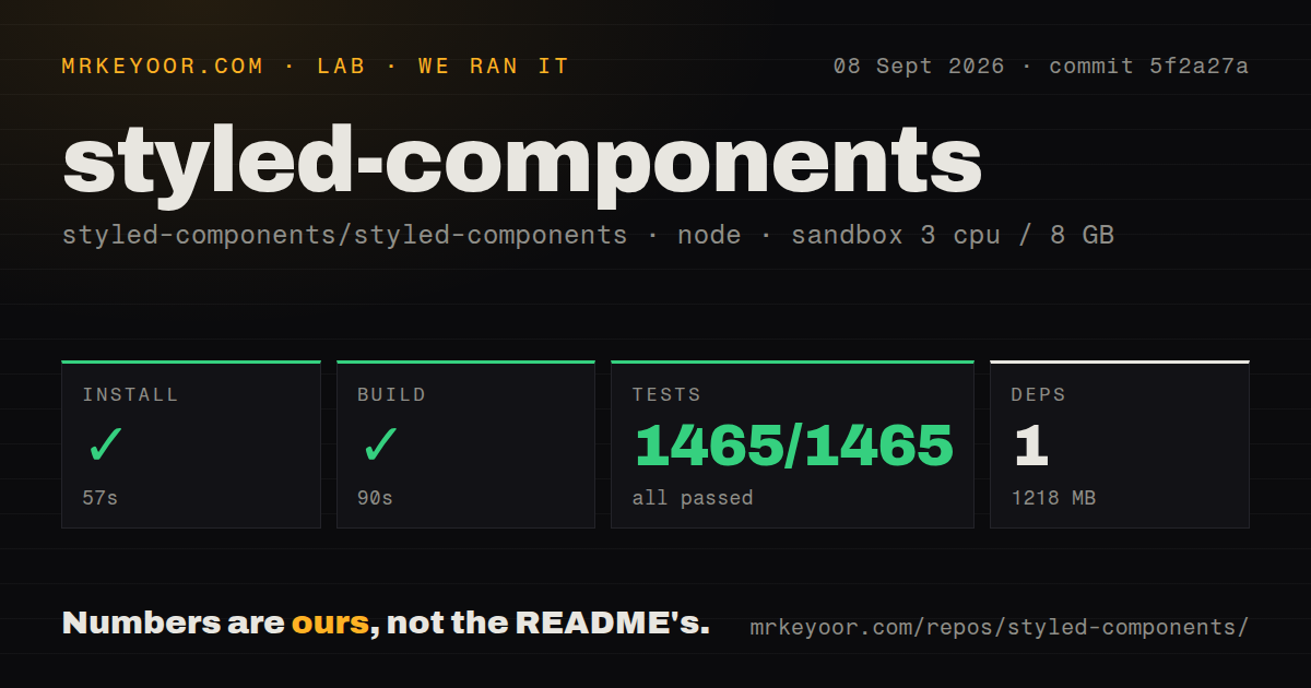
| Install | ✓ · 2s | 11 packages on disk · 5 MB |
| Import | ✓ | ESM import works · require() works · CommonJS package |
| Browser | 16 KB | gzipped (41.6 KB minified), bundled with esbuild |
| Types | ✓ | TypeScript types bundled |
| Known vulns | 0 | 0 critical · 0 high · 0 moderate · 0 low (npm audit) |
Answers from our run
Does styled-components install cleanly?
Yes. In a fresh container with an empty cache, npm install styled-components finished in 2 seconds, leaving 11 packages and 5 MB on disk. npm audit reported no known vulnerabilities.
How much does styled-components add to a browser bundle?
16 KB gzipped (41.6 KB minified) when the whole package is bundled for the browser with esbuild. Importing only part of it is usually smaller.
Does styled-components work with both ESM and CommonJS?
Yes. Both import 'styled-components' and require('styled-components') worked in Node 22 in our run. The package is published as CommonJS.
Does styled-components include TypeScript types?
Yes, type declarations ship inside the package, so no @types install is needed.
styled-components or @emotion/styled: which should you use?
@emotion/styled: Use it when the project already relies on Emotion's cache, serializer, and styled API. styled-components 6.5.3 installed in 2 seconds with zero audit findings, while our browser build measured 16 KB gzipped.
When should you not use styled-components?
The client budget calls for extracted CSS and little styling JavaScript. CSS Modules or vanilla-extract fit that requirement more directly.
Use it if
- A React component library already models variants, themes, selectors, and media queries with styled templates.
- Component styles must react to props at runtime and stay next to TypeScript implementation code.
- The server framework has a maintained styled-components registry or compiler integration.
- Runtime theme switching and component extension matter more than build-time CSS extraction.
- The client budget calls for extracted CSS and little styling JavaScript. CSS Modules or vanilla-extract fit that requirement more directly.
- Server components are the default and the architecture avoids client context, runtime rule insertion, and a framework style registry.
- A 41.6 KB minified and 16 KB gzipped namespace import is too large for the route we measured.
- The team will not use transient `$props` or a forwarding filter. Styling-only values can otherwise reach DOM elements and trigger warnings.
- User-controlled strings enter CSS templates without validation. Scoped class names do not make a hostile url() or arbitrary declaration safe.
Setup reality
We installed styled-components 6.5.3 in 2 seconds under Node 22. Eleven packages occupied 5 MB. It declares four direct dependencies and four peers, is 2,844 KB unpacked, requires Node >=16, includes TypeScript declarations, and uses the MIT license. npm audit found zero vulnerabilities. The package is CommonJS without an exports map, and both require() and ESM import worked in our checks.
Our esbuild browser import measured 41.6 KB minified and 16 KB gzipped. React is a peer; web projects also need react-dom, while native projects involve React Native and css-to-react-native. Resolve one styled-components copy because duplicates can split theme context and stylesheet state. Define styled components at module scope. Creating one during render makes a new React component and new styling work on every pass.
Version 6 does not remove arbitrary styling props from DOM nodes automatically. Prefix local style inputs with $, or set shouldForwardProp on a component or StyleSheetManager. Browser-only rendering needs no config file, but SSR does. Use the framework's current compiler or registry recipe so generated names and streamed rules match during hydration. A manual server must create and seal a separate ServerStyleSheet for each request.
CSS is unprefixed by default, so add the current prefix mechanism only when the supported browser set needs it. Keep ThemeProvider object identity stable when tokens are unchanged. Sanitize values inserted into CSS, especially url(). For values that change frequently across many combinations, inline CSS custom properties can avoid creating a separate generated rule for each state.
Patterns
Define a scoped button create-styled-button
import styled from 'styled-components'
const SaveButton = styled.button`
  border: 0; padding: .65rem 1rem; background: #2457d6; color: white;
  &:focus-visible { outline: 3px solid #9bb7ff; }
`
Declare this at module scope; creating styled components during render produces new component identities and rules.
Keep a style prop off the DOM use-transient-prop
const Badge = styled.span<{ $tone: 'good' | 'bad' }>`
  color: ${({$tone}) => $tone === 'good' ? '#126b37' : '#a51d2d'};
`
<Badge $tone="good">Paid</Badge>
The `$tone` name is consumed for styling and is not forwarded as an HTML attribute.
Add a danger variant extend-styled-component
const DangerButton = styled(SaveButton)`
  background: #a51d2d;
  &:hover { background: #821624; }
`
The rendered element keeps the base generated class and receives another class for the added declarations.
Render button styles on a link render-polymorphic-element
<SaveButton as="a" href="/account">Account settings</SaveButton>as changes the element; verify that the resulting link or control still has correct keyboard and semantic behavior.
Read tokens from ThemeProvider provide-theme-tokens
const theme = {color: {text: '#172033'}}
const Panel = styled.section`color: ${({theme}) => theme.color.text};`
<ThemeProvider theme={theme}><Panel>Invoice</Panel></ThemeProvider>
Define or memoize an unchanged theme object so descendants do not receive a new context value on every render.
Mount one global reset add-global-baseline
const GlobalStyle = createGlobalStyle`
  *, *::before, *::after { box-sizing: border-box; }
  body { margin: 0; }
`
<> <GlobalStyle /> <Routes /> </>
GlobalStyle rules are unscoped. Mount one deliberate baseline instead of scattering global injections across routes.
Disable a repeated animation respect-reduced-motion
const spin = keyframes`to { transform: rotate(360deg); }`
const Spinner = styled.span`
  animation: ${spin} 700ms linear infinite;
  @media (prefers-reduced-motion: reduce) { animation: none; }
`
The media query removes decorative continuous motion for users who request reduced motion.
Collect styles for one server request collect-ssr-styles
const sheet = new ServerStyleSheet()
try {
  const html = renderToString(sheet.collectStyles(<App />))
  const styles = sheet.getStyleTags()
  sendDocument({html, styles})
} finally { sheet.seal() }
Create a new sheet per request and seal it in finally; use the framework recipe when rendering streams.
Set a DOM prop filter filter-forwarded-props
<StyleSheetManager shouldForwardProp={(prop, target) =>
  typeof target === 'string' ? isPropValid(prop) : true
}><App /></StyleSheetManager>
This example uses @emotion/is-prop-valid. Transient props are simpler when every component call site is under your control.
Alternatives
| Package | Registry | Pick it when |
|---|---|---|
| @emotion/styled | npm | Use it when the project already relies on Emotion's cache, serializer, and styled API. |
| @vanilla-extract/css | npm | Use it to author typed styles that become static CSS during the build. |
| linaria | npm | Use it when tagged templates are preferred but runtime CSS generation should be extracted. |
More web frontend guides
postcss · react · react-dom · tailwindcss · htmlparser2 · tailwind-merge · the whole shelf →
How this guide is made: grounded in the library's documentation, release notes, changelog, and issue history, on a fixed rubric — not a hands-on install of every release. The 50 most-downloaded entries are additionally install-verified in clean containers. Corrections: contact the desk.