@neoconfetti/react review
@neoconfetti/react 1.0.0 is a React wrapper for a one-shot CSS confetti explosion. Mounting `<Confetti>` creates two DOM elements per particle, animates circles or rectangles across a configurable stage, and removes them after the duration unless cleanup is disabled. The 1.0.0 release's stated change is React Server Components compatibility, following the earlier addition of a `use client` directive. It is a decorative component rather than a canvas physics engine: there is no `fire()` method, gravity control, pause API, completion callback, or built-in reduced-motion switch.
@neoconfetti/react 1.0.0 installed in 1.3 seconds with 0 audit findings, yet its root import and our browser bundle probe both failed; adopt it only after your real React build passes. When it does pass, it fits occasional one-shot celebrations, while frequent or highly controlled effects belong on canvas-confetti.
We installed it
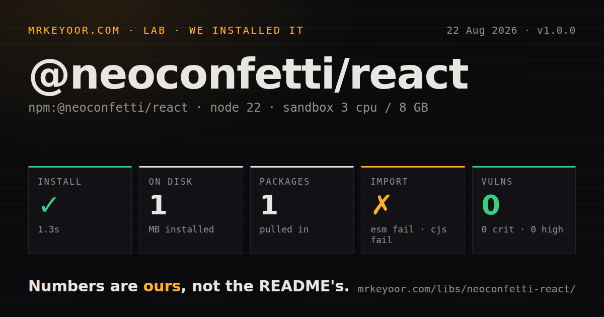
| Install | ✓ · 1.3s | 1 package on disk · 1 MB |
| Import | ✗ | ESM import fails · require() fails · ESM package with exports map |
| Browser | n/a | could not be bundled for the browser (Node-only code, most likely) |
| Types | ✓ | TypeScript types bundled |
| Known vulns | 0 | 0 critical · 0 high · 0 moderate · 0 low (npm audit) |
Answers from our run
Does @neoconfetti/react install cleanly?
Yes. In a fresh container with an empty cache, npm install @neoconfetti/react finished in 1 seconds, leaving 1 package and 1 MB on disk. npm audit reported no known vulnerabilities.
Can @neoconfetti/react run in a browser?
Not directly: esbuild could not bundle it for the browser in our run, which normally means it depends on Node built-ins. Use it on the server, or find a browser-targeted alternative.
Does @neoconfetti/react work with both ESM and CommonJS?
Neither plain import nor require succeeded in our sandbox, so it needs a bundler or extra setup.
Does @neoconfetti/react include TypeScript types?
Yes, type declarations ship inside the package, so no @types install is needed.
@neoconfetti/react or canvas-confetti: which should you use?
canvas-confetti: Use it for imperative canvas bursts with direction, gravity, drift, and fewer DOM nodes. @neoconfetti/react 1.0.0 installed in 1.3 seconds with 0 audit findings, yet its root import and our browser bundle probe both failed; adopt it only after your real React build passes.
When should you not use @neoconfetti/react?
Your build must load the package root successfully on Node 22.23.2. Both require() and ESM import failed in our sandbox despite the ESM package and exports map.
Use it if
- A button, badge, success state, or dialog needs one short React confetti burst at a known DOM position.
- Props for colors, shape, particle count, force, duration, and stage size cover the entire effect you want.
- You can remount the component to replay it and can supply your own reduced-motion gate.
- A CSS-and-DOM effect fits the page better than a canvas layer and temporary particle nodes are acceptable.
- Your build must load the package root successfully on Node 22.23.2. Both `require()` and ESM `import` failed in our sandbox despite the ESM package and exports map.
- You need a browser bundle proven by the same simple esbuild probe used across these guides. Our browser bundle attempt failed, so test the exact framework build before adopting it.
- Hundreds of particles will run repeatedly on low-end phones. The README states that each particle creates 2 nodes, so the default 150 particles temporarily add 300 DOM nodes.
- The effect needs imperative firing, pause, gravity, angle, drift, or a completion event. Version 1.0.0's props expose none of those controls.
- Your design system requires React's normal `className` prop. The published component calls its container prop `class` and uses `particleClass` for each particle.
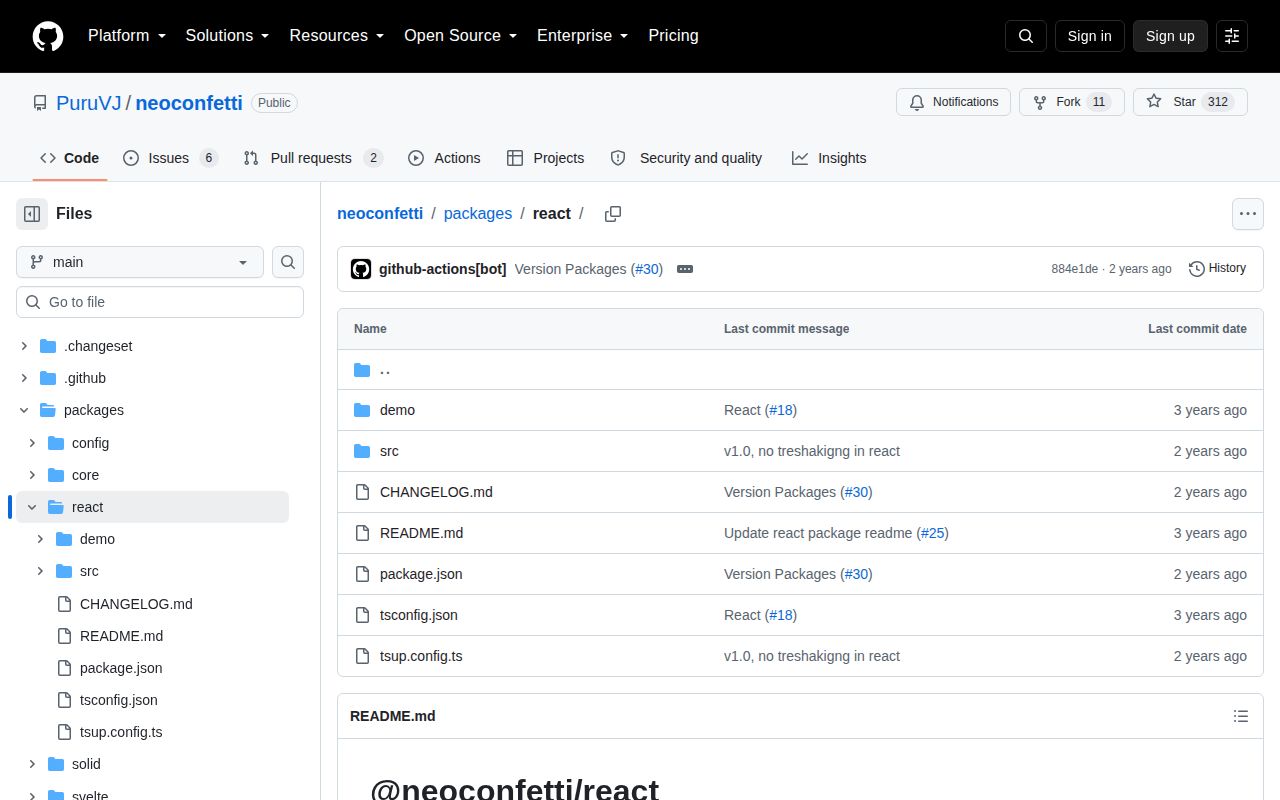
- You want a package with recent React release evidence. React 1.0.0 shipped in September 2024, and the monorepo's last push was March 2025.
Setup reality
We installed @neoconfetti/react 1.0.0 in 1.3 seconds in a fresh Node 22 Bookworm sandbox. It left 1 package and 1 MB on disk. npm audit reported 0 known vulnerabilities. The package is 44 KB unpacked, declares 0 direct and 0 peer dependencies, and bundles TypeScript declarations. React is still required because the compiled component imports React APIs; the missing peer declaration means npm will not enforce that requirement for you.
Loading was the rough part. This is an ESM package with an exports map, but both root require() and ESM import failed on Node 22.23.2. Our browser esbuild probe failed too, so there is no measured bundle size to quote. The component is intended for React client rendering, and 1.0.0 was released specifically for React Server Components compatibility, but you should prove it inside your Next, Vite, or other actual build before merging.
Mounting starts the effect immediately. Replay it by changing a React key or toggling it out and back in. Defaults are 150 particles, a 1,600 by 800 pixel stage, and 3,500 milliseconds. Since each particle uses 2 elements, that default adds 300 temporary nodes. destroyAfterDone removes them after the duration; setting it false keeps them until unmount.
No credentials, config file, native build, or external stylesheet is required. Position the zero-size container at the desired origin and choose stage dimensions for the real region. force must stay between 0 and 1. The component does not check prefers-reduced-motion, so read that media query before mounting. It also accepts class, not className, which is easy to miss in a typed React codebase.
Patterns
Render a confetti burst show-basic-burst
import { Confetti } from '@neoconfetti/react';

export function SuccessBurst() {
  return <Confetti />;
}
Mounting starts the animation. The defaults create 150 particles, or 300 temporary DOM elements, and remove them after 3,500 milliseconds.
Remount the component for each click replay-on-click
import { useState } from 'react';
import { Confetti } from '@neoconfetti/react';

export function CelebrateButton() {
  const [burst, setBurst] = useState(0);
  return (
    <button onClick={() => setBurst((n) => n + 1)} style={{ position: 'relative' }}>
      Celebrate
      {burst > 0 && <Confetti key={burst} class="burst" />}
    </button>
  );
}
Version 1.0.0 has no `fire()` method. Changing the key forces a fresh mount; the container prop is `class`, not `className`.
Use brand colors and circular particles set-colors-and-shape
<Confetti
  colors={['#6d28d9', '#ec4899', '#f59e0b']}
  particleShape="circles"
  particleCount={120}
  particleSize={10}
/>
`particleShape` accepts `mix`, `circles`, or `rectangles`. Every entry in `colors` must be a valid CSS color string.
Place the burst at the center of a card position-at-element
export function CompletedCard() {
  return (
    <section className="card">
      <Confetti class="card-burst" stageWidth={480} stageHeight={320} />
      <h2>Upload complete</h2>
    </section>
  );
}

// CSS
// .card { position: relative; overflow: hidden; }
// .card-burst { position: absolute; left: 50%; top: 45%; }
The confetti container has no size of its own. Position its origin explicitly and keep the stage dimensions close to the visible region.
Burst where the user clicks burst-at-pointer
import { useState } from 'react';
import { Confetti } from '@neoconfetti/react';

export function ClickStage() {
  const [burst, setBurst] = useState<{ id: number; x: number; y: number }>();
  return (
    <div className="stage" onClick={(e) => {
      const box = e.currentTarget.getBoundingClientRect();
      setBurst({ id: Date.now(), x: e.clientX - box.left, y: e.clientY - box.top });
    }}>
      {burst && (
        <div style={{ position: 'absolute', left: burst.x, top: burst.y }}>
          <Confetti key={burst.id} stageWidth={600} stageHeight={500} />
        </div>
      )}
    </div>
  );
}
Make the stage positioned, and add `overflow: hidden` when particles must stay inside it. A click remounts the effect at the new origin.
Skip animation for reduced-motion users respect-reduced-motion
import { useEffect, useState } from 'react';
import { Confetti } from '@neoconfetti/react';

function AccessibleBurst() {
  const [reduce, setReduce] = useState(true);
  useEffect(() => {
    const query = matchMedia('(prefers-reduced-motion: reduce)');
    const sync = () => setReduce(query.matches);
    sync();
    query.addEventListener('change', sync);
    return () => query.removeEventListener('change', sync);
  }, []);
  return reduce ? null : <Confetti />;
}
Reduced-motion behavior is absent from 1.0.0. Defaulting to reduced avoids a brief animation before the browser preference is known.
Use a lower-cost mobile burst tune-for-mobile
<Confetti
  particleCount={60}
  particleSize={8}
  duration={2200}
  stageWidth={360}
  stageHeight={640}
  force={0.35}
/>
At 60 particles this creates 120 temporary elements, versus 300 elements at the default count of 150.
Measure a container for stage dimensions size-to-container
import { useEffect, useRef, useState } from 'react';
import { Confetti } from '@neoconfetti/react';

function ResponsiveBurst() {
  const host = useRef<HTMLDivElement>(null);
  const [size, setSize] = useState({ width: 0, height: 0 });
  useEffect(() => {
    if (!host.current) return;
    const observer = new ResizeObserver(([entry]) => {
      setSize({ width: entry.contentRect.width, height: entry.contentRect.height });
    });
    observer.observe(host.current);
    return () => observer.disconnect();
  }, []);
  return <div ref={host}>{size.width > 0 && <Confetti stageWidth={size.width} stageHeight={size.height} />}</div>;
}
Stage dimensions are pixel numbers and do not track the container. ResizeObserver supplies current width and height after layout.
Attach a class to each particle style-particles
<Confetti particleClass="soft-confetti" />

// CSS
// .soft-confetti > div::before {
//   filter: drop-shadow(0 1px 1px rgb(0 0 0 / 20%));
// }
`particleClass` goes on each outer particle node. The separate `class` prop belongs to the zero-size burst container.
Keep finished particle nodes temporarily keep-particles-after-animation
<Confetti duration={5000} destroyAfterDone={false} />With `destroyAfterDone={false}`, particle nodes remain after the duration until React unmounts the component.
Create a typed reusable preset build-typed-preset
import { Confetti, type ConfettiProps } from '@neoconfetti/react';

const successPreset: ConfettiProps = {
  colors: ['#16a34a', '#86efac', '#facc15'],
  particleCount: 100,
  force: 0.45,
  duration: 2800,
};

export function SuccessConfetti(props: ConfettiProps) {
  return <Confetti {...successPreset} {...props} />;
}
Later spread props override this preset. The README requires `force` to remain between 0 and 1.
Mount from a Next.js App Router client component use-in-next-client-component
'use client';

import { Confetti } from '@neoconfetti/react';

export function PurchaseComplete() {
  return (
    <div className="purchase-complete">
      <Confetti particleCount={90} />
      <p>Payment received</p>
    </div>
  );
}
The compiled package carries a client directive and performs DOM work in an effect. Replay state must also live in a client component.
Alternatives
| Package | Registry | Pick it when |
|---|---|---|
| canvas-confetti | npm | Use it for imperative canvas bursts with direction, gravity, drift, and fewer DOM nodes. |
| react-confetti | npm | Use it for a full-window canvas shower, continuous recycling, and more simulation controls. |
| react-confetti-explosion | npm | Use it for the older React burst component that this project credits for the original effect. |
More web frontend guides
postcss · react · react-dom · tailwindcss · htmlparser2 · tailwind-merge · the whole shelf →
How this guide is made: grounded in the library's documentation, release notes, changelog, and issue history, on a fixed rubric — not a hands-on install of every release. The 50 most-downloaded entries are additionally install-verified in clean containers. Corrections: contact the desk.