@mui/material review
@mui/material 9.3.1 is MUI's React component implementation of Google's Material Design. It supplies controls, navigation, overlays, feedback, tables, layout primitives, transitions, theming, the `sx` styling prop, and slot-based customization. Data grids, date pickers, charts, and advanced trees remain separate MUI X packages. The 9.3.1 patch fixes exit transitions that could get stuck; its matching codemod release restores transforms that were missing from the published package.
@mui/material 9.3.1 installed in 9.5 seconds with 95 packages and 35 MB, but require, ESM import, and our browser bundle probe all failed under Node 22; adopt it only after the real React build passes. It suits Material-shaped applications with a central theme, while highly branded or server-first pages should start smaller.
We installed it
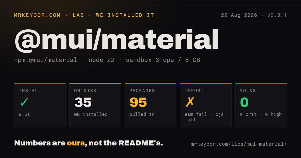
| Install | ✓ · 9.5s | 95 packages on disk · 35 MB |
| Import | ✗ | ESM import fails · require() fails · CommonJS package with exports map |
| Browser | n/a | could not be bundled for the browser (Node-only code, most likely) |
| Types | ✓ | TypeScript types bundled |
| Known vulns | 0 | 0 critical · 0 high · 0 moderate · 0 low (npm audit) |
Answers from our run
Does @mui/material install cleanly?
Yes. In a fresh container with an empty cache, npm install @mui/material finished in 10 seconds, leaving 95 packages and 35 MB on disk. npm audit reported no known vulnerabilities.
Can @mui/material run in a browser?
Not directly: esbuild could not bundle it for the browser in our run, which normally means it depends on Node built-ins. Use it on the server, or find a browser-targeted alternative.
Does @mui/material work with both ESM and CommonJS?
Neither plain import nor require succeeded in our sandbox, so it needs a bundler or extra setup.
Does @mui/material include TypeScript types?
Yes, type declarations ship inside the package, so no @types install is needed.
@mui/material or antd: which should you use?
antd: Choose it for dense business applications whose tables, trees, transfers, and form patterns match Ant Design. @mui/material 9.3.1 installed in 9.5 seconds with 95 packages and 35 MB, but require, ESM import, and our browser bundle probe all failed under Node 22; adopt it only after the real React build passes.
When should you not use @mui/material?
A small marketing page cannot justify the client and styling surface. Our clean install left 95 packages and 35 MB before application code.
Use it if
- A React product needs a broad set of keyboard-aware controls tied to one palette, spacing, typography, and breakpoint system.
- Material Design is close enough to the intended interface that theme overrides will refine it rather than replace its visual grammar.
- Component props, slots, theme augmentation, and responsive style values should arrive with bundled TypeScript declarations.
- The application may adopt MUI X later and needs the core controls and paid or free X packages to share a theme.
- A small marketing page cannot justify the client and styling surface. Our clean install left 95 packages and 35 MB before application code.
- Bare package loading must work in the target Node process. Both require and ESM import failed under Node.js v22.23.2 in our probes.
- The build cannot accommodate Emotion or a configured Pigment CSS path. Styling engines are optional peers in metadata but one of those integration routes is still needed.
- The brand rejects Material spacing, elevation, motion, and control shapes; overriding every component family can cost more than starting from headless primitives.
- Advanced grids must be part of the same free core dependency. MUI X is separately versioned and some X capabilities use commercial licenses.
Setup reality
We installed @mui/material 9.3.1 in a fresh Node 22 Bookworm sandbox in 9.5 seconds. npm left 95 packages consuming 35 MB and found 0 known vulnerabilities. The package declares 12 direct dependencies and 6 peers; its own unpacked size is 13,768 KB. TypeScript declarations are bundled. The package identifies as CommonJS and has an exports map, yet both require and ESM import failed under Node.js v22.23.2 in our entry probes.
React and react-dom are required peers across supported React 17, 18, and 19 ranges. The usual setup also installs @emotion/react and @emotion/styled. Metadata marks Emotion and @mui/material-pigment-css as optional because either styling route may be selected, not because styling setup disappears. Roboto and @mui/icons-material are separate installs. Keep related MUI packages on a compatible major.
Our esbuild browser-bundle attempt failed. Since this is a browser UI library, that result means the actual application build with React and the selected styling engine needs its own smoke test; a naked package probe did not establish a usable bundle. Server rendering also needs the framework-specific style cache or provider so streamed markup and generated styles keep a stable order.
Version 9 removes older Grid, TextField, Dialog, and system-prop paths. Run the official codemods, then review their edits and perform keyboard and visual tests. Current Grid uses size; TextField internals move through slotProps; system shorthands belong in sx. Dialogs, menus, and autocompletes should be retested for Escape handling, focus return, labels, and portal behavior after slot replacement.
Patterns
Provide a theme and baseline create-theme
import CssBaseline from '@mui/material/CssBaseline';
import { createTheme, ThemeProvider } from '@mui/material/styles';

const theme = createTheme({
  cssVariables: true,
  palette: { primary: { main: '#2457d6' } },
});

<ThemeProvider theme={theme}>
  <CssBaseline />
  <App />
</ThemeProvider>
CssBaseline must render below ThemeProvider to read its palette. `cssVariables` enables the theme variable and color-scheme path.
Use responsive theme values apply-sx-styles
<Box sx={{
  p: { xs: 2, md: 4 },
  color: 'text.primary',
  bgcolor: 'background.paper',
  '&:hover': { bgcolor: 'action.hover' },
}} />
Spacing numbers resolve through the theme. Version 9 expects system styling inside `sx`, not deprecated top-level shorthand props.
Split a page at md build-responsive-grid
<Grid container spacing={2}>
  <Grid size={{ xs: 12, md: 8 }}>Main</Grid>
  <Grid size={{ xs: 12, md: 4 }}>Aside</Grid>
</Grid>
The current Grid API uses `size` and no `item` prop. It is flexbox-based, so CSS Grid is a better fit for row spanning.
Change every Button set-component-defaults
const theme = createTheme({
  components: {
    MuiButton: {
      defaultProps: { disableElevation: true },
      styleOverrides: { root: { textTransform: 'none' } },
    },
  },
});
defaultProps changes inputs; styleOverrides targets generated CSS by the documented component and slot names.
Reach TextField slots configure-text-input
<TextField
  label='Amount'
  slotProps={{
    htmlInput: { inputMode: 'decimal', maxLength: 10 },
    inputLabel: { shrink: true },
  }}
/>
`htmlInput` reaches the native input. The `input` slot refers to MUI's wrapper and is the place for adornments.
Reject backdrop dismissal handle-dialog-close
function handleClose(event, reason) {
  if (reason !== 'backdropClick') setOpen(false);
}

<Dialog open={open} onClose={handleClose}>
  <ConfirmDelete />
</Dialog>
onClose reports a reason for backdrop and Escape actions. Buttons inside the dialog still need explicit handlers.
Keep remote filtering on the server load-autocomplete-options
<Autocomplete
  options={options}
  loading={loading}
  filterOptions={(items) => items}
  getOptionLabel={(item) => item.name}
  isOptionEqualToValue={(a, b) => a.id === b.id}
  onInputChange={(_, value) => search(value)}
  renderInput={(params) => <TextField {...params} label='User' />}
/>
Identity must be defined for object options. Debounce and cancel remote searches in application code.
Prevent a custom prop reaching the DOM filter-styling-prop
const Panel = styled(Paper, {
  shouldForwardProp: (prop) => prop !== 'tone',
})(({ theme, tone }) => ({
  borderLeft: `4px solid ${theme.palette[tone].main}`,
  padding: theme.spacing(2),
}));
Filtering `tone` avoids an unknown DOM attribute. Import styled from MUI so the callback receives the MUI theme.
Alternatives
| Package | Registry | Pick it when |
|---|---|---|
| antd | npm | Choose it for dense business applications whose tables, trees, transfers, and form patterns match Ant Design. |
| @chakra-ui/react | npm | Choose it when Chakra's recipes and prop-driven styling are closer to the team's component model. |
| react-bootstrap | npm | Choose it when Bootstrap conventions already define the product and JavaScript behavior should come through React components. |
More web frontend guides
postcss · react · react-dom · tailwindcss · htmlparser2 · tailwind-merge · the whole shelf →
How this guide is made: grounded in the library's documentation, release notes, changelog, and issue history, on a fixed rubric — not a hands-on install of every release. The 50 most-downloaded entries are additionally install-verified in clean containers. Corrections: contact the desk.