antd review
Ant Design 6.6.1 is a React 18+ component suite for dense product interfaces: forms, tables, pickers, uploads, navigation, overlays, localization, and token-driven themes all come from one package. The trade is visible in our browser build, which reached 1,641.5 KB minified and 529.3 KB gzipped when importing the package namespace. The current patch fixes async Upload removal, duplicate Anchor callbacks, Form layout jitter, Table row-span hover errors, and several keyboard or screen-reader problems. This is a styled system with its own DOM and CSS-in-JS runtime, not a set of unstyled primitives.
Ant Design 6.6.1 installed in 17.8 seconds and produced a 529.3 KB gzipped namespace bundle in our sandbox, so it earns its place in a data-heavy React product only when the team will use much of the system. Pick smaller primitives for a light site or a fully custom visual language.
We installed it
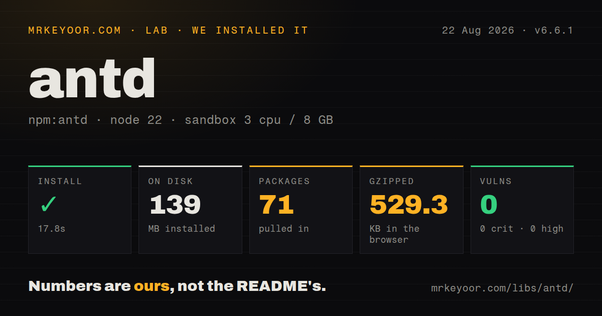
| Install | ✓ · 17.8s | 71 packages on disk · 139 MB |
| Import | ✓ | ESM import works · require() works · CommonJS package |
| Browser | 529.3 KB | gzipped (1641.5 KB minified), bundled with esbuild |
| Types | ✓ | TypeScript types bundled |
| Known vulns | 0 | 0 critical · 0 high · 0 moderate · 0 low (npm audit) |
Answers from our run
Does antd install cleanly?
Yes. In a fresh container with an empty cache, npm install antd finished in 18 seconds, leaving 71 packages and 139 MB on disk. npm audit reported no known vulnerabilities.
How much does antd add to a browser bundle?
529.3 KB gzipped (1641.5 KB minified) when the whole package is bundled for the browser with esbuild. Importing only part of it is usually smaller.
Does antd work with both ESM and CommonJS?
Yes. Both import 'antd' and require('antd') worked in Node 22 in our run. The package is published as CommonJS.
Does antd include TypeScript types?
Yes, type declarations ship inside the package, so no @types install is needed.
antd or @mui/material: which should you use?
@mui/material: Choose it when Material Design and its React ecosystem fit the product better than Ant's enterprise visual language. Ant Design 6.6.1 installed in 17.8 seconds and produced a 529.3 KB gzipped namespace bundle in our sandbox, so it earns its place in a data-heavy React product only when the team will use much of the system.
When should you not use antd?
A small site only needs buttons and a dialog: our namespace bundle was 529.3 KB gzipped, far beyond a focused primitive set
Use it if
- Your React 18+ admin or operations app needs complicated forms, tables, pickers, uploads, and overlays from one maintained system
- Your designers can work through ConfigProvider tokens and component tokens instead of replacing every component's markup
- You need built-in locale packs plus typed APIs for data-heavy controls such as TreeSelect, Transfer, and DatePicker
- You can test CSS-in-JS extraction and portal behavior in your SSR framework before release
- A small site only needs buttons and a dialog: our namespace bundle was 529.3 KB gzipped, far beyond a focused primitive set
- You need React 17 or Internet Explorer: version 6 requires React and React DOM 18 or newer and documents modern-browser support
- Your design system requires complete control of markup: Ant Design owns component structure, styling, motion, and many interaction decisions
- You rely on selectors against internal DOM: major releases can change that structure, while documented tokens and semantic class APIs are the supported extension points
- You want static feedback APIs to inherit provider state: top-level message, notification, and Modal calls do not receive ConfigProvider context
Setup reality
Our clean install of antd 6.6.1 finished in 17.8 seconds and left 71 packages using 139 MB on disk. The published package itself was 62,524 KB unpacked, with 48 direct dependencies and 2 peer dependencies. npm audit reported 0 known vulnerabilities. It is CommonJS with no exports map; both require() and ESM import worked, and TypeScript declarations are included.
Install compatible React and React DOM because both are peers at >=18.0.0. Component styling is generated through CSS-in-JS and CSS variables. Add antd/dist/reset.css only when you accept its global reset. Icons come from @ant-design/icons. Day.js supplies date values, so old Moment examples should not be copied into version 6 code.
The full namespace browser build measured 1,641.5 KB minified and 529.3 KB gzipped in our sandbox. Use named imports and check the application chunk graph rather than treating that worst-case number as the cost of one Button. Theme work belongs in ConfigProvider; selectors tied to private DOM are upgrade liabilities.
SSR needs deliberate style collection. The Next.js App Router recipe uses @ant-design/nextjs-registry, and dotted children such as Select.Option are a poor fit across server component boundaries. Hook-based App.useApp() feedback receives theme and locale context; static calls do not. Version 6.6.1 also changes List guidance toward Listy and fixes several async, keyboard, and accessibility defects, so pinning an old patch forfeits relevant behavior fixes.
Patterns
Import only the controls a screen uses render-controls
import { Button, DatePicker, Space } from 'antd'

export function Toolbar() {
  return <Space><DatePicker /><Button type="primary">Create</Button></Space>
}
Named imports let the bundler discard unused components; our 529.3 KB gzipped result came from importing the entire package namespace.
Add the optional global reset apply-reset
// application entry
import 'antd/dist/reset.css'
Components generate their own styles. This file resets global elements, so test it against existing typography and layout CSS.
Change global and Button tokens set-theme
import { ConfigProvider } from 'antd'

<ConfigProvider theme={{ token: { colorPrimary: '#5b3cc4', borderRadius: 6 }, components: { Button: { controlHeight: 40 } } }}>
  <App />
</ConfigProvider>
Documented tokens survive upgrades better than CSS selectors aimed at internal component nodes.
Derive dark compact tokens enable-dark-mode
import { ConfigProvider, theme } from 'antd'

<ConfigProvider theme={{ algorithm: [theme.darkAlgorithm, theme.compactAlgorithm] }}>
  <Dashboard />
</ConfigProvider>
The 2 algorithms derive the token map together. Nest a provider if only one section should change.
Keep component and Day.js locales together set-locale
import { ConfigProvider } from 'antd'
import enGB from 'antd/locale/en_GB'
import dayjs from 'dayjs'
import 'dayjs/locale/en-gb'

dayjs.locale('en-gb')

<ConfigProvider locale={enGB}><App /></ConfigProvider>
ConfigProvider changes component strings; Day.js controls date formatting and calendar language.
Submit a typed Form validate-form
import { Button, Form, Input } from 'antd'

type Values = { email: string }
const [form] = Form.useForm<Values>()

<Form form={form} layout="vertical" onFinish={save}>
  <Form.Item name="email" label="Email" rules={[{ required: true }, { type: 'email' }]}>
    <Input autoComplete="email" />
  </Form.Item>
  <Button htmlType="submit" type="primary">Invite</Button>
</Form>
Once Form.Item has a name, Form controls its child. Put initial field data on Form instead of using Input defaultValue.
Type a sortable paginated Table render-table
import { Table, type TableColumnsType } from 'antd'

type User = { id: string; name: string }
const columns: TableColumnsType<User> = [{ title: 'Name', dataIndex: 'name', sorter: (a, b) => a.name.localeCompare(b.name) }]

<Table<User> rowKey="id" columns={columns} dataSource={users} pagination={{ pageSize: 20 }} />
Use a stable rowKey. Move sorting and pagination into onChange when the server owns those operations.
Open a context-aware confirmation open-modal
import { App as AntApp, Button } from 'antd'

function DeleteButton() {
  const { modal } = AntApp.useApp()
  return <Button danger onClick={() => modal.confirm({ title: 'Delete record?', onOk: deleteRecord })}>Delete</Button>
}

export function Screen() { return <AntApp><DeleteButton /></AntApp> }
A modal obtained from App.useApp reads provider theme and locale. The static Modal.confirm API does not.
Report an asynchronous save show-message
import { App as AntApp } from 'antd'

function SaveButton() {
  const { message } = AntApp.useApp()
  return <button onClick={async () => {
    const close = message.loading('Saving', 0)
    try { await save(); message.success('Saved') } catch { message.error('Save failed') } finally { close() }
  }}>Save</button>
}
Duration 0 keeps the loading message open until close() runs; make sure every outcome reaches finally.
Build Select options without dotted children configure-select
import { Select } from 'antd'

<Select showSearch optionFilterProp="label" options={users.map((user) => ({ label: user.name, value: user.id }))} onChange={setOwner} />
The options prop avoids Select.Option and crosses Next.js server boundaries more cleanly than a dotted subcomponent.
Split a 24-column layout by breakpoint make-grid
import { Col, Row } from 'antd'

<Row gutter={[16, 16]}>
  <Col xs={24} md={16}><MainPanel /></Col>
  <Col xs={24} md={8}><Sidebar /></Col>
</Row>
Ant's grid uses 24 columns and viewport breakpoints. It does not respond to a container's width.
Collect styles in a Next.js App Router layout configure-nextjs-ssr
import { AntdRegistry } from '@ant-design/nextjs-registry'

export default function RootLayout({ children }: React.PropsWithChildren) {
  return <html lang="en"><body><AntdRegistry>{children}</AntdRegistry></body></html>
}
Install @ant-design/nextjs-registry separately. Without registry-based collection, the first server-rendered screen can arrive without its generated styles.
Alternatives
| Package | Registry | Pick it when |
|---|---|---|
| @mui/material | npm | Choose it when Material Design and its React ecosystem fit the product better than Ant's enterprise visual language. |
| @mantine/core | npm | Choose it for a broad typed React kit with hooks and a less recognizable default product style. |
| @chakra-ui/react | npm | Choose it when composable style props matter more than specialized enterprise widgets. |
| @radix-ui/react-dialog | npm | Choose focused Radix primitives when you want to own appearance and install only the behaviors each screen needs. |
More web frontend guides
postcss · react · react-dom · tailwindcss · htmlparser2 · tailwind-merge · the whole shelf →
How this guide is made: grounded in the library's documentation, release notes, changelog, and issue history, on a fixed rubric — not a hands-on install of every release. The 50 most-downloaded entries are additionally install-verified in clean containers. Corrections: contact the desk.