vaul review
Vaul 1.1.2 is an unstyled React drawer that layers dragging, velocity dismissal, snap points, nested sheets, four directions, input repositioning, and optional page scaling over Radix Dialog. Radix supplies the dialog and focus primitives; your components supply every visual style and layout constraint. Release 1.1.2 widens React and React DOM peer support through React 19 and fixes `onOpenChange` in nested drawers. The repository README now says the project is unmaintained. Our full-package browser build was 80.9 KB minified and 25.5 KB gzipped.
Vaul 1.1.2 installed 33 packages and 11 MB in 2.7 seconds in our sandbox, and its full import measured 25.5 KB gzipped; the repository is also explicitly unmaintained. Keep it only when an existing tested drawer makes replacement costly, and choose a maintained sheet or plain dialog for new work.
We installed it
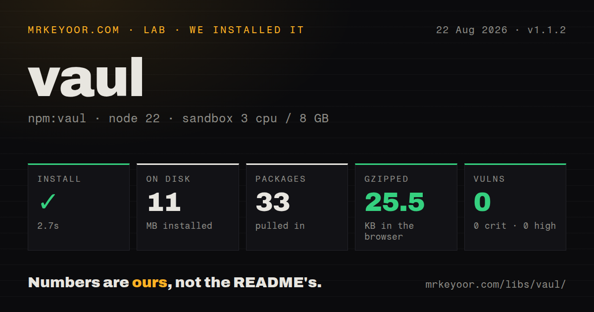
| Install | ✓ · 2.7s | 33 packages on disk · 11 MB |
| Import | ✓ | ESM import works · require() works · CommonJS package with exports map |
| Browser | 25.5 KB | gzipped (80.9 KB minified), bundled with esbuild |
| Types | ✓ | TypeScript types bundled |
| Known vulns | 0 | 0 critical · 0 high · 0 moderate · 0 low (npm audit) |
Answers from our run
Does vaul install cleanly?
Yes. In a fresh container with an empty cache, npm install vaul finished in 3 seconds, leaving 33 packages and 11 MB on disk. npm audit reported no known vulnerabilities.
How much does vaul add to a browser bundle?
25.5 KB gzipped (80.9 KB minified) when the whole package is bundled for the browser with esbuild. Importing only part of it is usually smaller.
Does vaul work with both ESM and CommonJS?
Yes. Both import 'vaul' and require('vaul') worked in Node 22 in our run. The package is published as CommonJS with an exports map.
Does vaul include TypeScript types?
Yes, type declarations ship inside the package, so no @types install is needed.
vaul or @radix-ui/react-dialog: which should you use?
@radix-ui/react-dialog: Use it for an accessible modal or side panel without drag physics and snap points. Vaul 1.1.2 installed 33 packages and 11 MB in 2.7 seconds in our sandbox, and its full import measured 25.5 KB gzipped; the repository is also explicitly unmaintained.
When should you not use vaul?
New dependencies need a credible upstream maintenance path. The author's README says Vaul is unmaintained and a return is not expected soon.
Use it if
- An existing React interface needs a touch-driven bottom sheet with snap positions and drag dismissal.
- Radix Dialog focus and portal behavior already matches the product's accessibility model.
- The interface requires nested sheets or panels that enter from the top, right, bottom, or left.
- A shipped shadcn-style Drawer already depends on Vaul and device tests cover its current behavior.
- New dependencies need a credible upstream maintenance path. The author's README says Vaul is unmaintained and a return is not expected soon.
- The design is a modal or fixed side panel without touch physics. Radix Dialog removes Vaul's gesture and snap layer.
- A 25.5 KB gzipped measured full import is too expensive for one drawer interaction.
- The application is outside React or cannot place this browser interaction behind a client-component boundary.
- Mobile keyboard, scroll locking, browser gestures, or snap bugs must be fixed upstream. The tracker has no dependable maintainer response.
Setup reality
We installed Vaul 1.1.2 in a fresh Node 22 Bookworm sandbox in 2.7 seconds. The install left 33 packages and 11 MB on disk. npm audit reported 0 vulnerabilities at every severity. Vaul itself was 204 KB unpacked with 1 direct dependency and 2 peer dependencies. It is a CommonJS package with an exports map; both require() and ESM import worked in our checks, and TypeScript declarations are bundled. A full esbuild import measured 80.9 KB minified and 25.5 KB gzipped.
React and React DOM are peers, while Radix Dialog is a direct dependency. In a Next.js App Router project, Vaul belongs in a client component. No stylesheet is supplied or required, so you must position Content, size it for the chosen direction, color the overlay, and handle responsive spacing. A bottom drawer usually needs fixed left, right, and bottom edges. Vaul supplies transforms rather than a finished sheet design.
Keep Drawer.Title and Drawer.Description in the tree, visually hiding them when the design calls for it, so assistive technology receives a useful dialog name. Test focus entry and return, Escape, outside interaction, touch dragging, and scrolling with the on-screen keyboard open. handleOnly or data-vaul-no-drag can keep sliders, maps, and scrollable children from becoming drag handles.
Snap points progress from least visible to most visible, and controlled points need both value and setter props. Page scaling requires a data-vaul-drawer-wrapper around the target content. Version 1.1.2 repairs nested drawer state callbacks and accepts React 19 peers, but the last repository push was 2025-10-03 and the README declares the project unmaintained. Plan to own patches for future browser, React, or Radix changes.
Patterns
Compose a named bottom drawer open-bottom-drawer
'use client'
import { Drawer } from 'vaul'

export function FiltersDrawer() {
  return (
    <Drawer.Root>
      <Drawer.Trigger>Filters</Drawer.Trigger>
      <Drawer.Portal>
        <Drawer.Overlay className='fixed inset-0 bg-black/40' />
        <Drawer.Content className='fixed inset-x-0 bottom-0 rounded-t-2xl bg-white p-6'>
          <Drawer.Title>Filters</Drawer.Title>
          <Drawer.Description>Limit the products shown.</Drawer.Description>
        </Drawer.Content>
      </Drawer.Portal>
    </Drawer.Root>
  )
}
Vaul does not position Content. Keep Title and Description present so the Radix dialog receives an accessible name and explanation.
Control opening from application state control-open-state
const [open, setOpen] = useState(false)

<Drawer.Root open={open} onOpenChange={setOpen}>
  <Drawer.Trigger>Review order</Drawer.Trigger>
  <Drawer.Portal>
    <Drawer.Overlay className='fixed inset-0 bg-black/40' />
    <Drawer.Content className='fixed inset-x-0 bottom-0 bg-white p-6'>
      <Drawer.Title>Order</Drawer.Title>
      <button onClick={() => setOpen(false)}>Close</button>
    </Drawer.Content>
  </Drawer.Portal>
</Drawer.Root>
`onAnimationEnd` is the appropriate point when cleanup must wait until the closing motion finishes.
Order controlled snap points configure-snap-points
const [snap, setSnap] = useState<number | string | null>('180px')

<Drawer.Root
  snapPoints={['180px', 0.6, 1]}
  activeSnapPoint={snap}
  setActiveSnapPoint={setSnap}
>
  {/* portal and content */}
</Drawer.Root>
List points from least visible to most visible. Numbers are viewport fractions, while strings can specify pixel sizes.
Begin overlay fading at one snap fade-overlay
<Drawer.Root
  snapPoints={[0.25, 0.6, 1]}
  fadeFromIndex={1}
  activeSnapPoint={snap}
  setActiveSnapPoint={setSnap}
>
  {/* content */}
</Drawer.Root>
`fadeFromIndex` is an array index and only has meaning when `snapPoints` is present.
Anchor a panel on the right open-side-drawer
<Drawer.Root direction='right'>
  <Drawer.Trigger>Open menu</Drawer.Trigger>
  <Drawer.Portal>
    <Drawer.Overlay className='fixed inset-0 bg-black/40' />
    <Drawer.Content className='fixed inset-y-0 right-0 w-80 bg-white p-6'>
      <Drawer.Title>Menu</Drawer.Title>
    </Drawer.Content>
  </Drawer.Portal>
</Drawer.Root>
The CSS anchor and dimensions must match `direction`; Vaul controls motion rather than panel layout.
Limit dragging to the visible handle drag-from-handle
<Drawer.Root handleOnly>
  <Drawer.Portal>
    <Drawer.Content className='fixed inset-x-0 bottom-0 bg-white'>
      <Drawer.Handle className='mx-auto my-3 h-1.5 w-12 rounded-full bg-gray-300' />
      <div className='overflow-y-auto p-6'>{children}</div>
    </Drawer.Content>
  </Drawer.Portal>
</Drawer.Root>
`handleOnly` reduces conflicts with scrolling, maps, range inputs, and other gesture-driven children.
Exclude one control from drawer dragging disable-drag-region
<Drawer.Content className='fixed inset-x-0 bottom-0 bg-white p-6'>
  <Drawer.Title>Volume</Drawer.Title>
  <input data-vaul-no-drag type='range' min={0} max={100} />
</Drawer.Content>
`data-vaul-no-drag` also covers descendants, so attach it to the smallest region that needs its own pointer behavior.
Use NestedRoot for a child sheet nest-drawers
<Drawer.Root>
  <Drawer.Content>
    <Drawer.Title>Account</Drawer.Title>
    <Drawer.NestedRoot>
      <Drawer.Trigger>Delete account</Drawer.Trigger>
      <Drawer.Portal>
        <Drawer.Overlay className='fixed inset-0 bg-black/40' />
        <Drawer.Content className='fixed inset-x-0 bottom-0 bg-white p-6'>
          <Drawer.Title>Confirm deletion</Drawer.Title>
        </Drawer.Content>
      </Drawer.Portal>
    </Drawer.NestedRoot>
  </Drawer.Content>
</Drawer.Root>
Release 1.1.2 fixes nested `onOpenChange` behavior. Use NestedRoot instead of inserting an unrelated Root under the parent.
Leave the page interactive behind the sheet allow-background-interaction
<Drawer.Root modal={false}>
  <Drawer.Portal>
    <Drawer.Content className='fixed inset-x-0 bottom-0 bg-white p-4'>
      <Drawer.Title>Now playing</Drawer.Title>
    </Drawer.Content>
  </Drawer.Portal>
</Drawer.Root>
Non-modal mode does not trap focus. Omit any full-screen overlay that would still intercept pointer events.
Scale a marked page wrapper scale-page-background
<div data-vaul-drawer-wrapper className='min-h-screen bg-white'>
  {children}
</div>

<Drawer.Root shouldScaleBackground>
  {/* drawer */}
</Drawer.Root>
`shouldScaleBackground` needs a `data-vaul-drawer-wrapper` target. Check the body color around the transformed page.
Take responsibility for body scroll styles disable-body-styles
<Drawer.Root noBodyStyles>
  <Drawer.Portal>
    <Drawer.Content className='fixed inset-x-0 bottom-0 bg-white p-6'>
      <Drawer.Title>Details</Drawer.Title>
    </Drawer.Content>
  </Drawer.Portal>
</Drawer.Root>
With `noBodyStyles`, the application must implement scroll locking and layout compensation itself.
Portal a drawer inside a local region render-in-container
const [container, setContainer] = useState<HTMLElement | null>(null)

return (
  <div ref={setContainer} className='relative h-96 overflow-hidden'>
    <Drawer.Root container={container}>
      <Drawer.Portal>
        <Drawer.Content className='absolute inset-x-0 bottom-0 bg-white p-4'>
          <Drawer.Title>Preview drawer</Drawer.Title>
        </Drawer.Content>
      </Drawer.Portal>
    </Drawer.Root>
  </div>
)
Store the mounted container in state so Root receives it after render, then use positioning relative to that container.
Alternatives
| Package | Registry | Pick it when |
|---|---|---|
| @radix-ui/react-dialog | npm | Use it for an accessible modal or side panel without drag physics and snap points. |
| react-modal-sheet | npm | Use it for a maintained React bottom sheet with motion and snap positions. |
| @base-ui/react | npm | Use it when a broader maintained set of unstyled React primitives is preferable. |
More web frontend guides
postcss · react · react-dom · tailwindcss · htmlparser2 · tailwind-merge · the whole shelf →
How this guide is made: grounded in the library's documentation, release notes, changelog, and issue history, on a fixed rubric — not a hands-on install of every release. The 50 most-downloaded entries are additionally install-verified in clean containers. Corrections: contact the desk.