@tanstack/react-table review
@tanstack/react-table 9.1.2 connects React to TanStack's headless table engine. It computes header and row models plus sorting, filtering, paging, selection, grouping, sizing, and controlled state, but renders no table element or CSS. Version 9 requires an explicit feature set, allowing a screen to omit behavior it never uses. The 9.1.2 core patch routes slice updates through one owner and stops auto-reset loops caused by newly allocated state that is structurally unchanged. This is infrastructure for building a grid, not a grid users can open immediately.
@tanstack/react-table 9.1.2 produced a 35.1 KB gzipped namespace bundle after our 2.2-second install, and it rendered no UI. Choose it when owning markup and state is the point; buy a finished grid when editors, virtualization, and spreadsheet behavior are the actual requirement.
We installed it
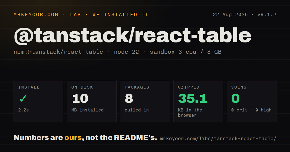

| Install | ✓ · 2.2s | 8 packages on disk · 10 MB |
| Import | ✓ | ESM import works · require() works · ESM package with exports map |
| Browser | 35.1 KB | gzipped (128.3 KB minified), bundled with esbuild |
| Types | ✓ | TypeScript types bundled |
| Known vulns | 0 | 0 critical · 0 high · 0 moderate · 0 low (npm audit) |
Answers from our run
Does @tanstack/react-table install cleanly?
Yes. In a fresh container with an empty cache, npm install @tanstack/react-table finished in 2 seconds, leaving 8 packages and 10 MB on disk. npm audit reported no known vulnerabilities.
How much does @tanstack/react-table add to a browser bundle?
35.1 KB gzipped (128.3 KB minified) when the whole package is bundled for the browser with esbuild. Importing only part of it is usually smaller.
Does @tanstack/react-table work with both ESM and CommonJS?
Yes. Both import '@tanstack/react-table' and require('@tanstack/react-table') worked in Node 22 in our run. The package is published as ESM with an exports map.
Does @tanstack/react-table include TypeScript types?
Yes, type declarations ship inside the package, so no @types install is needed.
@tanstack/react-table or ag-grid-react: which should you use?
ag-grid-react: Choose it when a finished enterprise grid justifies a larger API and commercial-feature licensing decisions. @tanstack/react-table 9.1.2 produced a 35.1 KB gzipped namespace bundle after our 2.2-second install, and it rendered no UI.
When should you not use @tanstack/react-table?
A usable grid is needed today. The package provides no markup, CSS, resize handle, cell editor, virtualizer, network layer, or export control.
Use it if
- The product already owns table markup and styles, making a prebuilt grid harder to adapt than a headless state engine
- Client-side and server-side screens should share sorting, filtering, pagination, visibility, and selection contracts
- Each route should register only the row models and features it actually uses
- Typed columns and predictable row state matter more than bundled editors, virtual scrolling, menus, or export UI
- A usable grid is needed today. The package provides no markup, CSS, resize handle, cell editor, virtualizer, network layer, or export control.
- The implementation plan copies v8 examples. Version 9 changed feature registration, row-model setup, helper types, rendering, and subscriptions.
- Tooling is stuck below Node 20 or cannot consume modern ESM. Version 9.1.2 declares Node >=20 and `type: module`.
- The requirement is a spreadsheet with ranges, paste, undo, frozen virtual columns, and finished editors. Building that shell is a product project.
- The team cannot absorb deep TypeScript generics. Feature definitions flow into table and column types, so inconsistent feature objects create difficult diagnostics.
- Every stock feature will be registered on every screen. That discards version 9's selective-feature size argument and reconstructs a full grid engine.
Setup reality
We installed @tanstack/react-table 9.1.2 in an uncached Node 22 container in 2.2 seconds. The result was 8 packages using 10 MB, with 0 npm-audit findings. Package metadata lists 2 direct dependencies, 1 peer, 256 KB unpacked, and MIT. It is ESM with an exports map, although both require() and ESM import succeeded. Types are bundled. Our namespace browser build measured 128.3 KB minified and 35.1 KB gzipped.
React 18 or newer is the peer and Node >=20 is the engine floor. Version 9 begins with tableFeatures(). Keep that object stable and carry its type into createColumnHelper and useTable. Data and column arrays also need stable identities. Recreating either on every render repeats table work and can reset state, so declare constants outside the component or memoize values that depend on props.
Headless setup includes the visible product: render headers and rows, connect sort and resize handlers, add accessible names, and define loading, empty, and failure states. TanStack Virtual is a separate install. Editing needs your own inputs, validation, and persistence. For server sorting or paging, keep the state feature, omit the corresponding client row model, turn on the manual option, and supply rowCount or pageCount.
An unselected useTable subscription can repaint its owner for every registered slice. Select only the state that component reads or subscribe closer to the control. The 9.1.2 fix prevents one auto-reset loop by suppressing structurally equal updates, but custom onXChange handlers may still receive no-op-looking updaters. Use functional controlled-state updates and preserve the data array when its contents have not changed.
Patterns
Build the table markup from row models render-basic-table
import { createColumnHelper, tableFeatures, useTable } from '@tanstack/react-table'

const features = tableFeatures({})
const helper = createColumnHelper<typeof features, Person>()
const columns = helper.columns([
  helper.accessor('name', { header: 'Name' }),
  helper.accessor('age', { header: 'Age' }),
])

function PeopleTable({ data }) {
  const table = useTable({ features, columns, data })
  return <table>
    <thead>{table.getHeaderGroups().map(group =>
      <tr key={group.id}>{group.headers.map(header =>
        <th key={header.id}>{header.isPlaceholder ? null : <table.FlexRender header={header} />}</th>
      )}</tr>
    )}</thead>
    <tbody>{table.getRowModel().rows.map(row =>
      <tr key={row.id}>{row.getAllCells().map(cell =>
        <td key={cell.id}><table.FlexRender cell={cell} /></td>
      )}</tr>
    )}</tbody>
  </table>
}
Feature and column identities must stay stable. Every `<table>`, header, row, and cell in this example is application markup.
Add a client-side sorted row model enable-sorting
import {
  createSortedRowModel,
  rowSortingFeature,
  sortFn_alphanumeric,
  tableFeatures,
} from '@tanstack/react-table'

const features = tableFeatures({
  rowSortingFeature,
  sortedRowModel: createSortedRowModel(),
  sortFns: { alphanumeric: sortFn_alphanumeric },
})
`rowSortingFeature` supplies state and column methods; `createSortedRowModel()` performs the actual in-browser reorder.
Expose sorting through a keyboard button toggle-column-sort
<button
  type="button"
  onClick={header.column.getToggleSortingHandler()}
  disabled={!header.column.getCanSort()}
>
  <table.FlexRender header={header} />
  {header.column.getIsSorted() === 'asc' ? ' up' : null}
  {header.column.getIsSorted() === 'desc' ? ' down' : null}
</button>
Keep the interactive control as a button and derive the header's `aria-sort` value from `getIsSorted()`.
Page an in-memory row set paginate-client-rows
import { createPaginatedRowModel, rowPaginationFeature, tableFeatures } from '@tanstack/react-table'

const features = tableFeatures({
  rowPaginationFeature,
  paginatedRowModel: createPaginatedRowModel(),
})

const table = useTable({
  features,
  columns,
  data,
  initialState: { pagination: { pageIndex: 0, pageSize: 25 } },
})
Sorting or filtering can reset `pageIndex`. Override that reset only when staying on the same page is an explicit product rule.
Control a remotely paged table control-server-table
const table = useTable({
  features,
  columns,
  data: page.rows,
  rowCount: page.total,
  manualSorting: true,
  manualPagination: true,
  state: { sorting, pagination },
  onSortingChange: setSorting,
  onPaginationChange: setPagination,
})
Omit client sort and pagination models when the backend already applied them. `rowCount` is needed to calculate the remaining pages.
Keep selection attached to record IDs select-stable-rows
const table = useTable({
  features,
  columns,
  data,
  getRowId: row => row.id,
  enableRowSelection: row => !row.original.locked,
})

<input
  type="checkbox"
  checked={row.getIsSelected()}
  disabled={!row.getCanSelect()}
  onChange={row.getToggleSelectedHandler()}
/>
Default row IDs follow array positions. `getRowId` prevents a sort or refetch from moving a checked state onto another record.
Render visibility switches for leaf columns hide-columns
{table.getAllLeafColumns().map(column => (
  <label key={column.id}>
    <input
      type="checkbox"
      checked={column.getIsVisible()}
      onChange={column.getToggleVisibilityHandler()}
    />
    {column.id}
  </label>
))}
A column with `enableHiding: false` stays visible and should not appear as an enabled removable choice.
Bind an input to a column filter filter-column
<input
  value={String(column.getFilterValue() ?? '')}
  onChange={event => column.setFilterValue(event.target.value)}
  aria-label={'Filter ' + column.id}
/>
Client filtering needs both its feature and filtered row model. For remote data, debounce the network request rather than the table state.
Limit the component subscription to paging narrow-state-selection
const table = useTable(
  { features, columns, data },
  state => ({ pagination: state.pagination }),
)
Without a selector, the owner observes every registered slice. Narrow selection prevents unrelated cell or column state from repainting it.
Window table rows with a separate virtualizer virtualize-rows
import { useVirtualizer } from '@tanstack/react-virtual'

const rows = table.getRowModel().rows
const virtualizer = useVirtualizer({
  count: rows.length,
  getScrollElement: () => scrollRef.current,
  estimateSize: () => 36,
  overscan: 8,
})

const visibleRows = virtualizer.getVirtualItems().map(item => ({
  item,
  row: rows[item.index],
}))
`@tanstack/react-virtual` is another dependency and only computes windows. Preserve native table semantics or implement equivalent grid roles and keys.
Alternatives
| Package | Registry | Pick it when |
|---|---|---|
| ag-grid-react | npm | Choose it when a finished enterprise grid justifies a larger API and commercial-feature licensing decisions. |
| react-data-grid | npm | Choose it for a rendered, virtualized React grid with editable cells and fewer assembly steps. |
| material-react-table | npm | Choose it when Material UI is fixed and a configured TanStack wrapper is preferable to authoring every control. |
| handsontable | npm | Choose it when spreadsheet-style editing and cell interactions are the central requirement. |
More web frontend guides
postcss · react · react-dom · tailwindcss · htmlparser2 · tailwind-merge · the whole shelf →
How this guide is made: grounded in the library's documentation, release notes, changelog, and issue history, on a fixed rubric — not a hands-on install of every release. The 50 most-downloaded entries are additionally install-verified in clean containers. Corrections: contact the desk.