shadcn review
shadcn is a Node command-line tool that copies React component source, styling tokens, utilities, and registry dependencies into your repository. It does not give applications a shadcn runtime component package; the generated files become local code that your team owns. Version 4.19.0 adds private GitHub registry access through GitHub CLI credentials or GH_TOKEN and a migrate base-color command. Our install left 291 packages and could not be imported as a library or bundled for a browser, which matches its role as a source-generating CLI.
Use shadcn when owning the component source is a deliberate design-system decision and the team has review capacity for generated changes. Skip it if package-style upgrades, a small toolchain, non-React output, or hands-off accessibility maintenance matters more than source ownership.
We installed it
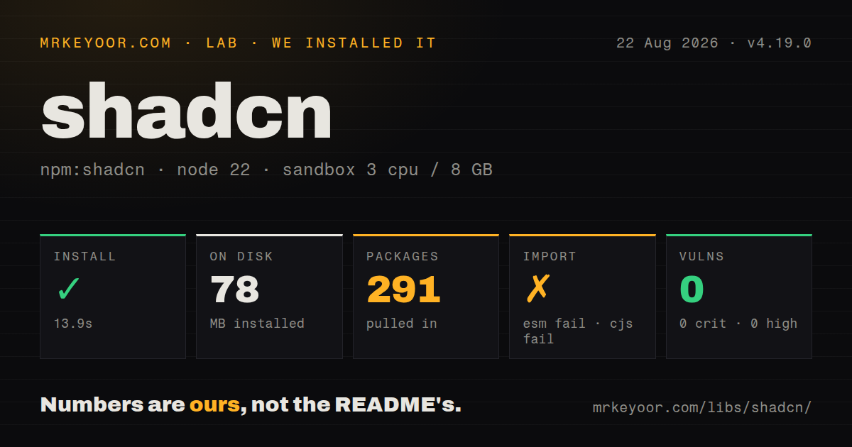
| Install | ✓ · 13.9s | 291 packages on disk · 78 MB |
| Import | ✗ | ESM import fails · require() fails · ESM package with exports map |
| Browser | n/a | could not be bundled for the browser (Node-only code, most likely) |
| Types | — | no TypeScript types found |
| Known vulns | 0 | 0 critical · 0 high · 0 moderate · 0 low (npm audit) |
Answers from our run
Does shadcn install cleanly?
Yes. In a fresh container with an empty cache, npm install shadcn finished in 14 seconds, leaving 291 packages and 78 MB on disk. npm audit reported no known vulnerabilities.
Can shadcn run in a browser?
Not directly: esbuild could not bundle it for the browser in our run, which normally means it depends on Node built-ins. Use it on the server, or find a browser-targeted alternative.
Does shadcn work with both ESM and CommonJS?
Neither plain import nor require succeeded in our sandbox, so it needs a bundler or extra setup.
Does shadcn include TypeScript types?
No type declarations were found in our install, so TypeScript users need their own declarations.
shadcn or @chakra-ui/react: which should you use?
@chakra-ui/react: Choose it for a packaged React component system with centralized releases and runtime theming. Use shadcn when owning the component source is a deliberate design-system decision and the team has review capacity for generated changes.
When should you not use shadcn?
You expect upstream bug fixes to arrive with an npm dependency update. Copied components do not update automatically after local edits.
Use it if
- A React and Tailwind project wants editable component source rather than opaque imports from a versioned UI runtime.
- A team is building its own design system and will review, test, and maintain every generated component.
- A monorepo needs registry-aware routing of shared UI source across known workspace aliases.
- Private or namespaced registries will distribute audited components as source to several internal applications.
- You expect upstream bug fixes to arrive with an npm dependency update. Copied components do not update automatically after local edits.
- Tailwind CSS and global design tokens are out of scope. Current initialization writes Tailwind-facing CSS and component configuration.
- A small command dependency matters. Our clean CLI install used 291 packages and 78 MB before it generated any component dependencies.
- The project must remain on Node older than 20.18.1. Version 4.19.0 rejects that runtime range.
- You need framework-neutral widgets or a browser-importable package. The CLI writes React-oriented source, and our browser bundle plus both module-load checks failed.
Setup reality
We installed shadcn 4.19.0 in a fresh Node 22 Bookworm container. npm took 13.9 seconds, installed 291 packages, and used 78 MB. The package declares 33 direct dependencies, no peers, and 900 KB unpacked; its license is MIT and Node must be at least 20.18.1. npm audit reported no known vulnerabilities at any severity. We found no TypeScript declarations in the measured package.
This is an ESM command package with an exports map, but it is not a normal runtime import. Both require and ESM import failed in our test and printed the CLI help line, help [command] display help for command. esbuild could not make a browser bundle, consistent with Node-only file, process, network, parser, and package-manager work. Invoke the pinned CLI from scripts or npx rather than importing shadcn into application code.
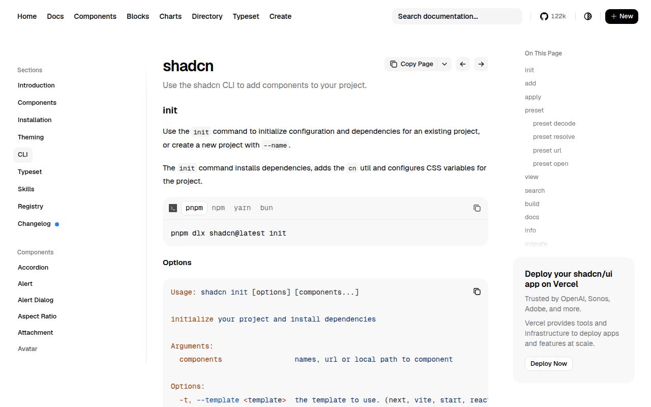
init changes the project. It can install dependencies, write components.json, add a cn utility, modify global CSS, and commit the project to aliases, a component base, icons, TypeScript output, and server-component behavior. Run it on a clean branch. For add commands, use dry-run and diff before writing; overwrite can replace local source. Aliases must resolve in components.json, TypeScript, and the bundler or generated imports land in paths the app cannot resolve.
Generated files can pull additional packages and client boundaries, so review them as third-party code even though they end up under src. In a monorepo, keep workspace components.json files, exports, style choices, and aliases consistent. Version 4.19.0 can migrate the base color, but that still rewrites owned theme source and needs visual regression testing. Private GitHub registries can use GitHub CLI auth or GH_TOKEN; limit token scope and never commit it to components.json or generated files.
Patterns
Configure the current repository initialize-existing-project
npx shadcn@4.19.0 initStart from a clean branch because init writes configuration, utilities, CSS, and dependencies.
Scaffold a Vite application create-vite-project
npx shadcn@4.19.0 init --template vite --name dashboardThis creates a project and requires Node 20.18.1 or newer.
Inspect an add operation preview-component-write
npx shadcn@4.19.0 add dialog --dry-run
npx shadcn@4.19.0 add dialog --diff
Review both generated files and dependency changes before accepting them in customized source.
Copy several components add-ui-components
npx shadcn@4.19.0 add button card dialogThe command writes local source and may install primitive packages; there is no single shadcn UI runtime import.
Set component aliases configure-install-paths
{
  "$schema": "https://ui.shadcn.com/schema.json",
  "style": "base-nova",
  "rsc": true,
  "tsx": true,
  "tailwind": {
    "config": "",
    "css": "src/index.css",
    "baseColor": "neutral",
    "cssVariables": true
  },
  "aliases": {
    "components": "@/components",
    "ui": "@/components/ui",
    "utils": "@/lib/utils",
    "lib": "@/lib",
    "hooks": "@/hooks"
  }
}
For Tailwind v4 the config path is empty. These aliases must also resolve in TypeScript and the bundler.
Change the generated theme base migrate-base-color
npx shadcn@4.19.0 migrate base-colorThis capability is new in 4.19.0. Review rewritten tokens and run visual regression tests before merging.
Find registry items search-registry
npx shadcn@4.19.0 search button
npx shadcn@4.19.0 view button
View an item before add so its source files, registry dependencies, and npm dependencies are known.
Install from a named registry add-namespaced-item
npx shadcn@4.19.0 add @acme/auth-cardTreat third-party registry source like any external dependency even though it is copied into your repository.
Authenticate a private GitHub registry use-private-github-registry
export GH_TOKEN="token-from-secret-store"
npx shadcn@4.19.0 add @internal/admin-panel
Version 4.19.0 can use GH CLI credentials or GH_TOKEN. Give the token only the repository access required and never store it in project JSON.
Target one monorepo app add-from-workspace
npx shadcn@4.19.0 add card --cwd apps/webParticipating workspaces need compatible configuration, and the shared UI package must export the generated paths.
Compose generated card source import-local-component
import {
  Card,
  CardContent,
  CardHeader,
  CardTitle,
} from '@/components/ui/card'

export function Summary() {
  return (
    <Card>
      <CardHeader><CardTitle>Project status</CardTitle></CardHeader>
      <CardContent>All checks passed.</CardContent>
    </Card>
  )
}
The import resolves to your repository. Registry presets and later local edits can change the available props.
Replace an existing generated file overwrite-component
npx shadcn@4.19.0 add button --overwriteUse only after reviewing diff output; overwrite can erase local changes to the component source.
Alternatives
| Package | Registry | Pick it when |
|---|---|---|
| @chakra-ui/react | npm | Choose it for a packaged React component system with centralized releases and runtime theming. |
| @mantine/core | npm | Choose it for a broad versioned React component library with hooks and maintained package upgrades. |
| daisyui | npm | Choose it for Tailwind component class names without copying a React source file for every widget. |
More web frontend guides
postcss · react · react-dom · tailwindcss · htmlparser2 · tailwind-merge · the whole shelf →
How this guide is made: grounded in the library's documentation, release notes, changelog, and issue history, on a fixed rubric — not a hands-on install of every release. The 50 most-downloaded entries are additionally install-verified in clean containers. Corrections: contact the desk.