react-resizable review
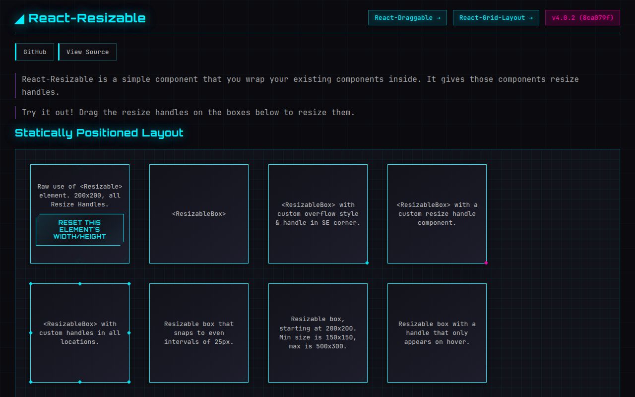
Our react-resizable 4.0.2 browser build measured 39.2 KB minified and 12 KB gzipped. The package adds mouse and touch resize handles around one React child and reports new pixel dimensions. Resizable is controlled, while ResizableBox keeps width and height in local state. Both support constraints, eight handle positions, aspect-ratio locking, drag-grid snapping, and scaled parents. Version 4 moved the source and declarations from Flow to TypeScript; 4.0.2 fixes optional props in those declarations without changing runtime behavior. It does not manage sibling layout or keyboard resizing.
react-resizable 4.0.2 installed in 1.7 seconds and added a 12 KB gzipped browser bundle in our sandbox, making it a focused option for pointer-resized React boxes. Skip it when the requirement is a keyboard-accessible splitter, responsive track sizing, or coordinated dashboard layout.
We installed it
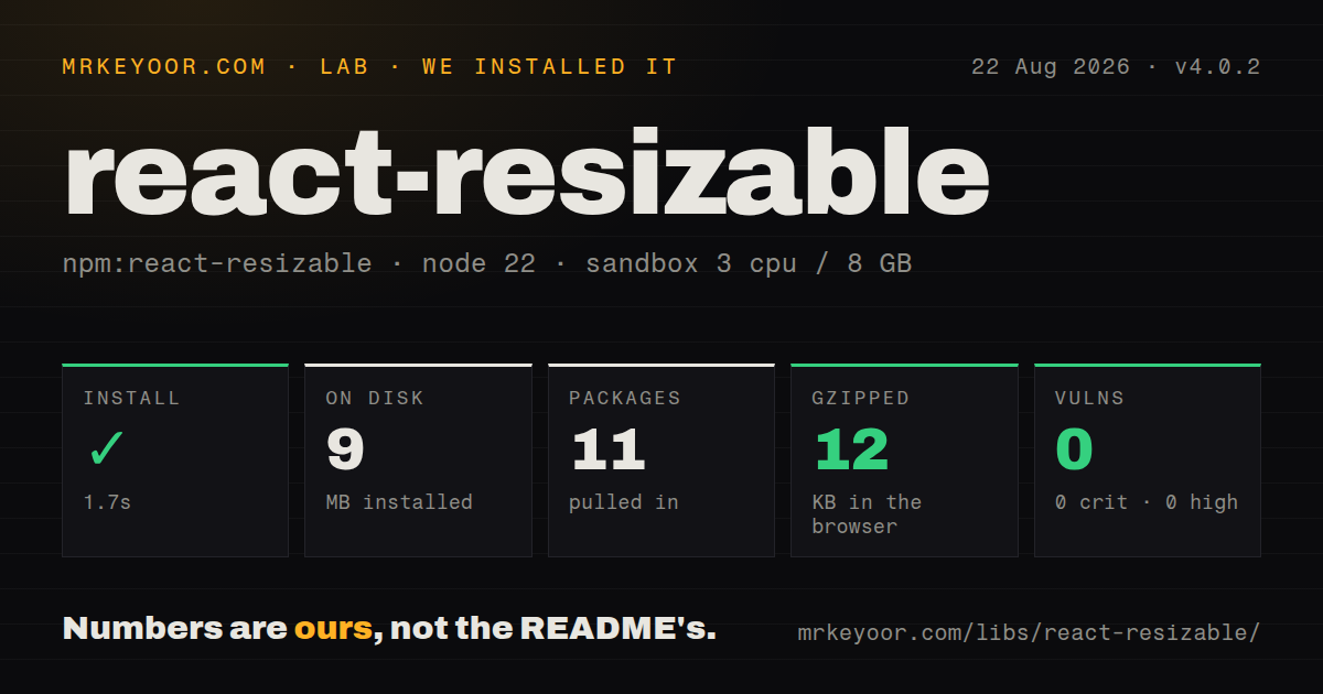
| Install | ✓ · 1.7s | 11 packages on disk · 9 MB |
| Import | ✓ | ESM import works · require() works · CommonJS package |
| Browser | 12 KB | gzipped (39.2 KB minified), bundled with esbuild |
| Types | ✓ | TypeScript types bundled |
| Known vulns | 0 | 0 critical · 0 high · 0 moderate · 0 low (npm audit) |
Answers from our run
Does react-resizable install cleanly?
Yes. In a fresh container with an empty cache, npm install react-resizable finished in 2 seconds, leaving 11 packages and 9 MB on disk. npm audit reported no known vulnerabilities.
How much does react-resizable add to a browser bundle?
12 KB gzipped (39.2 KB minified) when the whole package is bundled for the browser with esbuild. Importing only part of it is usually smaller.
Does react-resizable work with both ESM and CommonJS?
Yes. Both import 'react-resizable' and require('react-resizable') worked in Node 22 in our run. The package is published as CommonJS.
Does react-resizable include TypeScript types?
Yes, type declarations ship inside the package, so no @types install is needed.
react-resizable or re-resizable: which should you use?
re-resizable: Use it for a React resizer with more built-in size forms and handle configuration. react-resizable 4.0.2 installed in 1.7 seconds and added a 12 KB gzipped browser bundle in our sandbox, making it a focused option for pointer-resized React boxes.
When should you not use react-resizable?
Keyboard users must resize the control without extra work: the default span handles have no keyboard operation or ARIA separator behavior
Use it if
- A React panel needs pointer-driven resize handles and the application already knows how to apply the resulting pixel size
- You need min and max constraints, axis limits, aspect-ratio locking, grid snapping, or handles on selected edges
- A small controlled primitive fits better than adopting a split-pane or dashboard layout system
- React 16.3 or newer is already present and importing the package stylesheet is acceptable
- Keyboard users must resize the control without extra work: the default span handles have no keyboard operation or ARIA separator behavior
- You need a split view or dashboard engine: the package changes one element and does not rebalance siblings, resolve collisions, or save layouts
- Your source of truth is percentages, flex fractions, or grid tracks: public dimensions and constraints are numeric pixels
- You only need to observe layout-driven size changes: this listens to drag handles and does not wrap ResizeObserver
- Your build cannot import or copy its CSS: the README says the default handles are invisible and do not work properly without that stylesheet
Setup reality
We installed react-resizable 4.0.2 in 1.7 seconds on Node 22. The fresh sandbox contained 11 packages using 9 MB. The package itself has two direct dependencies, two peer dependencies, bundled TypeScript declarations, and a 96 KB unpacked size. npm audit found 0 known vulnerabilities. It is CommonJS with no exports map, though require() and ESM import both worked. Our browser build measured 39.2 KB minified and 12 KB gzipped.
React and React DOM 16.3 or newer are peer dependencies. Import react-resizable/css/styles.css or copy it into your CSS pipeline; the default handle is unusable without those rules. Version 4 includes its own types, so remove @types/react-resizable. No credentials or config file are involved. A server render can import the current package, but the actual drag behavior requires a DOM.
ResizableBox owns size internally and ignores width and height placed in its style prop. Resizable owns no size state: onResize must update the width and height props and the child element's dimensions, or the next render snaps back. A custom handle must attach the supplied ref and pointer props to a real DOM node. Missing the ref can produce the DraggableCore not mounted error documented in the changelog.
All sizes are pixels. transformScale must match a scaled ancestor, and draggableOpts carries grid snapping into react-draggable. The callbacks expose start, progress, and stop, which is enough to preview during drag and persist once at the end. The package does not add keyboard controls, focus management, ARIA values, responsive-unit conversion, storage, or changes to adjacent panels; each of those remains application code in version 4.0.2.
Patterns
Start with ResizableBox state render-stateful-box
import { ResizableBox } from 'react-resizable';
import 'react-resizable/css/styles.css';

<ResizableBox width={320} height={180}>
  <div>Drag the corner</div>
</ResizableBox>
The stylesheet is required for the default southeast handle to appear and receive drag interaction.
Own width and height in React state control-element-size
const [size, setSize] = useState({width: 320, height: 180});

<Resizable width={size.width} height={size.height} onResize={(_, {size}) => setSize(size)}>
  <div style={{width: size.width, height: size.height}}>Content</div>
</Resizable>
Resizable has no internal size; update its props and the child's dimensions on every resize callback.
Keep dimensions inside pixel bounds set-size-constraints
<ResizableBox
  width={300}
  height={200}
  minConstraints={[180, 120]}
  maxConstraints={[720, 480]}
>
  <div>Bounded panel</div>
</ResizableBox>
Constraint tuples are [width, height] in pixels; the documented defaults are [20, 20] and [Infinity, Infinity].
Limit dragging to width resize-horizontal-axis
<ResizableBox width={280} height={160} axis='x' resizeHandles={['e']}>
  <div>Width only</div>
</ResizableBox>
An east or west handle matches axis='x'; north and south handles cannot create horizontal deltas.
Keep the starting proportion lock-aspect-ratio
<ResizableBox
  width={320}
  height={180}
  lockAspectRatio
  minConstraints={[160, 90]}
  maxConstraints={[960, 540]}
>
  <div>16:9 preview</div>
</ResizableBox>
The ratio comes from the current width and height; version 4.0.1 fixed cursor tracking during locked-ratio drags.
Add handles to every side and corner enable-edge-handles
<ResizableBox
  width={360}
  height={240}
  resizeHandles={['n', 's', 'e', 'w', 'ne', 'nw', 'se', 'sw']}
>
  <div>Eight handles</div>
</ResizableBox>
Custom CSS must position each directional class you enable; the shipped stylesheet covers the package's handle classes.
Attach the required custom-handle ref forward-custom-handle-ref
const Handle = forwardRef(function Handle({handleAxis, ...props}, ref) {
  return <span ref={ref} className={`handle-${handleAxis}`} {...props} />;
});

<ResizableBox width={300} height={180} handle={<Handle />}>
  <div>Custom handle</div>
</ResizableBox>
The ref and remaining pointer props must reach a DOM node; omitting the ref can trigger '<DraggableCore> not mounted on DragStart!'.
Move in fixed drag increments snap-drag-grid
<ResizableBox
  width={300}
  height={200}
  draggableOpts={{grid: [20, 20]}}
>
  <div>20 px steps</div>
</ResizableBox>
The 20 px grid changes pointer deltas through DraggableCore; it does not resize CSS grid tracks.
Match a transformed ancestor's scale correct-parent-scale
<div style={{transform: 'scale(0.75)', transformOrigin: 'top left'}}>
  <ResizableBox width={400} height={240} transformScale={0.75}>
    <div>Scaled canvas</div>
  </ResizableBox>
</div>
transformScale must equal the ancestor's scale or cursor movement and reported size will disagree.
Preview during drag and save at the end persist-on-resize-stop
<ResizableBox
  width={320}
  height={200}
  onResize={(_, {size}) => preview(size)}
  onResizeStop={(_, {size}) => saveSize(size)}
>
  <div>Persistent panel</div>
</ResizableBox>
onResize fires throughout the drag, while onResizeStop reports the final size and is the cheaper place to persist it.
Type a resize callback type-resize-handler
import type {ResizeCallbackData} from 'react-resizable';
import type {SyntheticEvent} from 'react';

function handleResize(event: SyntheticEvent, data: ResizeCallbackData) {
  console.log(data.size.width, data.size.height, data.handle);
}
Version 4 exports declarations at the package root; remove @types/react-resizable to avoid competing type sources.
Style ResizableBox without overriding size style-resizable-wrapper
<ResizableBox
  width={320}
  height={200}
  className='settings-panel'
  style={{border: '1px solid #bbb', overflow: 'auto'}}
>
  <div>Settings</div>
</ResizableBox>
ResizableBox ignores width and height in style because its internal state owns those two values.
Alternatives
| Package | Registry | Pick it when |
|---|---|---|
| re-resizable | npm | Use it for a React resizer with more built-in size forms and handle configuration. |
| react-rnd | npm | Use it when one React element must move and resize inside bounds. |
| react-resizable-panels | npm | Use it for coordinated panel groups, layout persistence, and keyboard-aware resize handles. |
| @interactjs/interactjs | npm | Use it for framework-neutral drag, resize, gestures, snapping, and inertia. |
More web frontend guides
postcss · react · react-dom · tailwindcss · htmlparser2 · tailwind-merge · the whole shelf →
How this guide is made: grounded in the library's documentation, release notes, changelog, and issue history, on a fixed rubric — not a hands-on install of every release. The 50 most-downloaded entries are additionally install-verified in clean containers. Corrections: contact the desk.