react-grid-layout review
react-grid-layout 2.2.4 arranges React widgets on a draggable, resizable grid whose positions and dimensions are stored in column and row units. It resolves collisions, compacts empty space, supports fixed or overlapping items, and can keep separate layouts for responsive breakpoints. Version 2 is a TypeScript rewrite with hooks, grouped configuration, framework-independent layout algorithms, optional extras, and a legacy v1 adapter. Release 2.2.4 adjusted container-width measurement to the content box and whole pixels, and passes the native event to resize callbacks.
react-grid-layout 2.2.4 installed 14 packages and 10 MB in 2.3 seconds, while our full browser import measured 28 KB gzipped, a reasonable cost only for a genuinely editable React dashboard. Use CSS Grid for static pages, and budget separate work for storage, SSR sizing, v1 migration, and keyboard controls.
We installed it
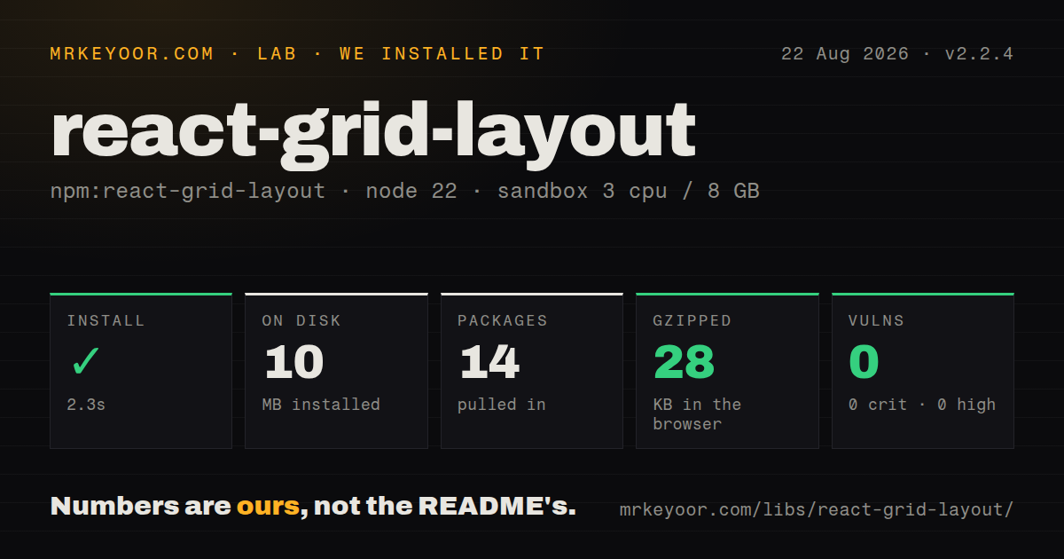
| Install | ✓ · 2.3s | 14 packages on disk · 10 MB |
| Import | ✓ | ESM import works · require() works · CommonJS package with exports map |
| Browser | 28 KB | gzipped (87.1 KB minified), bundled with esbuild |
| Types | ✓ | TypeScript types bundled |
| Known vulns | 0 | 0 critical · 0 high · 0 moderate · 0 low (npm audit) |
Answers from our run
Does react-grid-layout install cleanly?
Yes. In a fresh container with an empty cache, npm install react-grid-layout finished in 2 seconds, leaving 14 packages and 10 MB on disk. npm audit reported no known vulnerabilities.
How much does react-grid-layout add to a browser bundle?
28 KB gzipped (87.1 KB minified) when the whole package is bundled for the browser with esbuild. Importing only part of it is usually smaller.
Does react-grid-layout work with both ESM and CommonJS?
Yes. Both import 'react-grid-layout' and require('react-grid-layout') worked in Node 22 in our run. The package is published as CommonJS with an exports map.
Does react-grid-layout include TypeScript types?
Yes, type declarations ship inside the package, so no @types install is needed.
react-grid-layout or gridstack: which should you use?
gridstack: Choose it for a framework-neutral dashboard grid with wrappers for several UI stacks. react-grid-layout 2.2.4 installed 14 packages and 10 MB in 2.3 seconds, while our full browser import measured 28 KB gzipped, a reasonable cost only for a genuinely editable React dashboard.
When should you not use react-grid-layout?
The page only needs a responsive visual grid: CSS Grid avoids an 87.1 KB minified interaction engine and application state
Use it if
- Users need to drag and resize dashboard widgets, then return to the same saved arrangement
- Desktop, tablet, and phone widths require distinct widget coordinates rather than a single CSS reflow
- The grid mixes movable cards with static items, collision rules, and per-widget size limits
- Your React team needs components plus exported compaction, constraints, and positioning strategies
- The page only needs a responsive visual grid: CSS Grid avoids an 87.1 KB minified interaction engine and application state
- Cards should flow from measured content height: every react-grid-layout item needs explicit x, y, w, and h grid units
- You expect persistence or multi-user conflict handling from the package: it emits layouts but does not own storage, schema upgrades, or authorization
- You cannot fund a v1 migration: v2 requires width, moves data-grid and WidthProvider to /legacy, changes callback mutability, and groups configuration props
- Keyboard users must edit layouts immediately: the documented package interactions are pointer-based, so keyboard move and resize controls remain application work
Setup reality
Our install of react-grid-layout 2.2.4 completed in 2.3 seconds and left 14 packages using 10 MB on disk. npm audit found 0 known vulnerabilities. The package is 560 KB unpacked, declares six direct dependencies and two peers, React and ReactDOM. No native compilation ran.
Import react-grid-layout/css/styles.css and react-resizable/css/styles.css or resize handles will render incorrectly. The package is CommonJS with an exports map; require() and ESM import both worked in our Node 22 sandbox, and TypeScript declarations are bundled. Metadata accepts React >=16.3, but the v2 README compatibility table says React 18+; older applications belong on the legacy surface.
Version 2 requires a numeric width. useContainerWidth returns width, containerRef, and mounted; attach the ref to the wrapper and render after measurement. SSR can use measureBeforeMount with an initial width, trading a delayed grid for less hydration movement. Layout item i values must match child keys, and responsive layouts need widths that fit each breakpoint's column count.
Our browser build measured 87.1 KB minified and 28 KB gzipped. The component reports changed layouts but never persists them, so copy callback data and version your stored schema. Import /legacy during a staged v1 migration. Scaled ancestors need a matching position strategy or pointer coordinates drift. Pointer dragging also leaves keyboard movement, announcements, and focus management for the application.
Patterns
Render a width-aware v2 grid create-basic-grid
import GridLayout, {useContainerWidth} from 'react-grid-layout';
import 'react-grid-layout/css/styles.css';
import 'react-resizable/css/styles.css';

const layout = [
  {i: 'chart', x: 0, y: 0, w: 6, h: 3},
  {i: 'total', x: 6, y: 0, w: 3, h: 2},
];

export function Dashboard() {
  const {width, containerRef, mounted} = useContainerWidth();
  return <div ref={containerRef}>
    {mounted && <GridLayout width={width} layout={layout} gridConfig={{cols: 12, rowHeight: 40}}>
      <section key="chart">Chart</section>
      <section key="total">Total</section>
    </GridLayout>}
  </div>;
}
Version 2 requires width, both CSS imports, and a layout i matching each child's React key.
Store separate breakpoint layouts build-responsive-grid
import {Responsive, useContainerWidth} from 'react-grid-layout';

const layouts = {
  lg: [{i: 'sales', x: 0, y: 0, w: 6, h: 3}],
  sm: [{i: 'sales', x: 0, y: 0, w: 6, h: 3}],
};

function Dashboard() {
  const {width, containerRef, mounted} = useContainerWidth();
  return <div ref={containerRef}>{mounted && <Responsive
    width={width}
    layouts={layouts}
    breakpoints={{lg: 1200, md: 996, sm: 768, xs: 480, xxs: 0}}
    cols={{lg: 12, md: 10, sm: 6, xs: 4, xxs: 2}}
  ><div key="sales">Sales</div></Responsive>}</div>;
}
The sales widget is 6 columns wide, so it cannot fit unchanged at xs or xxs where the grid has only 4 or 2 columns.
Copy and save a completed layout persist-layout
const handleLayoutChange = (nextLayout) => {
  const stored = nextLayout.map((item) => ({...item}));
  setLayout(stored);
  localStorage.setItem('dashboard-layout-v2', JSON.stringify(stored));
};

<GridLayout width={width} layout={layout} onLayoutChange={handleLayoutChange}>
  {children}
</GridLayout>
Version 2 callback values are read-only; persist copied items and attach an application schema version to long-lived layouts.
Keep one row fixed make-static-widget
const layout = [
  {i: 'notice', x: 0, y: 0, w: 12, h: 1, static: true},
  {i: 'chart', x: 0, y: 1, w: 6, h: 4},
];
A static item cannot move or resize and still occupies collision space, so movable widgets route around it.
Bound a chart's grid dimensions constrain-widget-size
const layout = [{
  i: 'chart', x: 0, y: 0, w: 6, h: 4,
  minW: 4, maxW: 10, minH: 3, maxH: 8,
}];
minW, maxW, minH, and maxH use grid units; a minimum width must fit the smallest supported column count.
Drag from the card header only configure-drag-handle
<GridLayout
  width={width}
  layout={layout}
  dragConfig={{enabled: true, handle: '.widget-handle', cancel: 'button,input,a'}}
>
  <article key="orders">
    <header className="widget-handle">Orders</header>
    <button>Refresh</button>
  </article>
</GridLayout>
The cancel selector keeps buttons, inputs, and links interactive; v2 starts dragging after 3 pixels of pointer movement.
Enable four resize edges configure-resize-handles
<GridLayout
  width={width}
  layout={layout}
  resizeConfig={{enabled: true, handles: ['s', 'e', 'se', 'w']}}
>
  {children}
</GridLayout>
Only the southeast handle is enabled by default, and react-resizable/css/styles.css supplies the visible handle styling.
Leave gaps where users put them disable-compaction
import GridLayout from 'react-grid-layout';
import {noCompactor} from 'react-grid-layout/core';

<GridLayout width={width} layout={layout} compactor={noCompactor}>
  {children}
</GridLayout>
noCompactor preserves empty cells; overlap and collision prevention are separate choices and need their own configuration.
Use the faster vertical compactor compact-large-layout
import GridLayout from 'react-grid-layout';
import {fastVerticalCompactor} from 'react-grid-layout/extras';

<GridLayout width={width} layout={layout} compactor={fastVerticalCompactor}>
  {children}
</GridLayout>
The extras entry exports an O(n log n) vertical compactor intended for layouts with hundreds of widgets.
Match pointer math to a scaled parent support-scaled-container
import GridLayout from 'react-grid-layout';
import {createScaledStrategy} from 'react-grid-layout/core';

<div style={{transform: 'scale(0.75)', transformOrigin: 'top left'}}>
  <GridLayout width={width} layout={layout} positionStrategy={createScaledStrategy(0.75)}>
    {children}
  </GridLayout>
</div>
The 0.75 strategy value must equal the ancestor CSS scale or drag and resize positions will drift from the pointer.
Wait for a measured SSR container prepare-for-ssr
function Dashboard() {
  const {width, containerRef, mounted} = useContainerWidth({
    measureBeforeMount: true,
    initialWidth: 1200,
  });
  return <div ref={containerRef}>
    {mounted ? <GridLayout width={width} layout={layout}>{children}</GridLayout> : null}
  </div>;
}
measureBeforeMount delays the grid until width is known; initialWidth should resemble the server-rendered container to reduce movement.
Route v1 code through the legacy entry migrate-version-one
import GridLayout, {WidthProvider} from 'react-grid-layout/legacy';
import 'react-grid-layout/css/styles.css';
import 'react-resizable/css/styles.css';

const AutoWidthGrid = WidthProvider(GridLayout);

<AutoWidthGrid cols={12} rowHeight={30}>
  <div key="a" data-grid={{x: 0, y: 0, w: 4, h: 2}}>A</div>
</AutoWidthGrid>
The /legacy entry keeps v1 flat props, WidthProvider, and child data-grid while the root entry uses the v2 API.
Alternatives
| Package | Registry | Pick it when |
|---|---|---|
| gridstack | npm | Choose it for a framework-neutral dashboard grid with wrappers for several UI stacks. |
| muuri | npm | Choose it for draggable, filterable, sortable item layouts outside a React-only API. |
| react-mosaic-component | npm | Choose it for IDE-like split panes and tiled windows rather than free grid coordinates. |
| react-resizable-panels | npm | Choose it when the interface needs accessible resizable panel groups instead of movable dashboard cards. |
More web frontend guides
postcss · react · react-dom · tailwindcss · htmlparser2 · tailwind-merge · the whole shelf →
How this guide is made: grounded in the library's documentation, release notes, changelog, and issue history, on a fixed rubric — not a hands-on install of every release. The 50 most-downloaded entries are additionally install-verified in clean containers. Corrections: contact the desk.