react-focus-lock review
react-focus-lock 2.13.7 confines browser focus to a React subtree while a lock is active. It watches real focus movement, cycles eligible elements, handles portals through groups or shards, can return focus to the opener, and exposes components and hooks for programmatic movement. The current release fixes unstable React context that could cause hydration failure; 2.13.6 also aligned dependencies with React 19. This is only focus management. It does not supply dialog semantics, labeling, Escape dismissal, scroll locking, a backdrop, or screen-reader isolation.
react-focus-lock 2.13.7 installed in 2.2 seconds with 18 packages and 4 MB in our sandbox, bundled to 11.3 KB gzipped, and had 0 audit findings. Install it for focus containment across ordinary and portaled React content; choose a full dialog primitive when semantics, dismissal, scroll, and screen-reader isolation are also unfinished.
We installed it
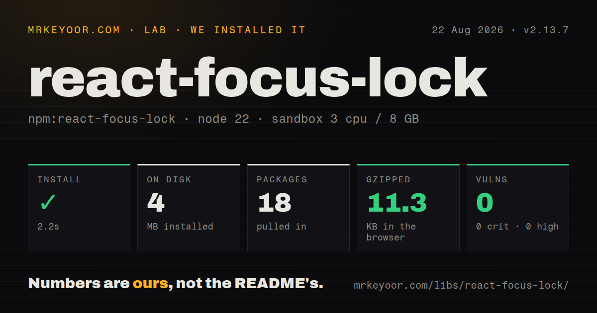
| Install | ✓ · 2.2s | 18 packages on disk · 4 MB |
| Import | ✓ | ESM import works · require() works · CommonJS package |
| Browser | 11.3 KB | gzipped (32.2 KB minified), bundled with esbuild |
| Types | ✓ | TypeScript types bundled |
| Known vulns | 0 | 0 critical · 0 high · 0 moderate · 0 low (npm audit) |
Answers from our run
Does react-focus-lock install cleanly?
Yes. In a fresh container with an empty cache, npm install react-focus-lock finished in 2 seconds, leaving 18 packages and 4 MB on disk. npm audit reported no known vulnerabilities.
How much does react-focus-lock add to a browser bundle?
11.3 KB gzipped (32.2 KB minified) when the whole package is bundled for the browser with esbuild. Importing only part of it is usually smaller.
Does react-focus-lock work with both ESM and CommonJS?
Yes. Both import 'react-focus-lock' and require('react-focus-lock') worked in Node 22 in our run. The package is published as CommonJS.
Does react-focus-lock include TypeScript types?
Yes, type declarations ship inside the package, so no @types install is needed.
react-focus-lock or focus-trap-react: which should you use?
focus-trap-react: Use it when the focus-trap activation, fallback-focus, and lifecycle option model better matches the component. react-focus-lock 2.13.7 installed in 2.2 seconds with 18 packages and 4 MB in our sandbox, bundled to 11.3 KB gzipped, and had 0 audit findings.
When should you not use react-focus-lock?
You need a complete accessible dialog. The README explicitly treats scroll lock and hiding outside content from assistive technology as separate jobs.
Use it if
- A custom modal, drawer, editor, or popover already has semantics and dismissal but lacks focus containment.
- Focusable controls cross React portals and must participate through a shared group or shard ref.
- The same component library supports React 16.8 through React 19.
- Arrow-key or custom navigation needs first, last, next, previous, or autofocus operations within a scope.
- You need a complete accessible dialog. The README explicitly treats scroll lock and hiding outside content from assistive technology as separate jobs.
- Another component or library already owns focus. Two active managers can pull focus back and forth, and the project warns against duplicate versions.
- Focus must return by default. The `returnFocus` prop defaults to `false` for compatibility and has to be enabled deliberately.
- Extra wrapper and guard elements are unacceptable. FocusLock renders a wrapper and hidden focus guards unless you customize or disable them.
- You are building without React. The lower-level `focus-lock` package is the intended DOM implementation.
Setup reality
We installed react-focus-lock 2.13.7 in 2.2 seconds in our fresh Node 22 sandbox. The install left 18 packages and 4 MB on disk, while npm audit reported 0 known vulnerabilities. The package has 6 direct dependencies and 2 peer dependencies, 248 KB unpacked, an MIT license, and bundled TypeScript declarations. Its CommonJS entry has no exports map; both require() and ESM import worked.
React is a peer and the declared range spans 16.8, 17, 18, and 19; @types/react is the other peer. There is no CSS or provider. Wrapping content activates containment and normally moves focus to the first eligible element. For a dialog, you still need role=dialog, aria-modal, a label, Escape behavior, outside-content isolation, scroll control, and a close path. Enable returnFocus and keep the opener mounted long enough to receive it.
Return after unmount or deactivation is deferred with a zero-timeout, so focus assertions must wait a task. data-autofocus or AutoFocusInside chooses an initial target. Portaled content needs a common group or refs in shards to join tab order. Shards do not get guards around their own DOM position, and an InFocusGuard may be needed at an edge. Positive tabIndex values require hasPositiveIndices; persistentFocus can interfere with text selection.
Our full-package browser bundle measured 32.2 KB minified and 11.3 KB gzipped. That is small enough for many apps, though importing a complete dialog primitive may remove more handwritten accessibility code than this focused dependency adds. Version 2.13.7 fixes a context-instability hydration bug, so older affected versions should be upgraded. Test actual keyboard traversal in Chrome, Firefox, and Safari; jsdom does not reproduce operating-system tab settings or every browser focus transition.
Patterns
Contain a custom dialog's focus lock-modal-focus
import FocusLock from 'react-focus-lock';

function Dialog({ onClose }) {
  return (
    <div role="dialog" aria-modal="true" aria-labelledby="dialog-title">
      <FocusLock returnFocus>
        <h2 id="dialog-title">Edit profile</h2>
        <input aria-label="Display name" />
        <button onClick={onClose}>Close</button>
      </FocusLock>
    </div>
  );
}
FocusLock manages focus only; Escape handling, scroll control, outside-content isolation, and a backdrop remain separate.
Mark the first focus target choose-initial-focus
<FocusLock returnFocus>
  <input aria-label="Search" data-autofocus />
  <button>Apply</button>
  <button>Cancel</button>
</FocusLock>
When 2 or more eligible nodes have `data-autofocus`, the first one wins during activation.
Choose an autofocus region autofocus-component
import FocusLock, { AutoFocusInside } from 'react-focus-lock';

<FocusLock>
  <button>Before</button>
  <AutoFocusInside>
    <input aria-label="Project name" />
  </AutoFocusInside>
</FocusLock>
`AutoFocusInside` acts only when a surrounding FocusLock activates; outside a lock it does not move focus.
Disable containment without unmounting toggle-focus-lock
<FocusLock disabled={!open} returnFocus>
  <Panel hidden={!open} />
</FocusLock>
Focus restoration after disabling uses a zero-timeout, so wait for the next task before asserting `document.activeElement`.
Add a portaled toolbar as a shard include-portal-shard
const toolbarRef = useRef(null);

<FocusLock shards={[toolbarRef]}>
  <textarea aria-label="Document" />
</FocusLock>

{createPortal(
  <div ref={toolbarRef}><button>Bold</button></div>,
  document.body
)}
A shard joins the lock but receives no automatic guards at its portal position; use `InFocusGuard` when tabbing can escape at that edge.
Join two regions with one group group-scattered-locks
<FocusLock group="palette">
  <input aria-label="Command" />
</FocusLock>

{createPortal(
  <FocusLock group="palette" disabled><button>Search files</button></FocusLock>,
  document.body
)}
Only 1 lock in a group should be active; the disabled member marks its portaled subtree as discoverable by the group.
Yield one subtree to another manager allow-unmanaged-focus
import FocusLock, { FreeFocusInside } from 'react-focus-lock';

<FocusLock>
  <button>Locked action</button>
  <FreeFocusInside><div id="third-party-modal-root" /></FreeFocusInside>
</FocusLock>
Use `FreeFocusInside` when a second focus manager owns the marked subtree and would otherwise fight the active lock.
Put dialog props on the wrapper customize-lock-wrapper
<FocusLock
  as="section"
  returnFocus
  lockProps={{ role: 'dialog', 'aria-modal': true, 'aria-labelledby': 'title' }}
>
  <h2 id="title">Settings</h2>
  <button>Save</button>
</FocusLock>
The default wrapper is a `div`; `as` changes its element and `lockProps` forwards attributes other than `className`.
Move focus without containment move-focus-on-mount
import { MoveFocusInside } from 'react-focus-lock';

<MoveFocusInside>
  <input aria-label="Rename file" defaultValue="notes.txt" />
</MoveFocusInside>
`MoveFocusInside` focuses its child region on mount but does not prevent later focus from leaving.
Move through a scope with arrow keys navigate-focus-scope
const { focusNext, focusPrev } = useFocusScope();

<div onKeyDown={(event) => {
  if (event.key === 'ArrowDown') { event.preventDefault(); void focusNext(); }
  if (event.key === 'ArrowUp') { event.preventDefault(); void focusPrev(); }
}}>
  <button>One</button><button>Two</button>
</div>
`useFocusScope` must run below a FocusLock, even a disabled one, and its movement methods return promises.
Alternatives
| Package | Registry | Pick it when |
|---|---|---|
| focus-trap-react | npm | Use it when the focus-trap activation, fallback-focus, and lifecycle option model better matches the component. |
| react-aria-modal | npm | Use it when a dialog should bundle focus handling with modal semantics and outside-content treatment. |
| react-focus-on | npm | Use the same author's combined focus lock, scroll lock, and outside-content isolation layer. |
More web frontend guides
postcss · react · react-dom · tailwindcss · htmlparser2 · tailwind-merge · the whole shelf →
How this guide is made: grounded in the library's documentation, release notes, changelog, and issue history, on a fixed rubric — not a hands-on install of every release. The 50 most-downloaded entries are additionally install-verified in clean containers. Corrections: contact the desk.