react-draggable review
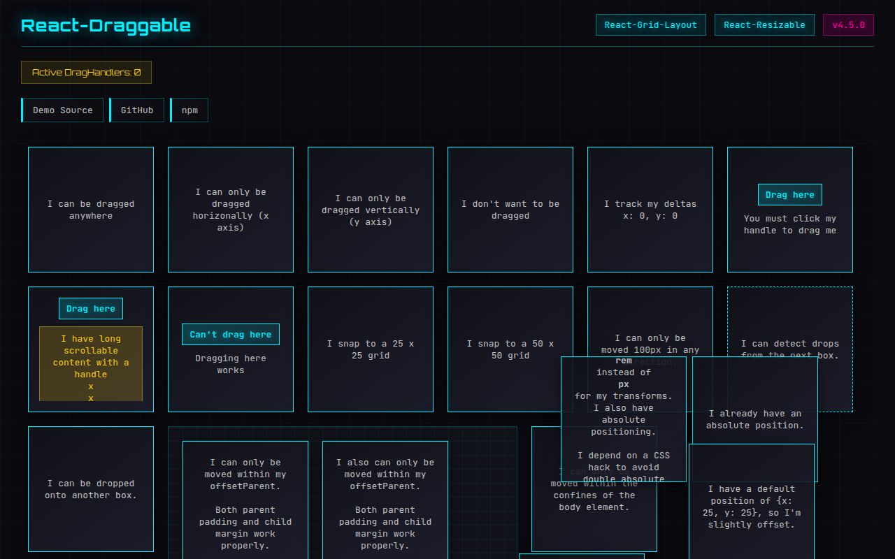
react-draggable moves one existing React child in response to mouse or touch input. `Draggable` owns coordinates and writes a CSS translate, while `DraggableCore` only reports position deltas for a renderer you control. The props cover handles, excluded controls, parent or numeric bounds, grid steps, axis locks, controlled coordinates, and scaled ancestors. Version 4.7.1 repairs optional prop typing for React 18 and prevents browser builds without a `process` shim from failing on import. It does not supply drop zones, sorting, collision detection, or keyboard dragging.
react-draggable 4.7.1 installed in 1.4 seconds, used 9 MB across 10 packages, and had 0 audit findings in our sandbox; its browser bundle measured 9.1 KB gzipped. It fits direct pointer movement of one React element, while sortable or accessible drag-and-drop products need a higher-level system.
We installed it
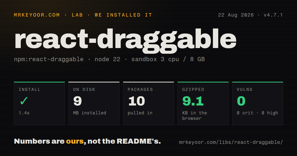
| Install | ✓ · 1.4s | 10 packages on disk · 9 MB |
| Import | ✓ | ESM import works · require() works · CommonJS package with exports map |
| Browser | 9.1 KB | gzipped (26.8 KB minified), bundled with esbuild |
| Types | ✓ | TypeScript types bundled |
| Known vulns | 0 | 0 critical · 0 high · 0 moderate · 0 low (npm audit) |
Answers from our run
Does react-draggable install cleanly?
Yes. In a fresh container with an empty cache, npm install react-draggable finished in 1 seconds, leaving 10 packages and 9 MB on disk. npm audit reported no known vulnerabilities.
How much does react-draggable add to a browser bundle?
9.1 KB gzipped (26.8 KB minified) when the whole package is bundled for the browser with esbuild. Importing only part of it is usually smaller.
Does react-draggable work with both ESM and CommonJS?
Yes. Both import 'react-draggable' and require('react-draggable') worked in Node 22 in our run. The package is published as CommonJS with an exports map.
Does react-draggable include TypeScript types?
Yes, type declarations ship inside the package, so no @types install is needed.
react-draggable or @dnd-kit/core: which should you use?
@dnd-kit/core: Choose it for sensors, collision rules, drag overlays, sortable UIs, and keyboard input. react-draggable 4.7.1 installed in 1.4 seconds, used 9 MB across 10 packages, and had 0 audit findings in our sandbox; its browser bundle measured 9.1 KB gzipped.
When should you not use react-draggable?
The feature sorts items or moves them between containers. There is no destination model, collision strategy, drag overlay, or reorder helper.
Use it if
- A floating panel, diagram node, marker, or canvas control needs pointer movement without drop-target rules.
- Movement can use CSS translate with a fixed axis, grid interval, or measured boundary.
- The UI wants internal drag state plus a controlled `position` for reset and programmatic movement.
- A canvas or custom renderer needs normalized deltas from DraggableCore without package-owned styles.
- The feature sorts items or moves them between containers. There is no destination model, collision strategy, drag overlay, or reorder helper.
- Keyboard operation and screen-reader movement announcements must arrive with the library. Its drag events are pointer-driven, so accessible controls remain your responsibility.
- The direct child already relies on its transform style. Draggable replaces that transform; preserving rotation or scale requires another wrapper or DraggableCore.
- Dragging should push siblings through normal layout. A transform changes where the child is painted without moving its original layout box.
- Your custom child cannot forward a DOM ref and spread cloned event/style props. Strict Mode wiring depends on both reaching the actual element.
Setup reality
We installed react-draggable 4.7.1 in a clean Node 22 Bookworm sandbox. npm finished in 1.4 seconds, left 10 packages, and consumed 9 MB. The package declares 2 direct dependencies and 2 peers, with 536 KB unpacked. npm audit found 0 known vulnerabilities. It includes TypeScript declarations. The CommonJS package has an exports map, and both require and ESM import worked for us. Our browser build measured 26.8 KB minified and 9.1 KB gzipped.
React and React DOM 16.3 or later are peers. Draggable expects one child. Under Strict Mode, create a nodeRef, pass it to Draggable, and attach the same ref to the underlying DOM element. A custom component must forward that ref and pass through the cloned handlers, class name, and style. Missing either part can bring back findDOMNode warnings or leave the drag inert.
The direct child receives a translate transform and stays in its original document-flow slot. Put any application rotation or scale on a nested element. Geometry for bounds depends on the DOM, including margins, padding, transformed ancestors, and the offset parent. Version 4.7.1 supports a scale prop for scaled canvases. With a controlled position, dragging still runs; update coordinates from onDrag or set disabled when movement should stop.
Touch drag competes with page scroll. allowMobileScroll lets scrolling continue, which also changes gesture behavior. On the first drag, the default selection fix inserts a shared style element. A strict style-src policy needs the matching nonce, webpack's configured nonce, or enableUserSelectHack={false} plus your own CSS. The library leaves focus, keyboard movement, announcements, auto-scroll, stacking, and all drop semantics to the application.
Patterns
Connect the Strict Mode ref drag-dom-element
import {useRef} from 'react';
import Draggable from 'react-draggable';

function MovableCard() {
  const nodeRef = useRef(null);
  return (
    <Draggable nodeRef={nodeRef}>
      <div ref={nodeRef}>Move this card</div>
    </Draggable>
  );
}
nodeRef and the child's ref must be the same object and must resolve to a DOM element.
Make a custom child draggable forward-custom-child
const Panel = forwardRef(function Panel(props, ref) {
  return <section ref={ref} {...props} />;
});

<Draggable nodeRef={nodeRef}>
  <Panel ref={nodeRef}>Panel contents</Panel>
</Draggable>;
Forward the ref and spread incoming props so the cloned handlers, styles, and classes reach the DOM node.
Start dragging from a header restrict-drag-handle
<Draggable nodeRef={nodeRef} handle=".panel-handle">
  <section ref={nodeRef}>
    <header className="panel-handle">Move panel</header>
    <input aria-label="Panel title" />
  </section>
</Draggable>
handle is a CSS selector for pointer initiation. Provide separate keyboard movement controls.
Keep controls out of drag initiation exclude-form-controls
<Draggable
  nodeRef={nodeRef}
  cancel="input, textarea, button, a, [data-no-drag]"
>
  <div ref={nodeRef}>
    <button>Save</button>
    <p>Drag from this text</p>
  </div>
</Draggable>
Matching descendants remain interactive instead of starting a drag gesture.
Keep a marker inside its stage constrain-to-parent
<div className="stage">
  <Draggable nodeRef={nodeRef} bounds="parent">
    <div ref={nodeRef}>Marker</div>
  </Draggable>
</div>
Parent bounds rely on measured geometry, so test padding, margins, and transformed ancestors in the target browsers.
Move in 16-pixel steps snap-to-grid
<Draggable
  nodeRef={nodeRef}
  grid={[16, 16]}
  defaultPosition={{x: 32, y: 48}}
>
  <div ref={nodeRef}>Grid item</div>
</Draggable>
Grid snapping changes translate coordinates; surrounding layout does not reserve snapped cells.
Reset from React state control-drag-position
const [position, setPosition] = useState({x: 0, y: 0});

<Draggable
  nodeRef={nodeRef}
  position={position}
  onDrag={(_event, data) => setPosition({x: data.x, y: data.y})}
>
  <div ref={nodeRef}>Controlled item</div>
</Draggable>;
Supplying position does not disable pointer input. Mirror onDrag updates or set disabled.
Persist coordinates after dragging save-final-position
<Draggable
  nodeRef={nodeRef}
  defaultPosition={savedPosition}
  onStop={(_event, data) => savePosition({x: data.x, y: data.y})}
>
  <div ref={nodeRef}>Remember me</div>
</Draggable>
defaultPosition is read for initial uncontrolled state. Use position if later storage updates must move the item.
Account for a zoomed canvas correct-scaled-coordinates
<div style={{transform: 'scale(0.75)', transformOrigin: '0 0'}}>
  <Draggable nodeRef={nodeRef} scale={0.75}>
    <div ref={nodeRef}>Accurate at 75%</div>
  </Draggable>
</div>
scale must match the effective ancestor scale; nested or nonuniform transforms can require custom coordinate handling.
Put rotation on an inner wrapper preserve-child-transform
<Draggable nodeRef={nodeRef}>
  <div ref={nodeRef}>
    <div style={{transform: 'rotate(4deg)'}}>Rotated content</div>
  </div>
</Draggable>
Draggable writes transform on its immediate child, so application transforms belong on another element.
Update a custom renderer consume-core-deltas
import {DraggableCore} from 'react-draggable';

<DraggableCore
  nodeRef={nodeRef}
  onDrag={(_event, data) => setPoint((point) => ({
    x: point.x + data.deltaX,
    y: point.y + data.deltaY,
  }))}
>
  <canvas ref={nodeRef} width={800} height={600} />
</DraggableCore>
DraggableCore applies no translate or stored position. Your renderer owns every visual update.
Pass a CSP nonce authorize-selection-style
<Draggable nodeRef={nodeRef} nonce={cspNonce}>
  <div ref={nodeRef}>CSP-compatible item</div>
</Draggable>
The shared selection style is inserted on the first drag, so every possible first instance should receive the valid nonce.
Alternatives
| Package | Registry | Pick it when |
|---|---|---|
| @dnd-kit/core | npm | Choose it for sensors, collision rules, drag overlays, sortable UIs, and keyboard input. |
| react-rnd | npm | Choose it when the same panel also needs resize handles and size constraints. |
| react-moveable | npm | Choose it for design-surface controls such as resizing, rotation, scaling, warping, and guides. |
More web frontend guides
postcss · react · react-dom · tailwindcss · htmlparser2 · tailwind-merge · the whole shelf →
How this guide is made: grounded in the library's documentation, release notes, changelog, and issue history, on a fixed rubric — not a hands-on install of every release. The 50 most-downloaded entries are additionally install-verified in clean containers. Corrections: contact the desk.