react-datepicker review
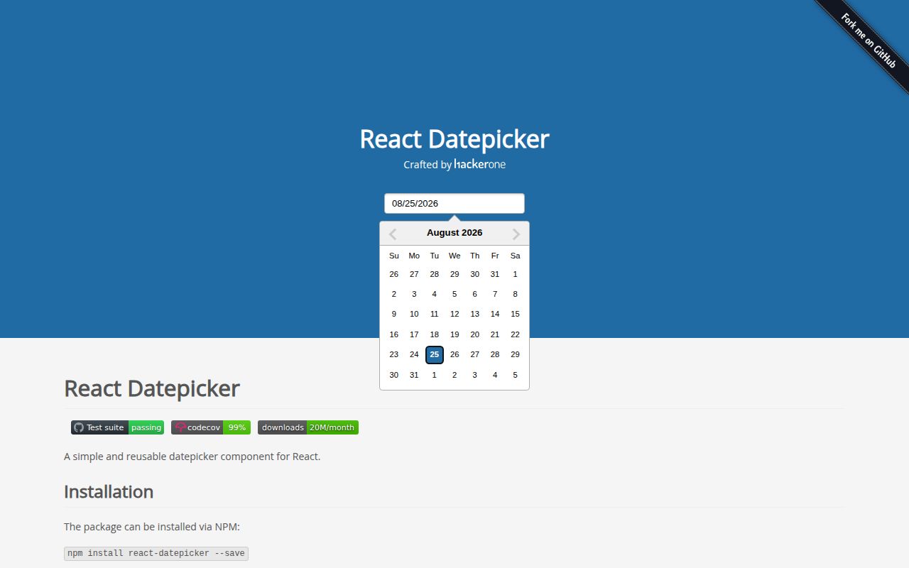
react-datepicker 9.1.0 is a controlled React input and popover calendar built on native Date values and date-fns 4. It covers one date, ranges, multiple dates, time lists, month and year views, locale registration, blocked dates, portals, custom inputs, and keyboard navigation. The 9.1.0 release restores non-strict date parsing lost in version 8, fixes default styles and several portal and Safari failures, improves prop types, and lets onClickOutside keep the calendar open through preventDefault(). Our browser build was 190 KB minified and 49.6 KB gzipped, so this is a substantial UI component rather than a small date helper.
react-datepicker 9.1.0 installed in 3.6 seconds, used 42 MB across 12 packages, bundled to 49.6 KB gzipped, and produced 0 audit findings in our sandbox. It fits React forms that want a styled Date-based picker with many modes; skip it for strict date-only models, headless design systems, or routes where 190 KB minified is too much.
We installed it
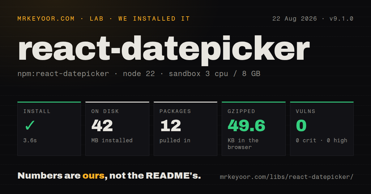
| Install | ✓ · 3.6s | 12 packages on disk · 42 MB |
| Import | ✓ | ESM import works · require() works · CommonJS package with exports map |
| Browser | 49.6 KB | gzipped (190 KB minified), bundled with esbuild |
| Types | ✓ | TypeScript types bundled |
| Known vulns | 0 | 0 critical · 0 high · 0 moderate · 0 low (npm audit) |
Answers from our run
Does react-datepicker install cleanly?
Yes. In a fresh container with an empty cache, npm install react-datepicker finished in 4 seconds, leaving 12 packages and 42 MB on disk. npm audit reported no known vulnerabilities.
How much does react-datepicker add to a browser bundle?
49.6 KB gzipped (190 KB minified) when the whole package is bundled for the browser with esbuild. Importing only part of it is usually smaller.
Does react-datepicker work with both ESM and CommonJS?
Yes. Both import 'react-datepicker' and require('react-datepicker') worked in Node 22 in our run. The package is published as CommonJS with an exports map.
Does react-datepicker include TypeScript types?
Yes, type declarations ship inside the package, so no @types install is needed.
react-datepicker or react-day-picker: which should you use?
react-day-picker: Use it when the design system should own the field, popover, markup, and visual treatment around a calendar primitive. react-datepicker 9.1.0 installed in 3.6 seconds, used 42 MB across 12 packages, bundled to 49.6 KB gzipped, and produced 0 audit findings in our sandbox.
When should you not use react-datepicker?
Birthdays or billing dates are stored as YYYY-MM-DD. The component returns Date objects, and the timezone guide documents day shifts caused by careless UTC serialization.
Use it if
- A React form needs a ready-styled calendar with single, range, multiple-date, and time selection modes.
- Application state already uses JavaScript Date objects and the team understands how those values cross timezones.
- One component should handle locale registration, date limits, custom inputs, inline rendering, and portals.
- The product can accept a 49.6 KB gzipped measured bundle for the picker and its imported code.
- Birthdays or billing dates are stored as YYYY-MM-DD. The component returns Date objects, and the timezone guide documents day shifts caused by careless UTC serialization.
- Your design system needs full control over markup and interaction primitives. react-datepicker ships a DOM structure and CSS, while react-day-picker is easier to shape from lower-level parts.
- The application already uses Material UI fields and adapters. @mui/x-date-pickers will share that theme and form behavior with less custom integration.
- A 190 KB minified measured browser bundle is too expensive for the route. Native date inputs or a smaller headless calendar deserve a bundle comparison.
- The project cannot take date-fns 4 or its optional timezone peer. Version 9.1.0 depends on date-fns and requires date-fns-tz 3 when the timeZone prop is used.
Setup reality
We installed react-datepicker 9.1.0 in a fresh Node 22 Bookworm container. npm completed in 3.6 seconds, left 12 packages, and used 42 MB on disk. npm audit found 0 vulnerabilities at all severity levels. The package declares 3 direct and 3 peer dependencies, is 4676 KB unpacked, and includes TypeScript declarations. Our browser import measured 190 KB minified and 49.6 KB gzipped.
React and react-dom must satisfy the declared 16.9 through 19 range. Import react-datepicker/dist/react-datepicker.css once unless your application replaces the supplied styling. The component is controlled through selected and onChange. Single selection returns Date or null, a range returns a 2-item tuple, and multiple selection returns an array or null. Those distinct callback types are encoded in the bundled declarations.
Date values need a storage decision. A local-midnight birthday can move to another calendar day when converted to UTC. Format date-only values as yyyy-MM-dd from local components; use ISO strings for actual moments. The timeZone prop accepts an IANA identifier and requires date-fns-tz 3. Without that peer, the source logs a development warning and falls back to local-time behavior. Locale data must also be imported from date-fns and registered by name.
Overflow containers can clip the floating calendar. withPortal and portalId move it, which changes focus, stacking, and test selectors. Custom inputs must forward the injected ref and handlers. Version 9.1.0 lets onClickOutside call preventDefault() to keep the calendar open for portal-based header controls. Date filters execute for rendered days, and time choices default to 30-minute intervals. Test keyboard paths, touch input, labels, and validation messages in the actual form.
Patterns
Control one selected date pick-single-date
import { useState } from 'react';
import DatePicker from 'react-datepicker';
import 'react-datepicker/dist/react-datepicker.css';

export function ShipDate() {
  const [value, setValue] = useState<Date | null>(null);
  return (
    <DatePicker
      selected={value}
      onChange={setValue}
      placeholderText="Choose a shipping date"
      isClearable
    />
  );
}
Version 9.1 types single selection as Date or null. Import the CSS once or replace the package styles yourself.
Collect a start and end date pick-date-range
const [period, setPeriod] = useState<[Date | null, Date | null]>([null, null]);
const [startDate, endDate] = period;

<DatePicker
  selectsRange
  startDate={startDate}
  endDate={endDate}
  onChange={setPeriod}
  isClearable
/>
selectsRange changes onChange to a 2-item tuple. A single-date setter has the wrong contract for this mode.
Collect separate dates pick-multiple-dates
const [dates, setDates] = useState<Date[] | null>([]);

<DatePicker
  selectsMultiple
  selectedDates={dates ?? []}
  onChange={setDates}
  formatMultipleDates={(items, formatDate) =>
    items.map(formatDate).join(', ')
  }
/>
selectsMultiple returns Date[] or null and enables formatMultipleDates. It cannot be combined with range selection.
Choose a date and a 15-minute slot pick-date-time
<DatePicker
  selected={appointment}
  onChange={setAppointment}
  showTimeSelect
  timeIntervals={15}
  dateFormat="Pp"
/>
The default interval is 30 minutes. Setting 15 changes the list, while the returned value remains a JavaScript Date.
Display a Spanish calendar register-locale
import DatePicker, { registerLocale } from 'react-datepicker';
import { es } from 'date-fns/locale/es';

registerLocale('es', es);

<DatePicker selected={value} onChange={setValue} locale="es" />
Locale registration is explicit. Passing 'es' without importing and registering the date-fns locale does not load it.
Display New York time set-iana-timezone
<DatePicker
  selected={instant}
  onChange={setInstant}
  showTimeSelect
  timeZone="America/New_York"
  dateFormat="MMMM d, yyyy h:mm aa"
/>
timeZone requires date-fns-tz 3. Without the peer, version 9.1 warns in development and uses local-time behavior.
Store a calendar date safely serialize-date-only
import { format } from 'date-fns';

function saveBirthday(date: Date | null) {
  const value = date ? format(date, 'yyyy-MM-dd') : null;
  submit({ birthday: value });
}

<DatePicker selected={birthday} onChange={saveBirthday} />
toISOString() converts to UTC and can change the calendar day. Format a date-only field from the intended local date.
Bound booking dates limit-selectable-dates
import { addMonths, startOfToday } from 'date-fns';

const first = startOfToday();
<DatePicker
  selected={value}
  onChange={setValue}
  minDate={first}
  maxDate={addMonths(first, 6)}
/>
minDate and maxDate are Date values. Keep their timezone assumptions consistent with selected and timeZone.
Disable weekends and closures block-business-dates
import { isSameDay, isWeekend } from 'date-fns';

const closures = [new Date(2026, 11, 25)];
<DatePicker
  selected={value}
  onChange={setValue}
  filterDate={(day) =>
    !isWeekend(day) && !closures.some((closed) => isSameDay(closed, day))
  }
/>
filterDate runs while days render. Large rule sets should use memoized lookup data or the exclusion props.
Protect a portal header control keep-open-on-outside-click
<DatePicker
  selected={value}
  onChange={setValue}
  onClickOutside={(event) => {
    if (headerPortal.current?.contains(event.target as Node)) {
      event.preventDefault();
    }
  }}
/>
Version 9.1 checks defaultPrevented after onClickOutside. Calling preventDefault() keeps the calendar open.
Use a button as the input forward-custom-input
const DateButton = forwardRef<HTMLButtonElement, any>(
  ({ value, onClick, ...inputProps }, ref) => (
    <button ref={ref} type="button" onClick={onClick} {...inputProps}>
      {value || 'Choose date'}
    </button>
  )
);

<DatePicker selected={value} onChange={setValue} customInput={<DateButton />} />
The custom element must forward its ref, click handler, value, and accessibility props or focus and keyboard opening can fail.
Escape an overflow container render-with-portal
<DatePicker
  selected={value}
  onChange={setValue}
  withPortal
  portalId="booking-date-portal"
/>
withPortal moves the calendar in the DOM. Recheck focus order, modal stacking, click-away behavior, and test selectors.
Alternatives
| Package | Registry | Pick it when |
|---|---|---|
| react-day-picker | npm | Use it when the design system should own the field, popover, markup, and visual treatment around a calendar primitive. |
| @mui/x-date-pickers | npm | Use it in Material UI applications that need matching fields, adapters, validation, and theme tokens. |
| flatpickr | npm | Use it on framework-neutral pages or mixed frontend stacks where a React-only controlled component is a poor fit. |
More web frontend guides
postcss · react · react-dom · tailwindcss · htmlparser2 · tailwind-merge · the whole shelf →
How this guide is made: grounded in the library's documentation, release notes, changelog, and issue history, on a fixed rubric — not a hands-on install of every release. The 50 most-downloaded entries are additionally install-verified in clean containers. Corrections: contact the desk.