react-colorful review
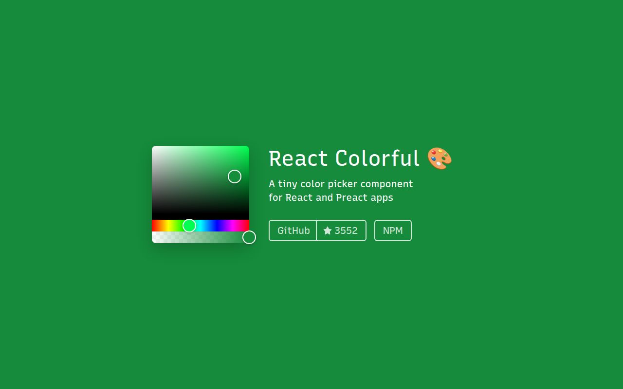
Our esbuild browser run put the full react-colorful 5.8.0 namespace at 22.9 KB minified and 7.8 KB gzipped. The package supplies React and Preact sliders for HEX, RGB, HSL, and HSV, including alpha variants and either string or channel-object values. HexColorInput is a separate export. Your application still provides the label, text-field styling, popover, swatches, validation message, and form connection. Version 5.8.1 fixes an alpha-slider bug that could turn RGB 200, 120, 35 into 199, 119, 34 even though the user changed only opacity; the component API stayed the same.
Our install of react-colorful 5.8.0 completed in 1.3 seconds with 0 audit findings, and the full browser namespace measured 7.8 KB gzipped. Use 5.8.1 when a React or Preact screen can own the field shell; pass if the requirement is CSS Color 4 editing or a finished popover control.
We installed it
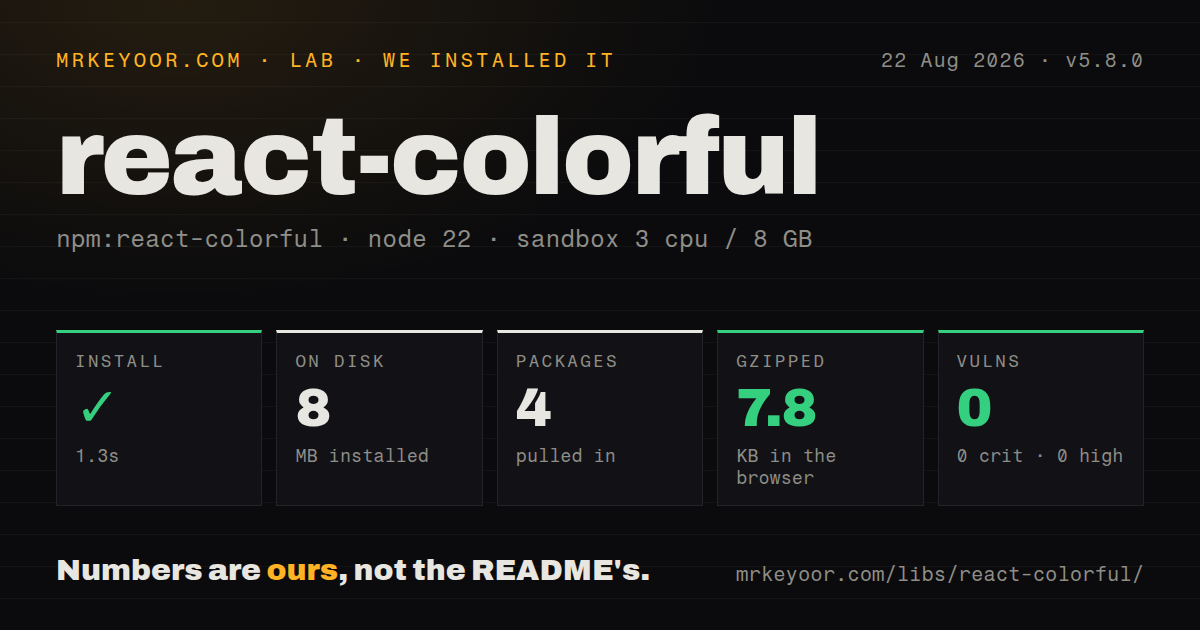
| Install | ✓ · 1.3s | 4 packages on disk · 8 MB |
| Import | ✓ | ESM import works · require() works · CommonJS package with exports map |
| Browser | 7.8 KB | gzipped (22.9 KB minified), bundled with esbuild |
| Types | ✓ | TypeScript types bundled |
| Known vulns | 0 | 0 critical · 0 high · 0 moderate · 0 low (npm audit) |
Answers from our run
Does react-colorful install cleanly?
Yes. In a fresh container with an empty cache, npm install react-colorful finished in 1 seconds, leaving 4 packages and 8 MB on disk. npm audit reported no known vulnerabilities.
How much does react-colorful add to a browser bundle?
7.8 KB gzipped (22.9 KB minified) when the whole package is bundled for the browser with esbuild. Importing only part of it is usually smaller.
Does react-colorful work with both ESM and CommonJS?
Yes. Both import 'react-colorful' and require('react-colorful') worked in Node 22 in our run. The package is published as CommonJS with an exports map.
Does react-colorful include TypeScript types?
Yes, type declarations ship inside the package, so no @types install is needed.
react-colorful or react-color: which should you use?
react-color: Pick react-color 2.19.3 when named Sketch, Photoshop, and Chrome-style picker layouts are more useful than a bare field primitive. Our install of react-colorful 5.8.0 completed in 1.3 seconds with 0 audit findings, and the full browser namespace measured 7.8 KB gzipped.
When should you not use react-colorful?
Your product edits OKLCH, Lab, LCH, HWB, or wide-gamut color; the exported picker types cover only HEX, RGB, HSL, and HSV families
Use it if
- A React settings panel already has its field shell and needs a compact color surface inside it
- Application state stores HEX text or explicit RGB, HSL, or HSV channels that match a named picker export
- Live preview belongs in onChange while persistence or undo history should wait for onChangeEnd
- A web component needs the picker inside its ShadowRoot; version 5.8 and later place the base style element in that root
- Your product edits OKLCH, Lab, LCH, HWB, or wide-gamut color; the exported picker types cover only HEX, RGB, HSL, and HSV families
- You need a ready-made trigger, popover, text field, preset grid, validation message, and focus return; the README presents those pieces as application recipes
- Inline style elements are forbidden even when they carry a nonce; version 5 injects its base CSS at runtime
- The interface uses Vue, Svelte, Angular, or plain custom elements without a React or Preact compatibility layer; React and React DOM are package peers
- One input must accept named colors, oklch(), color(), and other CSS syntax; HexColorInput validates HEX while the README sends broader parsing to a custom recipe
Setup reality
We installed react-colorful 5.8.0 in 1.3 seconds using an unprivileged node:22-bookworm container with 3 CPUs, 8 GB RAM, and no cache. It left 4 packages occupying 8 MB. npm audit found 0 known vulnerabilities at every severity. The current npm release is 5.8.1, but these lab figures belong to 5.8.0.
The installed package was 504 KB unpacked, declared 0 direct dependencies and 2 peer dependencies, and included its TypeScript declarations. Your app supplies React and React DOM 16.8 or newer. It is a CommonJS package with an exports map; require() and ESM import both loaded on Node 22. There are no credentials or config files, and the license is MIT.
Our full-package browser build of 5.8.0 measured 22.9 KB minified and 7.8 KB gzipped. Starting with 5.8, the runtime inserts one base style element into each Document or ShadowRoot that hosts a picker, with a WeakMap preventing a second insertion for the same root. A strict CSP needs setNonce() before the first picker renders unless Webpack supplies the nonce. Custom sizing still uses the documented react-colorful selectors.
onChange fires throughout a drag and for each arrow-key adjustment. Version 5.7 added onChangeEnd, which runs after a changed mouse, touch, or keyboard interaction finishes and is the better place for a database write. HexColorInput withholds onChange until its text is valid, then restores the last color when unfinished text loses focus. The package leaves popover dismissal, field errors, native form serialization, and focus return to your code. IE11 also needs the README's Object.assign polyfill.
Patterns
Bind a HEX picker to React state control-hex-picker
import { useState } from 'react';
import { HexColorPicker } from 'react-colorful';

export function AccentPicker() {
  const [color, setColor] = useState('#2563eb');

  return (
    <section>
      <HexColorPicker
        color={color}
        onChange={setColor}
        aria-label="Accent color"
      />
      <output>{color}</output>
    </section>
  );
}
HexColorPicker accepts a HEX string and sends the next string to onChange. Feed that value back through color so the sliders stay in sync.
Persist after the drag finishes save-on-change-end
<HexColorPicker
  color={color}
  onChange={setColor}
  onChangeEnd={(settledColor) => saveAccent(settledColor)}
/>
Version 5.7 added onChangeEnd for mouseup, touchend, and arrow-key release. Keep visual updates in onChange and put the remote write in the end callback.
Store RGB channels with opacity edit-rgba-opacity
import { useState } from 'react';
import { RgbaColorPicker } from 'react-colorful';
import type { RgbaColor } from 'react-colorful';

const [overlay, setOverlay] = useState<RgbaColor>({
  r: 200,
  g: 120,
  b: 35,
  a: 0.5,
});

return <RgbaColorPicker color={overlay} onChange={setOverlay} />;
Version 5.8.1 preserves r, g, and b during an alpha-only move. Earlier releases could lower each channel in the 200, 120, 35 regression case.
Keep the value as CSS HSL text store-hsl-string
import { useState } from 'react';
import { HslStringColorPicker } from 'react-colorful';

const [surface, setSurface] = useState('hsl(210, 50%, 40%)');

return (
  <HslStringColorPicker
    color={surface}
    onChange={setSurface}
    aria-label="Surface color"
  />
);
HslStringColorPicker reads and emits hsl(...) strings. HslColorPicker is the separate export for objects with h, s, and l keys.
Represent opacity in a HEX value pick-alpha-hex
import { HexAlphaColorPicker } from 'react-colorful';

<HexAlphaColorPicker
  color={overlayHex}
  onChange={setOverlayHex}
  aria-label="Overlay color and opacity"
/>
HexAlphaColorPicker accepts shorthand input, but an interaction emits normalized 8-digit HEX whenever opacity is below 1. HexColorPicker has no alpha slider.
Put a typed HEX field beside the picker pair-picker-with-input
import { HexColorInput, HexColorPicker } from 'react-colorful';

<div className="accent-field">
  <label htmlFor="accent-hex">Accent color</label>
  <HexColorInput
    id="accent-hex"
    color={color}
    onChange={setColor}
    prefixed
  />
  <HexColorPicker
    color={color}
    onChange={setColor}
    aria-label="Accent color picker"
  />
</div>
HexColorInput ships without visual styles. The shared color state keeps the text field and picker aligned, while your CSS supplies focus and error treatment.
Allow opacity in typed HEX accept-alpha-hex-input
<HexColorInput
  color={color}
  onChange={setColor}
  alpha
  prefixed
  placeholder="#336699cc"
  aria-label="HEX color with opacity"
/>
The alpha prop accepts #rgba and #rrggbbaa, and prefixed keeps # visible. Invalid partial text stays local and reverts to color on blur.
Build presets from ordinary buttons add-color-swatches
const presets = ['#0f172a', '#2563eb', '#dc2626', '#16a34a'];

<div role="group" aria-label="Preset accent colors">
  {presets.map((preset) => (
    <button
      key={preset}
      type="button"
      aria-label={`Use ${preset}`}
      aria-pressed={color === preset}
      onClick={() => setColor(preset)}
      style={{ backgroundColor: preset }}
    />
  ))}
</div>
react-colorful does not export a swatch grid. A preset button only needs to write into the same color state used by the picker.
Scope picker dimensions to one field resize-picker-with-css
.profile-accent .react-colorful {
  width: 240px;
  height: 220px;
}

.profile-accent .react-colorful__hue {
  height: 28px;
}

.profile-accent .react-colorful__saturation {
  border-radius: 10px 10px 0 0;
}
The package exposes static react-colorful class names for overrides. Prefix them with your field class when different picker instances need different sizes.
Authorize the injected style element set-csp-nonce
import { createRoot } from 'react-dom/client';
import { setNonce } from 'react-colorful';

const nonce = document
  .querySelector('meta[name="csp-nonce"]')
  ?.getAttribute('content');

if (nonce) setNonce(nonce);

createRoot(document.getElementById('root')).render(<App />);
setNonce must run before the first picker mounts because that mount creates the style element. The value must match the nonce in the response's Content Security Policy.
Render the picker in a web component mount-inside-shadow-root
import { useState } from 'react';
import { createRoot } from 'react-dom/client';
import { HexColorPicker } from 'react-colorful';

function ShadowPicker() {
  const [color, setColor] = useState('#7c3aed');
  return <HexColorPicker color={color} onChange={setColor} />;
}

class AccentPickerElement extends HTMLElement {
  connectedCallback() {
    if (this.shadowRoot) return;
    const root = this.attachShadow({ mode: 'open' });
    const mount = document.createElement('div');
    root.append(mount);
    createRoot(mount).render(<ShadowPicker />);
  }
}

customElements.define('accent-picker', AccentPickerElement);
Version 5.8 inserts base rules into the closest ShadowRoot after mount. The custom element still owns React mounting and its public value contract.
Include the color in native FormData submit-color-in-form
<form action="/profile" method="post">
  <HexColorPicker
    color={color}
    onChange={setColor}
    aria-label="Profile accent"
  />
  <input type="hidden" name="accentColor" value={color} />
  <button type="submit">Save</button>
</form>
The picker root is a div, so it contributes no value to native FormData. Mirror the controlled color into a named input when the browser submits the form.
Alternatives
| Package | Registry | Pick it when |
|---|---|---|
| react-color | npm | Pick react-color 2.19.3 when named Sketch, Photoshop, and Chrome-style picker layouts are more useful than a bare field primitive. |
| @uiw/react-color | npm | Use @uiw/react-color 2.10.3 when one package should expose Sketch, Material, wheel, swatch, alpha, hue, and editable-input components. |
| react-color-palette | npm | Choose react-color-palette 7.3.1 when the default component should already combine saturation, hue, alpha, and HEX, RGB, or HSV input fields. |
More web frontend guides
postcss · react · react-dom · tailwindcss · htmlparser2 · tailwind-merge · the whole shelf →
How this guide is made: grounded in the library's documentation, release notes, changelog, and issue history, on a fixed rubric — not a hands-on install of every release. The 50 most-downloaded entries are additionally install-verified in clean containers. Corrections: contact the desk.