input-otp review
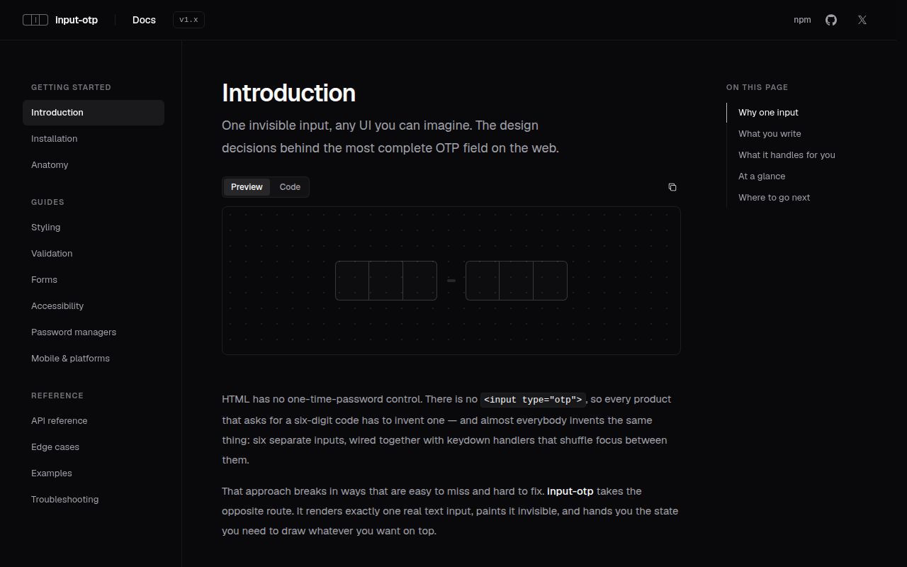
input-otp 1.5.0 gives React applications a one-time-code field built from one transparent HTML input. Your component paints the separate character boxes from slot state, while the browser still sees one focusable control for SMS autofill, labels, selection, undo, paste, and form submission. Our full-package browser build came to 18.2 KB minified and 7 KB gzipped. The current release adds a CSP nonce, turns off spellcheck by default, checks whether ResizeObserver exists, and fixes failures involving unmounts, page translation, narrow overflow containers, and a missing input reference.
input-otp 1.5.0 installed in 1 second with 0 audit findings, and our browser build measured 18.2 KB minified and 7 KB gzipped. Choose it when one real React input must look like separate OTP boxes; skip it if you need finished styling or expect a UI component to supply server-side code security.
We installed it
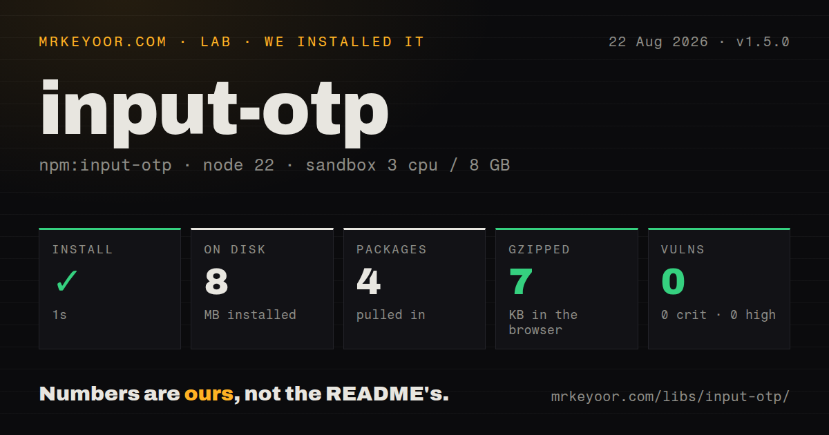
| Install | ✓ · 1s | 4 packages on disk · 8 MB |
| Import | ✓ | ESM import works · require() works · CommonJS package with exports map |
| Browser | 7 KB | gzipped (18.2 KB minified), bundled with esbuild |
| Types | ✓ | TypeScript types bundled |
| Known vulns | 0 | 0 critical · 0 high · 0 moderate · 0 low (npm audit) |
Answers from our run
Does input-otp install cleanly?
Yes. In a fresh container with an empty cache, npm install input-otp finished in 1 seconds, leaving 4 packages and 8 MB on disk. npm audit reported no known vulnerabilities.
How much does input-otp add to a browser bundle?
7 KB gzipped (18.2 KB minified) when the whole package is bundled for the browser with esbuild. Importing only part of it is usually smaller.
Does input-otp work with both ESM and CommonJS?
Yes. Both import 'input-otp' and require('input-otp') worked in Node 22 in our run. The package is published as CommonJS with an exports map.
Does input-otp include TypeScript types?
Yes, type declarations ship inside the package, so no @types install is needed.
input-otp or react-otp-input: which should you use?
react-otp-input: Use it when a row of separately rendered inputs matches the interaction model you have already tested. input-otp 1.5.0 installed in 1 second with 0 audit findings, and our browser build measured 18.2 KB minified and 7 KB gzipped.
When should you not use input-otp?
You want a styled PIN control ready after import. input-otp provides the invisible field and slot data, leaving all visible markup and CSS to your application.
Use it if
- A React login or recovery form needs six visual slots while keeping a single tab stop, label, and FormData value.
- SMS one-time-code autofill and pasting into a partly filled code matter on mobile browsers.
- Your design system will draw every border, separator, character, focus state, and fake caret itself.
- The project already uses the shadcn/ui OTP composition and needs direct control over the package below it.
- You want a styled PIN control ready after import. input-otp provides the invisible field and slot data, leaving all visible markup and CSS to your application.
- The client is Vue, Svelte, React Native, or plain server-rendered HTML. Version 1.5.0 declares React and React DOM as its two peer dependencies and uses browser selection APIs.
- You need code delivery, expiration, retry limits, session binding, or replay protection. This package only handles the browser field; the authentication service must enforce those controls.
- The design cannot tolerate the thin native selection mark that may appear on iOS. The 1.5.0 notes keep that cosmetic artifact after an experimental workaround was removed.
- Your release process cannot include tests on real mobile browser paths. The project says headless tests cannot cover iOS behavior, SMS autofill, or password-manager badges.
Setup reality
We installed input-otp 1.5.0 in a new Node 22 Bookworm sandbox. npm finished in 1 second, and the result was 4 packages using 8 MB. npm audit found 0 vulnerabilities across critical, high, moderate, and low severity. The package has 0 direct dependencies, 2 peer dependencies, bundled TypeScript declarations, and a measured unpacked size of 144 KB. Its MIT-licensed CommonJS package has an exports map; both require() and ESM import worked.
React and React DOM are the 2 peers, which explains why a blank test project contains more than input-otp alone. Components using it need browser execution, so put a client boundary around the field in a Next.js App Router page. There is no theme or stylesheet to load. maxLength controls the slot count, render receives the slots, and containerClassName styles their wrapper. className is forwarded to the transparent input.
Keep autoComplete set to one-time-code for SMS suggestions. inputMode requests a mobile keyboard, while pattern decides which characters the component accepts. Under a nonce-based style-src policy, pass the new nonce prop to the injected style tag. Setting noScriptCSSFallback to null removes the fallback rule. The default password-manager strategy may widen the hidden input by 40 pixels; version 1.5.0 skips that move when a nearby overflow boundary has no room.
onChange receives the next string rather than a DOM event. onComplete runs when the value reaches maxLength, but the server must still reject expired or repeated attempts. The visual caret comes from hasFakeCaret, and errors need an accessible relationship to the real input. Test paste, iOS selection, autofill, browser translation, and password-manager overlays on actual devices. Our esbuild measurement was 18.2 KB minified and 7 KB gzipped, so this is a UI choice rather than a free abstraction.
Patterns
Render a six-slot code field render-code-slots
'use client'
import { OTPInput } from 'input-otp'

export function LoginCode() {
  return (
    <OTPInput
      maxLength={6}
      autoComplete="one-time-code"
      containerClassName="code-row"
      render={({ slots }) => slots.map((slot, index) => (
        <CodeBox key={index} {...slot} />
      ))}
    />
  )
}
maxLength=6 creates 6 slot records around one actual input. Put styles on containerClassName or the rendered boxes.
Paint the active slot and caret paint-slot-state
import type { SlotProps } from 'input-otp'

function CodeBox({ char, placeholderChar, isActive, hasFakeCaret }: SlotProps) {
  return (
    <span className={isActive ? 'code-box active' : 'code-box'}>
      {char ?? placeholderChar}
      {hasFakeCaret && <span className="fake-caret" aria-hidden />}
    </span>
  )
}
The browser caret is transparent. Render hasFakeCaret or a focused empty slot may provide no visible insertion point.
Control the code with React state control-code-value
const [code, setCode] = useState('')

<OTPInput
  maxLength={6}
  value={code}
  onChange={setCode}
  render={({ slots }) => <CodeRow slots={slots} />}
/>
onChange passes a string directly. A handler expecting event.target.value will fail.
Reject non-digit input restrict-to-digits
import { OTPInput, REGEXP_ONLY_DIGITS } from 'input-otp'

<OTPInput
  maxLength={6}
  inputMode="numeric"
  pattern={REGEXP_ONLY_DIGITS}
  render={({ slots }) => <CodeRow slots={slots} />}
/>
The numeric inputMode changes the suggested keyboard. REGEXP_ONLY_DIGITS is what filters typed and pasted characters.
Strip spaces and hyphens on paste clean-pasted-code
<OTPInput
  maxLength={6}
  pattern={REGEXP_ONLY_DIGITS}
  pasteTransformer={(text) => text.replace(/[\s-]/g, '')}
  render={({ slots }) => <CodeRow slots={slots} />}
/>
pasteTransformer runs before validation, so copied forms such as 123-456 can become a 6-digit value.
Submit through an HTML form post-native-form
<form action={verifyCode}>
  <label htmlFor="login-code">Login code</label>
  <OTPInput
    id="login-code"
    name="code"
    required
    maxLength={6}
    render={({ slots }) => <CodeRow slots={slots} />}
  />
  <button type="submit">Continue</button>
</form>
One underlying input produces one code entry in FormData and gives the label a single focus target.
Verify after all slots fill verify-on-complete
const [busy, setBusy] = useState(false)

<OTPInput
  maxLength={6}
  disabled={busy}
  onComplete={async (code) => {
    setBusy(true)
    try { await verify(code) } finally { setBusy(false) }
  }}
  render={({ slots }) => <CodeRow slots={slots} />}
/>
onComplete is a convenience trigger, not a security boundary. Disable duplicate requests and enforce expiry and attempt limits on the server.
Wire react-hook-form through Controller connect-form-controller
<Controller
  name="code"
  control={control}
  rules={{ required: true, minLength: 6 }}
  render={({ field }) => (
    <OTPInput
      ref={field.ref}
      maxLength={6}
      value={field.value}
      onChange={field.onChange}
      onBlur={field.onBlur}
      render={({ slots }) => <CodeRow slots={slots} />}
    />
  )}
/>
The forwarded ref targets the real input, so focus-on-error still works. Keep the controlled value initialized to a string.
Build slots from context compose-context-slots
import { OTPInput, OTPInputContext } from 'input-otp'

function ContextSlot({ index }) {
  const { slots } = useContext(OTPInputContext)
  return <CodeBox {...slots[index]} />
}

<OTPInput maxLength={4}>
  {[0, 1, 2, 3].map((index) => <ContextSlot key={index} index={index} />)}
</OTPInput>
Context supports composed children such as the shadcn/ui wrapper. Do not supply both children and a render callback.
Allow the fallback style under CSP pass-csp-nonce
<OTPInput
  maxLength={6}
  nonce={requestNonce}
  render={({ slots }) => <CodeRow slots={slots} />}
/>
The nonce prop is new in 1.5.0 and is attached to the style element injected by the component.
Stop password-manager width expansion disable-badge-shift
<OTPInput
  maxLength={6}
  pushPasswordManagerStrategy="none"
  render={({ slots }) => <CodeRow slots={slots} />}
/>
The hidden input stays within its original width, but an extension badge can cover the final slot.
Clear and refocus after rejection clear-rejected-code
const ref = useRef<HTMLInputElement>(null)
const [code, setCode] = useState('')

async function submit(value: string) {
  if (!(await verify(value))) {
    setCode('')
    ref.current?.focus()
  }
}

<OTPInput
  ref={ref}
  maxLength={6}
  value={code}
  onChange={setCode}
  onComplete={submit}
  render={({ slots }) => <CodeRow slots={slots} />}
/>
The ref points to the single native input, so focus() and selection methods remain available after a failed attempt.
Alternatives
| Package | Registry | Pick it when |
|---|---|---|
| react-otp-input | npm | Use it when a row of separately rendered inputs matches the interaction model you have already tested. |
| react-pin-input | npm | Use it when an older React codebase needs a preassembled PIN component and accepts its established API. |
| react-otp-field | npm | Use it when a small hook and field component fit better than rendering input-otp's slot state. |
More web frontend guides
postcss · react · react-dom · tailwindcss · htmlparser2 · tailwind-merge · the whole shelf →
How this guide is made: grounded in the library's documentation, release notes, changelog, and issue history, on a fixed rubric — not a hands-on install of every release. The 50 most-downloaded entries are additionally install-verified in clean containers. Corrections: contact the desk.