bootstrap review
Bootstrap 5.3.8 gives server-rendered pages a responsive grid, utility classes, styled forms, and browser components such as modals, dropdowns, collapse panels, toasts, and offcanvas menus. The CSS works without a JavaScript framework; interactive pieces use Bootstrap's own DOM plugins and `data-bs-*` attributes. This patch fixes WCAG 2.1 behavior in the Sass `color-contrast()` function and stops flex layouts from distorting spinners with multiline content. Our browser build measured 79.9 KB minified and 24 KB gzipped when importing the package namespace.
Bootstrap 5.3.8 installed in 1.3 seconds with 0 audit findings, but our full browser import still weighed 79.9 KB minified and 24 KB gzipped. Install it for conventional server-rendered interfaces that benefit from its complete component vocabulary; skip it when a small utility layer or framework-native component kit already covers the job.
We installed it
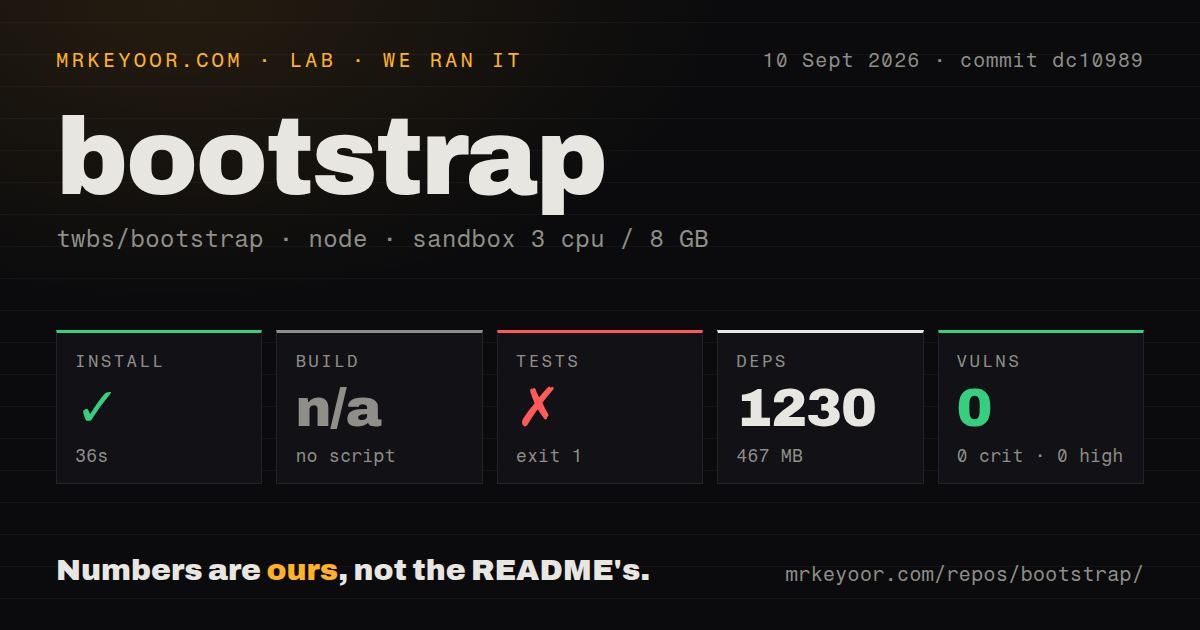
| Install | ✓ · 1.3s | 2 packages on disk · 13 MB |
| Import | ✗ | ESM import fails · require() fails · CommonJS package |
| Browser | 24 KB | gzipped (79.9 KB minified), bundled with esbuild |
| Types | — | no TypeScript types found |
| Known vulns | 0 | 0 critical · 0 high · 0 moderate · 0 low (npm audit) |
Answers from our run
Does bootstrap install cleanly?
Yes. In a fresh container with an empty cache, npm install bootstrap finished in 1 seconds, leaving 2 packages and 13 MB on disk. npm audit reported no known vulnerabilities.
How much does bootstrap add to a browser bundle?
24 KB gzipped (79.9 KB minified) when the whole package is bundled for the browser with esbuild. Importing only part of it is usually smaller.
Does bootstrap work with both ESM and CommonJS?
Neither plain import nor require succeeded in our sandbox, so it needs a bundler or extra setup.
Does bootstrap include TypeScript types?
No type declarations were found in our install, so TypeScript users need their own declarations.
bootstrap or bulma: which should you use?
bulma: Choose it when component styling should remain CSS-only and your application will own every interactive state. Bootstrap 5.3.8 installed in 1.3 seconds with 0 audit findings, but our full browser import still weighed 79.9 KB minified and 24 KB gzipped.
When should you not use bootstrap?
A product must look unlike Bootstrap. Its spacing, breakpoints, component markup, and state classes spread through HTML, so replacing the visual grammar takes more than changing variables.
Use it if
- A server-rendered admin panel needs a grid, forms, navigation, dialogs, and responsive utilities without adopting React or Vue.
- Your team is comfortable putting framework classes in templates and values consistent screens more than a unique visual system.
- You want compiled CSS for static pages now, with dropdowns, modals, or offcanvas behavior added only where needed.
- Existing staff and templates already use Bootstrap 5 conventions such as `container`, `row`, breakpoints, and `data-bs-*` controls.
- A product must look unlike Bootstrap. Its spacing, breakpoints, component markup, and state classes spread through HTML, so replacing the visual grammar takes more than changing variables.
- Your React or Vue stack already has an accessible component system. Bootstrap's plugins own DOM state imperatively and the core package does not provide official framework components.
- You need only a small grid or a few utilities. Our namespace import produced 79.9 KB minified and 24 KB gzipped JavaScript, much of which a CSS-only page would never execute.
- You expect copied markup to settle accessibility. Bootstrap documents author duties for labels, heading order, keyboard context, ARIA relationships, and contrast; classes cannot supply the missing product semantics.
- Your Sass build must use only the module system. Bootstrap 5.3 source customization still depends on ordered `@import` calls, which current Dart Sass deprecates.
Setup reality
We installed bootstrap 5.3.8 in a fresh Node 22 Bookworm container in 1.3 seconds. The install left 2 packages and 13 MB on disk, and npm audit reported 0 known vulnerabilities. Bootstrap declares no direct dependencies and one peer dependency, @popperjs/core; the package itself is 9980 KB unpacked and has no TypeScript declarations.
The package identifies as CommonJS and has no exports map, yet both require('bootstrap') and ESM import('bootstrap') failed under Node 22.23.2 in our sandbox. That is a server-side loading result, not a browser failure. Import explicit browser files such as bootstrap/dist/css/bootstrap.min.css and the bundled JavaScript, or load a specific plugin module through your bundler. Our full namespace browser build came to 79.9 KB minified and 24 KB gzipped.
Dropdowns, tooltips, and popovers need Popper. The bootstrap.bundle files include it; individual or non-bundle imports need the peer installed and resolved. Grid, spacing, forms, and static cards need no JavaScript. Collapse, modal, offcanvas, toast, and dropdown state do. Tooltips and popovers also require explicit initialization, so their data attributes alone produce nothing.
Sass overrides must appear after functions are imported but before Bootstrap consumes its variables and maps. Color modes switch Bootstrap variables with data-bs-theme; custom colors and third-party widgets still need matching dark styles. The package ships separate RTL CSS. In applications that replace DOM nodes, call a plugin instance's dispose() before removal so Bootstrap does not retain listeners or references.
Patterns
Start with the compiled CDN files cdn-starter
<link href="https://cdn.jsdelivr.net/npm/bootstrap@5.3.8/dist/css/bootstrap.min.css" rel="stylesheet">

<main class="container py-4">
  <h1>Hello</h1>
</main>

<script src="https://cdn.jsdelivr.net/npm/bootstrap@5.3.8/dist/js/bootstrap.bundle.min.js"></script>
Version 5.3.8's bundle includes Popper. Copy the current integrity and crossorigin attributes from the official quick-start page before deploying CDN tags.
Load every compiled component through npm npm-global-import
import 'bootstrap/dist/css/bootstrap.min.css';
import 'bootstrap/dist/js/bootstrap.bundle.min.js';
This path loads all component behavior. A page using only the grid, utilities, or styled forms can omit the second import.
Instantiate only the modal plugin import-one-plugin
import 'bootstrap/dist/css/bootstrap.min.css';
import Modal from 'bootstrap/js/dist/modal';

const element = document.querySelector('#confirm-modal');
const modal = Modal.getOrCreateInstance(element, { keyboard: true });
modal.show();
Direct plugin imports avoid the all-in-one entry. Dropdown, tooltip, and popover modules still resolve the `@popperjs/core` peer.
Change card columns at two breakpoints responsive-grid
<div class="container">
  <div class="row g-3">
    <div class="col-12 col-md-6 col-xl-4"><article class="card p-3">A</article></div>
    <div class="col-12 col-md-6 col-xl-4"><article class="card p-3">B</article></div>
    <div class="col-12 col-md-6 col-xl-4"><article class="card p-3">C</article></div>
  </div>
</div>
The unprefixed 12-column rule applies first. `md` and `xl` replace it only after their documented minimum widths.
Wire a navbar toggle to its collapse target responsive-navbar
<nav class="navbar navbar-expand-lg bg-body-tertiary">
  <div class="container-fluid">
    <a class="navbar-brand" href="/">Acme</a>
    <button class="navbar-toggler" type="button" data-bs-toggle="collapse" data-bs-target="#main-nav" aria-controls="main-nav" aria-expanded="false" aria-label="Toggle navigation">
      <span class="navbar-toggler-icon"></span>
    </button>
    <div class="collapse navbar-collapse" id="main-nav">
      <a class="nav-link" href="/docs">Docs</a>
    </div>
  </div>
</nav>
Collapse needs Bootstrap JavaScript. The selector in `data-bs-target`, the target `id`, and `aria-controls` must name the same element.
Connect a button to a labelled modal open-modal
<button class="btn btn-primary" data-bs-toggle="modal" data-bs-target="#confirm-modal">Delete</button>

<div class="modal fade" id="confirm-modal" tabindex="-1" aria-labelledby="confirm-title" aria-hidden="true">
  <div class="modal-dialog"><div class="modal-content">
    <div class="modal-header"><h2 class="modal-title fs-5" id="confirm-title">Confirm deletion</h2></div>
    <div class="modal-body">This cannot be undone.</div>
  </div></div>
</div>
Bootstrap handles focus while the modal is open. Your markup still needs a useful label plus a visible way to close or finish the task.
Activate tooltip elements after rendering enable-tooltips
import Tooltip from 'bootstrap/js/dist/tooltip';

const tooltips = [...document.querySelectorAll('[data-bs-toggle="tooltip"]')]
  .map((element) => new Tooltip(element));
Tooltip attributes do nothing until this constructor runs, and the plugin needs Popper. Keep required instructions visible outside hover-only content.
Show a toast and release its instance show-toast
import Toast from 'bootstrap/js/dist/toast';

const element = document.querySelector('#saved-toast');
const toast = Toast.getOrCreateInstance(element, { delay: 5000 });
toast.show();

element.addEventListener('hidden.bs.toast', () => toast.dispose(), { once: true });
The HTML needs the appropriate live-region semantics. `dispose()` removes Bootstrap's stored instance and event handlers after hiding.
Persist a Bootstrap color mode toggle-color-mode
const root = document.documentElement;

function setTheme(theme) {
  root.setAttribute('data-bs-theme', theme);
  localStorage.setItem('theme', theme);
}

setTheme(localStorage.getItem('theme') || 'light');
`data-bs-theme` swaps Bootstrap's color variables. It does not rewrite custom colors or the styles inside third-party widgets.
Reveal native validation styles on submit validate-form
const form = document.querySelector('.needs-validation');

form.addEventListener('submit', (event) => {
  if (!form.checkValidity()) {
    event.preventDefault();
    event.stopPropagation();
  }
  form.classList.add('was-validated');
});
These classes expose the browser's constraint result. Server-side failures need their own message, invalid state, and accessible field association.
Set Sass variables before the framework consumes them customize-sass
// styles.scss
@import "bootstrap/scss/functions";

$primary: #5b21b6;
$border-radius: .25rem;
$enable-shadows: true;

@import "bootstrap/scss/bootstrap";
Bootstrap 5.3 reads overrides in import order and still uses Sass `@import` internally. Current Dart Sass can emit deprecation warnings for that pipeline.
Clean up an offcanvas before deleting its node dispose-on-removal
import Offcanvas from 'bootstrap/js/dist/offcanvas';

const element = document.querySelector('#filters');
const panel = Offcanvas.getOrCreateInstance(element);

panel.hide();
element.addEventListener('hidden.bs.offcanvas', () => {
  panel.dispose();
  element.remove();
}, { once: true });
A rendering framework can delete the node without notifying Bootstrap. Dispose the instance first so its listeners and stored reference are released.
Alternatives
| Package | Registry | Pick it when |
|---|---|---|
| bulma | npm | Choose it when component styling should remain CSS-only and your application will own every interactive state. |
| tailwindcss | npm | Choose it when utilities should support a custom design system instead of prescribing component markup. |
| @picocss/pico | npm | Choose it for semantic HTML, few classes, and a smaller set of styled elements and components. |
More web frontend guides
postcss · react · react-dom · tailwindcss · htmlparser2 · tailwind-merge · the whole shelf →
How this guide is made: grounded in the library's documentation, release notes, changelog, and issue history, on a fixed rubric — not a hands-on install of every release. The 50 most-downloaded entries are additionally install-verified in clean containers. Corrections: contact the desk.